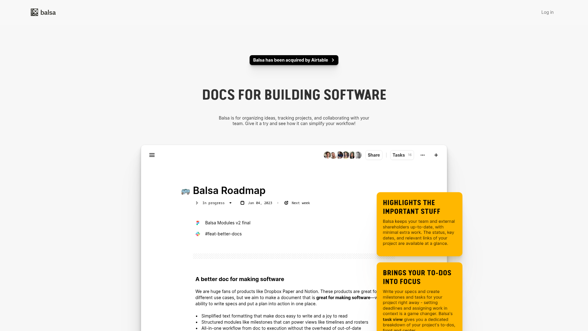
Balsa Software Documentation Landing Page
A clean document-centric layout featuring a centered hero section, high-contrast callout boxes, and a nested dashboard UI preview for collaborative tool showcases.
Overview
Balsa is a minimalist landing page designed to showcase a document-centric collaboration tool for software teams. It is a strong reference for builders because it uses a "product-as-hero" layout, where the primary UI of the application serves as the visual centerpiece to demonstrate value through immediate functional context.
Design System
- Color Palette & Visual Hierarchy: The design follows a high-contrast, clean aesthetic. It uses a primary white/light-gray background to emphasize the document editor UI. Actionable highlights and callouts use a bold, saturated yellow background with black text, creating a strong visual pop that guides the eye towards value propositions.
- Typography System: The page uses a tall, condensed sans-serif typeface for main headings (e.g., "DOCS FOR BUILDING SOFTWARE") to create a modern, industrial feel. Body text is a standard, highly legible sans-serif. Emphasis is achieved through bold weights and uppercase styling for headers and callout titles.
- Page Structure: The layout follows a classic vertical stack: a slim top navigation bar, a central announcement capsule for news, a massive hero heading, and a floating UI window that blends into the background. Content is further explained using overlapping "sticky-note" style callouts positioned to the right of the main UI preview.
- Reusable Components:
- The "App Window" Container: A soft-shadowed, rounded-corner white block that simulates a dashboard interface.
- Status Pills: Small, interactive-looking badges used inside the UI preview for things like "In progress" or date pickers.
- Notification Capsule: The rounded black bar at the top with a chevron arrow, perfect for quick link-outs or acquisition news.
- Collaborator Stack: A row of overlapping circular avatars with a "Share" button, a classic pattern for SaaS tools.
- Implementation Clues: The HTML structure suggests a focus on clean, semantic layout containers. The use of shadow effects on the central document area and callout boxes points toward a utility-first CSS approach (like Tailwind) for managing elevations and spacing.
Use Cases
- Who should clone this pattern: Developers launching documentation tools, project management apps, or collaborative editors who want to lead with a "live-look" product preview rather than abstract illustrations.
- What products can remix it effectively: Internal tool builders, knowledge base software, or developer experience (DevEx) platforms. The minimalist aesthetic works well for technical audiences who value utility over decorative fluff.
- Practical remix directions: Swap the bold yellow callouts for branding-specific accent colors (e.g., tech blue or deep purple). The "App Window" can be easily swapped with a browser screenshot from any SaaS dashboard. The info architecture can be adapted by extending the vertical height of the document block into a multi-step feature walkthrough.
- Suggested clone scope: The hero section and its overlapping yellow callouts are the most valuable parts to clone for a high-impact, single-page product pitch.
Related Inspirations

Slite SaaS Knowledge Base Landing Page
A clean SaaS hero section with a conversational headline, secondary call-to-action buttons, and a structured software interface preview featuring user testimonials.
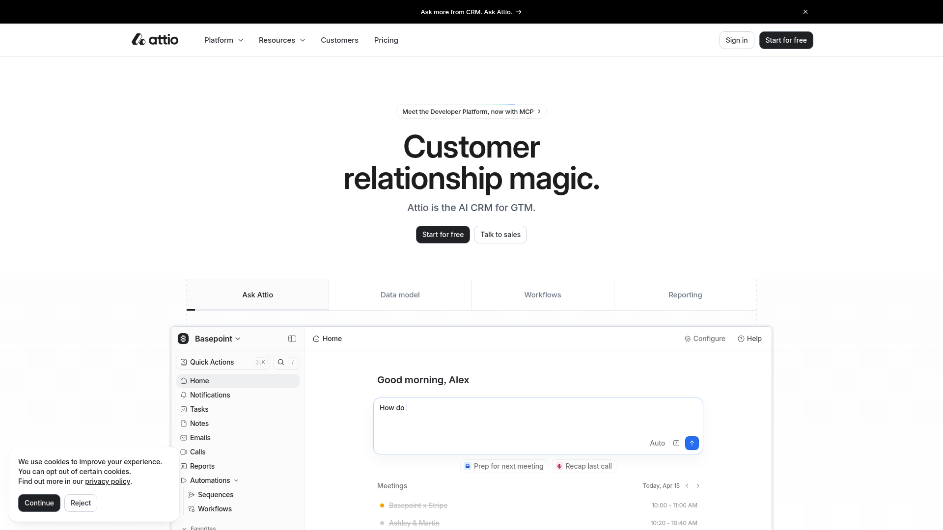
Attio AI CRM Landing Page
A clean SaaS landing page featuring a tiered navigation bar, a centered hero section with twin CTAs, and a detailed interactive dashboard preview.
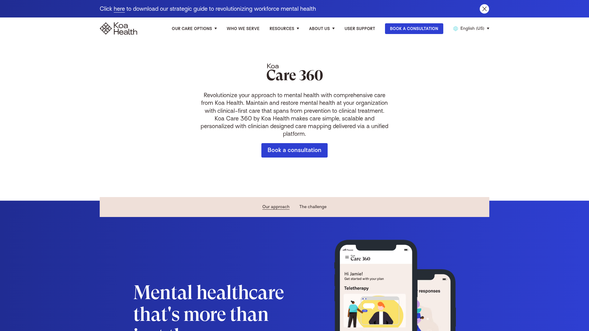
Koa Health Mental Care Landing Page
A clean healthcare landing page featuring a centered hero section, scroll-based fade-in animations, overlapping mobile mockups, and a multi-column feature grid with accent borders.
Firebase Hosting Site Not Found
A minimal placeholder layout for 404 error states including a centered logo, numbered troubleshooting guide, and linked utility text.
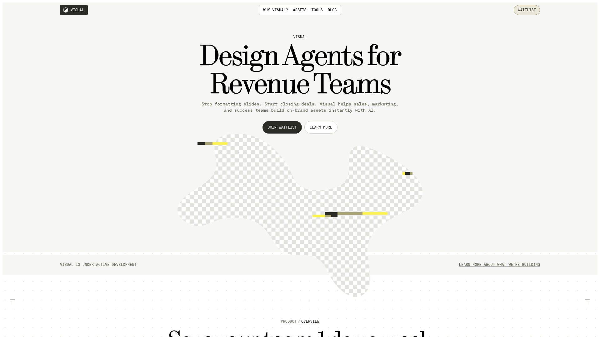
Visual AI Landing Page Templates
A high-end SaaS layout featuring a serif-heavy typography system, bento-style product showcase grids, accordion-style feature blocks, and minimalist wireframe UI components.
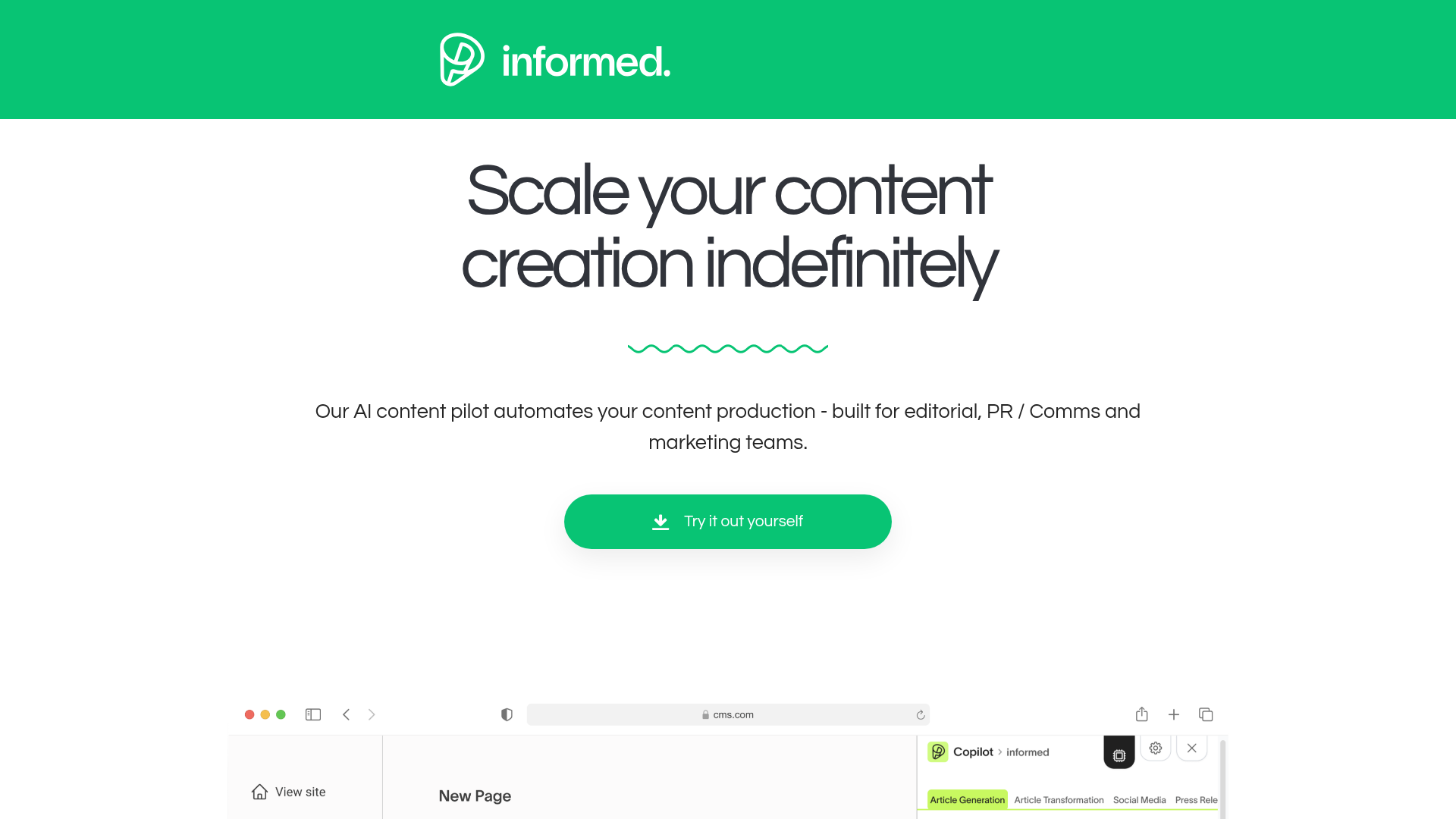
Informed AI Content Landing Page
A clean SaaS landing page featuring a green brand header, centered hero section, feature list with image, tag-based task list, and a simple pricing card layout.
