Visual AI Landing Page Templates
A high-end SaaS layout featuring a serif-heavy typography system, bento-style product showcase grids, accordion-style feature blocks, and minimalist wireframe UI components.
Overview
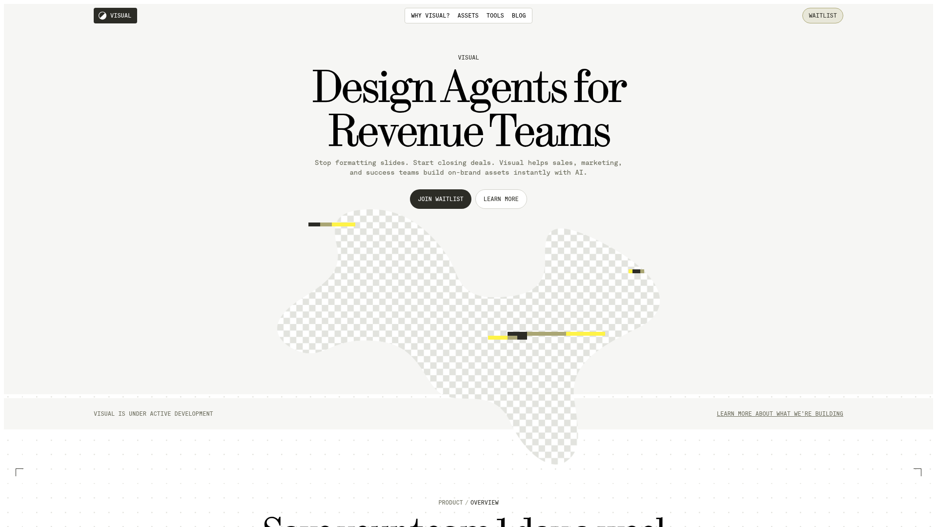
This landing page is a high-end SaaS template designed for AI design agents, featuring a sophisticated balance of classic serif typography and modern minimalist layouts. It is an excellent reference for builders wanting to convey high authority and creative quality through a "digital-first agency" aesthetic.
Design System
- Color Palette & Visual Hierarchy: The site uses a high-contrast monochromatic base (Black
#000000, Off-Whitebg-neutral-50) with strategic micro-accents of yellow and green. Hierarchy is established through extreme scale shifts in typography rather than color pops. - Typography: A dual-system approach pairing an elegant, high-contrast Serif (for headlines like "Design Agents for Revenue Teams") with a functional Monospaced font (
font-mono) for labels, dates, and technical details. Headings usetracking-tighterand range fromtext-5xltotext-8xlfor maximum impact. - Page Structure: The layout follows a modular grid: Hero section with a centered CTA -> Bento-style product showcase with rounded corner offsets -> Dark-themed feature section with vertical accordions -> 3-column use case block -> Horizontal template gallery -> Minimalist Blog grid.
- Reusable Components:
- Corner-Border Containers: Decorative L-shaped borders used as frame accents in the hero and template sections.
- Vertical Accordions: A unique dark-mode list where numbered items (
01,02) expand to reveal feature details. - Status Banner: A minimalist top-bar for system status ("Visual is under active development") using a monospaced font.
- Pill Buttons: High-contrast, fully rounded buttons with uppercase text.
- Implementation Clues: The HTML reveals a heavy reliance on Tailwind CSS utility classes (
grid-cols-12,aspect-square,subgrid) and Radix UI primitives for accessible components like accordions (data-state="open").
Use Cases
- Who should clone this: B2B SaaS startups in the creative, AI, or high-end productivity space looking to differentiate from standard "gradient-heavy" tech designs.
- Remix Directions: Swap the serif font for a modern grotesque (like Inter or Helvetica) for a more "utility-first" feel, or replace the monochrome base with deep brand colors while keeping the thin borders and monospaced labels.
- Suggested Clone Scope: The "Bento" product showcase and the vertical accordion list are the most high-value components for quick reuse. The entire page is ideal for a full clone if you need a cohesive GTM (Go-To-Market) strategy for a premium software product.
Related Inspirations

Koa Health Mental Care Landing Page
A clean healthcare landing page featuring a centered hero section, scroll-based fade-in animations, overlapping mobile mockups, and a multi-column feature grid with accent borders.
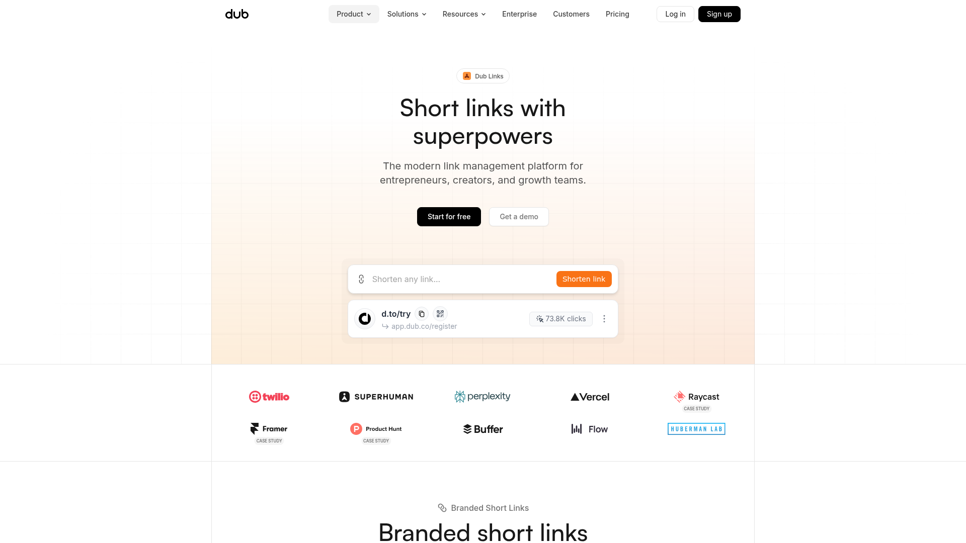
Dub.sh Link Management Landing Page
A clean SaaS landing page featuring a centralized link shortener input, bento-style product features, and a logo marquee for high-profile integrations.
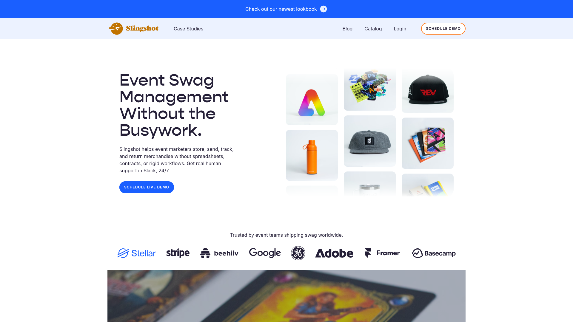
Slingshot Event Swag Hero and Logos
A clean SaaS landing page featuring a split hero layout with promotional product imagery, a call-to-action button, and a monochrome brand logo trust bar.

Slite SaaS Knowledge Base Landing Page
A clean SaaS hero section with a conversational headline, secondary call-to-action buttons, and a structured software interface preview featuring user testimonials.
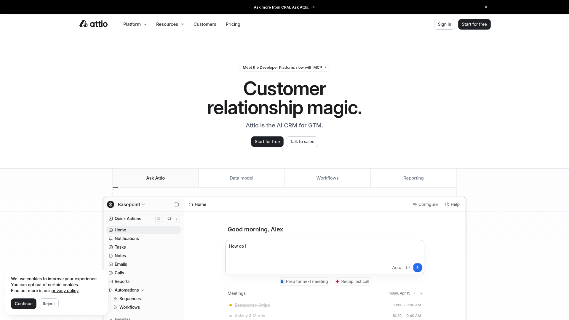
Attio AI CRM Landing Page
A clean SaaS landing page featuring a tiered navigation bar, a centered hero section with twin CTAs, and a detailed interactive dashboard preview.
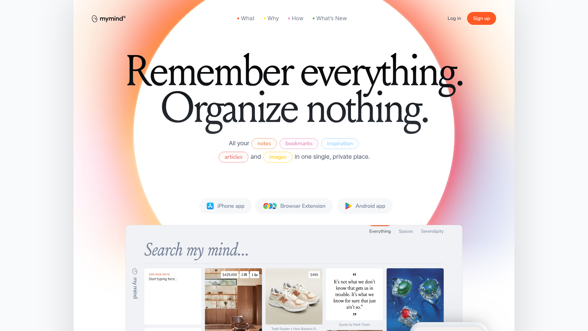
Mymind AI Tool Landing Page
A minimalist SaaS landing page featuring a soft-gradient hero section, custom pill-shaped text badges, and a dynamic bento-style search result preview grid.
