Attio AI CRM Landing Page
A clean SaaS landing page featuring a tiered navigation bar, a centered hero section with twin CTAs, and a detailed interactive dashboard preview.
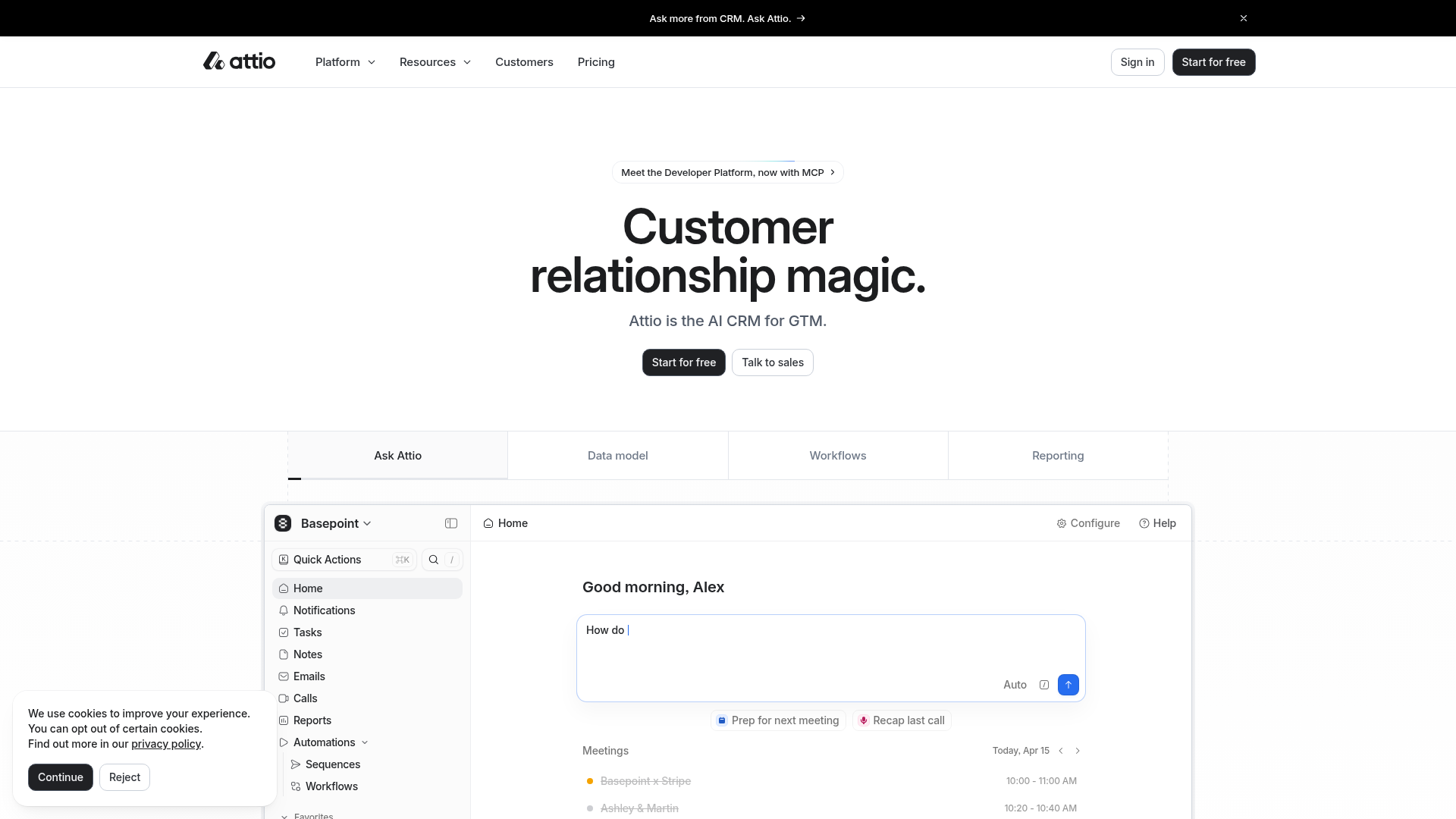
Overview
Attio’s landing page is a premier example of a modern, high-end SaaS "clean aesthetic" that balances white space with deep information density. It is an excellent clone reference for developers building B2B tools because it demonstrates how to showcase complex software features through a refined, minimalist UI while maintaining a strong call-to-action hierarchy.
Design System
- Color Palette & Visual Hierarchy: The site uses a monochrome base (White
#FFFFFF, Rich Black#000000, and Soft Grays) to create a professional, utility-first look. Vibrancy is reserved for the software interface preview (e.g., the blue AI button and status indicators), guiding the eye toward product functionality. - Typography: Features a clean neo-grotesk sans-serif. The hero uses a high-contrast weight for the display text ("Customer relationship magic.") to establish immediate brand authority, while UI labels use smaller, medium-weight scales for readability.
- Page Structure: A standard but refined flow: a persistent thin-banner promo at the top, a multi-column global navigation, a centered hero with dual CTAs, and a tabbed feature section that switches between "Ask Attio," "Data model," "Workflows," and "Reporting."
- Reusable Components:
- Tiered Buttons: High-contrast solid black buttons for primary actions ("Start for free") and outlined/ghost buttons for secondary actions ("Talk to sales", "Sign in").
- Compound Navbar: A complex header featuring dropdown menus with chevrons and a right-aligned sticky action group.
- Interactive Dashboard Shell: A detailed mock-up of an application sidebar (navigation links with icons) and a central workspace with an integrated AI prompt input.
- Interaction Patterns: The layout uses a tab-switcher below the hero to swap product views without page reloads, a common pattern for reducing friction while educating users on various sub-features.
Use Cases
- Who should clone this: Developers building developer tools, enterprise CRMs, project management software, or AI-integrated platforms that require a high-trust, professional aesthetic.
- Effective Remixes:
- Brand Variation: Swap the monochrome palette for a brand-specific primary color while keeping the layout structure to maintain the "premium" feel.
- Information Architecture: Adapt the four-tab feature switcher to highlight different user personas instead of product features (e.g., "For Sales," "For Marketing," "For Support").
- Clone Scope:
- Quick Clone: The hero section and primary navigation provide a robust foundation for any SaaS homepage.
- Full-Page Clone: Ideal for those needing to build a feature-rich marketing site that needs to explain complex workflows via the interactive dashboard mockup section.
Related Inspirations

Slite SaaS Knowledge Base Landing Page
A clean SaaS hero section with a conversational headline, secondary call-to-action buttons, and a structured software interface preview featuring user testimonials.

Koa Health Mental Care Landing Page
A clean healthcare landing page featuring a centered hero section, scroll-based fade-in animations, overlapping mobile mockups, and a multi-column feature grid with accent borders.
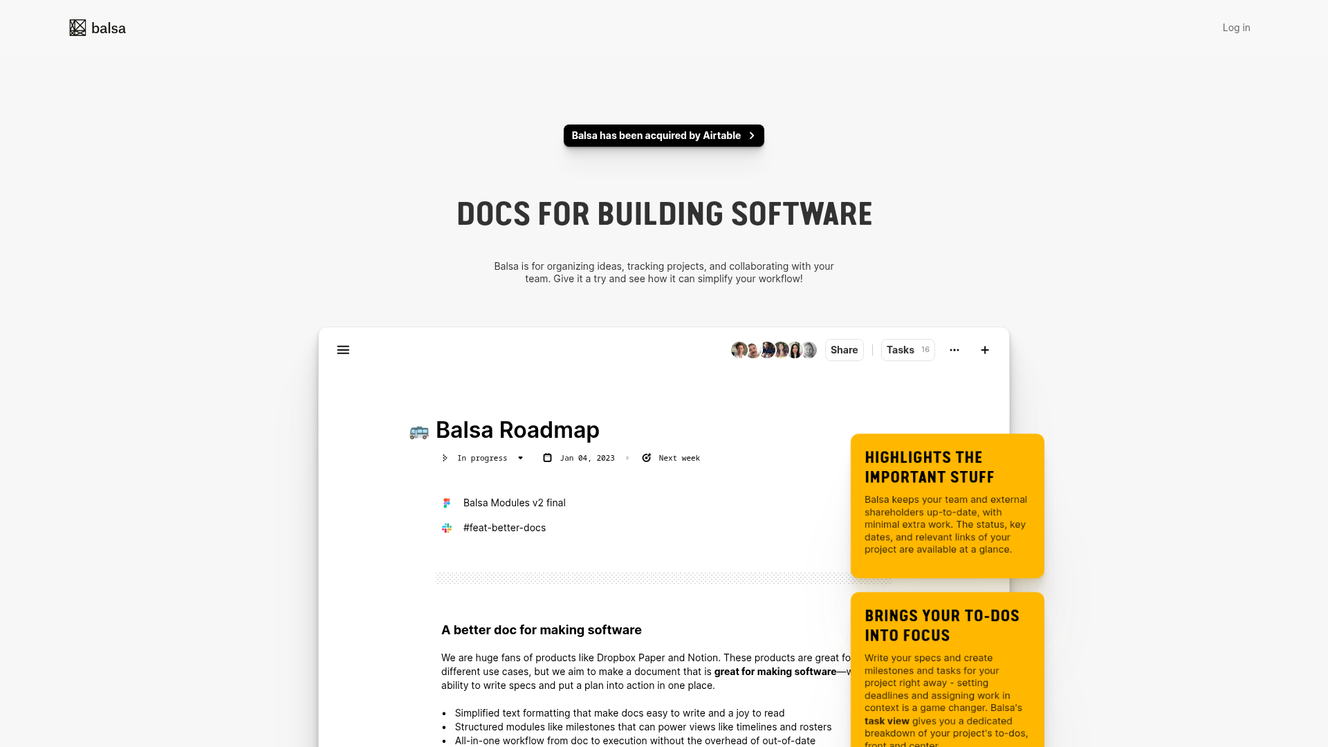
Balsa Software Documentation Landing Page
A clean document-centric layout featuring a centered hero section, high-contrast callout boxes, and a nested dashboard UI preview for collaborative tool showcases.
Firebase Hosting Site Not Found
A minimal placeholder layout for 404 error states including a centered logo, numbered troubleshooting guide, and linked utility text.
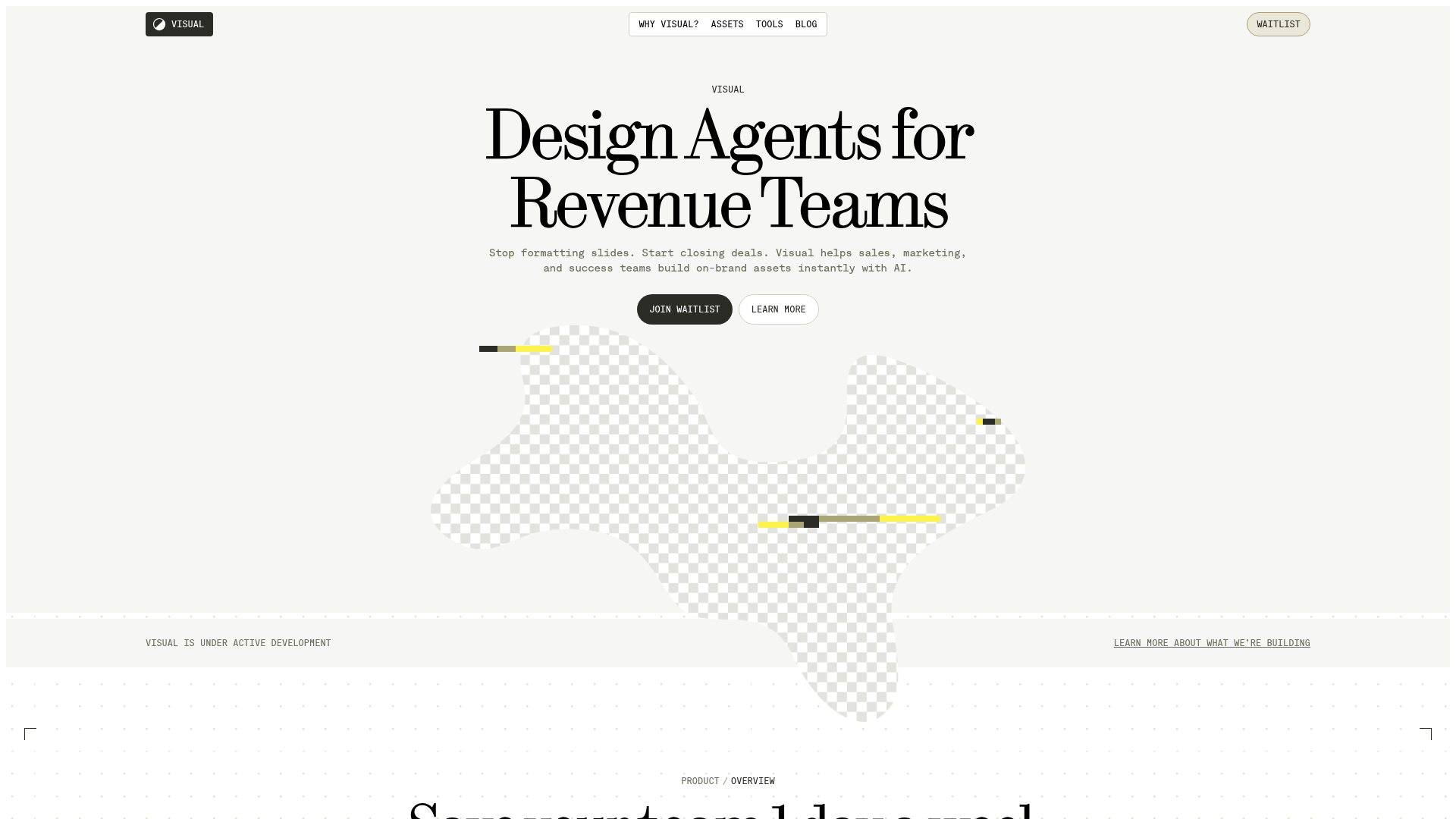
Visual AI Landing Page Templates
A high-end SaaS layout featuring a serif-heavy typography system, bento-style product showcase grids, accordion-style feature blocks, and minimalist wireframe UI components.
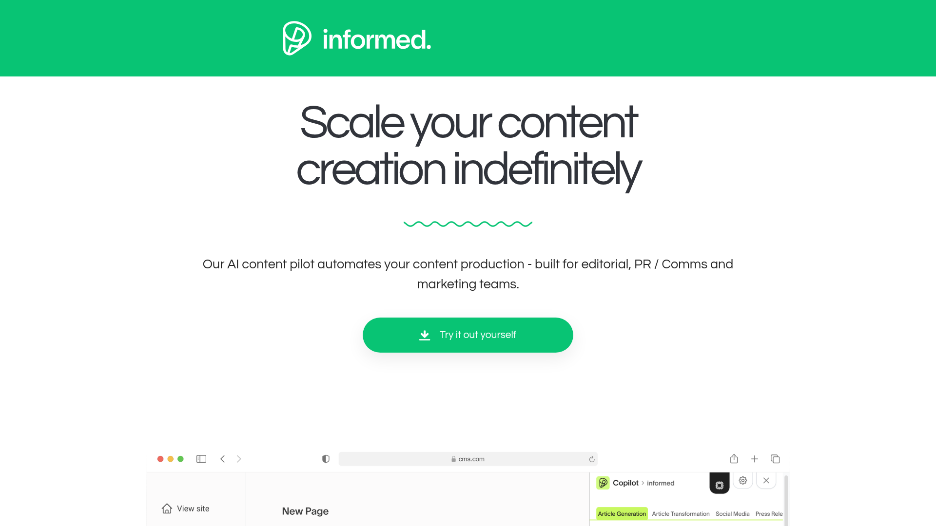
Informed AI Content Landing Page
A clean SaaS landing page featuring a green brand header, centered hero section, feature list with image, tag-based task list, and a simple pricing card layout.
