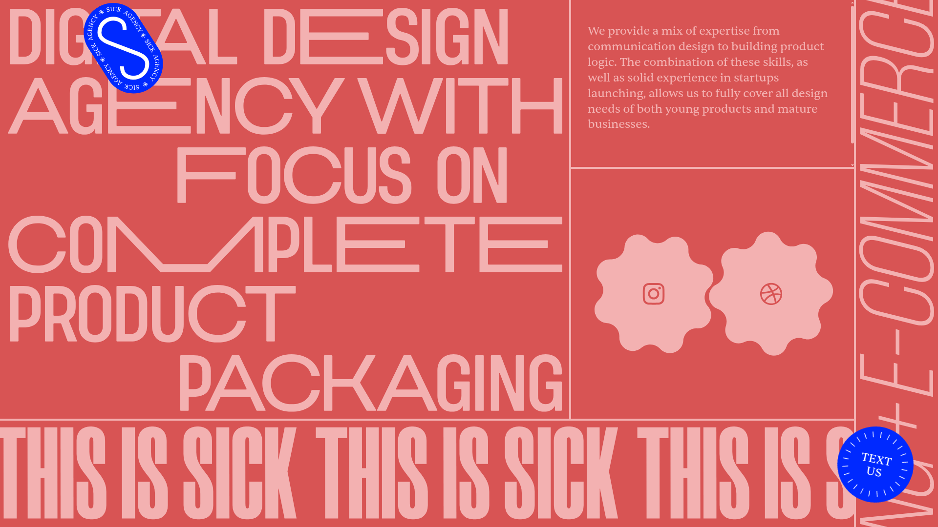
Sick Agency Typographic Resizable Grid
A brutalist design featuring resizable flex containers, dynamic floating UI elements, scrolling ticker marquee, and interactive gear-shaped social links.
Overview
This site for Sick Agency is a masterclass in brutalist, typographic-first design using a highly interactive grid system. It is an exceptional reference for builders interested in unconventional layouts that utilize resizable flex containers and dynamic CSS-driven animations to create a high-impact branded experience.
Design System
- Color Palette & Visual Hierarchy: The palette is a bold, high-contrast duo-tone featuring a vibrant coral-red base with pale pink typography. Accents are provided by a deep cobalt blue used for floating, interactive UI elements (the logo and contact button) to break the grid's color monotony.
- Typography System: The system uses extreme typographic scale. The primary display font is a highly compressed sans-serif with a futuristic, almost stencil-like quality in certain glyphs (e.g., the stylized 'E' and 'M'). Font sizes are dynamic, often sized via viewport units (
vw) to fill the container width entirely. - Page Structure: The layout relies on a nested flexbox grid. It features a large central splash area for the core message, a sidebar for descriptive text, a dedicated gear-shaped social media section, and a horizontal scrolling ticker (marquee) at the footer titled "THIS IS SICK."
- Reusable Components:
- Resizable Handles: The
.handleelements in the HTML indicate the use of user-adjustable grid dividers. - Floating UI: Circular, rotating stickers for the "TEXT US" CTA and the primary logo that use CSS variables (
--rotate) for non-static orientation. - Interactive Gears: SVG-style gear links for Instagram and Dribbble that rotate on interaction.
- Full-screen Contact Form: A hidden-by-default form utilizing a grid of checkboxes for service selection and a unique "Amazing/Excellent" marquee state upon submission.
- Resizable Handles: The
- Interaction & Motion: The site features active scrolling marquees via
translateoverrides, staggered rotations on floating elements, and hover states that change the orientation of the circular CTA and gear elements. - Responsive Behavior: The use of
flex: 1 1 0pxand viewport-relative units (--size: 9.8vw) ensures that the typography and containers scale proportionally with the browser width while maintaining the brutalist aesthetic.
Use Cases
- Who should clone this: Creative agencies, portfolio-based freelancers, or experimental fashion brands looking for a high-energy, non-standard digital presence.
- Effective Remixes: This pattern works well for landing pages with limited copy where visual impact is prioritized over information density. The ticker and resizable grid can be adapted for product launches or digital magazines.
- Remix Directions: Swap the coral color for a neon/dark mode palette for a tech-heavy look; replace the display font with a serif to shift from 'brutalist' to 'high-fashion'; or extract strictly the resizable
.layoutgrid logic for a dashboard application. - Suggested Scope: Developers should start by cloning the flexbox grid structure and the horizontal ticker (
feature_pane). The resizable handle logic is the most advanced feature worth isolating for reuse in complex layouts.
Related Inspirations
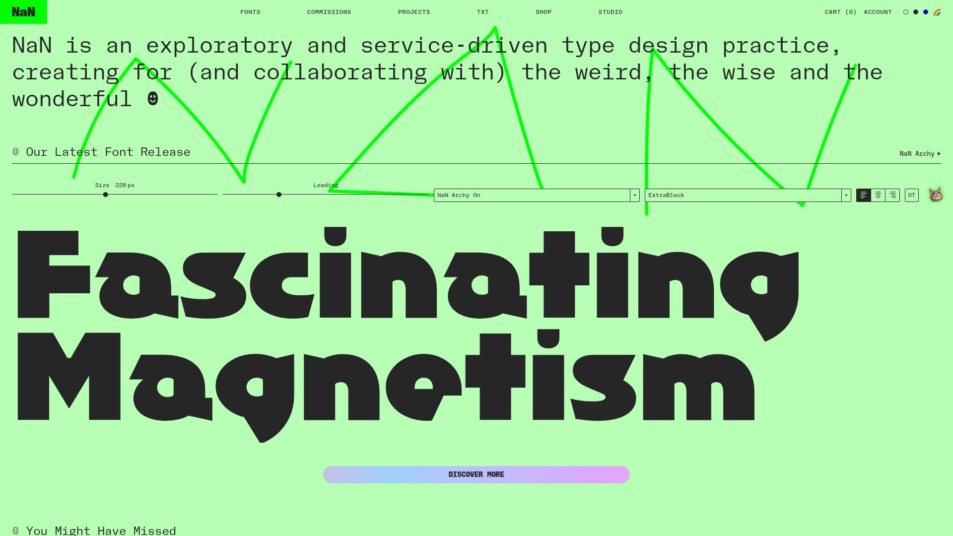
NaN Type Foundry Typography Showcase
A font-centric layout featuring a signature interactive type tester, a minimalist grid-based font gallery with hover effects, and a bold, high-contrast aesthetic.
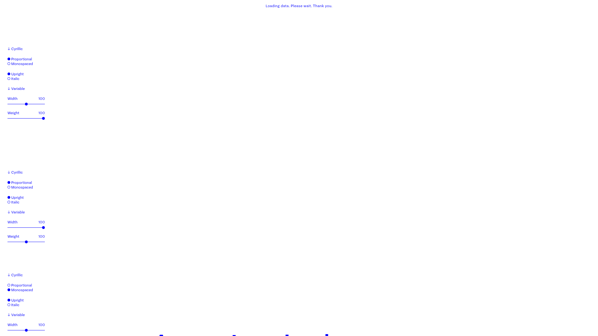
GT America Typography Tester
A layout-heavy landing page featuring interactive font testing toolkits with multi-language support, font-weight sliders, and content-editable text areas.
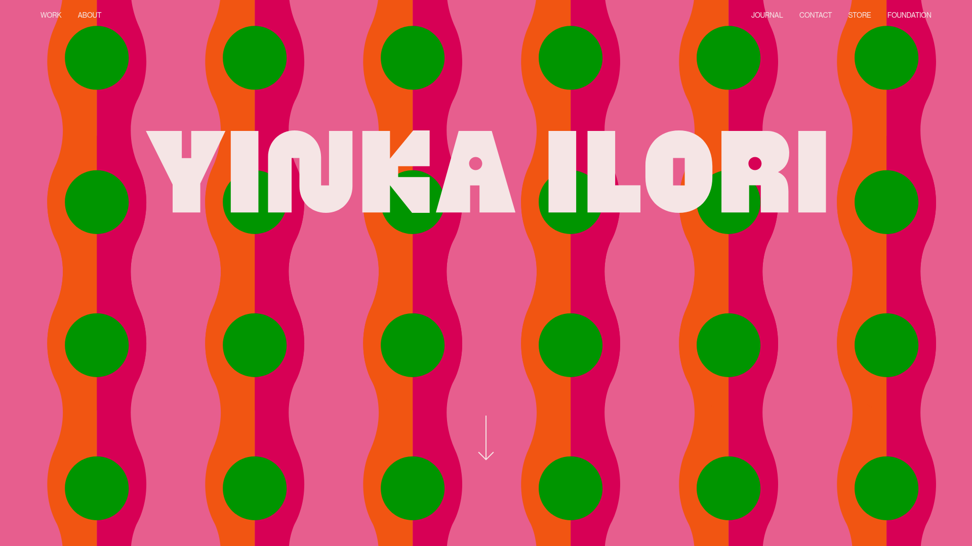
Yinka Ilori Portfolio Mosaic Grid
A vibrant portfolio featuring a scroll-activated parallax hero, bold typography, and a staggered mosaic image grid with asymmetric layouts and fade-in animations.
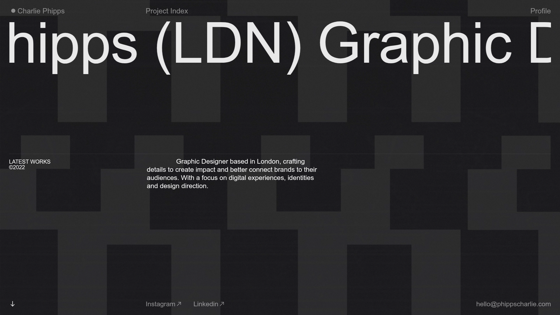
Charlie Phipps Portfolio Hero Layout
A dark-themed portfolio featuring a large horizontal scrolling marquee header, full-bleed video backgrounds, and a clean typography-focused grid for case studies.
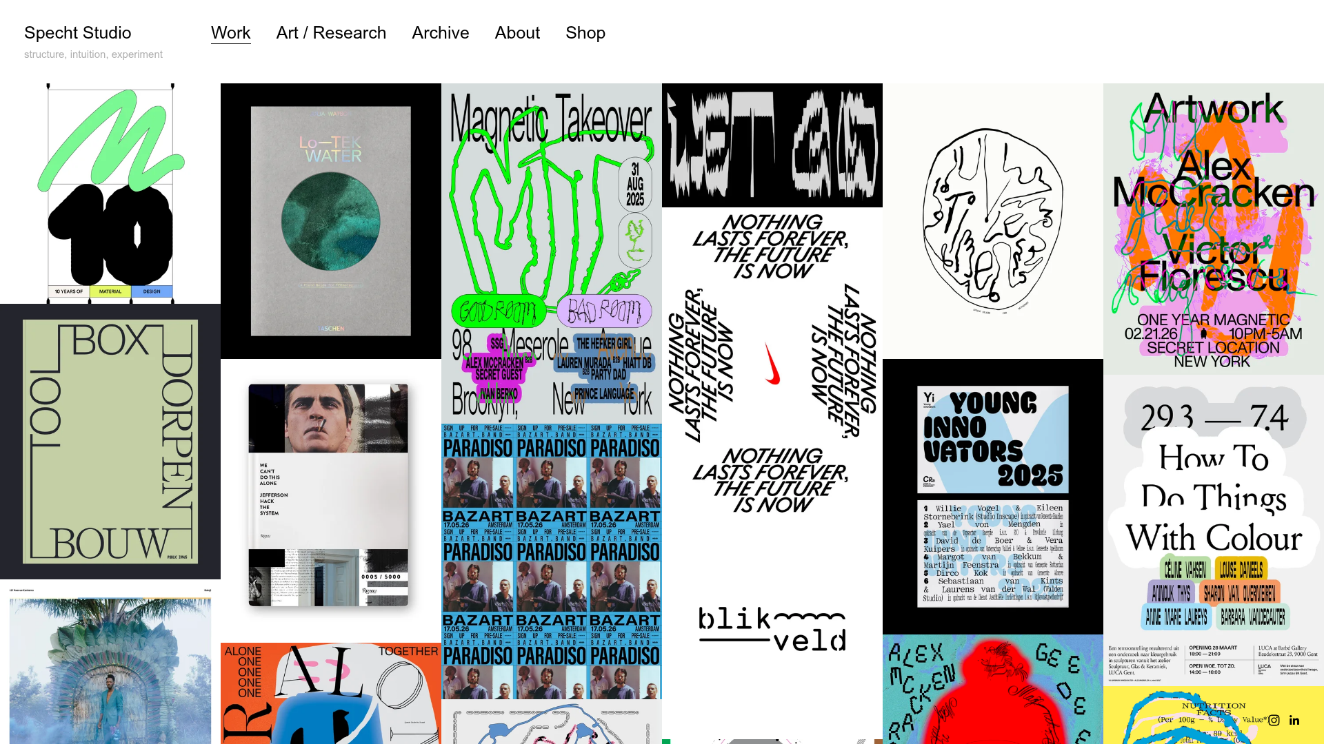
Specht Studio Portfolio Masonry Grid
A minimalist graphic design portfolio featuring an irregular masonry image gallery with high-contrast typography, hidden project details, and a top-aligned persistent navigation bar.
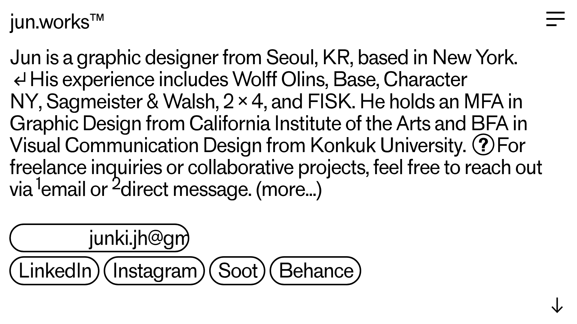
Jun Works Portfolio Landing Page
Minimalist graphic design portfolio featuring a text-heavy layout with image-on-hover tooltips, a pill-shaped marquee contact card, and a categorized hashtag tag cloud for project navigation.
