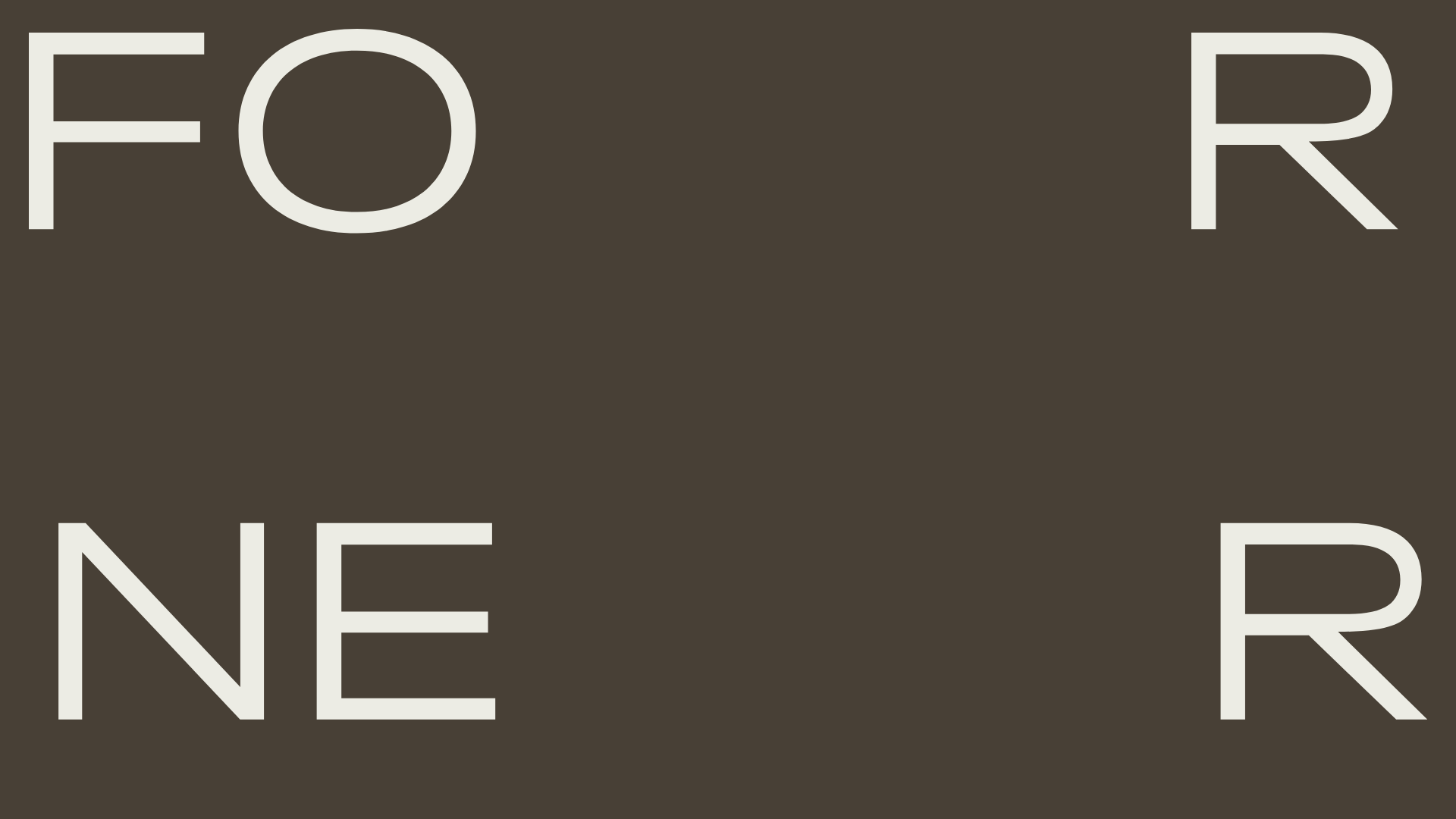
Forner Studio Minimalist Agency Landing Page
A minimalist design featuring a large-scale liquid typography layout, high-contrast dark theme, and a clean grid-based navigation structure.
Overview
Forner Studio is a high-end minimalist agency landing page that utilizes extreme scale and negative space to create a premium, gallery-like experience. It serves as an excellent clone reference for builders looking to implement liquid typography layouts where text elements serve as primary architectural components rather than just content.
Design System
- Color Palette & Visual Hierarchy: The design uses a sophisticated high-contrast dark theme centered around a deep charcoal/earthy brown background (
#453F36) paired with off-white typography. The hierarchy is driven entirely by size and placement within a rigid grid, rather than color variations. - Typography System: A clean, geometric sans-serif (similar to Inter or Helvetica Neue) is used throughout. The hero section features oversized characters positioned in the corners of the viewport, creating a frame. Body copy and secondary navigation use a significantly smaller scale to emphasize the scale difference.
- Page Structure & Section Flow: The layout follows a deconstructed grid. The landing experience is defined by a four-corner logo/navigation placement (FO/R/NE/R), which likely leads into a vertical scroll of portfolio work or studio philosophy.
- Reusable Components:
- The Corner-Grid Nav: A unique navigation system where the brand name and menu links are anchored to the four corners of the screen.
- Minimalist Full-Screen Hero: A hero design that uses letterforms as a background texture.
- Interaction & Motion Patterns: Based on the studio's aesthetic, the implementation likely utilizes smooth scrolling (Lenis/GSAP) and fade-in transitions for text. The layout implies a responsive flexbox or CSS grid container set to
100vhto maintain the corner spacing. - Implementation Clues: The HTML structure indicates a highly semantic setup with clean container classes, indicating a focus on CSS Grid for the absolute positioning of the corner elements.
Use Cases
- Who should clone this: Creative directors, boutique design agencies, and high-fashion brands that want a minimal, "less is more" digital presence.
- Remix Directions:
- Typography Swap: Change the sans-serif to a high-contrast serif (like Ogg or Editorial New) to shift the vibe from architectural to editorial.
- Branding Adaptation: Replace the "FORNER" corner-split with an 8-character 브랜드 name or four separate navigation categories (Work, Lab, About, Contact).
- Color Inversion: Flip to a light theme with vibrant accent text for a contemporary tech-studio look.
- Suggested Clone Scope: Start with a full-page clone to master the CSS grid layout required for the corner placement, then strip down internal sections for custom portfolio work.
Related Inspirations
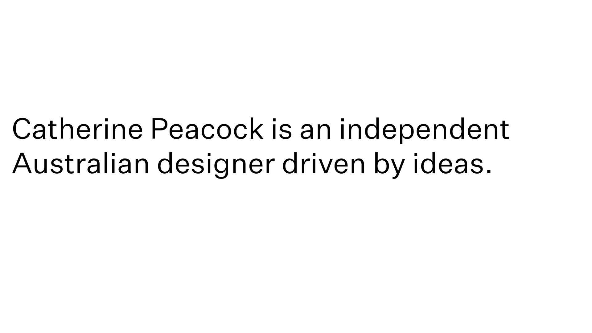
Catherine Peacock Designer Portfolio Home
A minimalist portfolio layout featuring a vertically stacked masonry project grid, sticky navigation with animated icons, and offset typography.
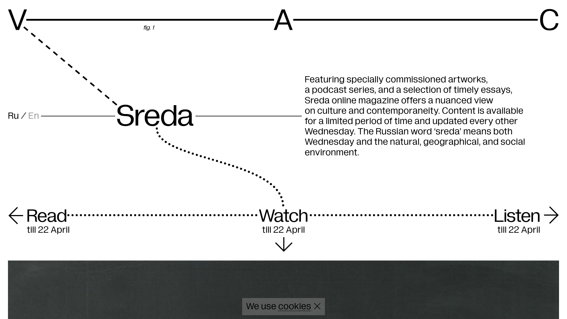
V–A–C Sreda Online Magazine Hub
Minimalist art magazine layout featuring a conceptual typographic header, interactive vertical navigation for mixed media content, and a clean grid for high-resolution archival imagery.
ALT Studios Minimalist Infinite Scroller
An ultra-minimalist portfolio featuring an infinite-scrolling typographic comparison list and a clean sticky footer navigation layout.
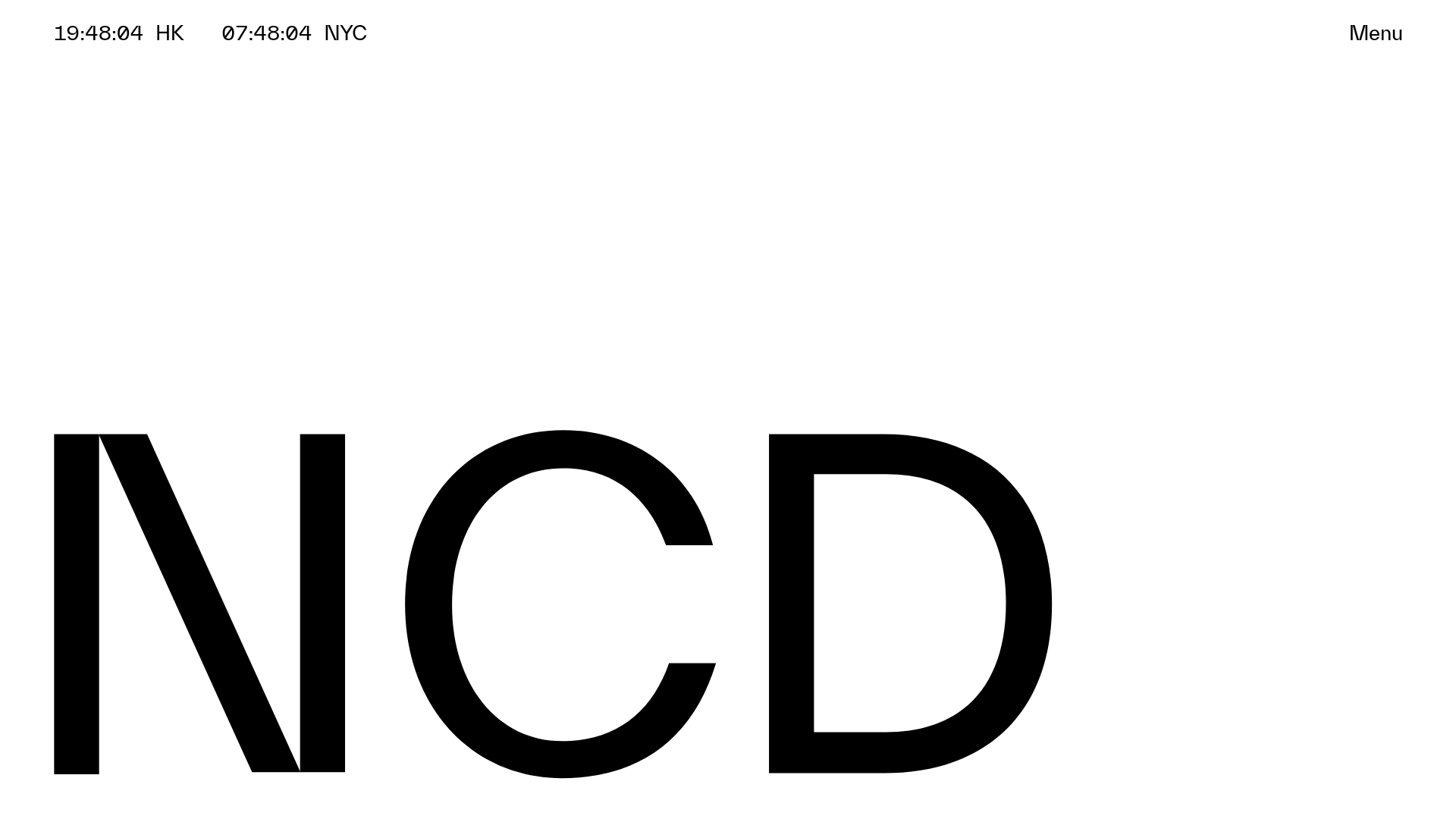
NCDA Architecture Studio Portfolio Template
A minimalist design featuring a bold typography splash screen, real-time dual-city clocks, and a discipline-based vertical scroll layout with hover-triggered overlays.

Egstad Minimalist Design Portfolio
A refined Nuxt.js portfolio featuring bold variable typography, interactive canvas elements, and a clean grid-based layout for showcasing design work.

Bruno Arizio Designer Portfolio Website
A minimalist creative director portfolio featuring a clean typographic layout, side-aligned image previews, and high-contrast spacing patterns suitable for luxury or design showcases.
