Genius.Design Access Denied Page
A minimal, text-dominant error page layout useful as a template for restricted access messaging or server-side permission warnings.
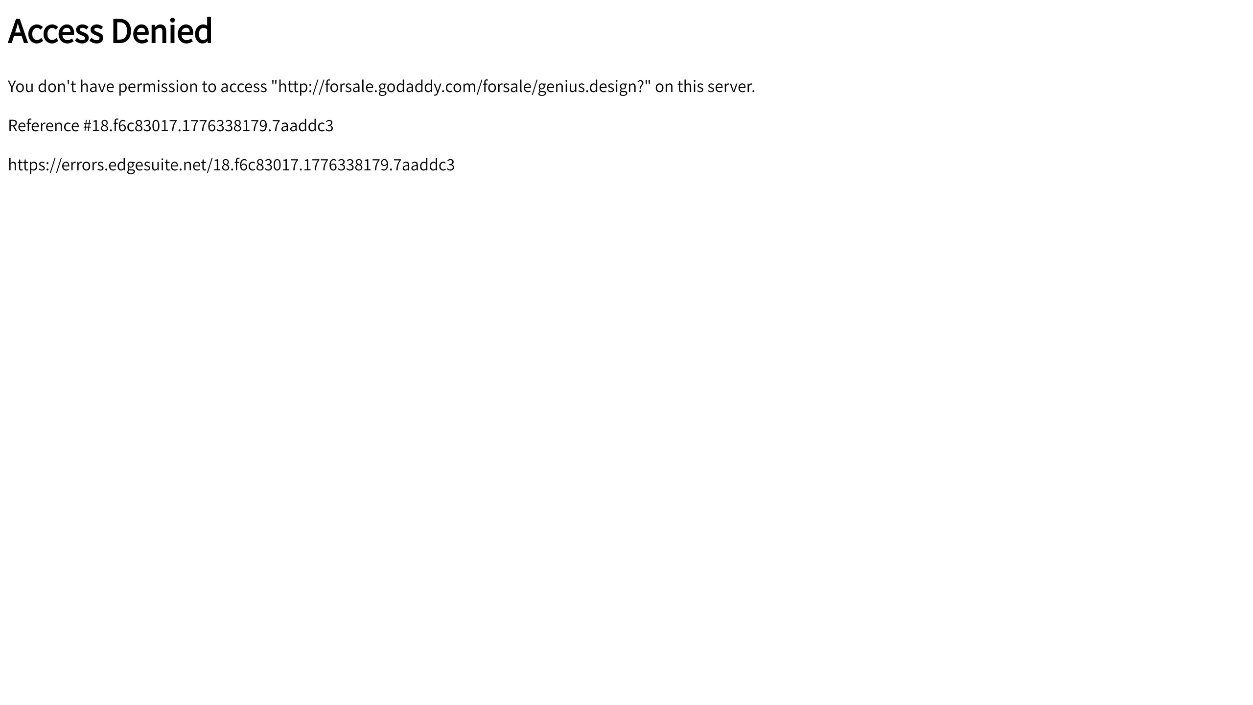
Overview
This page is a bare-bones implementation of a server-side "Access Denied" (403 Forbidden) error template. It represents a functional, high-utility UI pattern that prioritizes clarity and technical logging over aesthetic embellishment, making it a reliable reference for building robust error-handling infrastructure.
Design System
- Color Palette and Hierarchy: The design uses a high-contrast, binary palette of black (#000000) text on a white (#FFFFFF) background. Hierarchy is established purely through font weight and spacing, with a bold heading signaling the error type followed by regular-weight technical details.
- Typography System: The typography uses system sans-serif fonts. The
h1heading uses a large, bold weight for immediate recognition, while the body text uses standard paragraph sizing for legibility of long alphanumeric strings. - Page Structure: The layout follows a linear, top-down flow: a primary headline, a descriptive error message indicating the specific resource being blocked, a unique reference ID for support tracking, and a direct URL to technical documentation/logs.
- Reusable Components: The core reusable element is the "Error Block." This contains three distinct data types: the status message, the target URI variable, and the unique transaction ID.
- Implementation Clues: The HTML is minimal and semantic, using standard
<h1>and<p>tags without complex styling or external scripts, ensuring the page loads even when assets or CDNs are failing.
Use Cases
- Who should clone this: Developers building backend systems, intranets, or paywalled platforms that need a lightweight UI for permission errors.
- Effective Remixes: While the base version is utilitarian, SaaS products can remix this by adding a brand logo, a "Return to Home" button, or a custom support contact form.
- Practical Directions: Builders should clone the data architecture (specifically the Reference ID pattern) but remix the styles to match their site’s CSS framework (e.g., Tailwind or Bootstrap classes) to maintain brand consistency during error states.
- Suggested Scope: A quick section clone. This pattern is best used as a component within a larger error-page routing system rather than a full landing page.
Related Inspirations
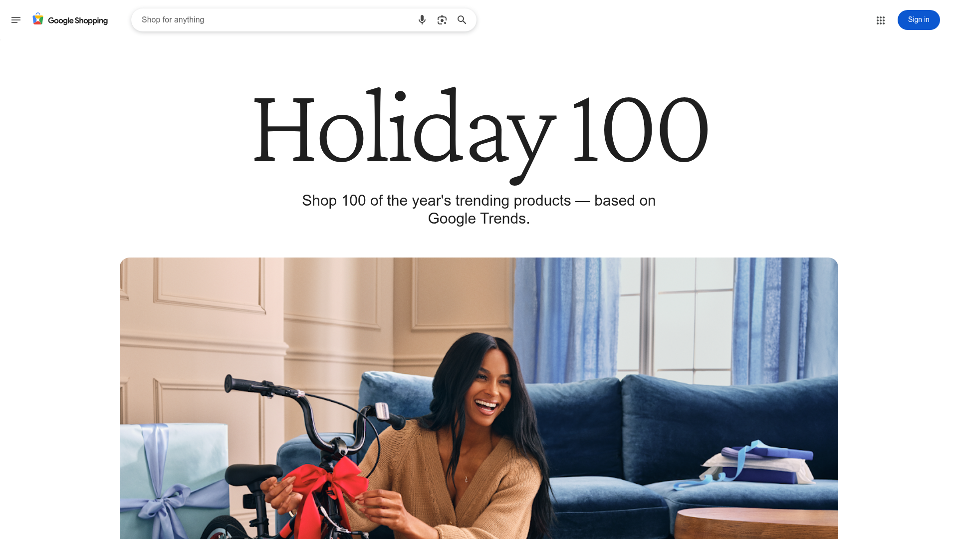
Google Holiday 100 Curator Landing Page
A minimalist e-commerce showcase featuring a wide hero section, clean search integration, and a bold typography-driven header designed for trending product collections.

Finn Pet Supplements Landing Page
An e-commerce landing page featuring high-contrast typography, a sticky brand logo banner, parallax scroll effects on product headers, and a clean product grid.
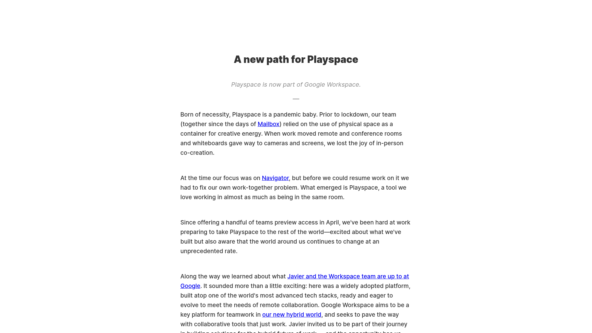
Playspace Acquisition Announcement Minimalist Layout
A clean, center-aligned announcement template featuring a vertical stack of rich text content and linked text elements on a neutral background.
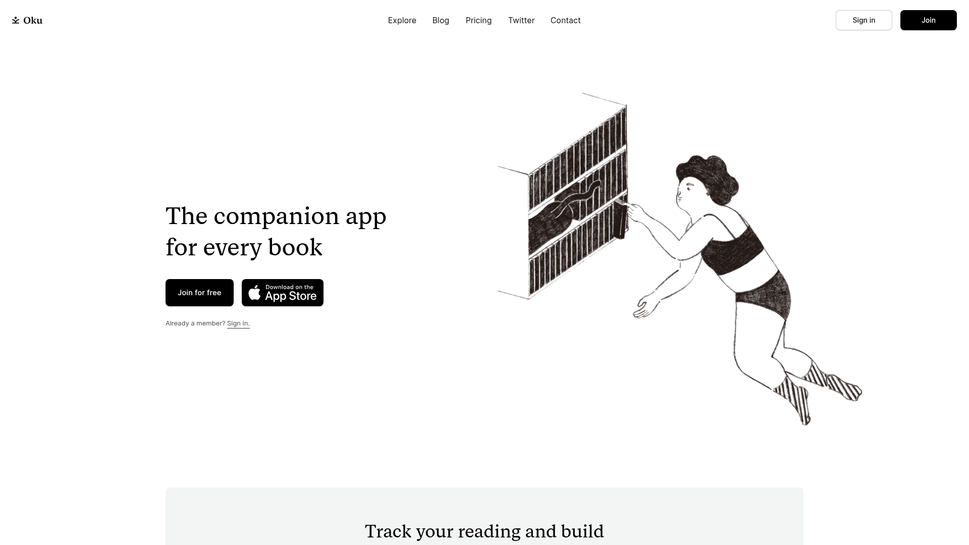
Oku Minimalist Book Tracking Landing Page
A clean, typography-focused landing page featuring a minimalist header, illustrated hero section, and clear call-to-action buttons for app downloads.
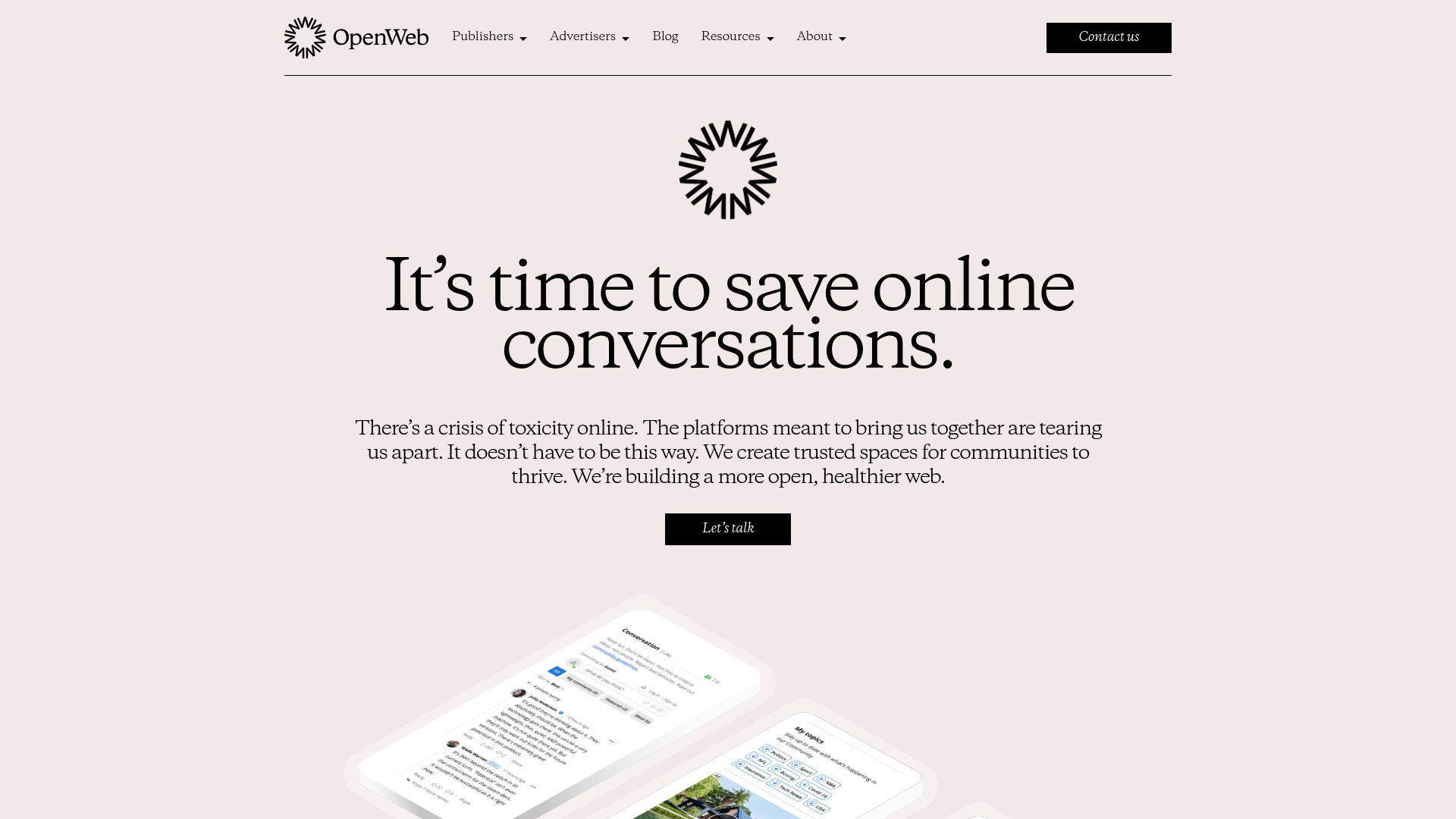
OpenWeb B2B Service Landing Page
A professional landing page layout featuring a central animated hero area, data visualization counters, a client logo grid, testimonial slider, and tabbed lead generation forms.

Slite SaaS Knowledge Base Landing Page
A clean SaaS hero section with a conversational headline, secondary call-to-action buttons, and a structured software interface preview featuring user testimonials.
