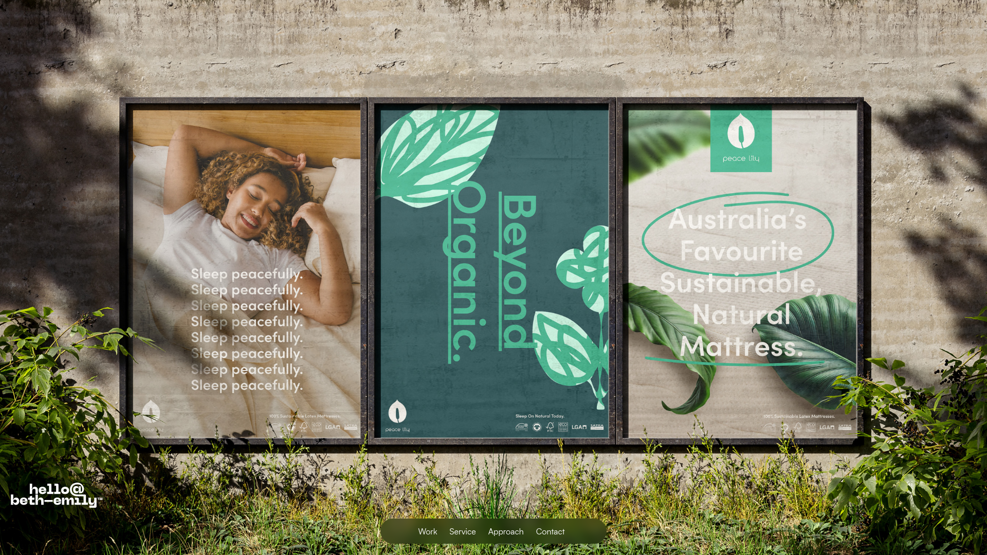
Beth-Emily Portfolio Carousel Landing Page
A minimalist portfolio layout featuring a full-width background slider, transparent navigation overlays, and an integrated bottom menu for service navigation.
Overview
This portfolio landing page features a high-impact, full-screen carousel that serves as the primary navigation and visual engine for a creative studio. It is an excellent clone reference for designers wanting to showcase large-scale photography or campaign assets within a minimalist, "content-first" UI that blends digital navigation with a physical environmental backdrop.
Design System
- Color Palette & Visual Hierarchy: The design uses a high-contrast palette of crisp white and deep black for utility elements (logos, nav), overlaid on organic imagery. The visual hierarchy is heavily weighted towards the central carousel images, using a background texture (concrete wall and foliage) to frame the digital content.
- Typography: The typography system utilizes a clean geometric sans-serif. The secondary logo and floating navigation links use a lowercase, tight-kerning style for a boutique feel. The carousel content features bold, vertical headings (e.g., "Beyond Organic") and repetitive text patterns for rhythmic emphasis.
- Page Structure & Flow: The layout is structured as a single-viewport experience (hero-focused) with a sticky top notification bar for site-wide updates. It transitions from a full-width background slider (
w-slider) to a footer section featuring a "Let's Chat" call-to-action. - Reusable Components:
- Floating Bottom Nav: A pill-shaped, semi-transparent dark menu (
div-block) centered at the bottom for quick access to Work, Service, and Approach. - Corner-Pinned Branding: The responsive logo placement in the bottom-left corner ensures brand persistence without obstructing the main visual field.
- Carousel Wrappers: A robust
w-slider-maskimplementation that allows for seamless transitions between varied visual styles (photography vs. typography-heavy assets).
- Floating Bottom Nav: A pill-shaped, semi-transparent dark menu (
- Interaction & Motion: The site utilizes auto-playing fade transitions (
data-animation="fade") with a 3000ms delay to keep the experience dynamic. Interactive elements like the top bar feature slight opacity shifts and arrow iconography for affordance.
Use Cases
- Cloning Targets: Creative agencies, luxury lifestyle brands, and architectural firms should clone this pattern to emphasize visual storytelling over text-heavy explanations.
- Remixing Directions:
- Brand Swap: Replace the concrete/foliage background with a solid color or a 3D-rendered environment to shift the brand's mood.
- IA Adaptation: Use the bottom floating menu to navigate specific project categories rather than site pages.
- Sectional Reuse: Clone the isolated floating navigation bar and the corner logo component for a lightweight sticky-nav overlay on any image-rich landing page.
- Clone Scope: Start with a full-page clone to master the layering of the background video/image, the carousel middle layer, and the floating UI top layer.
Related Inspirations

Clase Agency Branding Portfolio
A minimalist design agency portfolio featuring a typographic hero section, full-width image articles, sticky title bars, and integrated scrolling text marquees for a clean editorial layout.

Lundqvist & Dallyn Studio Portfolio
Minimalist design studio portfolio featuring a custom video loader, world clock navigation, and a fluid masonry-style grid for high-quality photography and type design showcases.

AcolorBright Design Agency Portfolio
Minimalist bento-style portfolio layout featuring numerical section headers, horizontally scrolling project teasers, and a clean grayscale client logo grid.
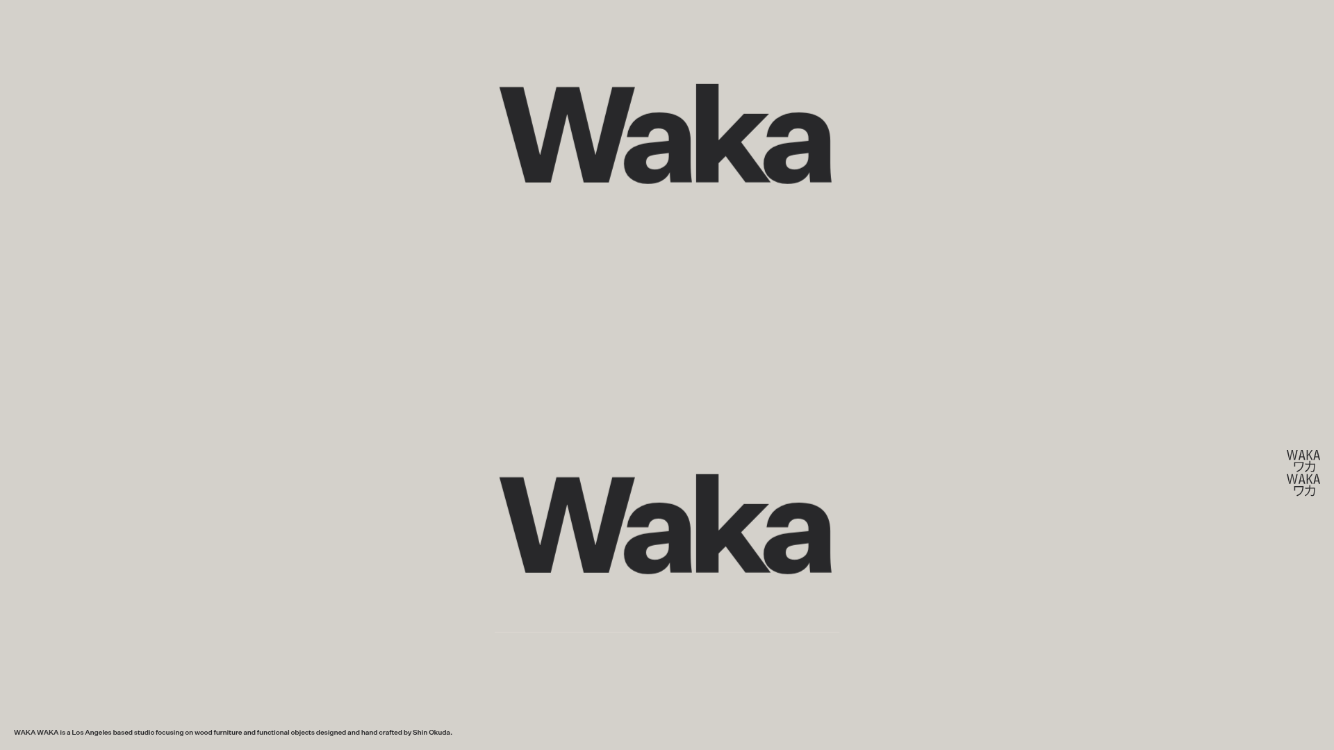
Waka Waka Furniture Portfolio
A minimalist design showcase featuring a custom cursor, parallax scroll effects, and a vertical image grid layout for high-end product displays.
Manna Architects Minimalist Portfolio Grid
A clean, single-page architecture portfolio featuring a centered intro, a varied multi-column image gallery with captions, and a detailed project service breakdown.
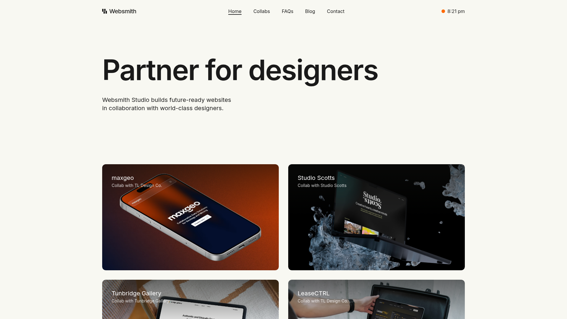
Websmith Studio Portfolio Site Template
A clean studio portfolio featuring a responsive bento-style project grid, interactive process cards, and a split-screen testimonial section built with Tailwind CSS.
