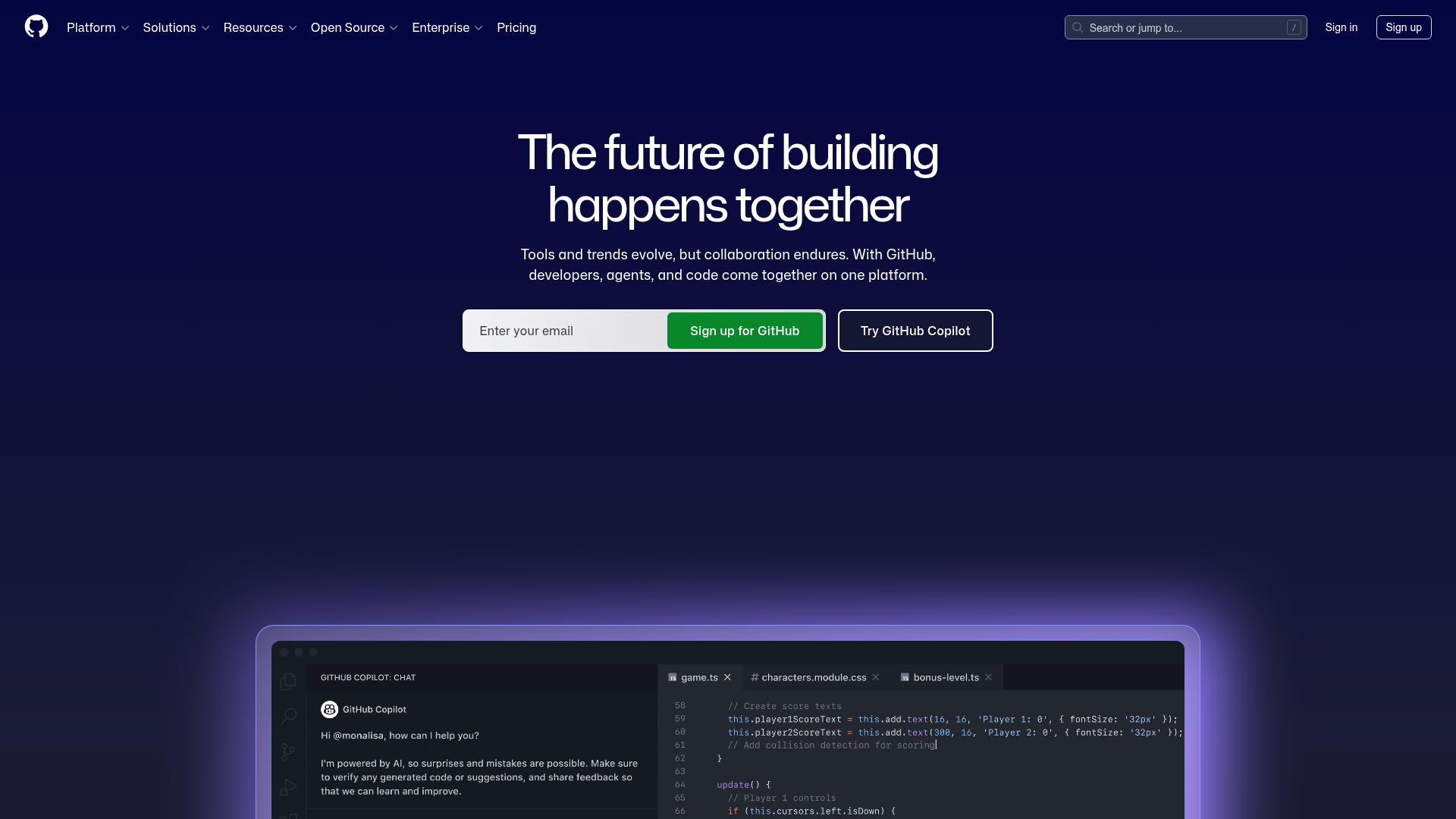
GitHub Developer Platform SaaS Landing Page
Dark-themed homepage layout featuring a text-centered hero section, double-action CTA buttons, and high-fidelity code editor product mockups.
Overview
This is the high-conversion landing page for GitHub, the world's leading developer platform. It serves as an excellent reference for SaaS builders due to its sophisticated dark-mode aesthetic, clear value proposition hierarchy, and integrated code-centric product mockups that build immediate trust with technical audiences.
Design System
- Color Palette & Visual Hierarchy: The design utilizes a deep navy-to-black gradient background (#0d1117) providing high contrast for white and light-gray typography. A vibrant "GitHub Green" (#238636) is used strategically for the primary CTA, while a subtle purple/blue glow effect (diffused box-shadow) anchors the product mockup section to create depth.
- Typography: The system relies on a clean, sans-serif stack (Primer-derived). The H1 headline uses a tight letter-spacing and substantial font size to dominate the hero section, while the sub-headline uses a muted gray for secondary hierarchy.
- Page Structure: The layout follows a classic Z-pattern for the header (Logo left, Nav center, Search/Auth right), transitioning to a centered-column hero section. This leads directly into a large-scale product container that showcases features through visual storytelling (IDE/Chat mockup).
- Reusable Components:
- Compound CTA Bar: A unique input-and-button group that allows users to enter an email seamlessly alongside a secondary ghost button.
- Global Navigation: A sophisticated header featuring dropdown menus for Platform, Solutions, and Resources.
- Product Frame: A high-fidelity code editor mockup with tabbed navigation and a sidebar chat interface, perfect for showcasing software features.
- Interaction Patterns: Based on CSS references and layout, the page utilizes a sticky header overlay (
header-overlay-fixed) that adapts transparency on scroll. Buttons feature subtle scale or saturation transitions on hover. - Implementation Clues: The HTML confirms the use of the Primer design system (GitHub’s proprietary framework), utilizing utility classes for spacing (
px-2,tmp-py-4) and flexible layout containers.
Use Cases
- Who should clone this: Developers and founders building developer tools, API-first products, or technical SaaS platforms requiring a "pro" look.
- Effective Remixing: This layout works exceptionally well for products where the "interface is the feature." You can swap the IDE mockup for a dashboard screenshot, a terminal window, or a API documentation snippet.
- Practical Directions:
- Brand Swap: Change the primary green to your brand's accent color (e.g., Electric Blue or Neon Pink) and the gradient background to match your brand's depth.
- Information Architecture: Adapt the centered hero for a shorter, punchier tagline if your product is in a crowded niche.
- Clone Scope: Beginners should focus on cloning the Hero CTA block and the Glassmorphism-style product frame. Advanced builders can clone the full responsive navigation system and the integrated splash-glow background effects.
Related Inspirations
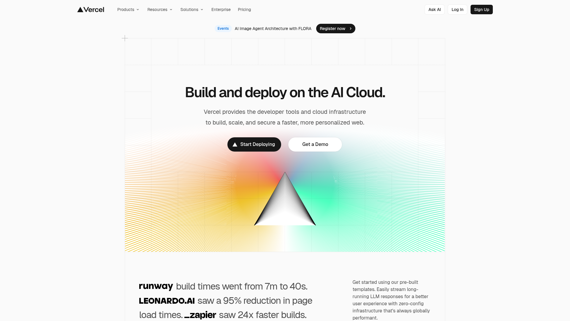
Vercel AI Cloud Landing Page
A modern landing page featuring a minimalist dark-themed navbar, a grid-overlay hero section with radial color gradients, and high-contrast typography for customer success stories.
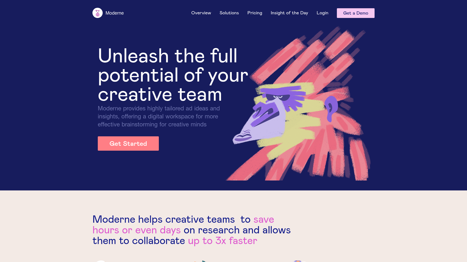
Moderne Creative Landing Page
A high-contrast landing page featuring a dark hero section with an artistic illustration overlay, distinct alternating content blocks, and a visual comparison bar chart component.
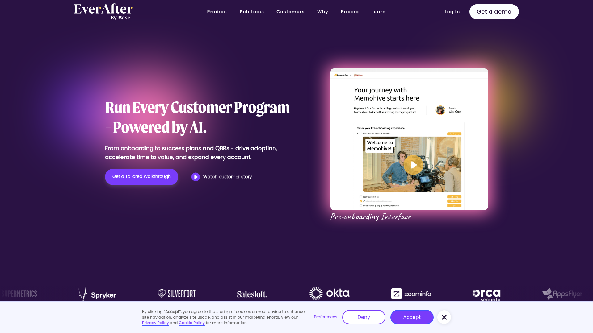
EverAfter AI Customer Portal Hero
A SaaS landing page template featuring a glowing product carousel, auto-scrolling logo marquee, accordion-based feature reveals, and an embedded scheduling widget.
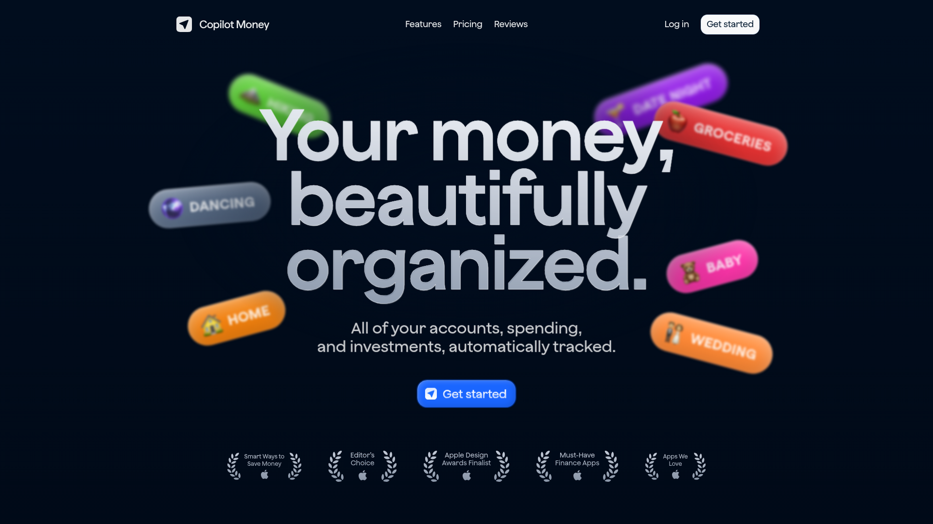
Copilot Money Finance Landing Page
A dark-themed finance landing page featuring a centered animated hero section with floating category badges, integrated trust badges, and a clean minimalist navigation bar.
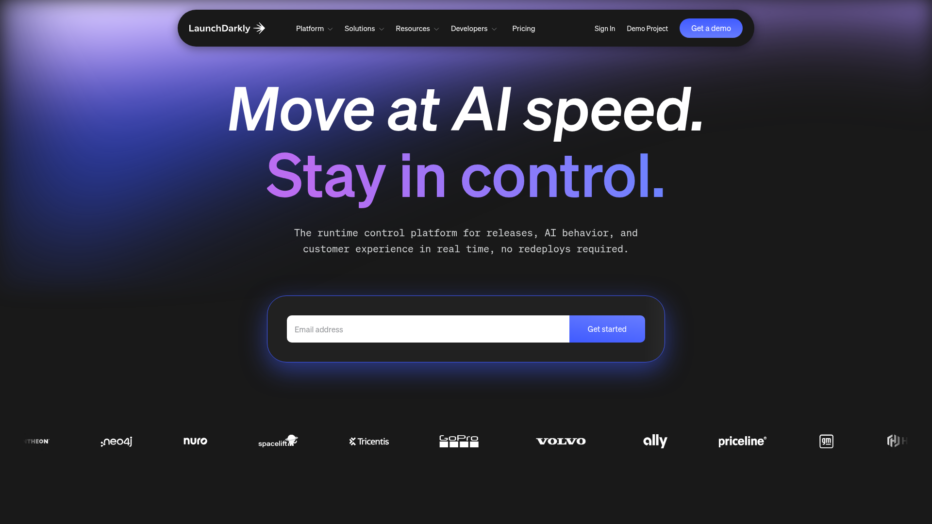
LaunchDarkly SaaS Landing Page Hero
A dark-themed developer marketing layout featuring a glowing blurred background, sticky pill-shaped navigation, tabbed feature showcases, and a horizontal logo marquee.
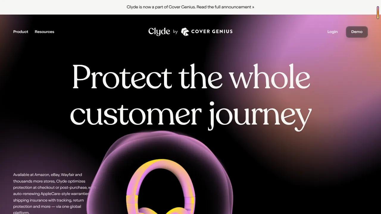
Clyde Insurance Landing Page with Animated Hero
A dark-themed landing page featuring a prominent serif headline, a product-focused animated blob hero, and a clean minimalist navigation bar.
