Sprout Virtual Meetup Landing Page
A playful landing page featuring a multi-session video slider, interactive grid layouts, floating avatar elements, and CSS-themed content preview blocks.
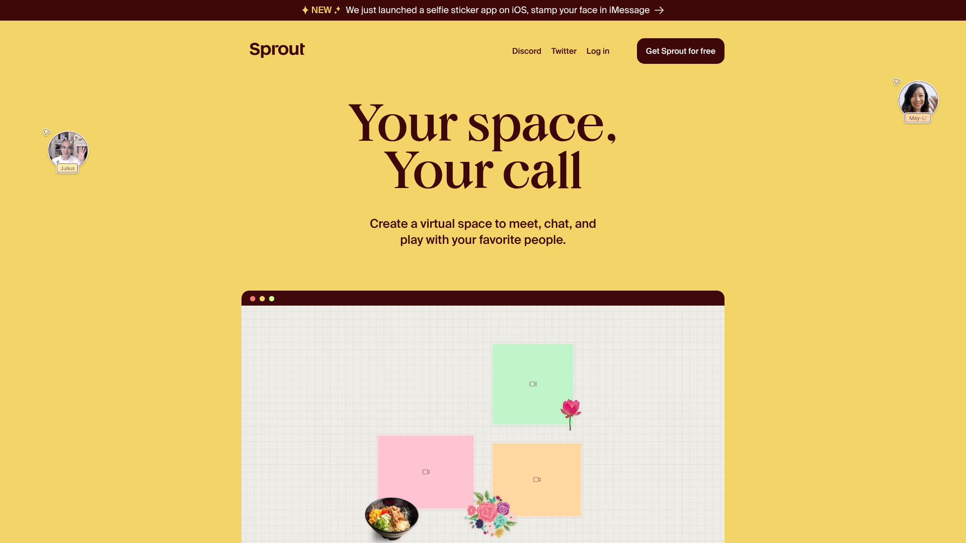
Overview
Sprout’s landing page is a high-energy, playful showcase for a virtual collaboration tool, utilizing a bold "digital canvas" aesthetic. It serves as an excellent reference for builders looking to implement interactive video-based product demos and non-traditional grid layouts. The site succeeds by blending static illustrative elements with dynamic video previews to explain abstract software concepts like "Facedocks" and "CSS Blocks."
Design System
- Color Palette & Visual Hierarchy: The design uses a warm, high-contrast palette featuring a dominant 'Sprout Yellow' (#f3d162) background, complemented by 'Off-White' and 'Cream' sections for content separation. Accents of orange-red and deep brown text provide readability without the harshness of pure black.
- Typography: The system relies on a bold, high-contrast serif for hero headings ("Your space, Your call") to create a friendly, editorial feel. Subheaders and body text use a clean, geometric sans-serif to maintain clarity during technical explanations.
- Page Structure: The flow begins with a hero section containing floating avatar cursors, followed by a series of alternating-background sections that introduce features via video. It concludes with a 'Join the fun' gallery of user-generated spaces and a prominent call-to-action.
- Reusable Components:
slide-show: A custom component managing video/image transitions based on data-attributes, featuring a clean button-based navigation bar.- Facedock Previews: Mock-browser windows with rounded corners and window controls that house video demonstrations.
- Floating Avatars: Absolute-positioned image elements (
curser-image) that simulate a live multi-player environment.
- Interactions & Motion: The site uses
will-change: transformfor performance and smooth opacity transitions (0.25s linear) on video elements. The announcement bar features a high-visibility "NEW" badge to draw immediate attention. - Implementation Clues: The HTML reveals a custom-element approach (
section-content,slide-show) suggesting a modular web component architecture. CSS classes likebg-orange-red,col-2, andvh-100-desktopindicate a utility-first styling method similar to Tailwind or Tachyons.
Use Cases
- Who Should Clone: Startup founders and creative technologists building collaborative "canvas-based" apps, social platforms, or virtual event spaces.
- Effective Remixes: This pattern can be adapted for digital whiteboards, portfolio sites requiring a "live" feel, or project management tools that want to move away from standard SaaS aesthetics.
- Remix Directions:
- Brand Swap: Replace the yellow/brown palette with neon-on-dark for a gaming or developer tool vibe.
- Information Architecture: Use the
col-2browser-detail grid to showcase hardware specs or service features instead of software UI. - Selective Reuse: Clone the
slide-showcomponent specifically to create a lightweight, tabbed product feature walkthrough.
- Clone Scope: A full-page clone is recommended for high-impact product launches; however, the
section-browser-iframesgallery is a perfect quick-clone for displaying a user testimonial wall or portfolio grid.
Related Inspirations
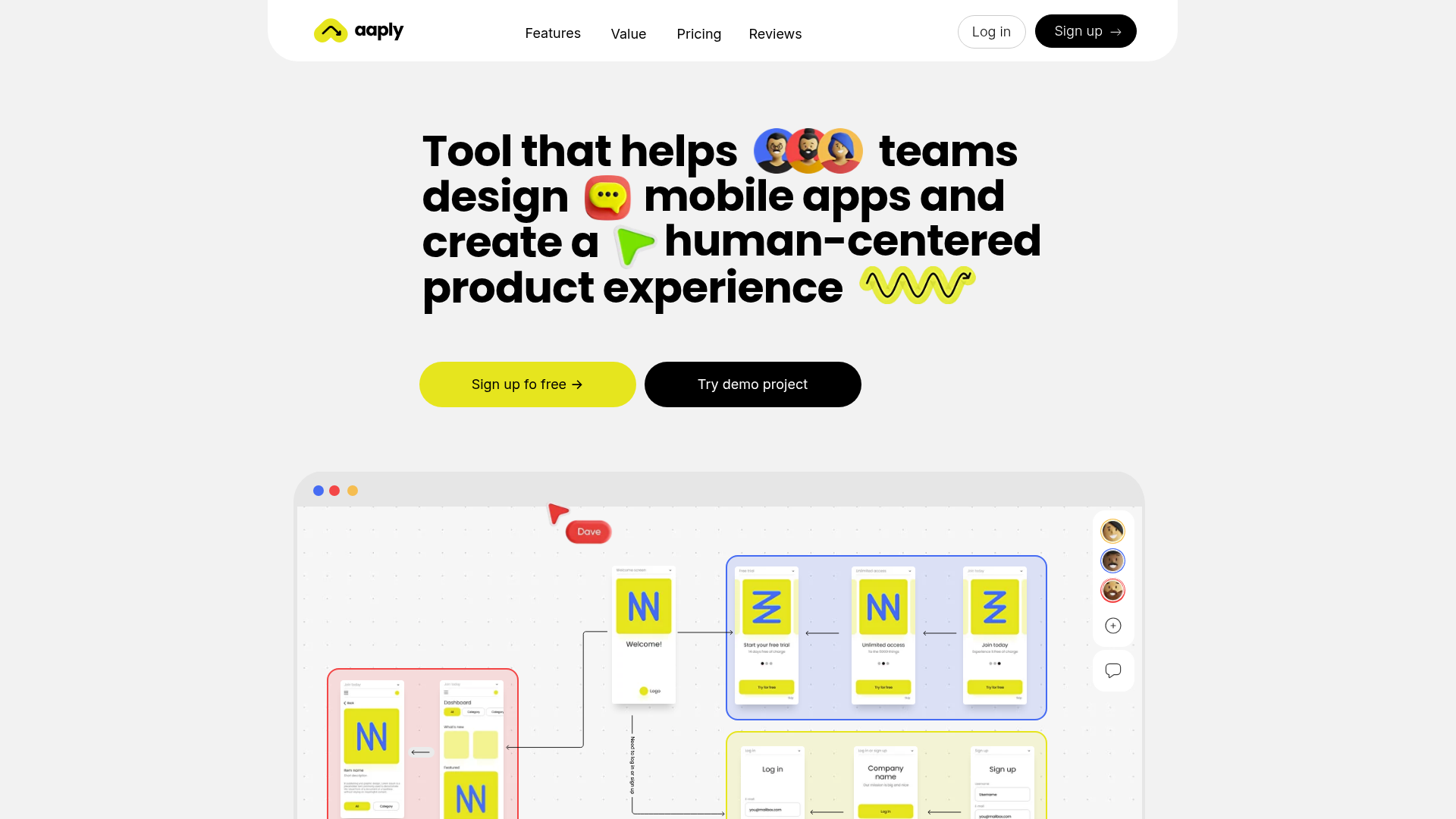
Aaply Mobile App Design Landing Page
A clean SaaS landing page featuring a bold typography-driven hero section, a sticky navigation bar, and integrated collaborative workspace UI mockups.
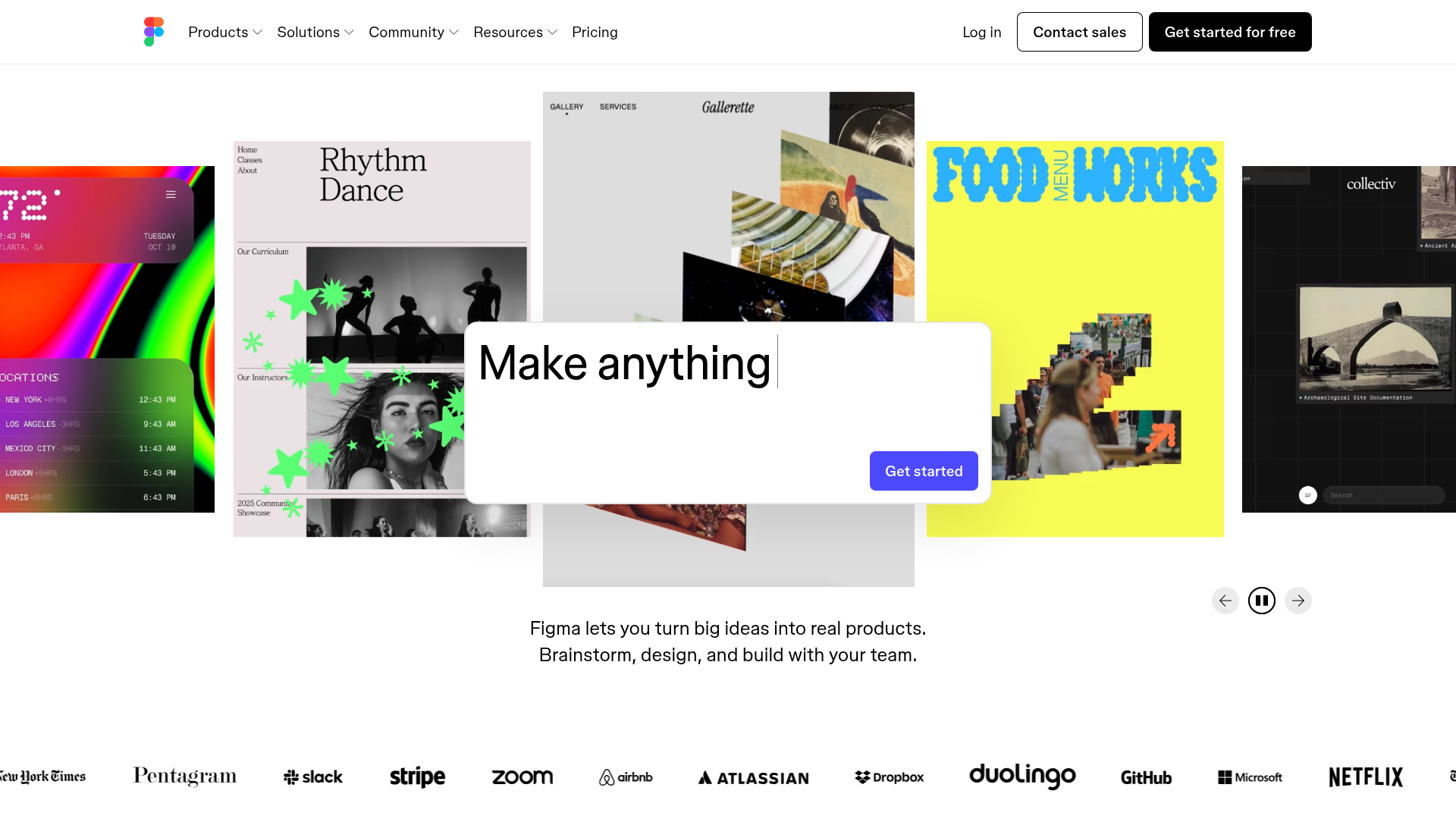
Figma Landing Page Gallery Hero
A dynamic landing page featuring a center-focused search bar hero, a horizontally-scrolling interactive video carousel, and a clean brand logo grid.
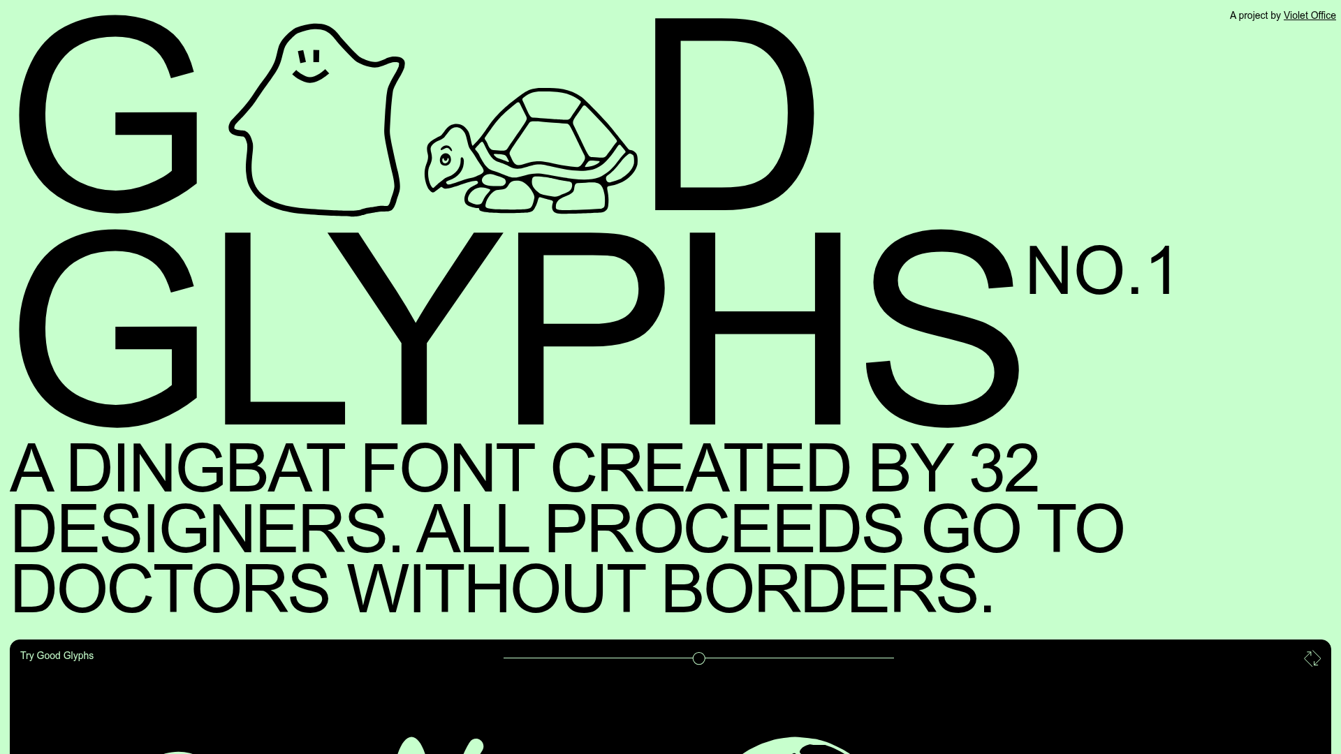
Good Glyphs Font Showcase Landing Page
A single-page layout featuring an interactive type tester, donation form with custom amount logic, and a contributor gallery using swiper-based glyph previews.
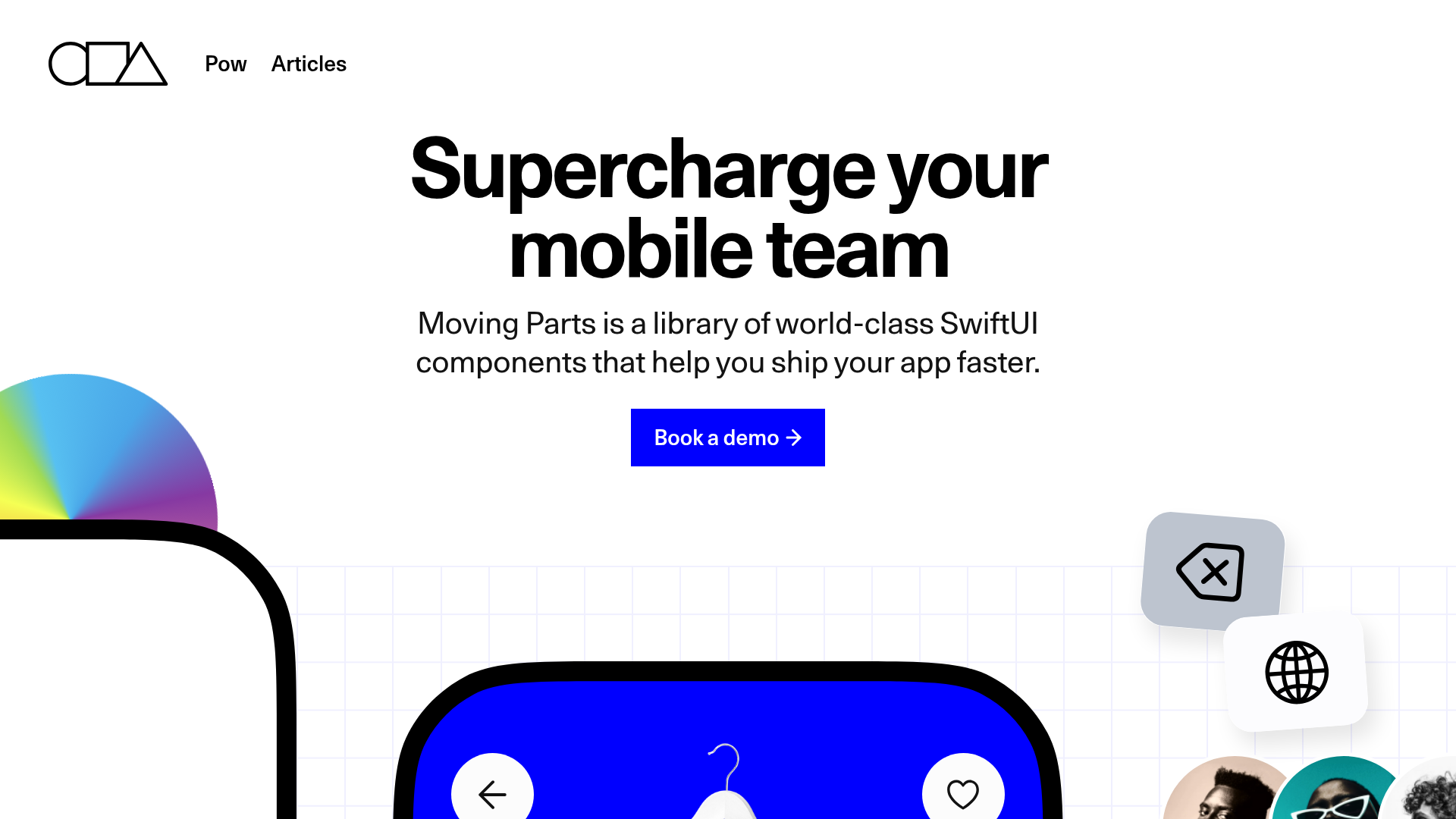
Moving Parts SwiftUI Component Library
A high-performance landing page featuring a interactive code comparison toggle, animated mobile UI previews, and a clean minimalist aesthetic for developer tools.
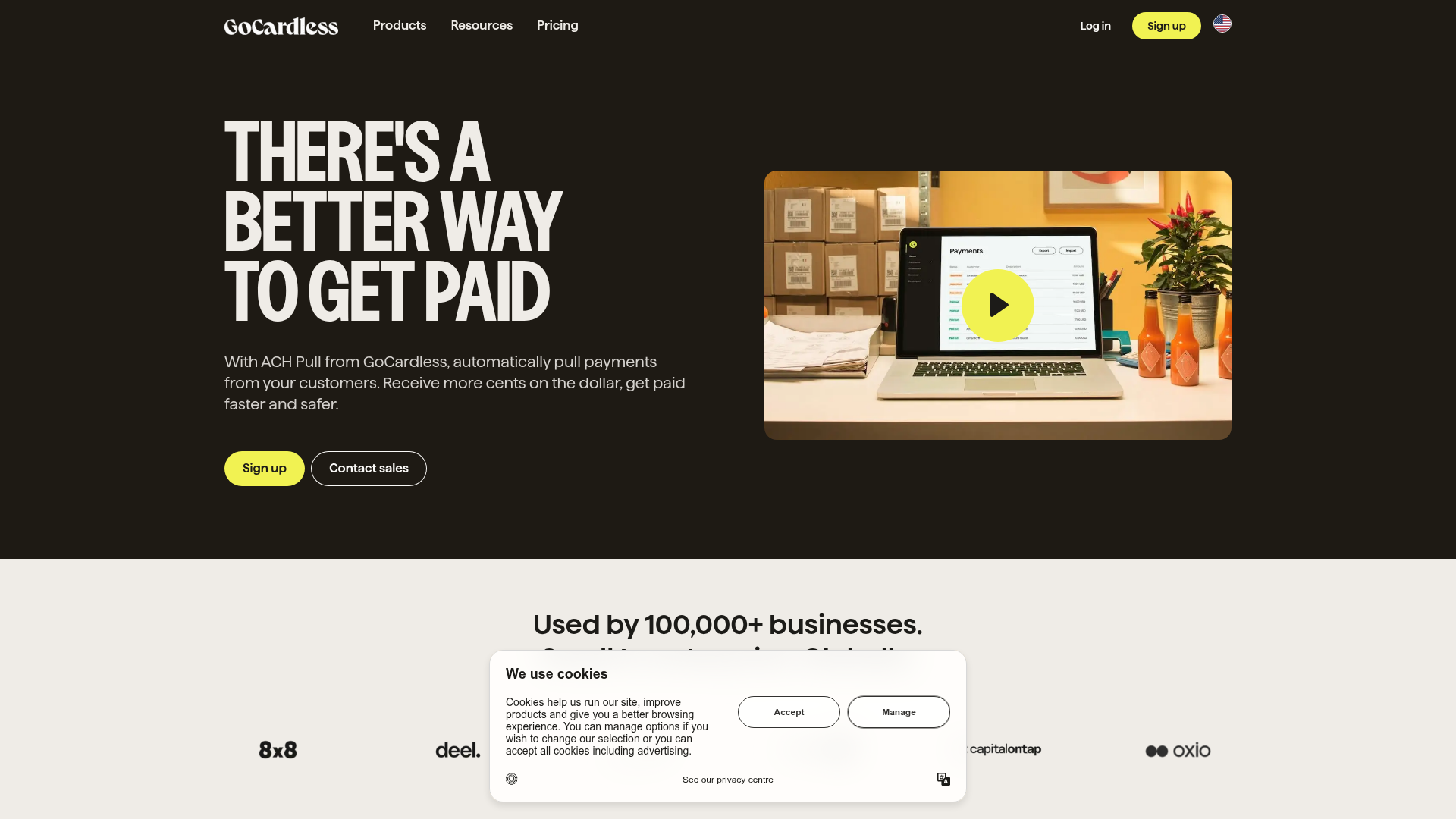
GoCardless Payments Platform Landing Page
A dark-themed fintech landing page featuring a split-screen video hero, bento-style feature cards, a horizontal logo slider, and step-by-step accordion guides.

Special Offer Studio Landing Page
Minimalist full-screen landing page featuring a centered logo, bold flat-color background, and accessible skip link structure using Nuxt.js and Tailwind CSS.
