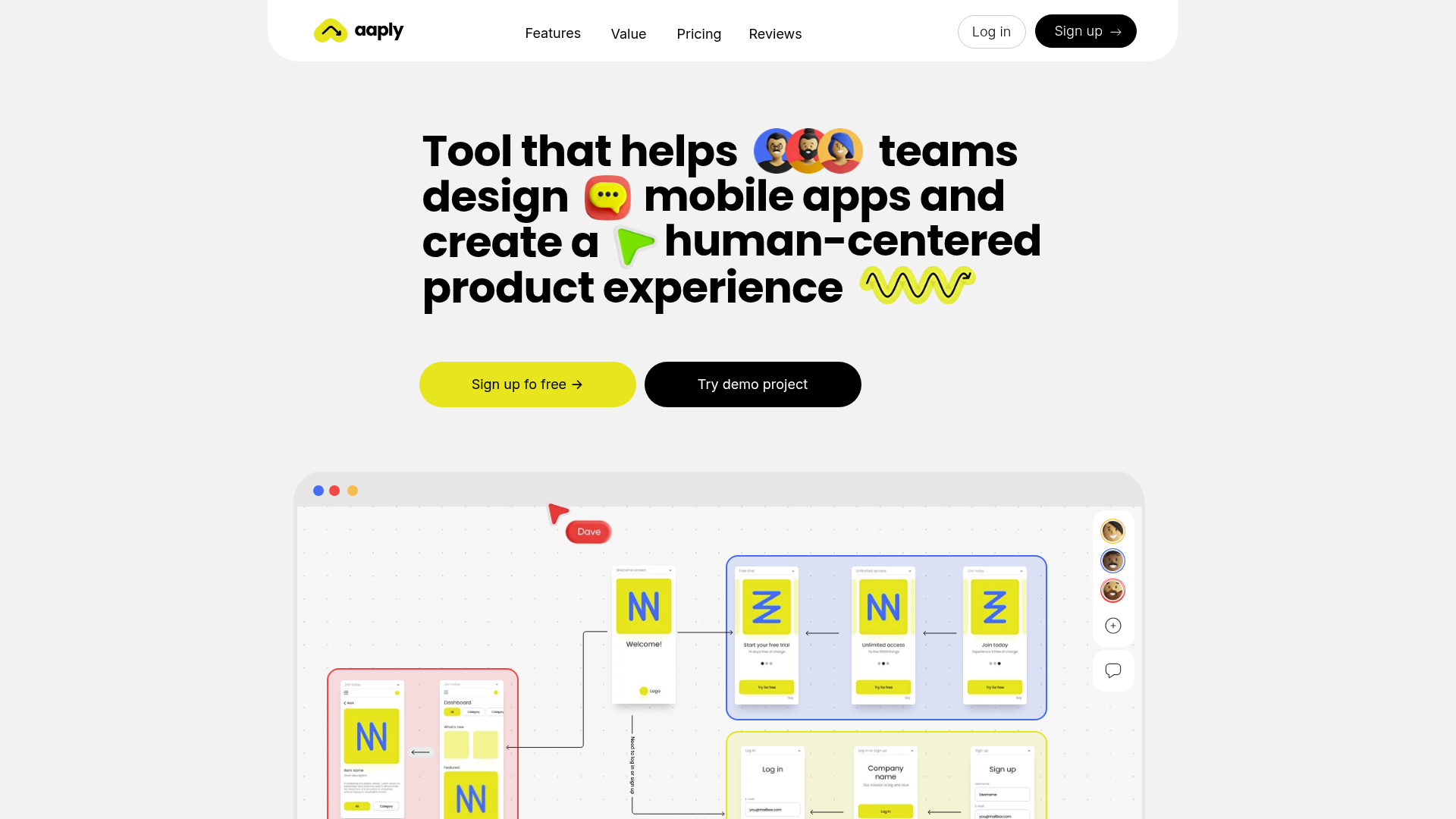
Aaply Mobile App Design Landing Page
A clean SaaS landing page featuring a bold typography-driven hero section, a sticky navigation bar, and integrated collaborative workspace UI mockups.
Overview
Aaply is a landing page for a collaborative design tool specifically tailored for mobile app wireframing and flow mapping. It serves as a strong clone reference due to its masterful use of bold display typography, playful iconography, and high-fidelity interface visualizations that explain complex software functionality without heavy copy.
Design System
- Color Palette & Visual Hierarchy: The design uses a high-contrast palette anchored by a vibrant neon yellow (
#E6F03C) for primary CTAs and accents. This is balanced against a clean off-white background and deep black text. The hierarchy is established through extreme scale—large headlines act as the primary visual anchor. - Typography System: The site features a bold, geometric Sans-Serif font (likely a variation of Inter or a custom grotesk). It utilizes tight letter-spacing and varying weights to create a rhythmic, conversational feel in the hero section, punctuated by inline emojis and graphic elements.
- Page Structure: The layout follows a classic SaaS flow: a floating sticky navigation bar at the top, a centered hero text block with dual CTAs, followed immediately by a large-scale product workspace visualization that demonstrates the 'human-centered' workflow.
- Reusable Components:
- Navigation Bar: Rounded container with centered links and distinct 'Log in' vs 'Sign up' button styles.
- Pill Buttons: High-radius buttons with arrows, including a primary yellow variation and a secondary black 'Try demo' variation.
- Workspace UI Mockup: A structured canvas element containing mobile screen frames, connectors, and collaborator cursors that can be repurposed for any collaborative tool showcase.
- Interaction Patterns: Based on the UI, expected patterns include hover states on pill buttons (color shifts or slight scaling) and the floating 'sticky' behavior of the header to maintain accessibility across long-form content.
- Implementation Clues: The HTML structure uses clean semantic sections with a clear separation between the
headerfor navigation and the mainherocontainer, suggesting a modern CSS Grid or Flexbox layout for centering elements.
Use Cases
- Who should clone this pattern: Sub-niche SaaS founders, design agencies, or developers launching a collaborative productivity tool that needs to look 'friendly' yet professional.
- What products can remix it effectively: Project management tools, whiteboarding apps, flow-chart builders, or even mobile-first development frameworks.
- Practical remix directions: Developers can swap the neon yellow for a brand-specific primary color like electric blue or purple. The hero text can be easily adapted to any three-line value proposition while maintaining the inline icon placement for visual interest.
- Suggested clone scope: A full-page clone is ideal for startups looking for a high-converting 'Coming Soon' or Launch page. Alternatively, cloning just the hero section and the navigation bar provides a robust foundation for building out a larger site.
Related Inspirations

Slite SaaS Knowledge Base Landing Page
A clean SaaS hero section with a conversational headline, secondary call-to-action buttons, and a structured software interface preview featuring user testimonials.
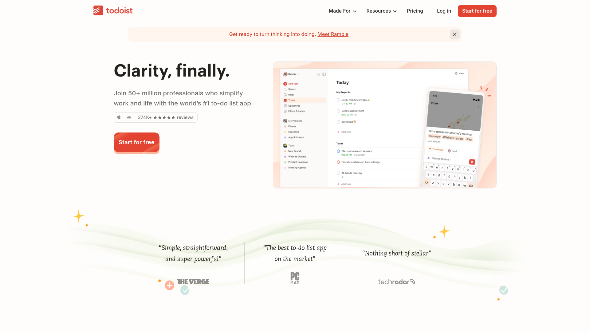
Todoist Landing Page with Sticky Features
A clean productivity app landing page featuring an animated hero section, a horizontal logo/quote marquee, a sticky side-by-side feature scroll, and a categorized project template gallery.
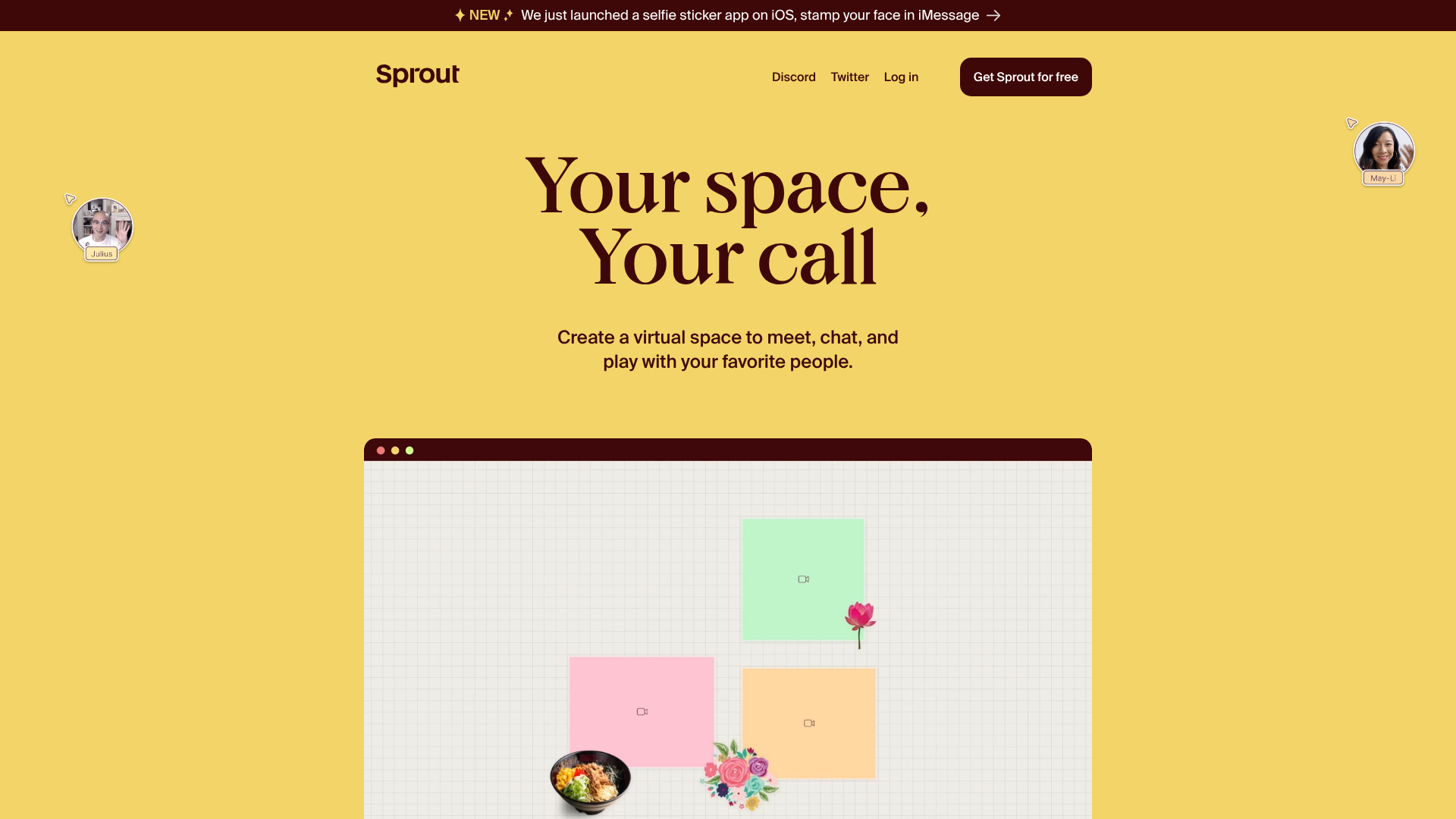
Sprout Virtual Meetup Landing Page
A playful landing page featuring a multi-session video slider, interactive grid layouts, floating avatar elements, and CSS-themed content preview blocks.
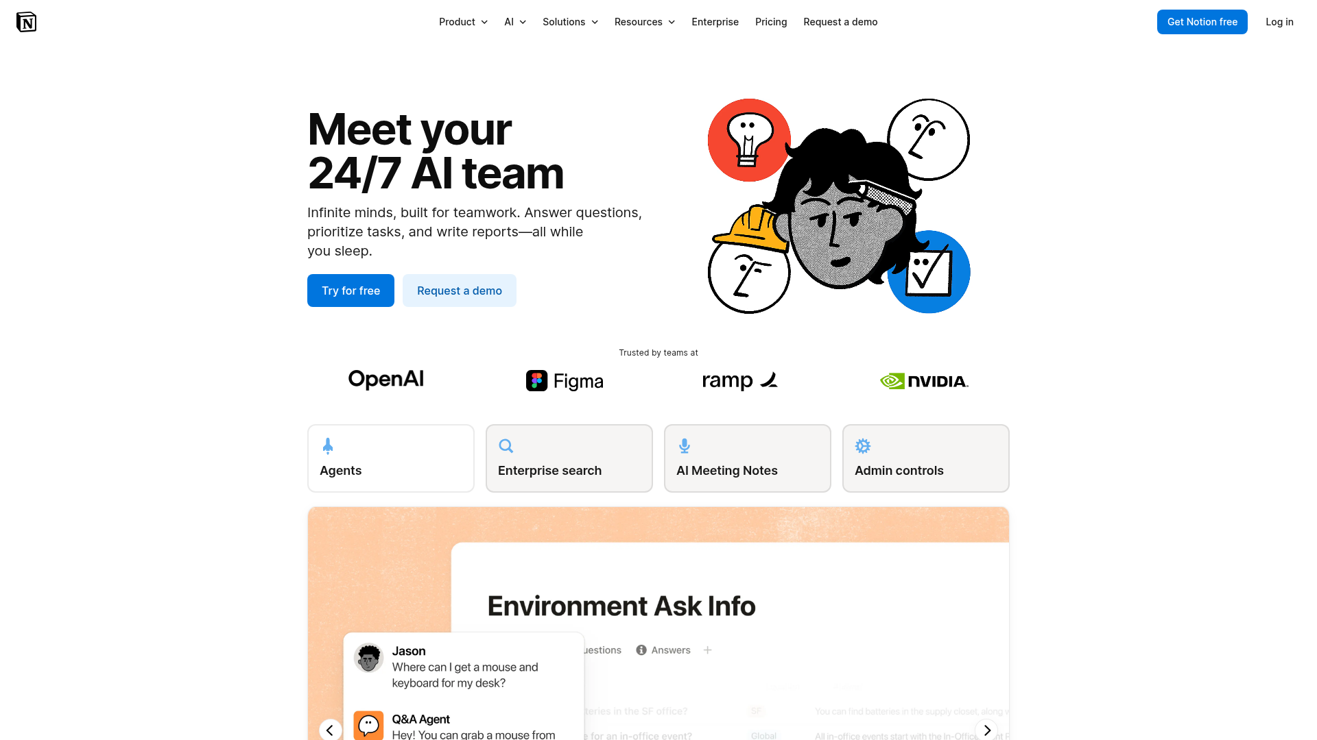
Notion AI Product Landing Page
A professional landing page layout featuring a clean hero section, distinctive bento-style feature cards, partner logo grid, and interactive product demo previews.
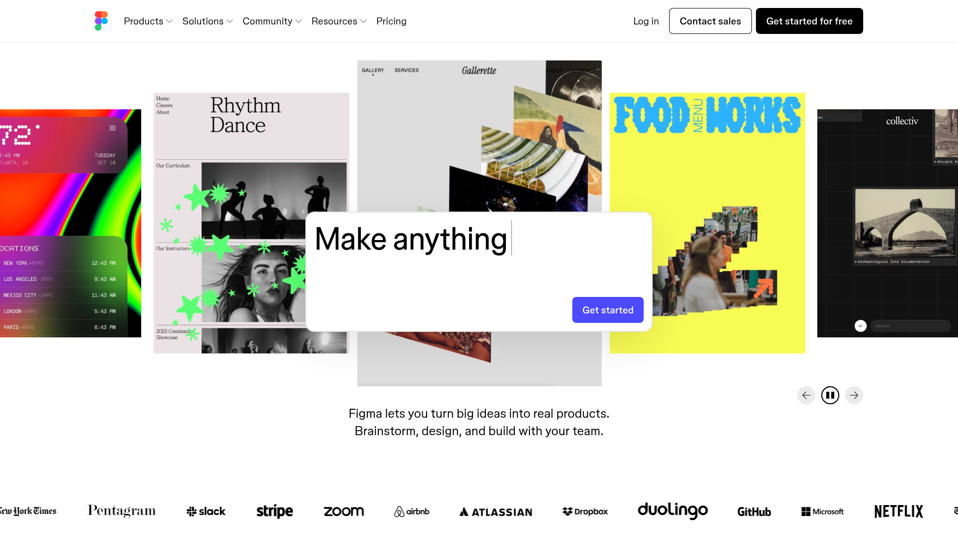
Figma Landing Page Gallery Hero
A dynamic landing page featuring a center-focused search bar hero, a horizontally-scrolling interactive video carousel, and a clean brand logo grid.
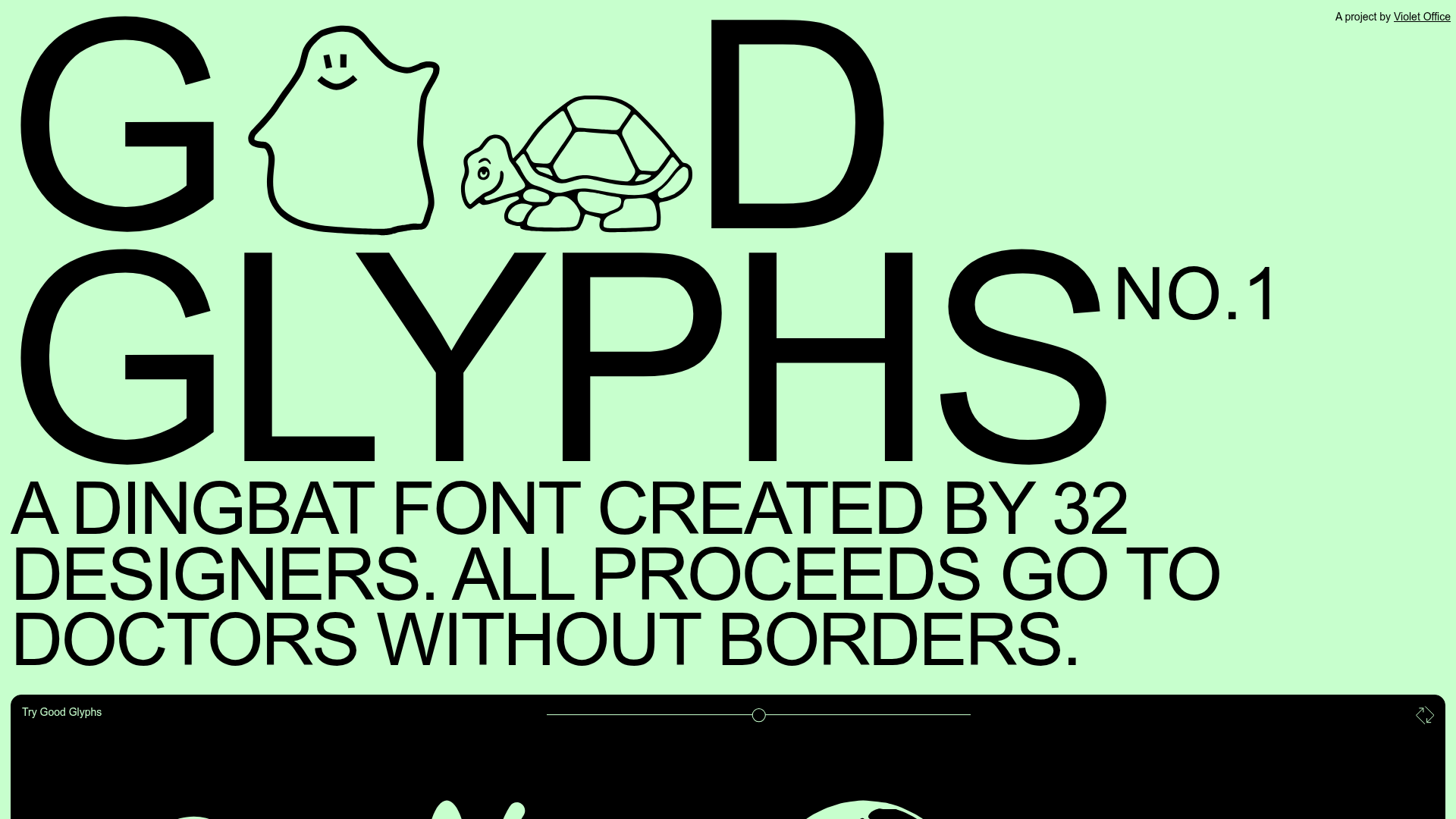
Good Glyphs Font Showcase Landing Page
A single-page layout featuring an interactive type tester, donation form with custom amount logic, and a contributor gallery using swiper-based glyph previews.
