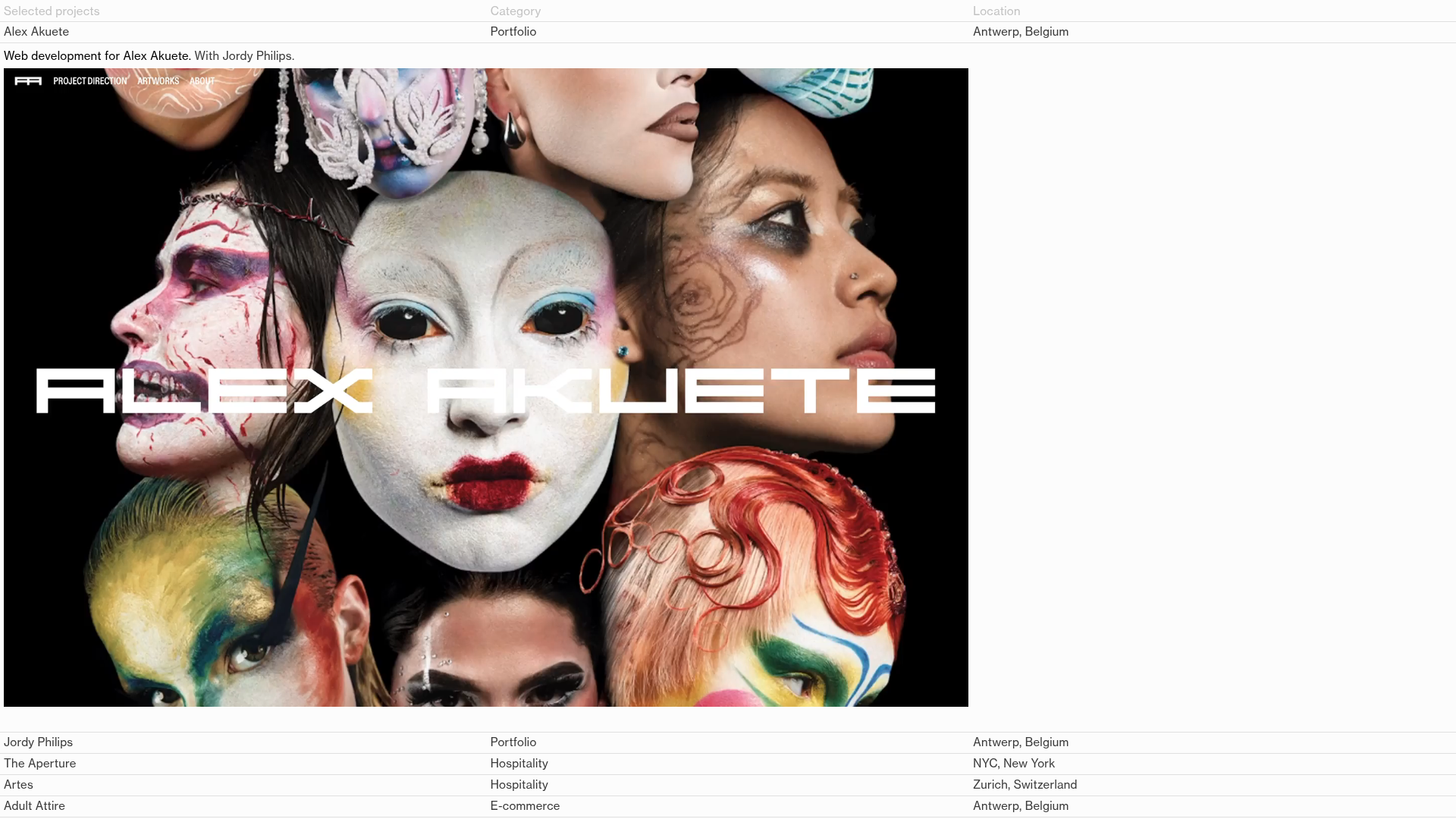
Kevin Brenkman Creative Portfolio Showcase
A minimalist, typography-driven portfolio featuring a clean data-table project list, large image previews, and high-contrast layout transitions for creative professionals.
Overview
This portfolio for Kevin Brenkman is a masterclass in brutalist minimalism and data-driven information architecture. It leverages a unique table-based navigation system that doubles as a project index, making it an excellent reference for creators who want to showcase high-impact visual work alongside technical project metadata.
Design System
- Color Palette & Visual Hierarchy: The site uses a high-contrast monochromatic scheme (stark white background with black text). Hierarchy is established through the physical scale of images versus the rigid, small-font grid of the project list.
- Typography System: A clean, neo-grotesque sans-serif is used throughout. It utilizes a three-tier scale: extra-large headlines for the "landing-text," standard body text for the project table columns, and a larger paragraph style for the "about" section to ensure readability against the dense grid.
- Page Structure: The layout follows a top-down information flow: a persistent minimalist header, followed by an expansive spreadsheet-style project list (
.projects-container), and concluding with a dense project detail view featuring full-width imagery and a descriptive footer. - Reusable Components: The primary component is the "Data Table Project Row." It features precise alignment for category, location, and title. The "Sticky Navigation" (
.stick) bar and the multi-column footer layout are also highly modular. - Interaction & Motion: The design features an "accordion-style" expansion where clicking or hovering on a table row reveals a large-scale project preview. The HTML mentions "GSAP interactions" and "Barba-wrapper," indicating smooth, asynchronous page transitions and sophisticated scroll-based animations.
- Implementation Clues: The HTML structure uses a wrapper-based system (
.barba-container) for seamless transitions and anhtml-embedfor custom scripting, suggesting a highly customized Webflow or Shopify implementation focused on performance.
Use Cases
- Who should clone this: Independent developers, graphic designers, architecture firms, and curated creative agencies who prioritize clear documentation over flashy decor.
- Effective Remixes: This pattern works exceptionally well for digital archives, editorial mood boards, or B2B service catalogs where professional specifications (category, client, date) are as important as visual imagery.
- Practical Remix Directions: Swapping the high-contrast white for a dark mode/slate palette can instantly shift the vibe from "minimalist gallery" to "technical studio." Users can also adapt the table columns to include metadata like "Tech Stack" or "Project Status."
- Suggested Clone Scope: For a fast build, clone the
.projects-containertable structure and CSS grid. For a comprehensive site overhaul, the full Barba.js implementation provides a framework for elite-level page transitions.
Related Inspirations

Clase Agency Branding Portfolio
A minimalist design agency portfolio featuring a typographic hero section, full-width image articles, sticky title bars, and integrated scrolling text marquees for a clean editorial layout.

Lundqvist & Dallyn Studio Portfolio
Minimalist design studio portfolio featuring a custom video loader, world clock navigation, and a fluid masonry-style grid for high-quality photography and type design showcases.

AcolorBright Design Agency Portfolio
Minimalist bento-style portfolio layout featuring numerical section headers, horizontally scrolling project teasers, and a clean grayscale client logo grid.
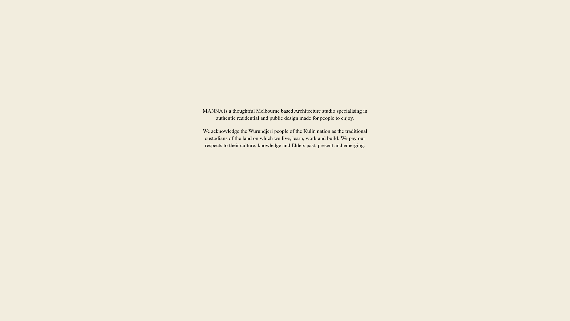
Manna Architects Minimalist Portfolio Grid
A clean, single-page architecture portfolio featuring a centered intro, a varied multi-column image gallery with captions, and a detailed project service breakdown.
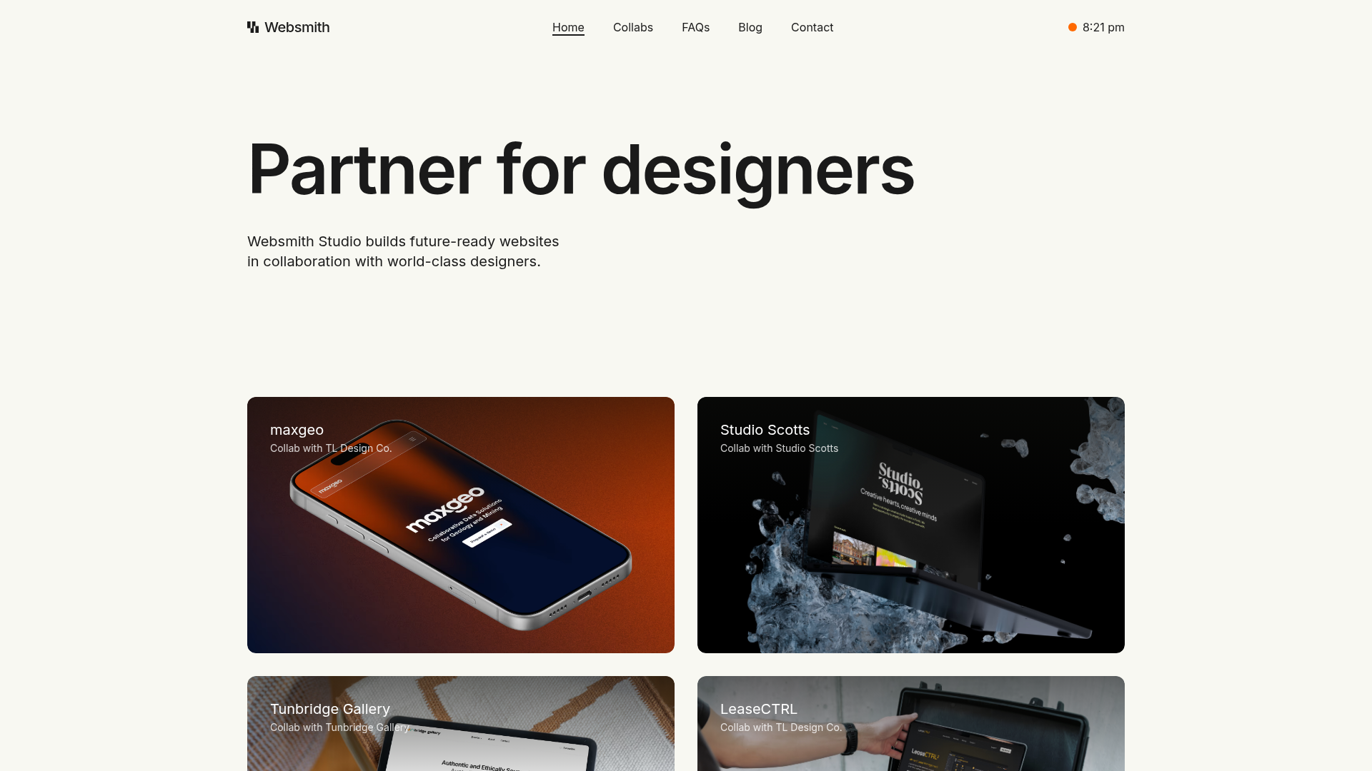
Websmith Studio Portfolio Site Template
A clean studio portfolio featuring a responsive bento-style project grid, interactive process cards, and a split-screen testimonial section built with Tailwind CSS.
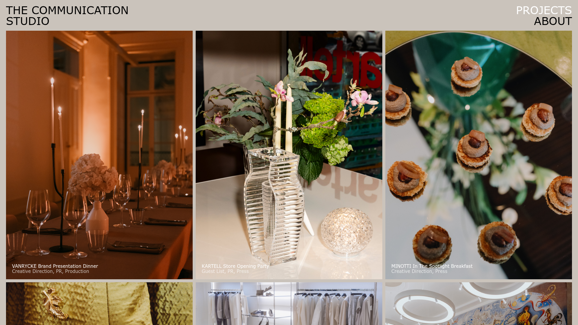
The Communication Studio Portfolio Grid
A minimalist creative agency portfolio featuring a gapless image grid with image-swap hover effects and Tailwind-based reveal animations.
