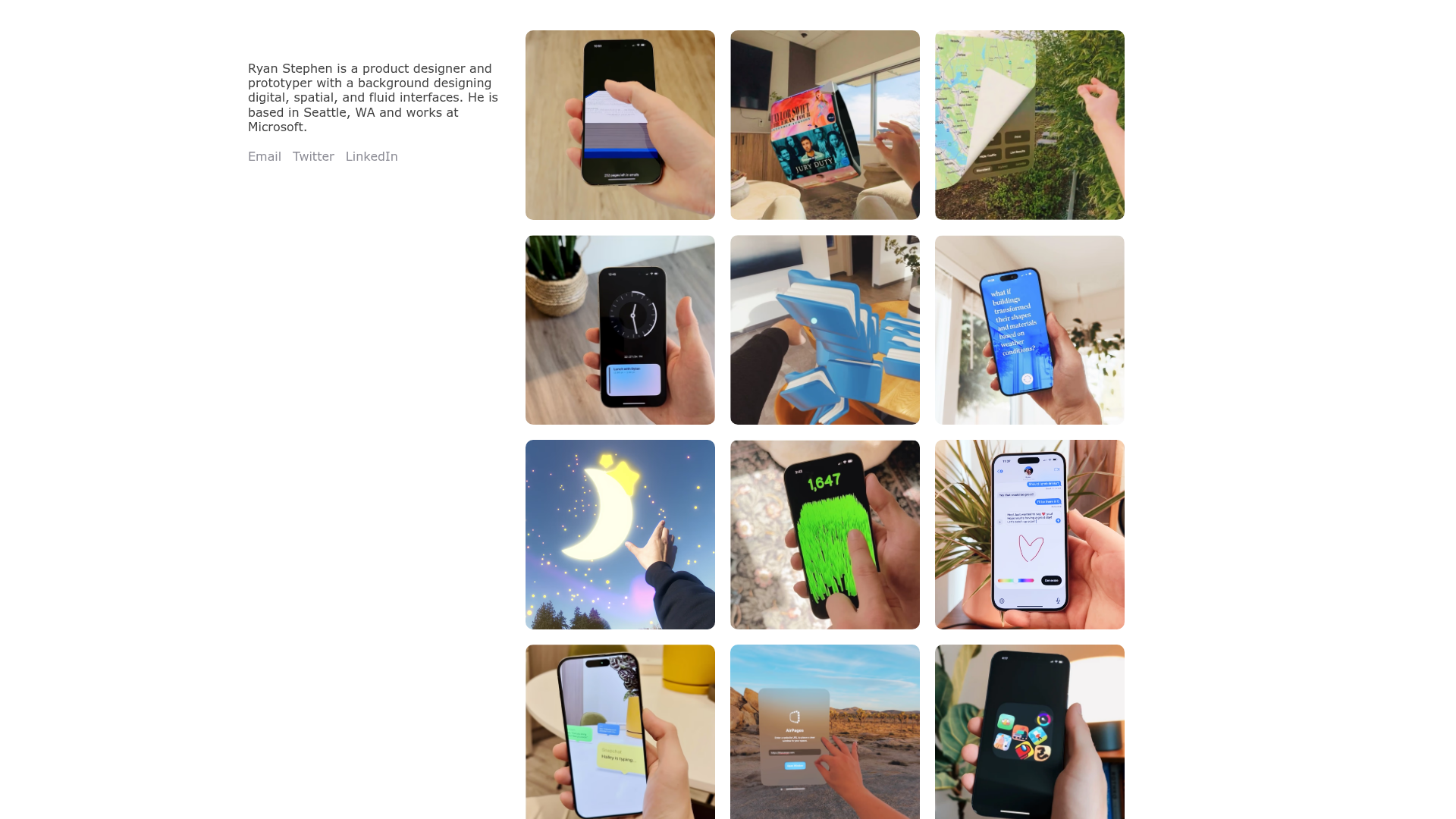
Ryan Stephen Portfolio Grid Layout
A clean, responsive portfolio featuring a sticky bio sidebar and a minimalist 3-column media grid with hover-ready image cards for showcasing spatial and UI design projects.
Overview
This portfolio layout showcases a clean, two-column split design that prioritizes high-fidelity visual media. It is an excellent reference for creators who want to balance a persistent, text-based professional identity with a dense, interactive gallery of projects. The layout is particularly strong for its ability to handle varied aspect ratios within a strictly defined grid.
Design System
- Color Palette & Visual Hierarchy: The site uses a minimalist grayscale palette with high-contrast text (
rgb(64, 64, 64)for body copy andrgb(139, 139, 148)for secondary links). This neutral background ensures that the vibrant colors in the project thumbnails remain the focal point. - Typography: The system relies on standard system fonts (
system-ui,-apple-system) with a medium weight (500) for readability. Hierarchy is established through location (sidebar vs. grid) rather than aggressive scaling. - Page Structure: The layout features a left-aligned sticky sidebar containing the bio and social links, paired with a right-side scrollable grid. On smaller viewports, the grid collapses into fewer columns while maintaining the consistent gutter spacing.
- Reusable Components:
- The Sticky Sidebar: A vertical container that remains fixed, ensuring professional context is never lost during scrolling.
- The Media Card: A simplified link block (
framer-1ipyq5c) containing adivwithobject-fit: coverandborder-radius: inherit. This component is built for rapid replication.
- Interaction Design: The layout uses a responsive 3-column
grid(1200px+), 2-column (600px-1199px), and 1-column (under 600px) structure. The media cards are designed as clickable targets, leading to sub-pages with detailed case studies. - Implementation Clues: Built with Framer, the site utilizes absolute positioning for background image wrappers to maintain consistent aspect ratios across the grid regardless of original image dimensions.
Use Cases
- Who should clone this: Digital designers, 3D artists, and spatial developers who have a large volume of visual assets but want a sophisticated, low-friction entry point for visitors.
- Remix Directions:
- Photography/Video Focus: Replace static thumbnails with autoplaying video loops to emphasize motion design.
- E-commerce/Lookbook: Swap the bio sidebar for a category-based navigation menu (e.g., "Spring Collection," "Accessories") to transform the portfolio into a lightweight shop.
- Quick Section Clone: The sticky contact/bio sidebar is highly reusable as a navigation pattern for single-page landing pages.
- Suggested Scope: This is best cloned as a full-page layout to preserve the spatial relationship between the fixed text and the fluid grid.
Related Inspirations

Caserne Design Studio Portfolio
A minimalist, high-impact portfolio featuring a dynamic masonry grid of project thumbnails with overlay text and a clean, oversized typography-driven footer.
Patrick Miller Photography Portfolio Template
A minimalist, full-bleed photography portfolio featuring a split-screen grid, scroll-triggered section transitions, and integrated Swiper.js image carousels for project galleries.
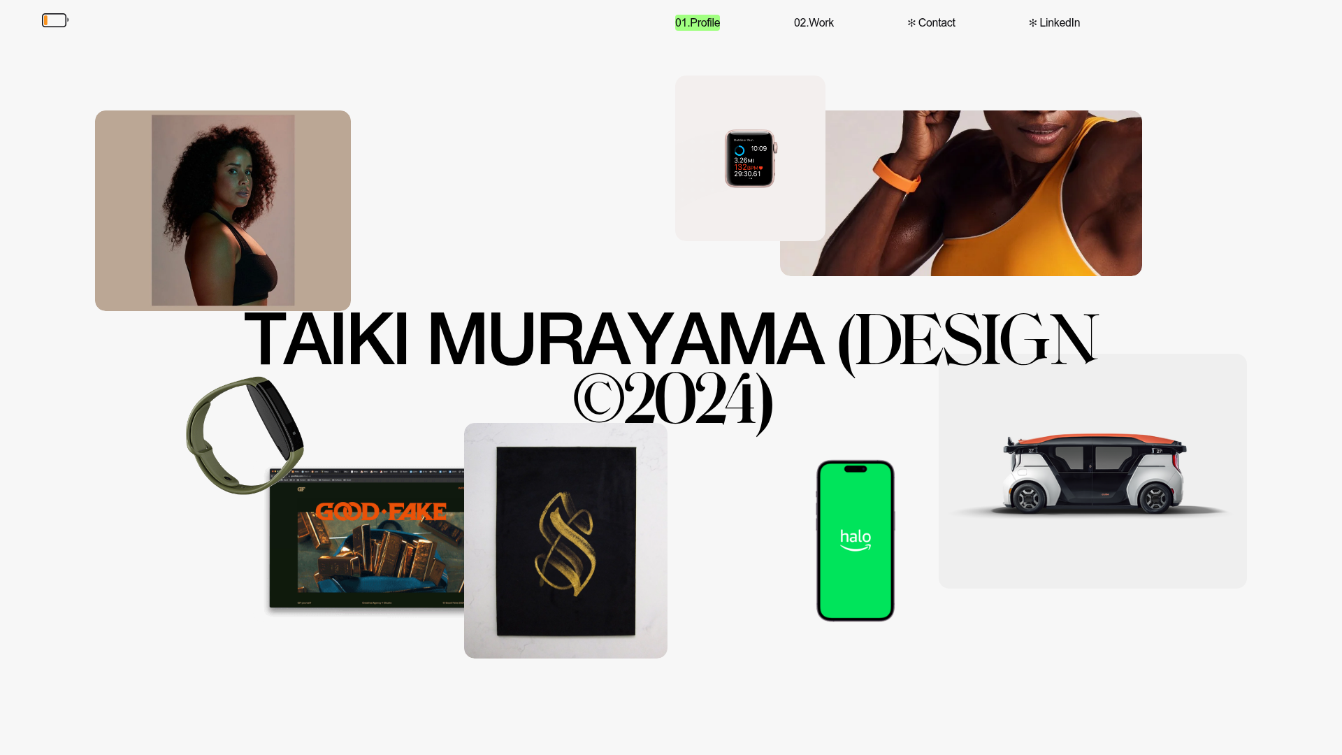
Taiki Murayama Portfolio Bento Grid
A minimalist designer portfolio featuring a dynamic bento-style layout for project imagery, integrated accordion project lists, and high-contrast typography.
Friends of the New Artist Portfolio
An interactive grid-based portfolio featuring a minimal dot navigation background, responsive image tiles for artists, and a persistent custom audio player footer.
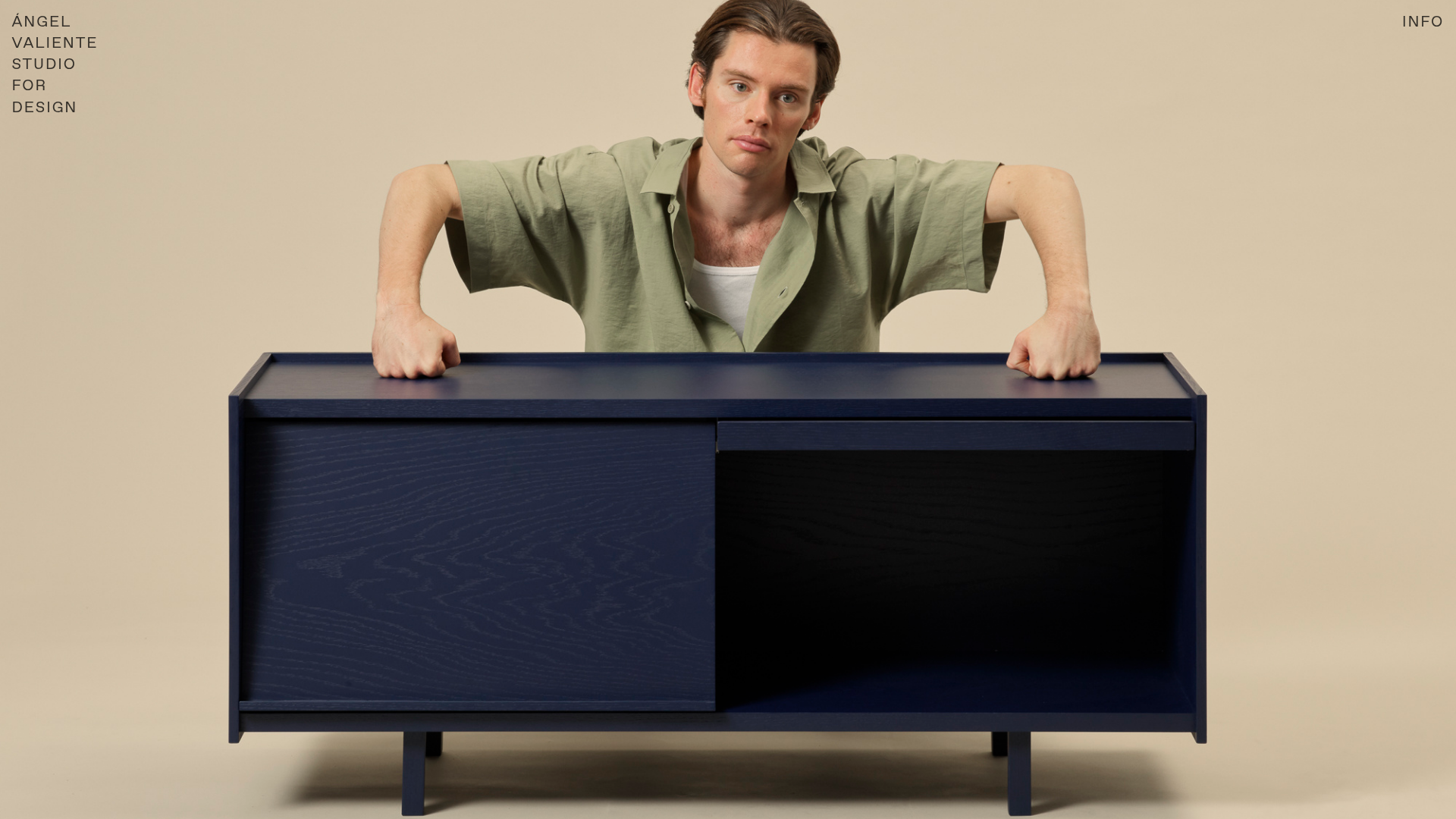
Ángel Valiente Design Portfolio
A minimalist design portfolio featuring a full-bleed hero slider, a bento-style product grid with randomized image rotations, and a clean two-column industrial layout.
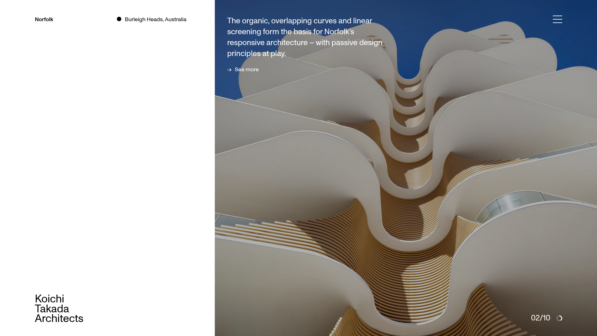
Koichi Takada Architects Portfolio Home
A high-end architectural portfolio featuring a split-screen layout with an interactive project slider, sticky typography, and smooth transition animations.
