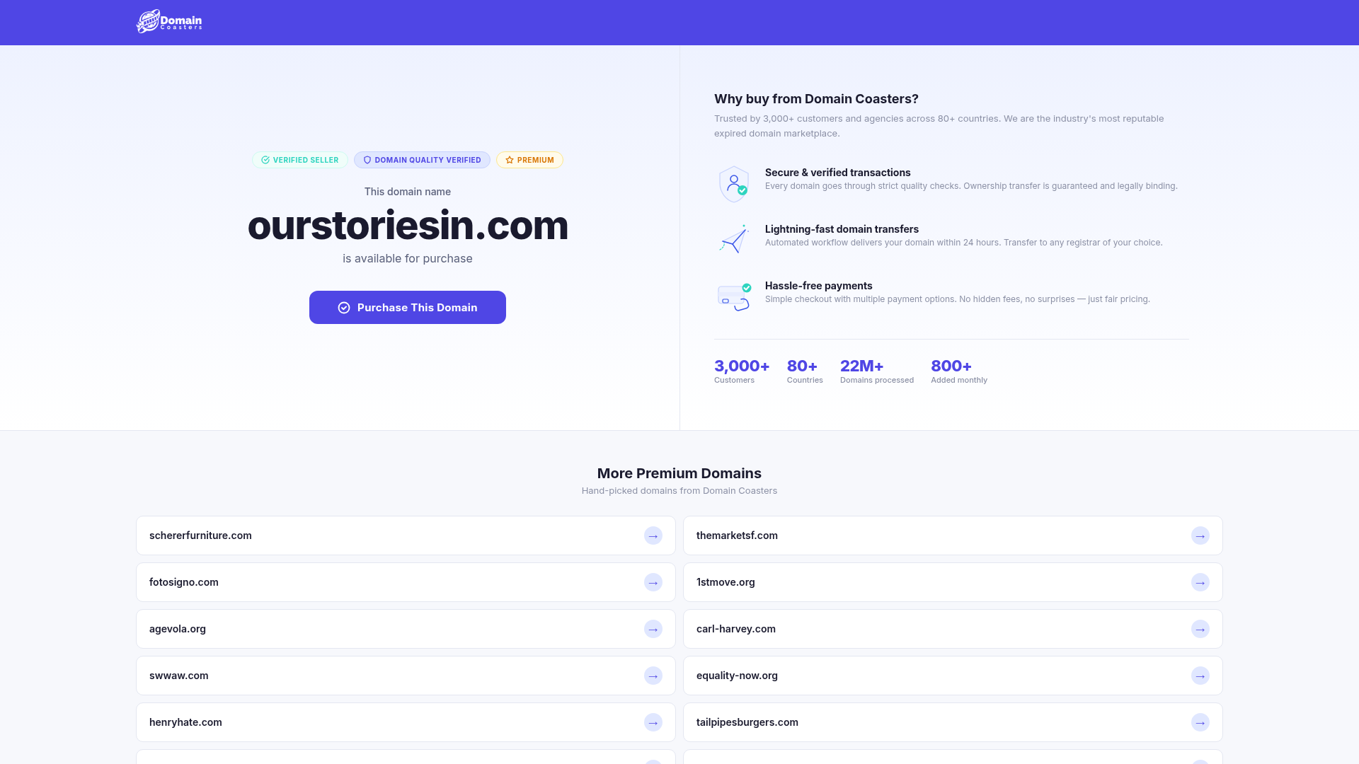
Domain Coasters Landing Page Layout
A clean domain marketplace landing page featuring a split-screen hero with trust badges, statistical counters, and a responsive grid of card-based links for additional inventory.
Overview
This landing page is a high-conversion layout for a domain marketplace, focusing on building immediate trust for high-value digital assets. It features a clean split-screen hero section that balances a clear call-to-action with social proof and statistical data. This is a strong template for any single-item sales page or product landing page where credibility and security are the primary barriers to purchase.
Design System
- Color Palette & Visual Hierarchy: A professional palette anchored by a Deep Indigo (#4F46E5) for primary actions and headers. It uses a high-contrast white background for the hero and a light gray for supplementary sections. Subtle accent colors (Mint Green, Sky Blue, and Amber) are used specifically for trust badges to categorize metadata without overwhelming the main CTA.
- Typography: A clean sans-serif system (likely Inter or similar) utilizing heavy weight for the primary domain name (
h1.hero-domain) to create a focal point. Secondary information uses lighter weights and smaller scales, while statistical figures are bolded and enlarged to emphasize scale. - Structure & Flow: The layout follows a logical trust-building flow: Identity (Header) -> The Offer (Left Hero) -> Why Us? (Right Hero) -> Credibility Proof (Stats) -> Discovery (Related Grid). The split-hero design allows for a "soft pitch" and a "hard pitch" to exist comfortably side-by-side above the fold.
- Reusable Components: Notable components include the
.badge-rowfor meta-tags, the.trust-rowwhich combines iconography with two-tier text, and the.domain-gridwhich features simple, uniform.domain-cardelements with subtle hover arrows. - Responsive Patterns: The use of
.hero-gridand.domain-gridsuggests a flexbox or CSS Grid implementation that stacks vertically on mobile. The related domains section uses a two-column grid that naturally collapses as viewport width decreases.
Use Cases
- Who should clone this: Businesses selling high-ticket individual items like automotive listings, premium real estate, or digital intellectual property (SaaS tools, logos, domains).
- Product Remixes: It can be effectively adapted for newsletter sign-up pages (where the left side is the form and the right side is the "what you get" list) or professional service portfolios.
- Remix Directions: Swap the primary Indigo for brand-specific colors; replace the domain name header with a product image; or transform the related links grid into a feature comparison or service category matrix.
- Clone Scope: For a fast win, clone the
.herosection for any transaction-heavy landing page. The full-page clone is ideal for developers needing a robust template for asset marketplaces or directory sites.
Related Inspirations
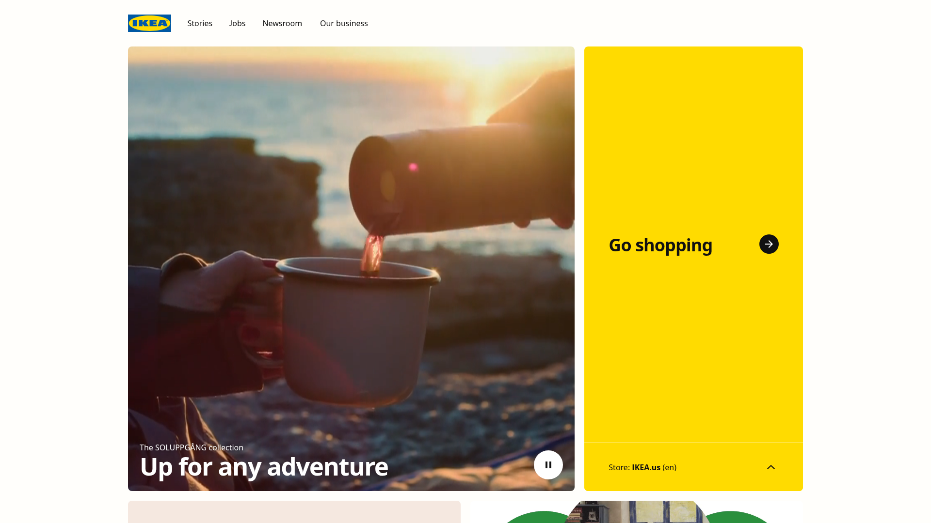
IKEA Corporate Landing Page Layout
A clean corporate portal featuring a large hero hero section with video playback, a split-screen call-to-action block, and a minimalist navigation bar.
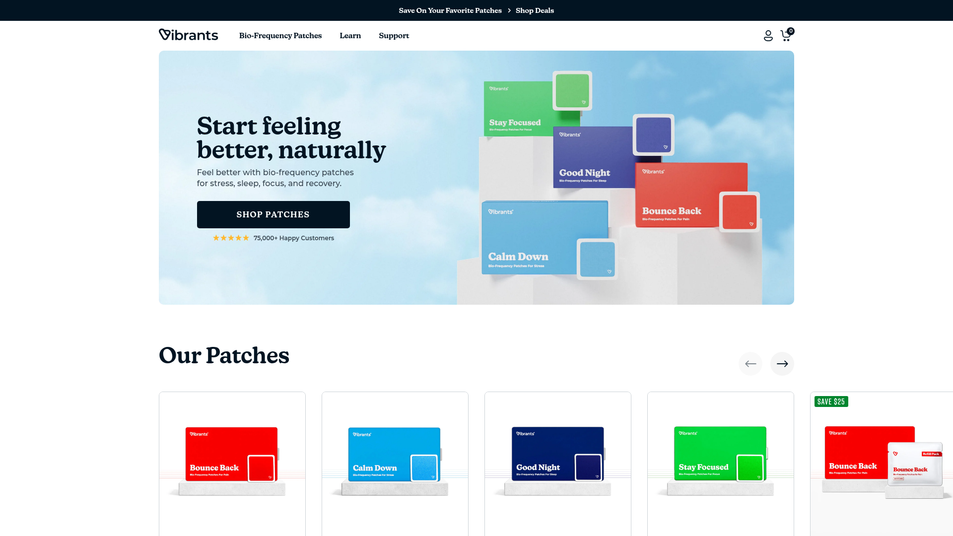
Vibrants Wellbeing E-commerce Landing Page
A clean Shopify-style landing page featuring a full-width hero with overlaid product cards, a horizontal product slider, and interactive cart drawer with utility progress bars.
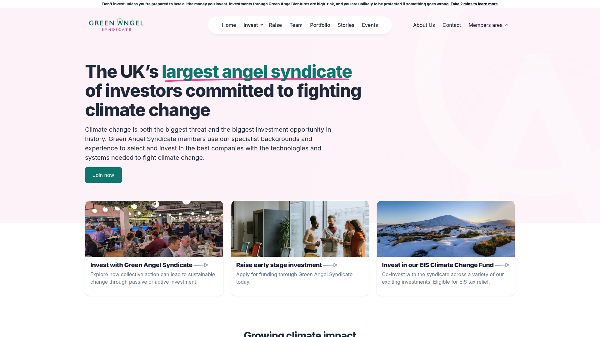
Green Angel Syndicate Investment Landing Page
A clean venture capital landing page featuring a hero section with card-based navigation, a four-column stat grid, and alternating split-layout content sections with image-text pairings.
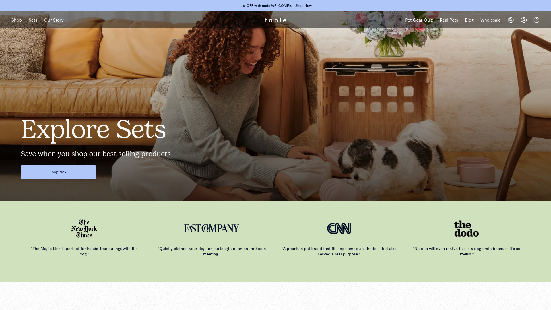
Fable Pets E-commerce Landing Page
A minimalist lifestyle pet brand template featuring a high-impact hero section, a clean logo trust bar, and a centered navigation menu.
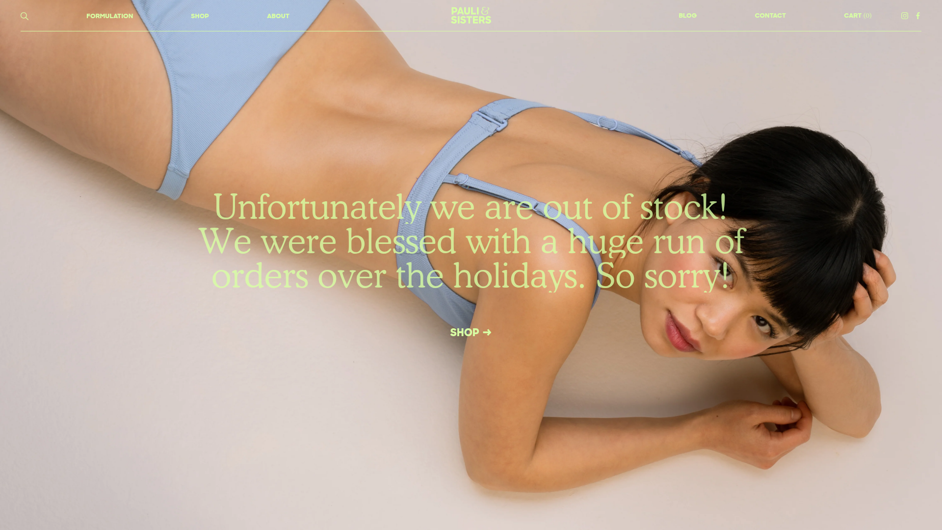
Pauli & Sisters Landing Page
A minimalist e-commerce design featuring a full-width hero image with large overlapping serif text, an interactive ingredient explorer, and a clean split-block layout.
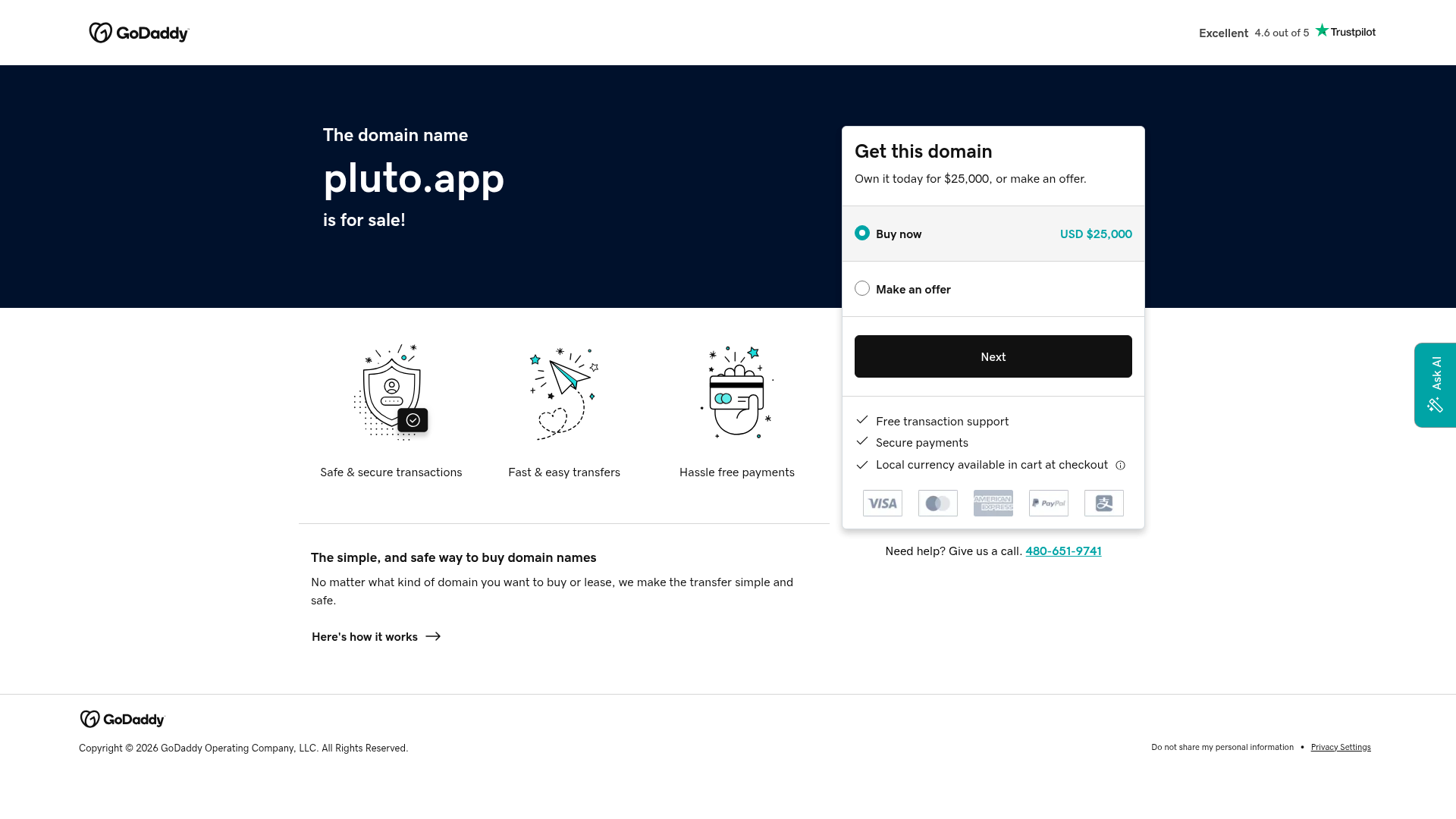
GoDaddy Domain Sales Landing Page
A clean domain aftermarket layout featuring a hero section with purchase/offer selectors, trust signals, payment icons, and a three-column feature grid.
