Becklyn Agency Dark Mode Portfolio
A high-end dark-themed agency site with a floating capsule navigation, staggered case study layouts, text-reveal animations, and horizontal team sliders.
Overview
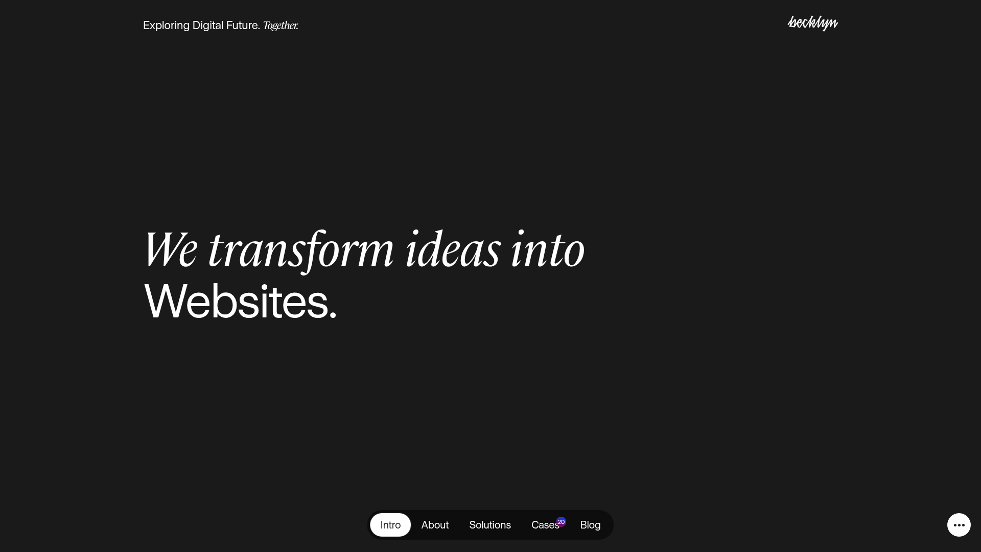
Becklyn is a sophisticated dark-mode agency portfolio that leverages a minimalist aesthetic and premium motion design to showcase digital products. It serves as an excellent reference for builders wanting to implement high-end navigation systems, fluid scroll-triggered animations, and a design-forward content hierarchy.
Design System
- Color Palette & Visual Hierarchy: The site uses a high-contrast dark theme (near-black background) with white and light-grey typography. Vibrant accents, such as the purple notification badge on the 'Cases' link, are used sparingly to draw attention to specific metrics.
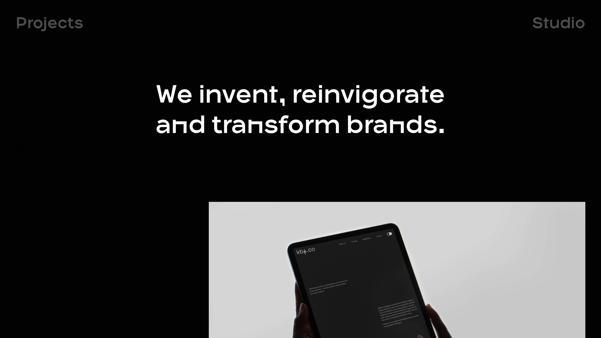
- Typography: The system mixes a classic serif font for expressive headlines ("We transform ideas into...") with a clean, geometric sans-serif for body text and navigation labels. This creates a balance between "design-driven" personality and "tech-agency" readability.
- Grid & Flow: The layout is structured around an airy, asymmetrical grid. Section flow begins with a large-scale hero statement, followed by staggered case study cards, a vertical list for services, a client logo wall, and a horizontal team slider.
- Reusable Components:
- Floating Capsule Nav: A pill-shaped navigation bar anchored at the bottom with a sliding active state indicator.
- Staggered Case Cards: Image-heavy cards with overlapping meta-data tags (e.g., "Engineering", "Design").
- Horizontal Team Sliders: Touch-friendly sliders that display headshots paired with punchy personality-driven quotes.
- Service List: A structured list where each item features a hover-active background shift and numeric indexing.
- Interaction Design: The site features sophisticated entry animations including text reveals (translateY and opacity shifts seen in the
__nextcode) and scale transitions on the main container. A utility drawer (accessible via the "..." button) toggles light/dark modes and language (DE/EN). - Implementation Clues: Built using Next.js and styled-components (evidenced by
sc-class prefixes). It useskeen-sliderfor the team and blog carousels and Framer Motion-style transforms for the smooth vertical transitions.
Use Cases
- Personal Portfolios: Creatives or developers can clone the header and hero structure to establish immediate authority through bold typography.
- B2B SaaS Foundations: Use the structured 'Services' list and client logo wall to build trust and outline complex product offerings clearly.
- Creative Agencies: The staggered case study layout and floating navigation are perfect for agencies that need to appear modern and "motion-first."
- Remix Directions: Swap the dark theme for a neutral light mode using the existing hierarchy; replace the serif headers with a mono-space font for a more "dev-tool" aesthetic; or isolate the team slider component for use within a standard corporate about page.
- Clone Scope: A full-page clone is recommended for those wanting to master the scroll-driven container scaling and the persistent capsule navigation logic.
Related Inspirations
OPX Studio Agency Portfolio
A minimalist dark-themed portfolio featuring a staggered masonry project grid, cinematic video embeds, and a responsive oversized typography hero section.

Niklas Rosén Designer Portfolio Index
A minimalist, responsive grid-based portfolio index featuring a clean 16-column layout, typographic list components, and a custom dark mode transition.
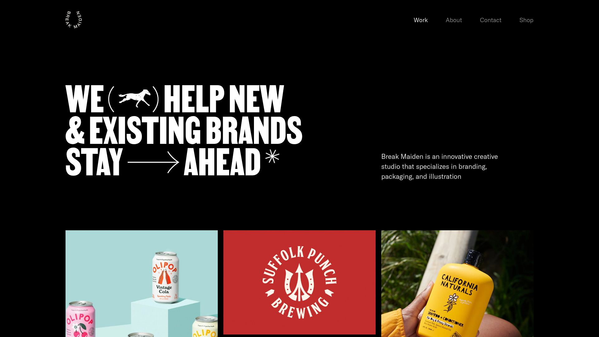
Break Maiden Agency Portfolio Hero
A high-impact dark mode hero section featuring oversized typography with inline GIF icons and a responsive grid for display-heavy case studies.
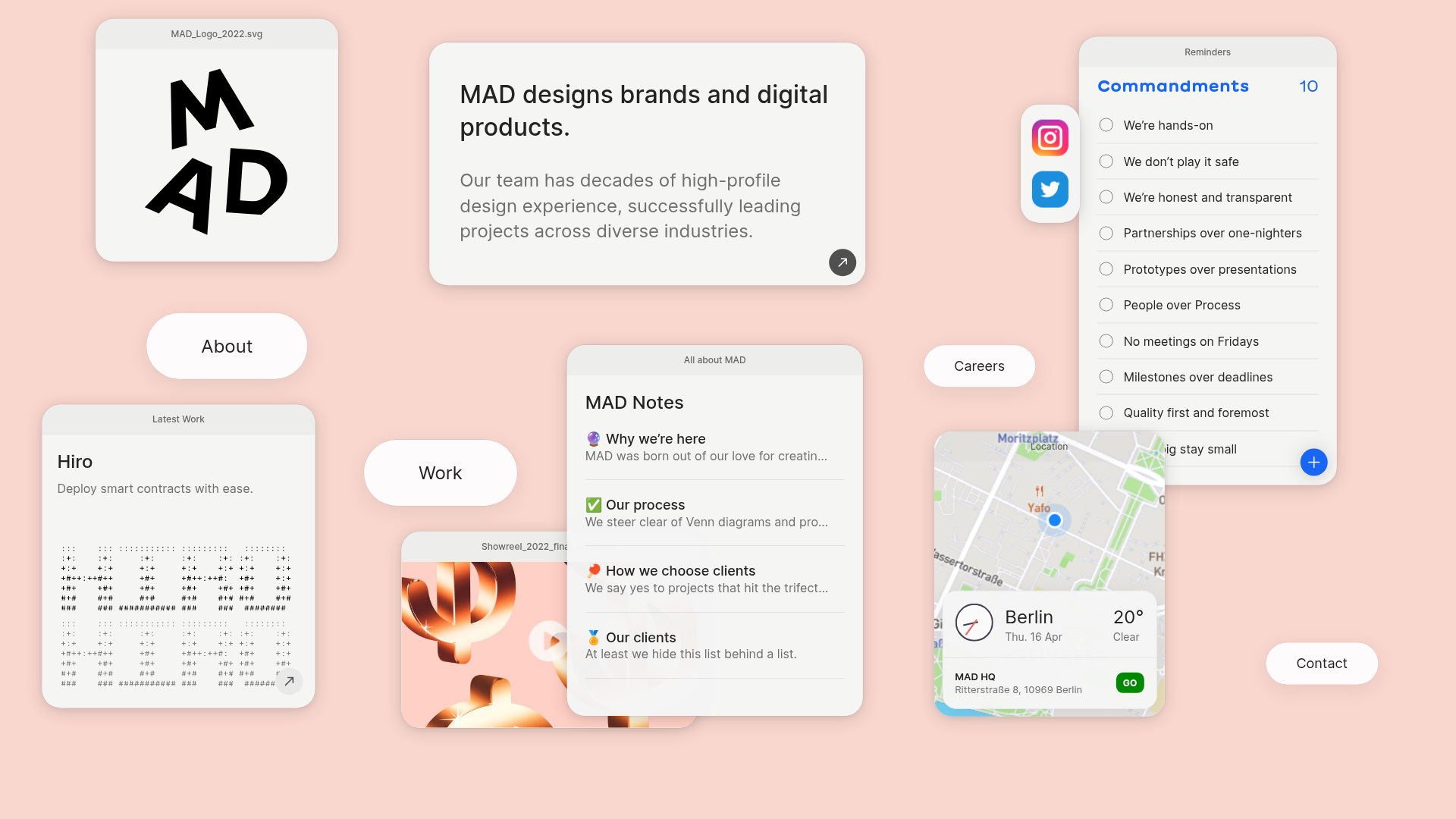
MAD Agency Interactive Dashboard Portfolio
A creative workspace-style layout featuring draggable OS-like applets, including interactive notes, a map widget with live weather, and a custom task checklist.
Catherine Peacock Designer Portfolio Home
A minimalist portfolio layout featuring a vertically stacked masonry project grid, sticky navigation with animated icons, and offset typography.

Dries Bos Creative Developer Portfolio
A high-interaction dark-mode portfolio featuring a grain-textured bento grid, marquee headers, theme switching, and a dynamic project list with hover-triggered image previews.
