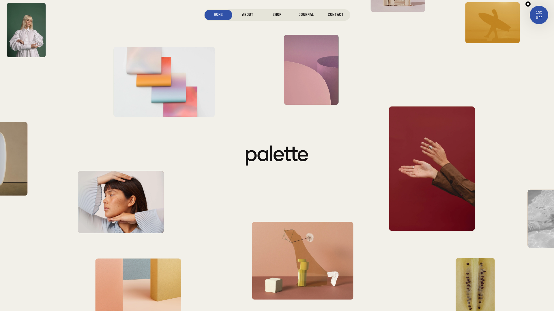
Palette Creative Tools E-commerce Gallery
A minimalist Shopify storefront featuring a floating image collage hero, horizontal product sliders, scroll-triggered parallax sections, and a clean, pill-shaped navigation menu.
Overview
Palette is a minimalist Shopify storefront designed as a high-end digital gallery for creative tools and physical photography gear. Its sophisticated use of negative space, asymmetrical image grids, and scroll-triggered parallax effects makes it an exceptional reference for builders looking to create an editorial-style e-commerce experience that feels more like a portfolio than a standard shop.
Design System
- Color Palette & Visual Hierarchy: The foundation is a warm, off-white neutral background (
#f3f0e9) that reduces eye strain and provides a premium, paper-like feel. Visual hierarchy is achieved through high-contrast black typography and "pops" of a signature cobalt blue (#3051a8) used for active navigation states, primary buttons, and promotional callouts. - Typography: The design utilizes specialized foundry fonts such as
PPSupplyMonofor technical details (prices, labels) andESbuildfor high-impact headlines. Size scales are dramatic, with massive<h1>hero statements contrasted against small, all-caps mono labels for a structured, blueprint-inspired aesthetic. - Page Structure & Section Flow:
- Floating Hero: A collage of overlapping images that creates immediate visual depth through varying aspect ratios.
- Editorial Content: A "Built for visual thinkers" section featuring images with staggered scroll speeds (parallax).
- Product Sliders: Clean horizontal carousels with minimal borders, where products are paired with large lifestyle preview images to the left.
- The Journal: A two-column split section utilizing a soft sage green background to differentiate the blog/learning content from the commerce sections.
- Social Banner: A continuous auto-scrolling horizontal marquee of Instagram/Pinterest imagery.
- Reusable Components:
- Pill Navigation: A floating, centered navigation bar with a distinct background-fill transition for the active link.
- Slider-Component: A custom horizontal product grid with toggleable navigation icons and smooth CSS transitions (
transform: translateX). - Cart Overlay: A full-height slide-out panel that maintains the site's minimalist styling.
- Interaction & Motion: The site relies heavily on scroll-triggered movement. Images in the
about-sectionusedata-speedattributes to calculate 3D translations, creating a dynamic layering effect as the user moves down the page. - HTML/Implementation Clues: Built on Shopify, the structure uses
isolatecontainers and modern CSS utilities. The presence ofdata-barba="container"indicates a Barba.js integration for seamless, zero-refresh page transitions between the home and product pages.
Use Cases
- Who should clone this: Designers and developers building boutique brands, digital download marketplaces (mockups, presets), or fashion editorials who want to move away from rigid, boxy layouts.
- Remix Directions: Swap the cobalt blue for a fluorescent accent to make it feel more "tech-heavy," or replace the wide sans-serif headers with a high-contrast serif for a luxury fragrance or skincare store. The info architecture can be adapted by converting the image sliders into vertically stacked cards for smaller catalogs.
- Clone Scope:
- Quick Clone: The pill-shaped navigation and the horizontal social/image marquee are perfect standalone components for any project.
- Full Clone: Replicate the entire homepage to master the integration of e-commerce utility with editorial storytelling through parallax and asymmetrical grids.
Related Inspirations
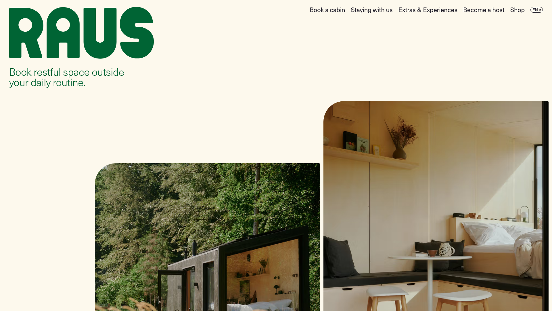
Raus Booking Site with Asymmetric Layout
A nature-focused landing page featuring a floating booking widget, stylized image masks, and an asymmetric animated gallery for showcasing cabin experiences.
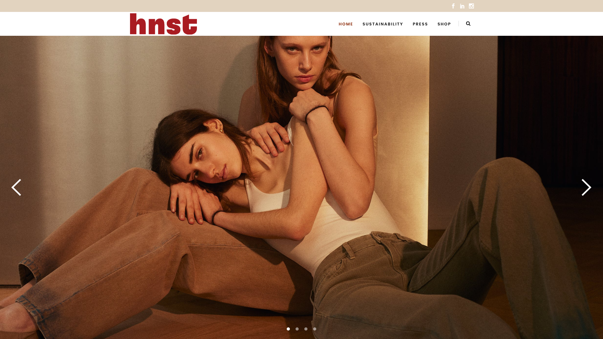
HNST Circular Fashion eCommerce Gallery
A minimalist apparel site featuring a full-screen image slider with parallax effects, grid-based product sections, and a clean typography-focused header for sustainable brand storytelling.
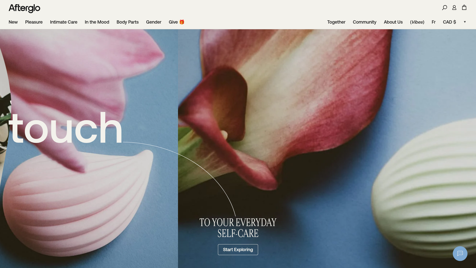
Afterglo Sensual Self-Care Storefront
An elegant e-commerce landing page featuring a split-screen horizontal scrolling hero, kinetic typography with 'vibrating' text animations, and a customized product carousel.
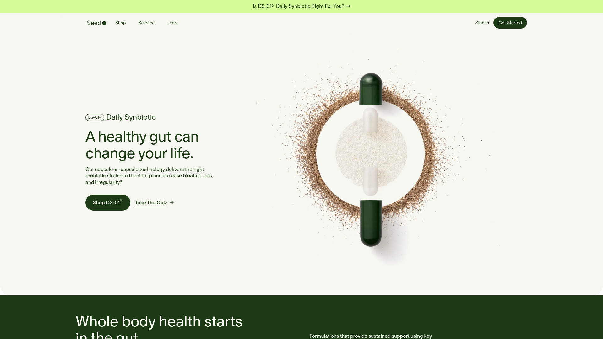
Seed Health Landing Page
An elegant wellness landing page featuring a full-viewport parallax hero, vertical swiper transitions, an interactive product carousel, and a custom video gallery for customer stories.
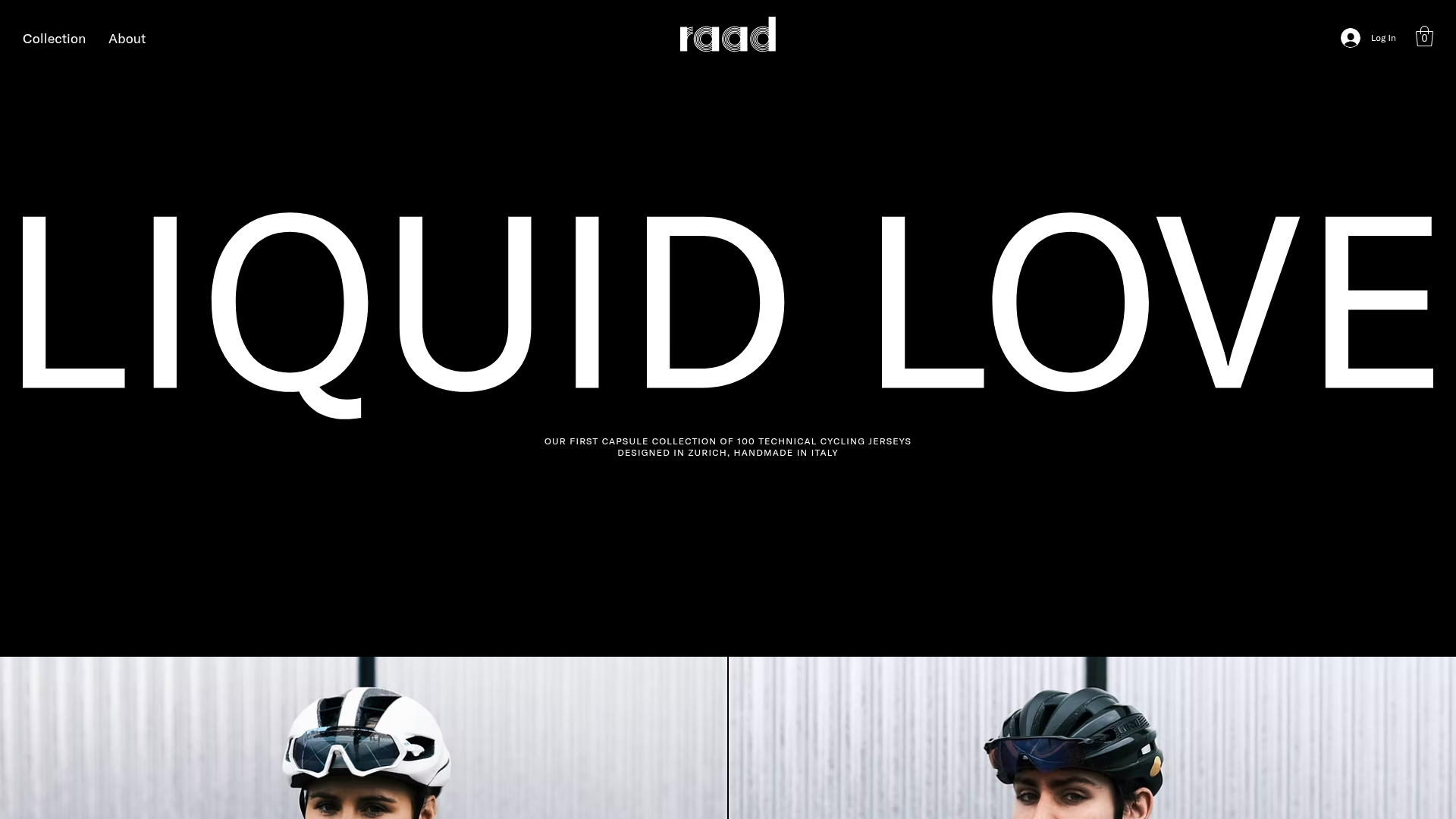
RAAD Cycling Apparel Storefront
A minimalist e-commerce layout featuring large-scale typography, high-contrast black backgrounds, and alternating image-text sections for a premium brand feeling.
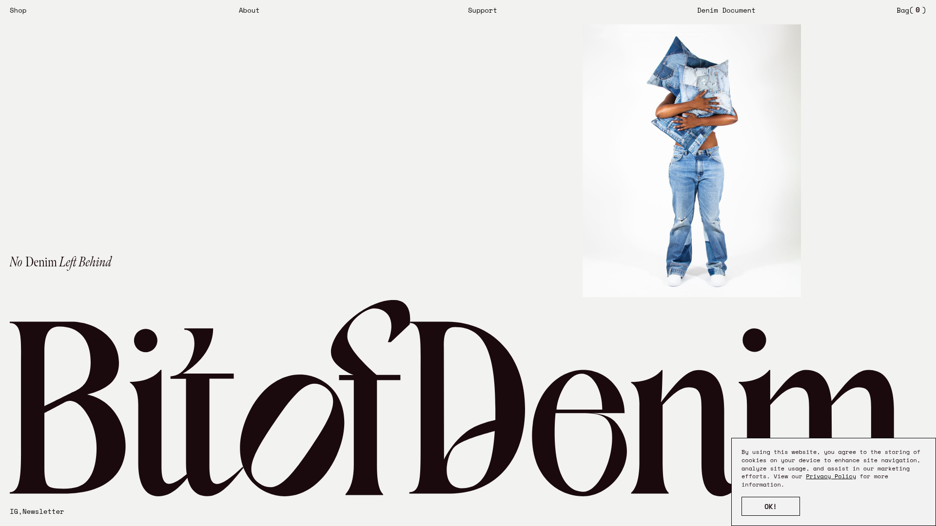
Bit of Denim Minimalist E-commerce Hero
A minimalist layout featuring oversized serif custom typography, a clean split-screen hero with an image slider, and a slide-out navigation menu for sustainable fashion brands.
