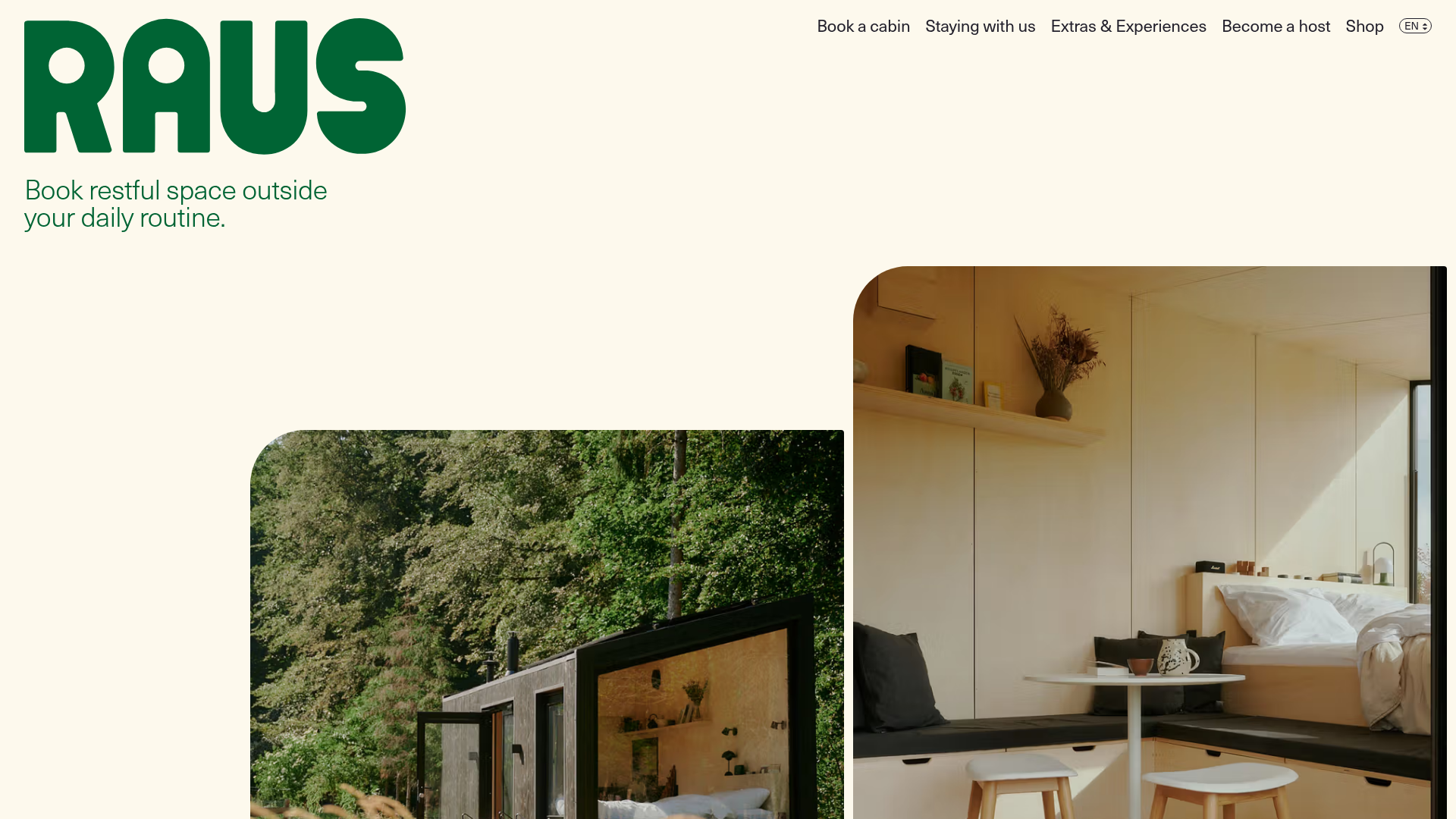
Raus Booking Site with Asymmetric Layout
A nature-focused landing page featuring a floating booking widget, stylized image masks, and an asymmetric animated gallery for showcasing cabin experiences.
Overview
This nature-focused landing page for Raus provides a sophisticated reference for hospitality and travel booking experiences. It captures a "luxury-minimalist" aesthetic through an asymmetric layout and stylized image masks, making it a strong clone candidate for brands focused on calmness, outdoor living, or retreat-based services.
Design System
- Color Palette & Visual Hierarchy: The site uses a high-contrast palette consisting of a deep "Forest Green" (#005E34) for primary branding and headers, set against a warm "Cream" background. This combination avoids the harshness of white/black to lean into a natural, organic feel.
- Typography: A bold, heavy sans-serif is used for the logotype and large-scale headings, while a cleaner, high-legibility sans-serif manages body text and meta-information. The hierarchy is clear: massive oversized branding, followed by mid-sized headlines, and small-caps labels (e.g., "Idea 32").
- Page Structure: The layout follows a non-linear, staggered flow. It begins with a hero header, transitions into an asymmetric primary gallery ("IdeasGrid"), moves into a feature section with a single large image mask, and concludes with a structured "Journal" section for editorial content.
- Reusable Components:
- Floating Booking Widget: A compact horizontal bar fixed at the bottom containing "Region," "Date," and "Guests" selectors.
- Image Masks: Containers with large border-radii on opposite corners, creating a unique "leaf" or "pod" shape.
- Idea Tiles: Vertical cards with staggered entrance animations (visible via
transform: translateYin HTML) and simple metadata overlays.
- Interaction & Motion: The HTML indicates the use of
Plx(Parallax) andanimationContainerclasses, suggesting that images slide into view or shift depth as the user scrolls. The booking widget uses a popover/modal pattern for selection inputs. - Implementation Clues: Built with Next.js and styled-components (seen via
sc-class prefixes). It utilizes a grid-based container system (Grid.Container) to manage its complex asymmetry across breakpoints.
Use Cases
- Who should clone this: Developers building rental marketplaces, boutique hotel sites, or glamping experiences that need to feel high-end yet approachable.
- Product Remixes: This pattern effectively suits wellness apps, architectural portfolios, or curated e-commerce brands where photography is the primary selling point.
- Remix Directions: Replace the Forest Green with a deep terracotta for desert-based properties; keep the asymmetric gallery but swap the "Booking Widget" for a "Sign Up" form for newsletters or digital products.
- Clone Scope: The IdeasGrid and ImageMask components are the highest-value elements to clone individually for a unique aesthetic boost, while the full-page structure is ideal for a comprehensive brand site project.
Related Inspirations
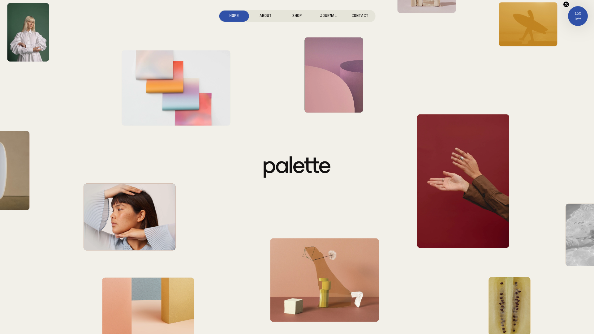
Palette Creative Tools E-commerce Gallery
A minimalist Shopify storefront featuring a floating image collage hero, horizontal product sliders, scroll-triggered parallax sections, and a clean, pill-shaped navigation menu.
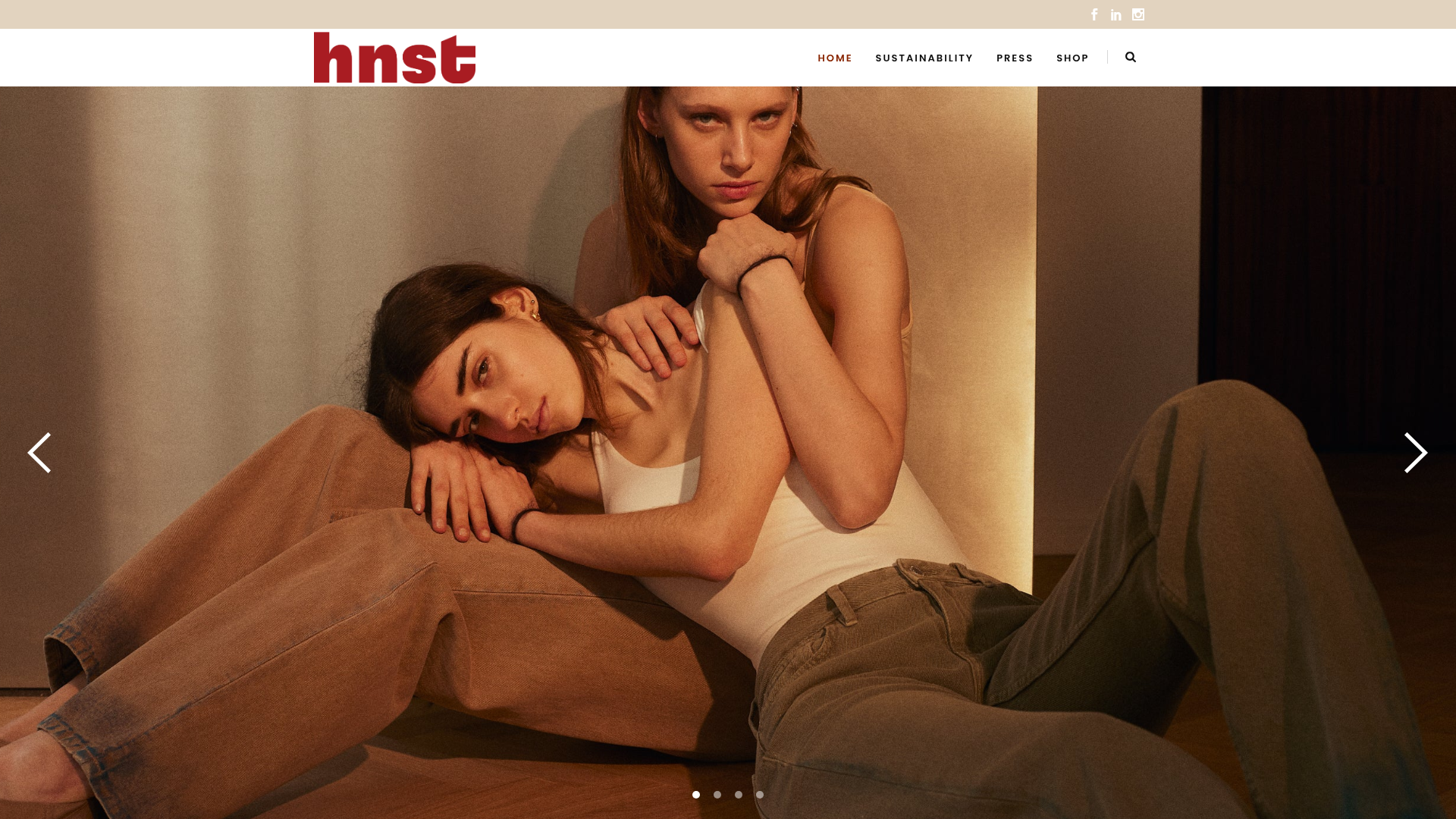
HNST Circular Fashion eCommerce Gallery
A minimalist apparel site featuring a full-screen image slider with parallax effects, grid-based product sections, and a clean typography-focused header for sustainable brand storytelling.
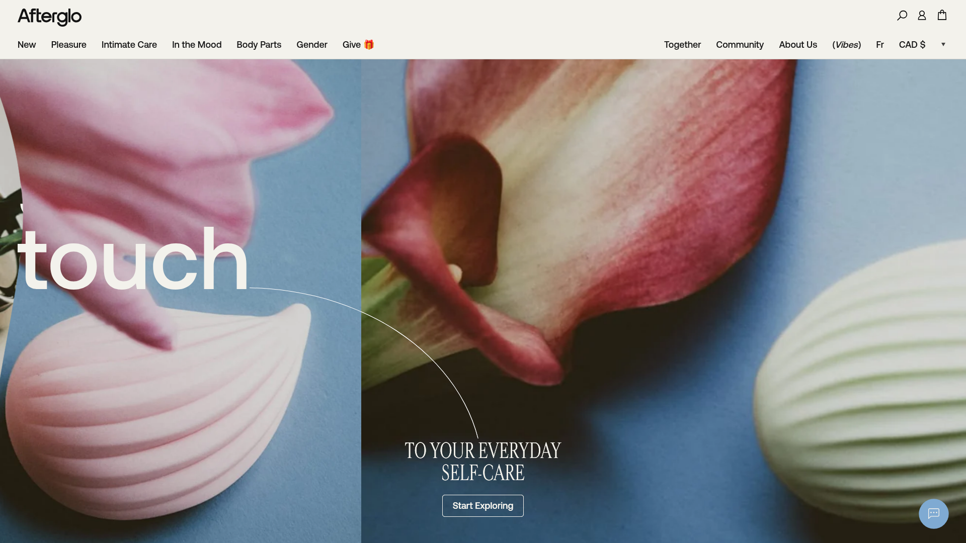
Afterglo Sensual Self-Care Storefront
An elegant e-commerce landing page featuring a split-screen horizontal scrolling hero, kinetic typography with 'vibrating' text animations, and a customized product carousel.
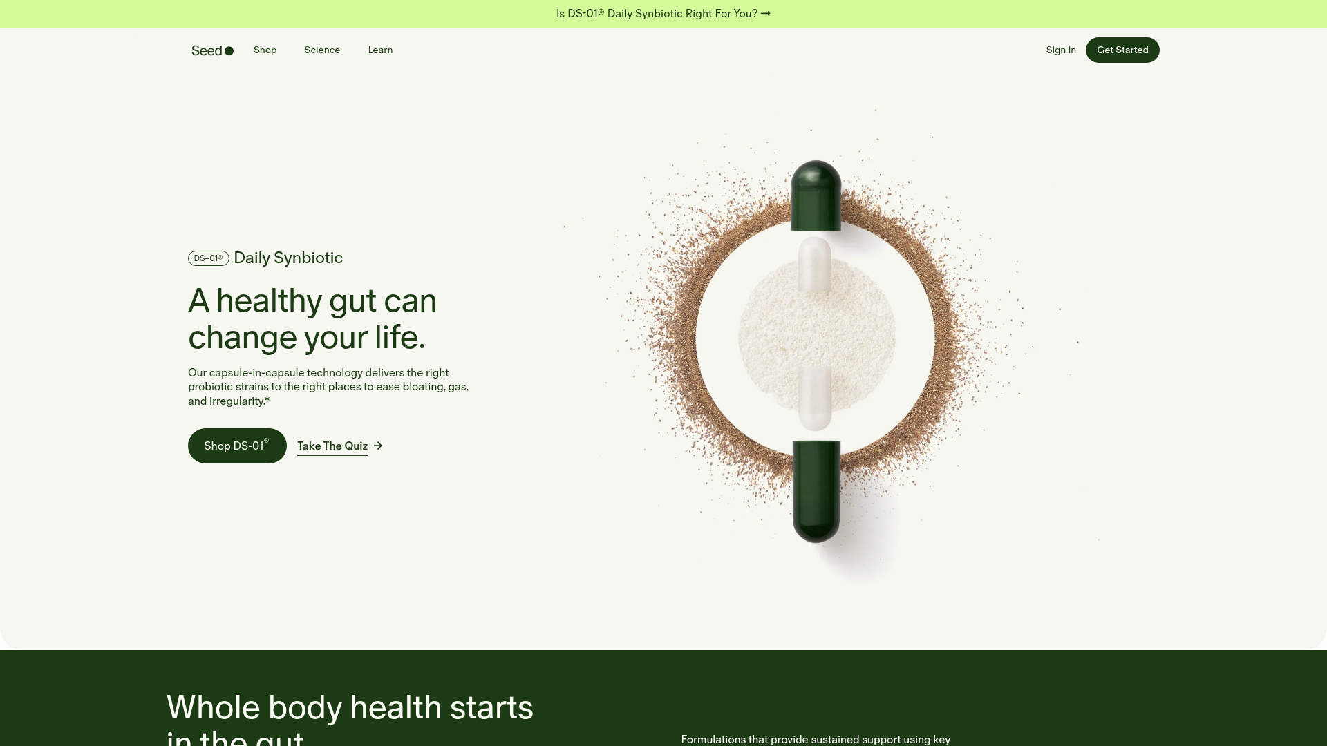
Seed Health Landing Page
An elegant wellness landing page featuring a full-viewport parallax hero, vertical swiper transitions, an interactive product carousel, and a custom video gallery for customer stories.
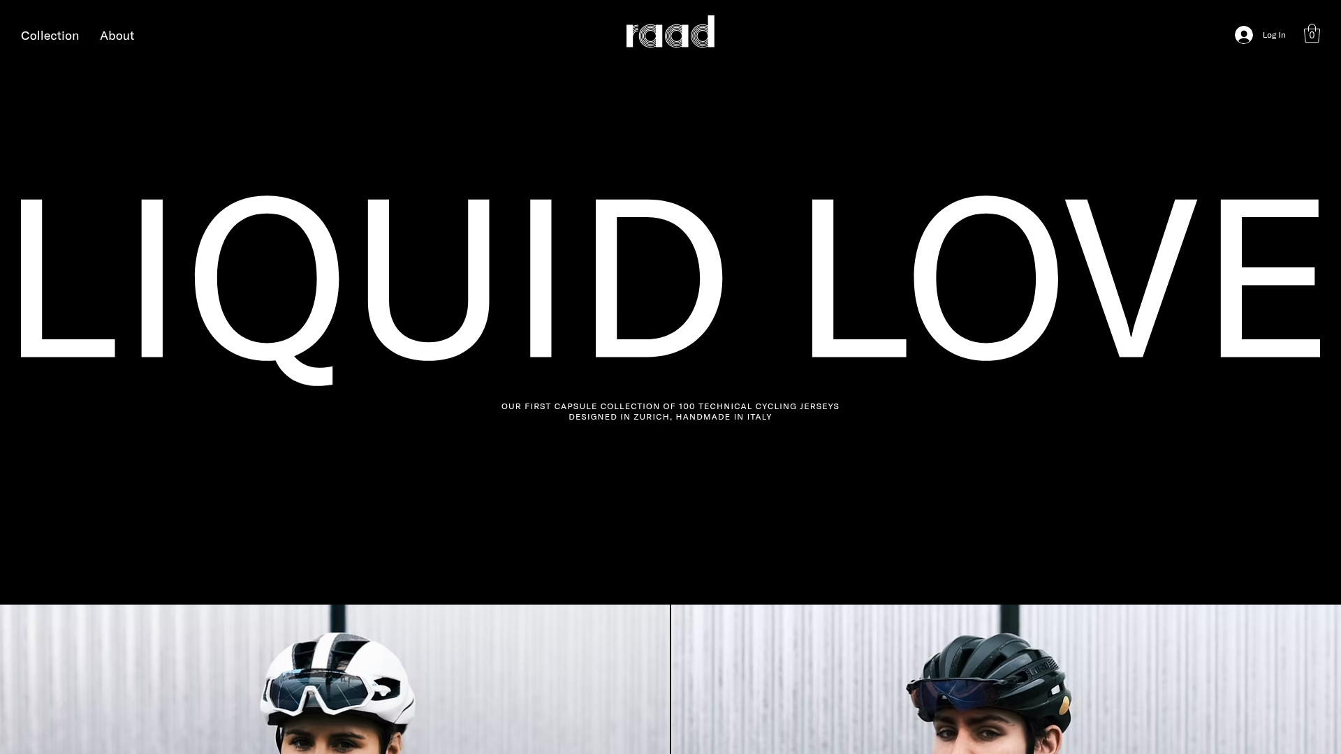
RAAD Cycling Apparel Storefront
A minimalist e-commerce layout featuring large-scale typography, high-contrast black backgrounds, and alternating image-text sections for a premium brand feeling.
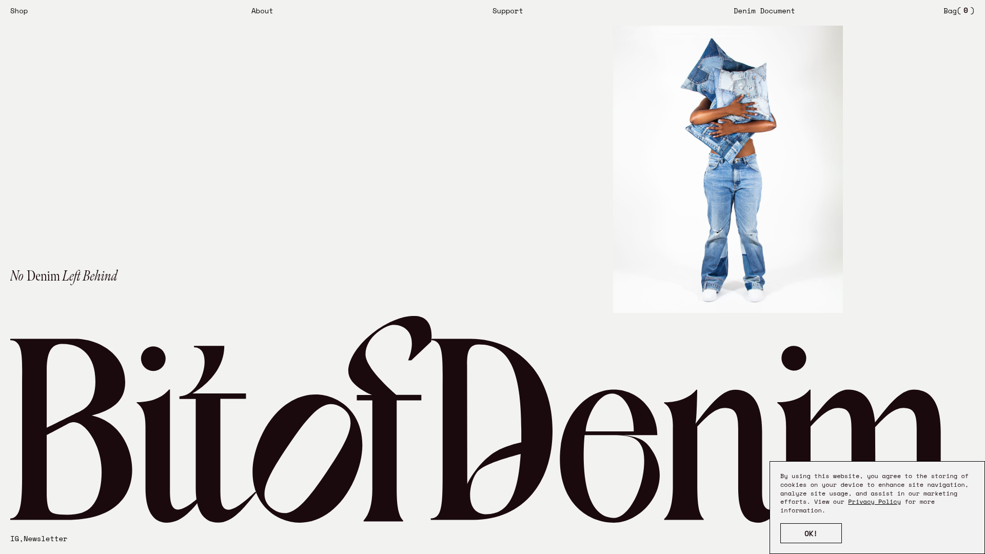
Bit of Denim Minimalist E-commerce Hero
A minimalist layout featuring oversized serif custom typography, a clean split-screen hero with an image slider, and a slide-out navigation menu for sustainable fashion brands.
