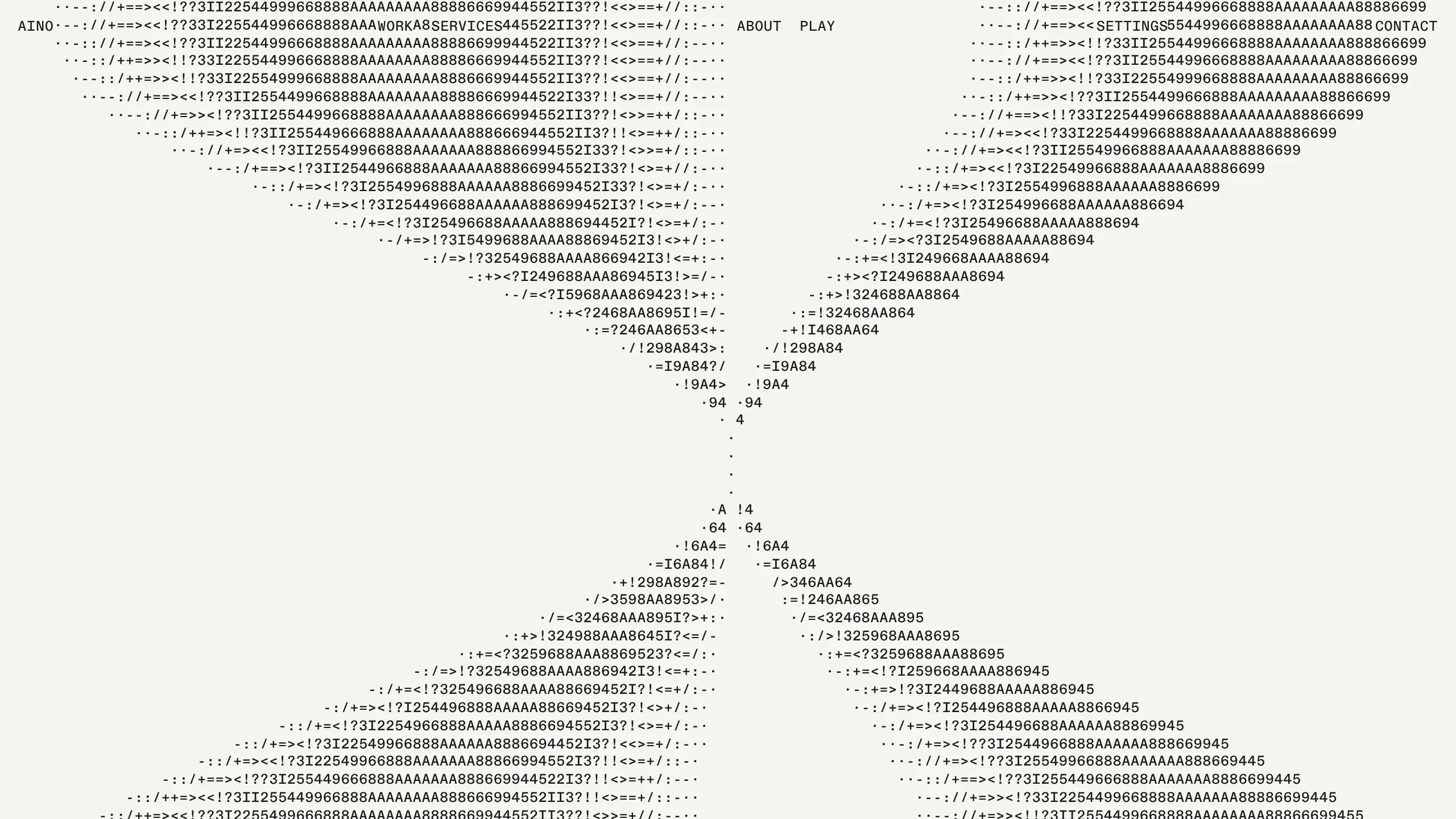
Aino Agency Portfolio with ASCII Hero
A minimalist brutalist portfolio featuring an interactive ASCII art hero, a monospaced typography grid, and an asymmetrical scrollable gallery with smooth media transitions.
Overview
This website is a sophisticated execution of minimalist brutalism, serving as the portfolio for Aino Agency. It stands out as a remix reference due to its innovative use of interactive ASCII art as a hero element and its strict adherence to a monospaced, grid-based layout that balances technical aesthetics with high-end fashion sensibilities.
Design System
- Color Palette & Visual Hierarchy: The design uses a high-contrast but soft "paper" off-white (#f9f8f4) background with black text. Hierarchy is established through spatial positioning rather than color, using wide-open negative space to force focus on centered ASCII elements and oversized media.
- Typography: A strictly monospaced typography system is employed, likely using a face like JetBrains Mono or similar. The scale is kept consistent across the navigation and project titles, with a shift to all-caps for headers to create a data-driven, engineered feel.
- Page Structure & Section Flow: The flow begins with a viewport-filling ASCII hero section that reacts to user presence. This transitions into an asymmetrical, scrollable gallery where project cards are staggered across an 8-column grid (
w4,w8classes), ending in a massive SVG logo footer with localized meta-data (time/location). - Reusable Components:
- ASCII Grid Container: The
section.gridcontainerholding thediv.grid.monois a prime candidate for reuse as a unique hero section. - Four-Corner Nav: A fixed header that utilizes the corners of the viewport for primary and secondary navigation links.
- Staggered Media Cards: Project links (
a.col) that wrap responsiveimgandvideotags with clean, bottom-aligned labels.
- ASCII Grid Container: The
- Interactions & Motion: The navigation uses a
hovercharclass, suggesting character-level animation on hover. The media items utilize smooth transitions and fade-in states (fadeinclass) triggered by scroll. The ASCII art itself is dynamically generated or updated via JavaScript within the pre-formatted text block. - Implementation Clues: The site is built using Vercel (indicated by image optimization URLs) and follows a component-based architecture (
data-component="header"). Layout is controlled via CSS variables (e.g.,calc(var(--line) * 6)) to ensure elements align perfectly with the typographic baseline grid.
Use Cases
- Who should clone this: Creative developers, niche architectural firms, or digital design boutiques looking to signal technical depth and "understated premium" branding.
- Remixing Directions: Replace the specific ASCII logo with a generative character-based version of your own brand; adapt the asymmetrical grid for a personal blog or photography portfolio; or isolate the four-corner navigation for a high-concept landing page.
- Suggested Clone Scope: A full-page clone is ideal to preserve the "monolithic" feel of the grid, but the staggered media section and the fixed header are the most practical individual components to extract for more traditional projects.
Related Inspirations
Magda Reyman Designer Portfolio
A minimalist portfolio layout featuring a fixed hero intro, absolute-positioned mobile UI mockups, and a distinctive high-contrast footer with rounded interaction buttons.
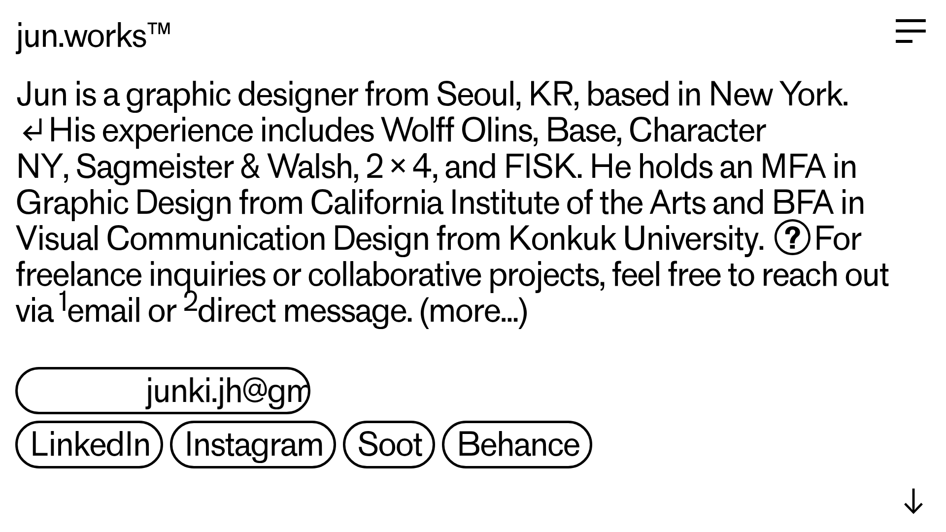
Jun Works Portfolio Landing Page
Minimalist graphic design portfolio featuring a text-heavy layout with image-on-hover tooltips, a pill-shaped marquee contact card, and a categorized hashtag tag cloud for project navigation.
Ekipa Agency Artist Roster Site
A minimalist agency portfolio featuring a dynamic block-based logo, colorful background transitions, and a hover-activated image preview grid for an artist roster.
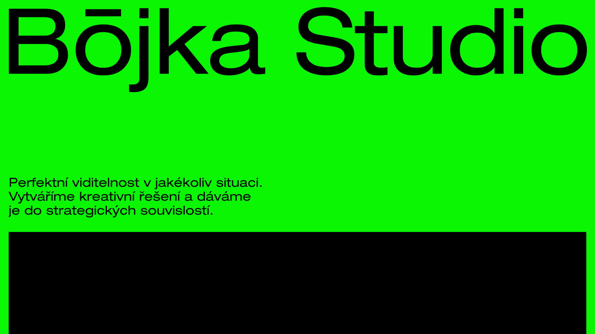
Bōjka Studio Minimalist Portfolio Landing
A bold, high-contrast design featuring a vibrant green hero section, large-scale typography, a crossfade image slideshow, and a fixed navigation footer.
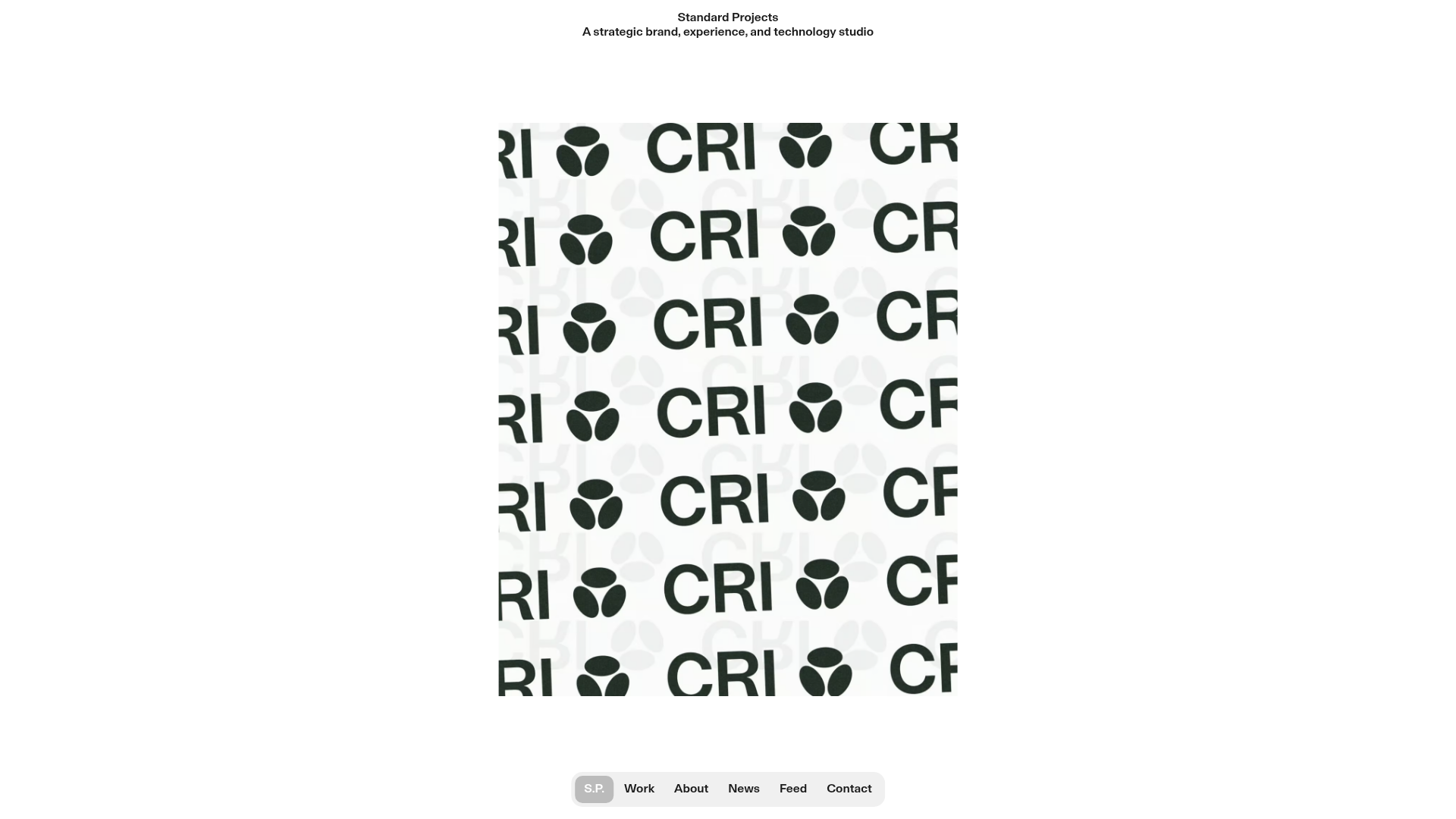
Standard Projects Portfolio with Sticky Hero
A minimalist studio layout featuring a full-height animated carousel, sticky header typography, and a dynamic masonry element grid for case studies.
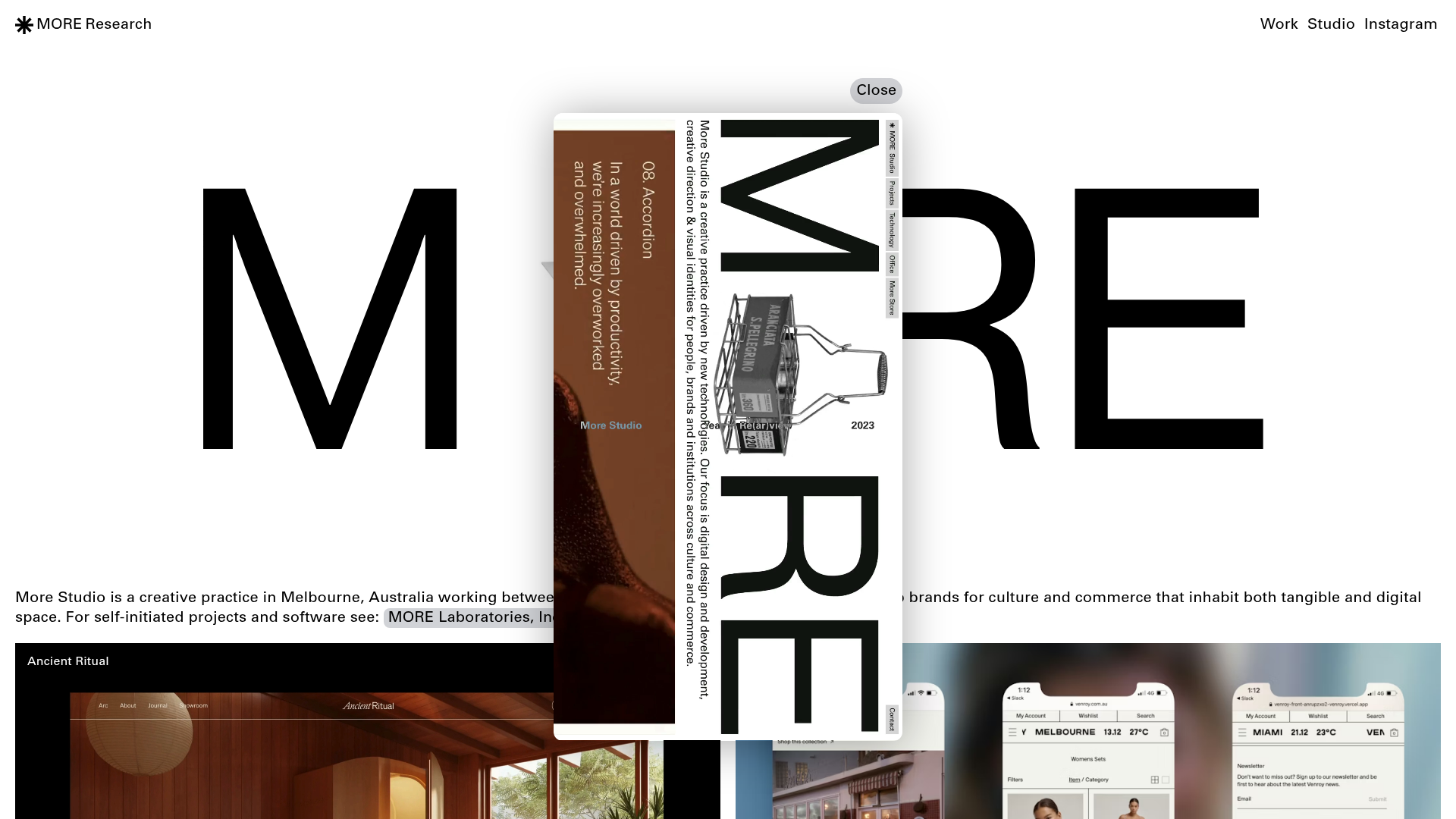
More Studio Creative Agency Portfolio
A high-end creative portfolio featuring oversized experimental typography, immersive video modals, accordion-based project lists, and unique cursor-following hover effects.
