SuperHi Creative Learning Landing Page
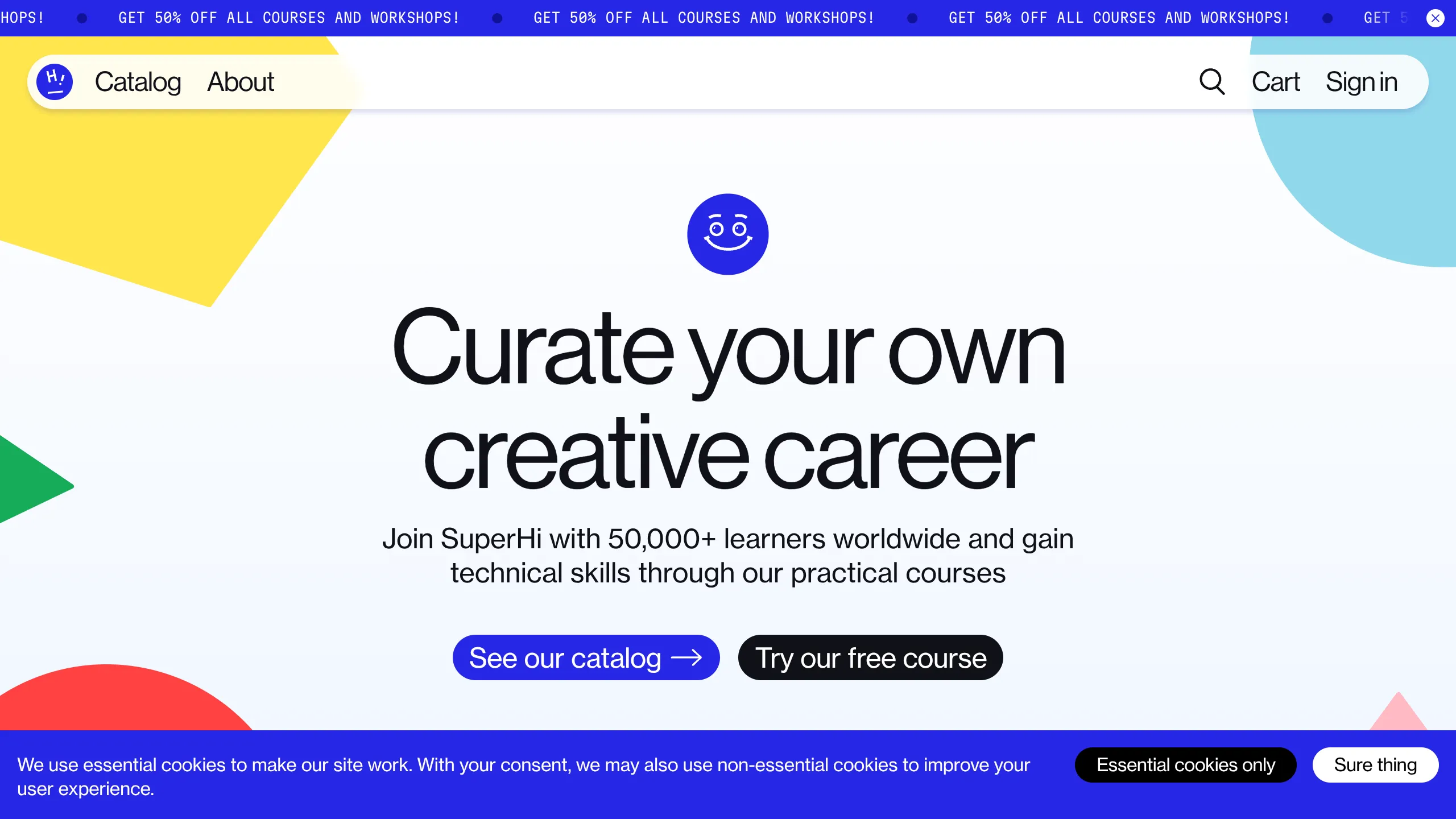
A vibrant hero section featuring abstract geometric shapes, a floating rounded navigation bar, and clear call-to-action buttons for online course catalogs.
Overview
SuperHi's landing page is an exemplary model of high-energy, modern educational branding that balances playful geometric abstraction with a clear conversion focus. It is a strong remix reference for developers looking to build a professional yet approachable presence that utilizes floating UI elements and a bold primary color palette.
Design System
- Color Palette & Visual Hierarchy: The design uses a vibrant palette of primary and secondary colors (Bright Blue, Canary Yellow, Soft Teal, and Coral Red) set against a stark white background. This "digital primary" scheme creates high contrast, drawing immediate attention to the Blue primary CTA and the dark secondary CTA.
- Typography System: A clean, modern sans-serif (reminiscent of Inter or sans-serif families) is used with tight letter spacing in the headline. The hierarchy is established through extreme scale, with a massive H1 headline ("Curate your own creative career") followed by a medium-weight sub-headline.
- Page Structure: The layout features a non-traditional header—a floating, rounded capsule white bar—that sits atop background geometric shapes. Below the navigation is a centered hero stack comprising a logo mark, headline, value proposition, and dual CTA buttons. The page footer/cookie consent bar uses a solid blue block to anchor the design.
- Reusable Components:
- Floating Navigation Bar: A rounded capsule containing logo, links, and utility icons (search, cart, sign-in).
- Dual CTAs: A primary high-contrast blue button with an arrow icon and a secondary black button with a "ghost-style" pill shape.
- Anniversary/Promo Ticker: A blue scrolling marquee at the top for site-wide announcements.
- Geometrical Background Elements: Large SVG-style shapes (triangles, semicircles) used as framing elements.
- Implementation Clues: The HTML structure shows the use of semantic containers and utility-first styling for alignment. The navigation is decoupled from the main page flow, suggesting a fixed or sticky position relative to the viewport.
Use Cases
- Who should clone this: Ed-tech platforms, portfolio sites for creative professionals, or SaaS startups aiming for a "friendly-tech" aesthetic.
- Remix Directions: Developers can effectively remix this by swapping the abstract shapes for illustrative product screenshots or photography while keeping the floating nav structure. The layout is highly adaptable to a dark mode transition by flipping the white background to deep navy and adjusting the secondary button borders.
- Suggested Scope: This is ideal for a hero section clone. The specific intersection of the floating header and background shapes requires precise z-index management and is the most valuable portion to replicate for a modern look. The cookie banner and marquee ticker are excellent utility snippets to harvest for any modern web project.
Related Inspirations

Good Glyphs Font Showcase Landing Page
A single-page layout featuring an interactive type tester, donation form with custom amount logic, and a contributor gallery using swiper-based glyph previews.
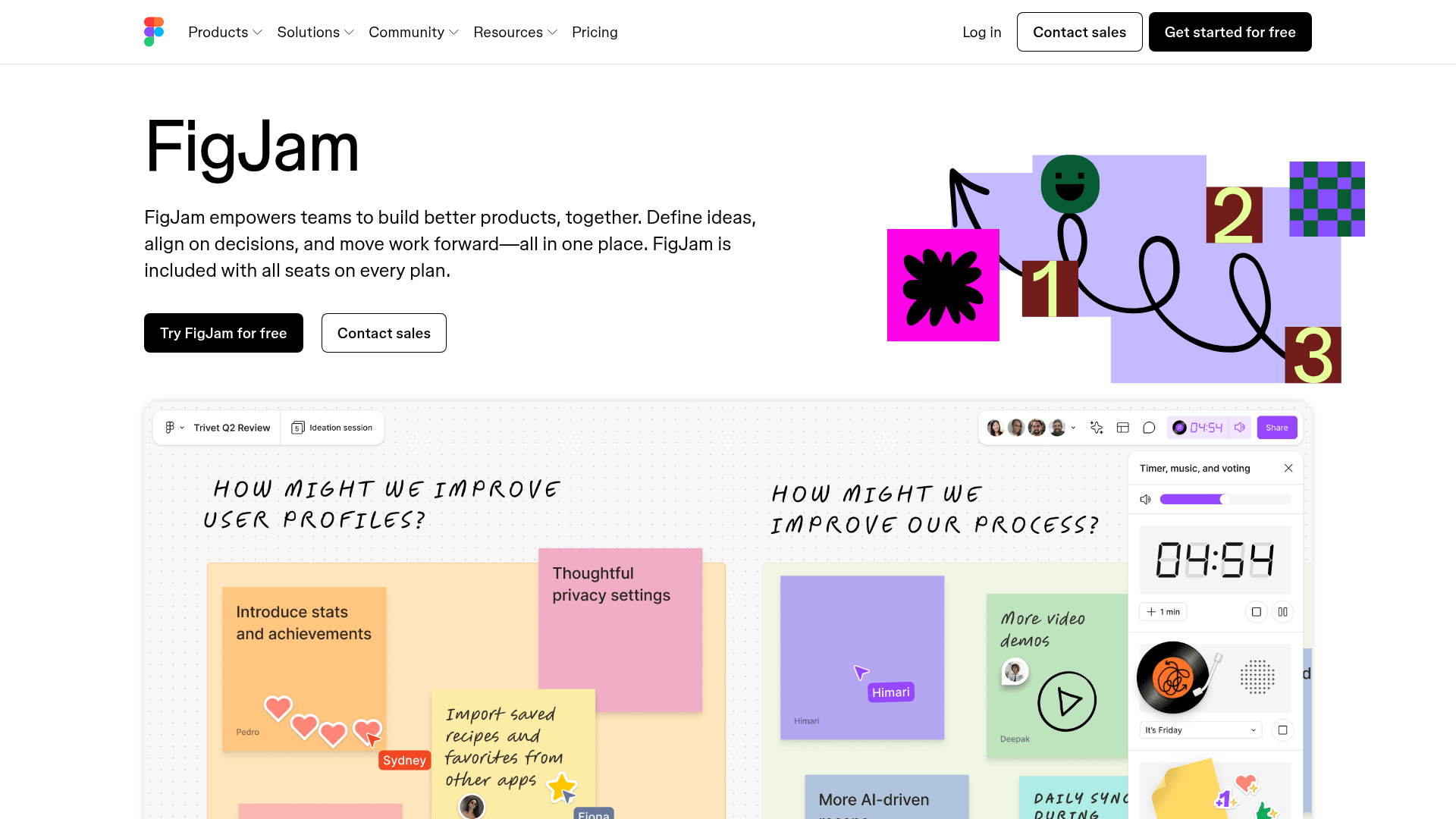
FigJam Product Landing Page
A collaborative tool showcase featuring a centered hero section, logo marquee, vertical tabbed feature switcher, and interactive carousel for templates.
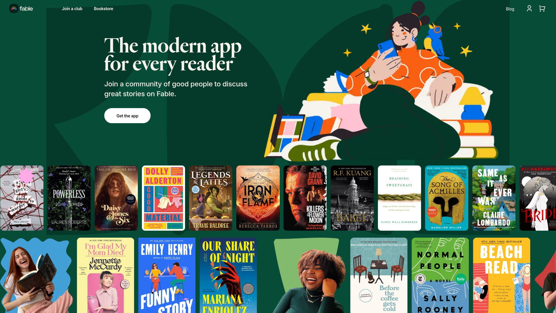
Fable Social Reading Landing Page
A vibrant community site featuring a dual-row animated book cover slider, bento-style feature cards with parallax transforms, and a horizontal gallery of popular clubs.
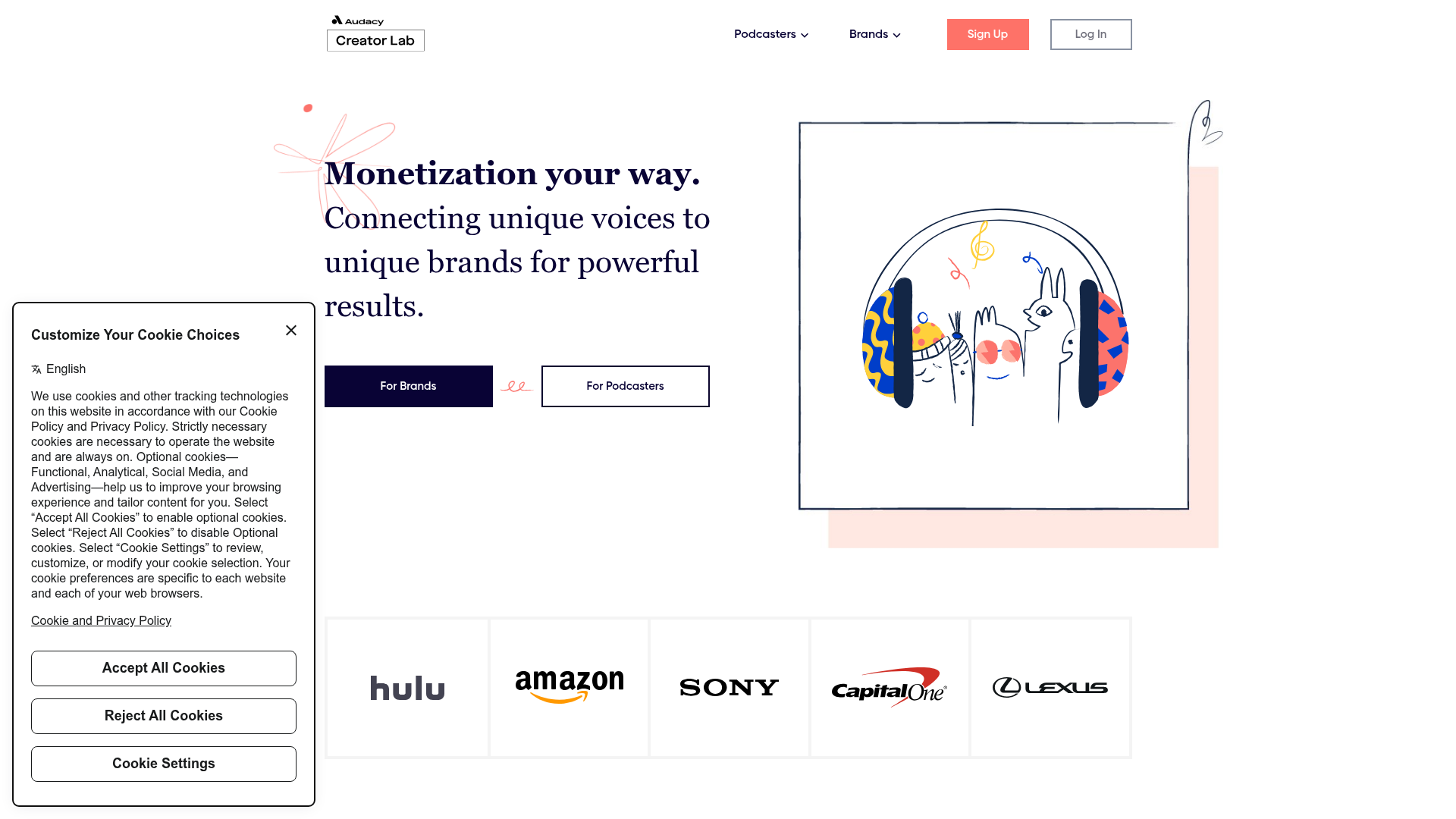
Audacy Creator Lab Marketplace Landing Page
A clean marketplace landing page featuring a dual-CTA hero section, an auto-scrolling partner logo ribbon, animated illustration containers, and three-column feature cards.
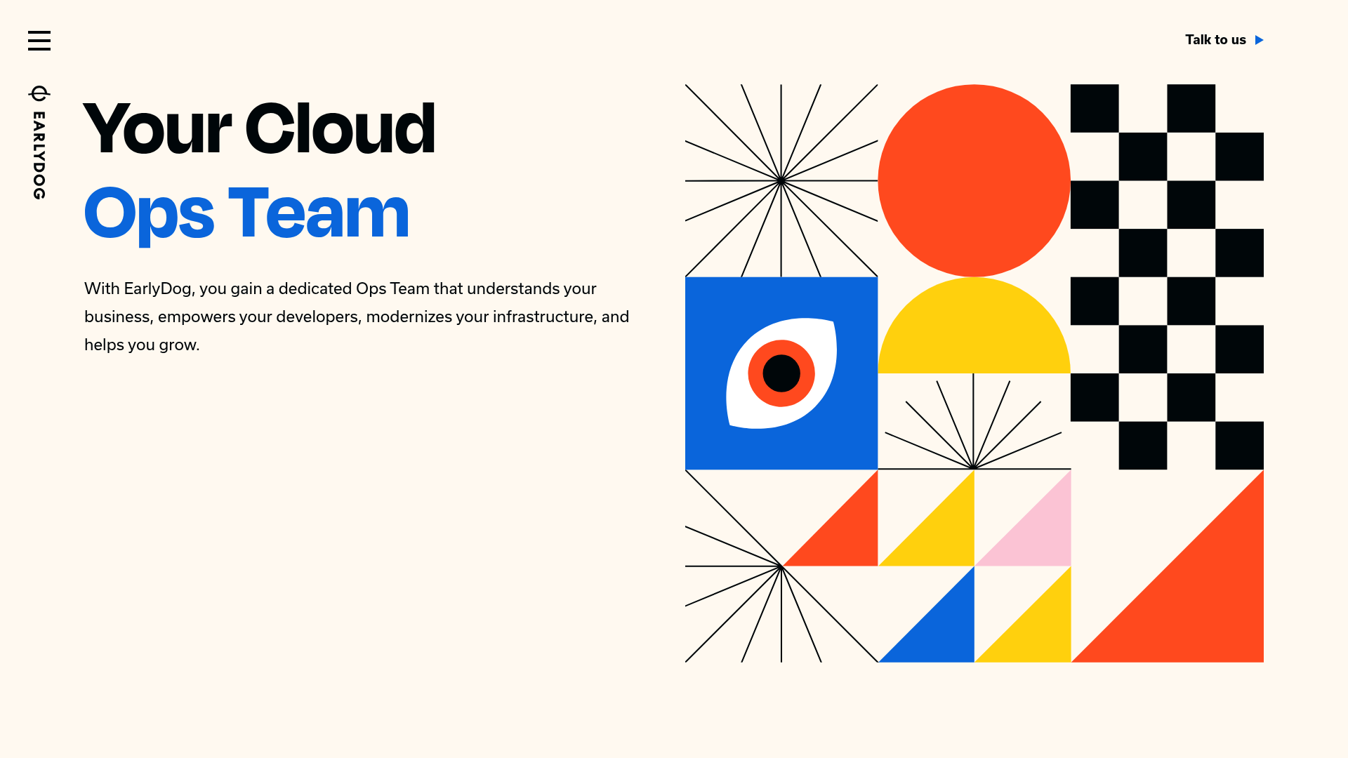
EarlyDog Managed Ops Landing Page
A minimalist landing page featuring a bold geometric hero illustration, asymmetrical grid layouts, and clean typography for service-based businesses.
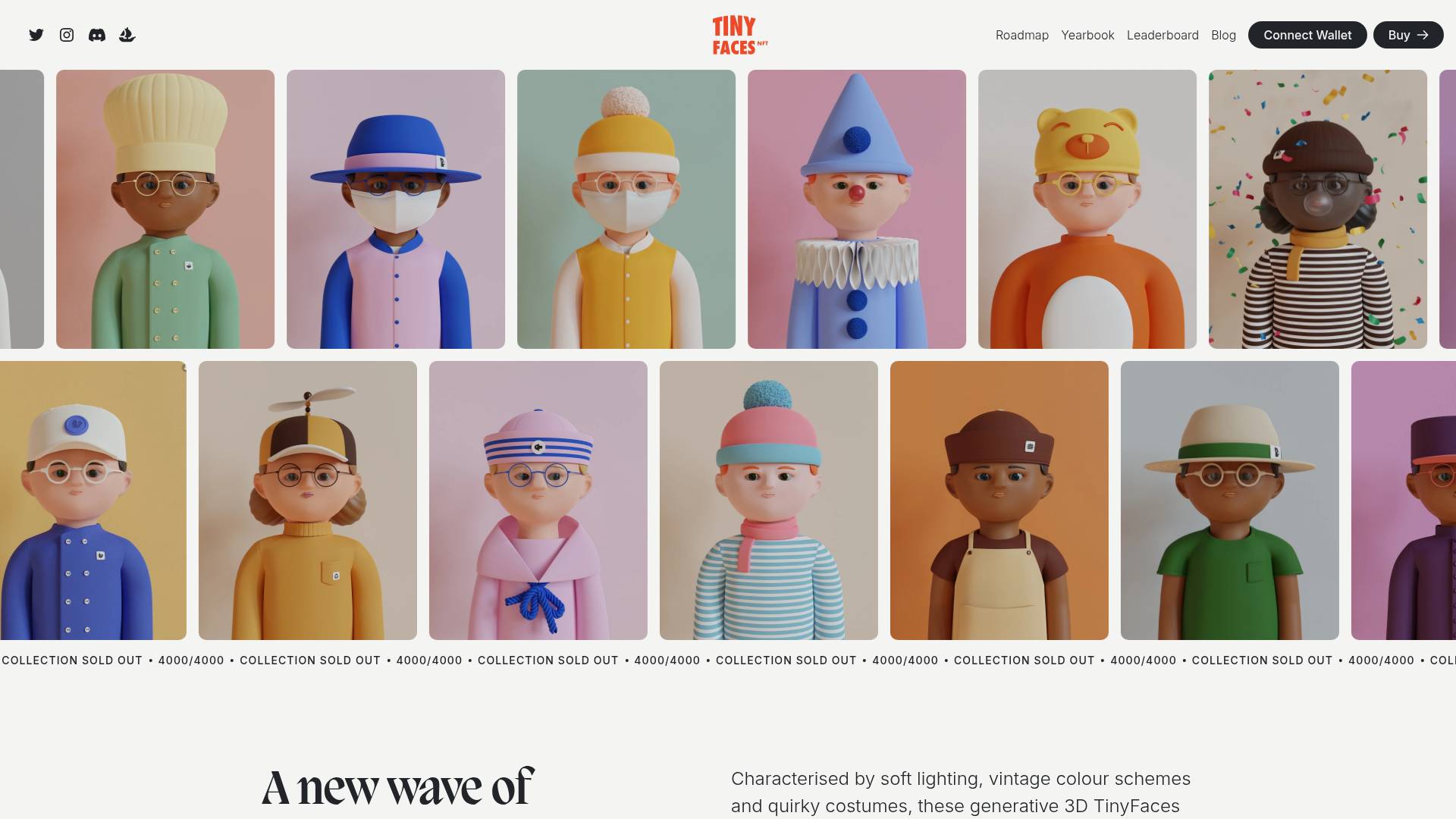
TinyFaces NFT Collection Landing Page
A high-fidelity Web3 landing page featuring an animated infinite image marquee, sticky navigation with wallet connection, a Swiper-based character carousel, and a collapsible FAQ accordion.
