FigJam Product Landing Page
A collaborative tool showcase featuring a centered hero section, logo marquee, vertical tabbed feature switcher, and interactive carousel for templates.
Overview
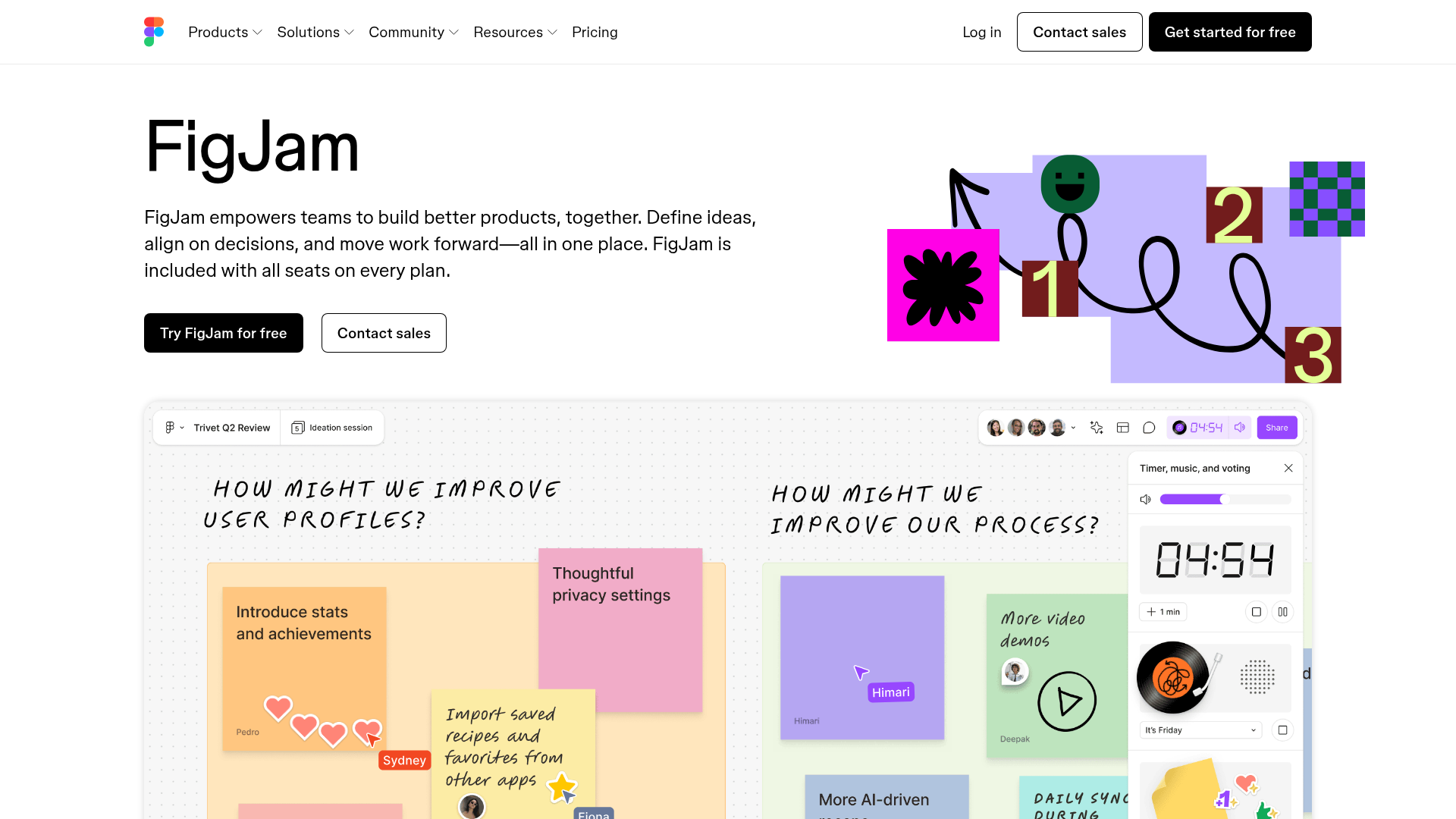
This landing page for FigJam, Figma's whiteboarding tool, represents a modern SaaS marketing template optimized for clarity and engagement. It is an excellent clone reference because it masterfully balances bold graphic elements with interactive feature demonstrations, such as vertical tab switchers and template carousels.
Design System
- Color Palette & Visual Hierarchy: The page uses a clean white background with high-contrast black primary buttons. Bright accent colors (pink, green, purple, yellow) are reserved for illustrative elements and interactive states, mirroring the playful nature of a whiteboard tool. Hierarchy is established through bold, oversized headings (H1, H2) and ample whitespace.
- Typography: The system utilizes a clean geometric sans-serif font. The scale is generous: the main headline is prominently oversized for impact, while subheads use a medium weight for readability. Monospaced elements and "handwritten" script accents are used within UI screenshots to simulate a live workspace environment.
- Page Structure: The layout follows a classic high-conversion flow:
- Hero: Split layout with text on the left and a dynamic illustration on the right.
- Logo Marquee: An infinite-scroll list of monochromatic partner logos for social proof.
- Interactive Feature Switchers: Vertical tabs on the left that update a large media display (images/videos) and descriptive text on the right.
- Template Gallery: A carousel-integrated section for browsing use cases with direct "Start with this template" calls to action.
- Feature Deep-Dives: Alternating sections (media left/text right and vice versa) detailing specific AI and collaborative capabilities.
- Reusable Components:
- Buttons: Two distinct variations—solid black primary and outlined secondary buttons with rounded corners.
- Interactive Tabs: A vertical tab list with distinct active states (high-contrast text + color bar indicators).
- Carousel: A swipeable/clickable container for card-based content.
- Motion Patterns: The HTML indicates the use of
Vimeoembeds andcanvaselements for light-weight animation. Transition states are triggered via scroll (theinviewclass in the HTML) and tab selection, utilizing opacity fades and 3D transforms (translate3d). - Implementation Clues: The structure uses a class-driven utility system (e.g.,
fig-2qv4kfor containers) and relies on a CMS (Sanity.io) for asset delivery. It implements accessible ARIA roles for regions, carousels, and tablists.
Use Cases
- Who should clone this: SaaS companies launching a complex collaborative tool that requires visual demonstrations of different workflows within a single interface.
- Effective Remixes:
- Portfolio Sites: Adapt the vertical feature switcher to showcase different project categories.
- Learning Platforms: Use the template carousel section to highlight various course modules or syllabi.
- Practical Directions: To remix, builders should maintain the layout's structural spacing but swap the playful illustrative style for brand-specific imagery. The navigation and hero section can be cloned as a standalone high-impact landing page.
- Suggested Clone Scope: For a fast win, clone the Hero and Logo Marquee. For an advanced project, the Vertical Tab Switching component is the most valuable reusable pattern for reducing page length while maintaining high information density.
Related Inspirations
MetaMusic Service Landing Page
Features a horizontal scrolling card deck, animated SVG illustrations, a partner logo marquee, and a multi-step process layout with notched corner UI components.
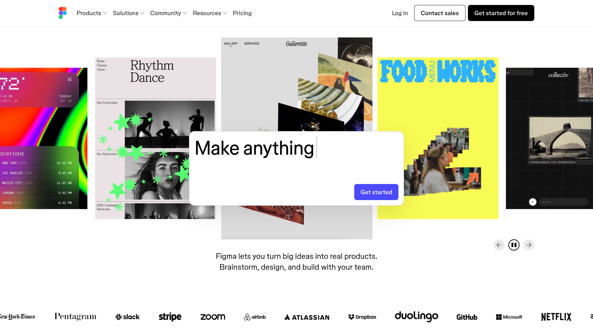
Figma Landing Page Gallery Hero
A dynamic landing page featuring a center-focused search bar hero, a horizontally-scrolling interactive video carousel, and a clean brand logo grid.
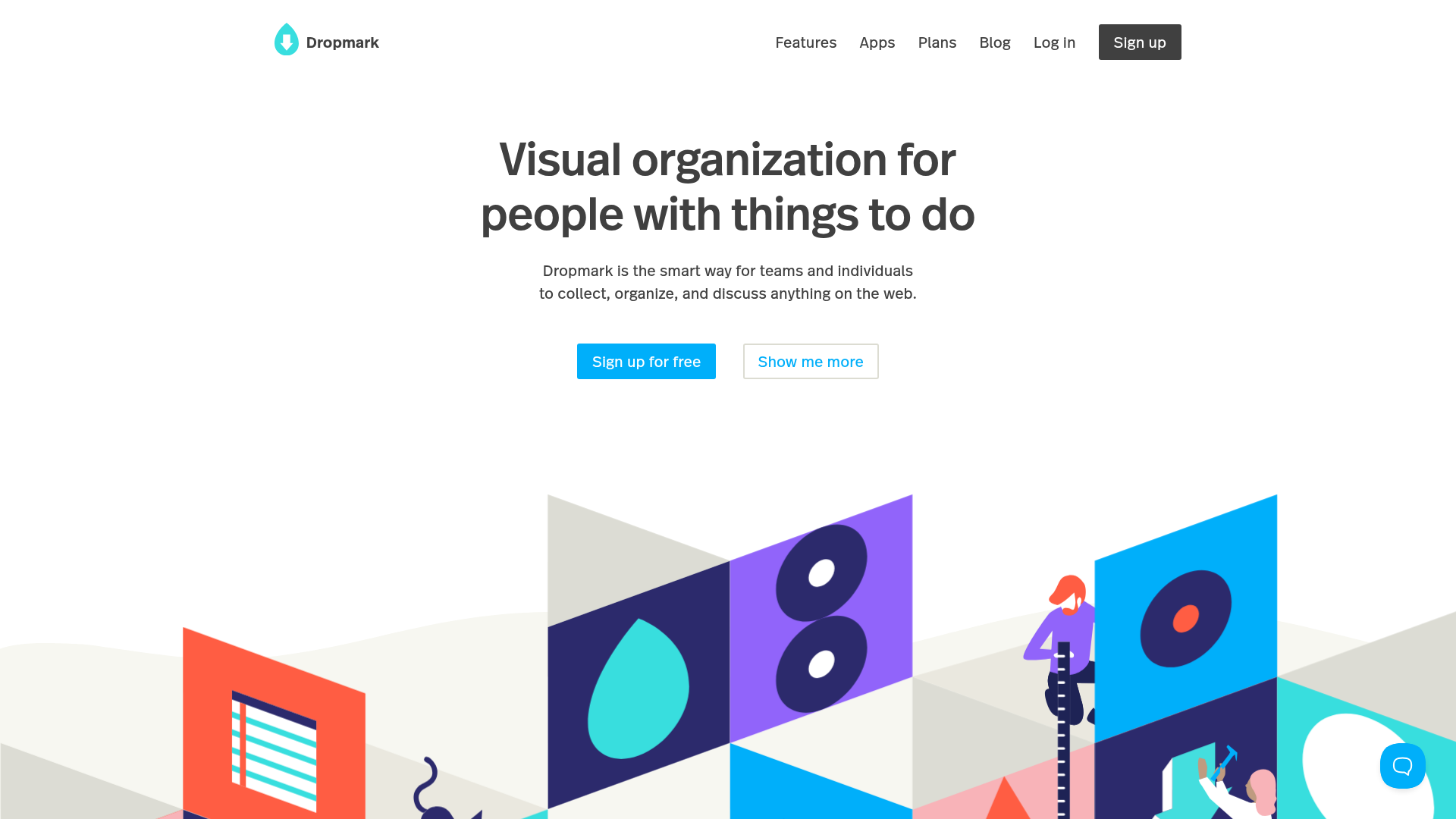
Dropmark Visual Organization Landing Page
Features a clean minimalist hero section with split-action buttons, a vibrant vector illustration footer, and an interactive horizontal flickity carousel for case studies.
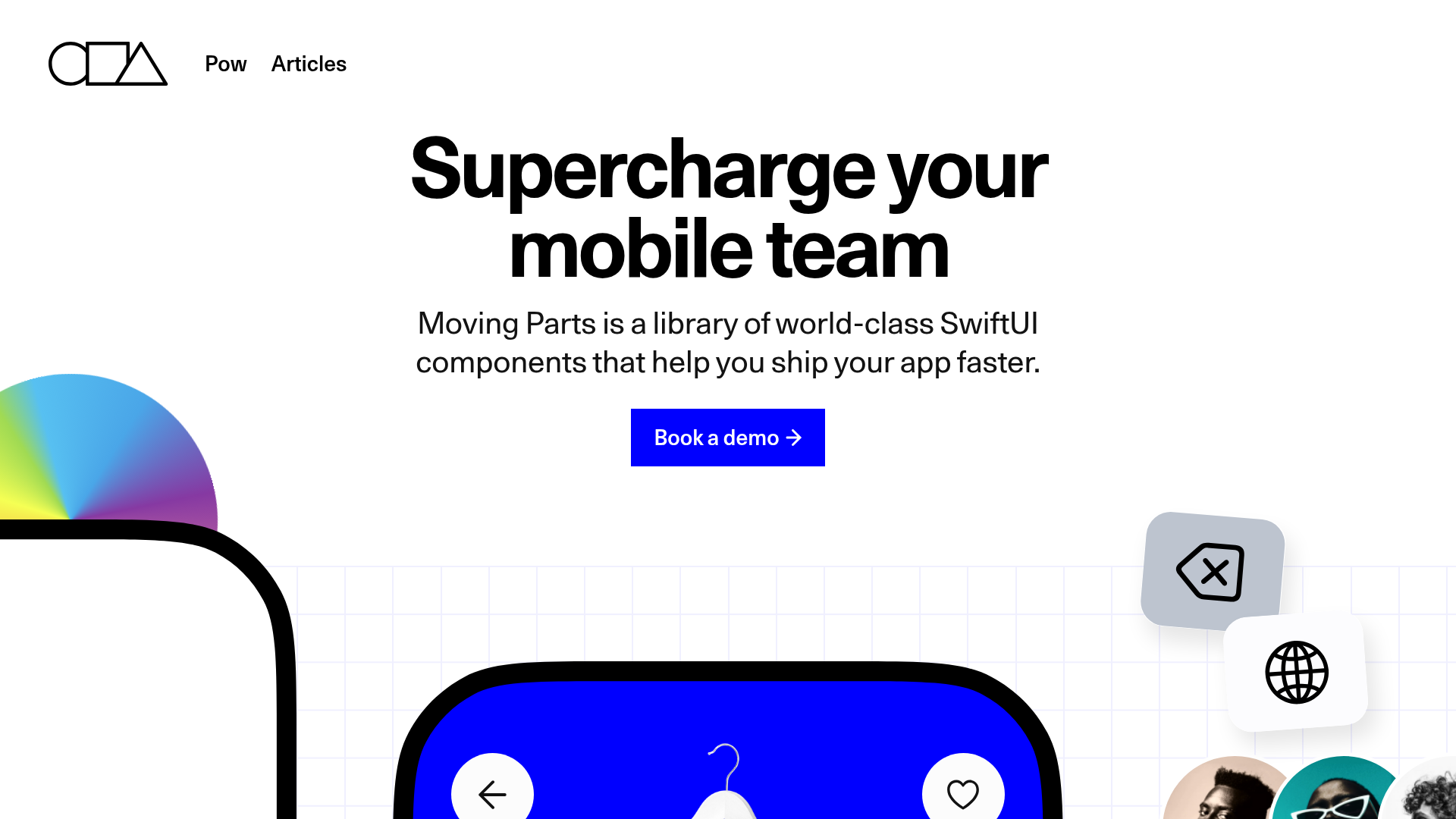
Moving Parts SwiftUI Component Library
A high-performance landing page featuring a interactive code comparison toggle, animated mobile UI previews, and a clean minimalist aesthetic for developer tools.

Slite SaaS Knowledge Base Landing Page
A clean SaaS hero section with a conversational headline, secondary call-to-action buttons, and a structured software interface preview featuring user testimonials.
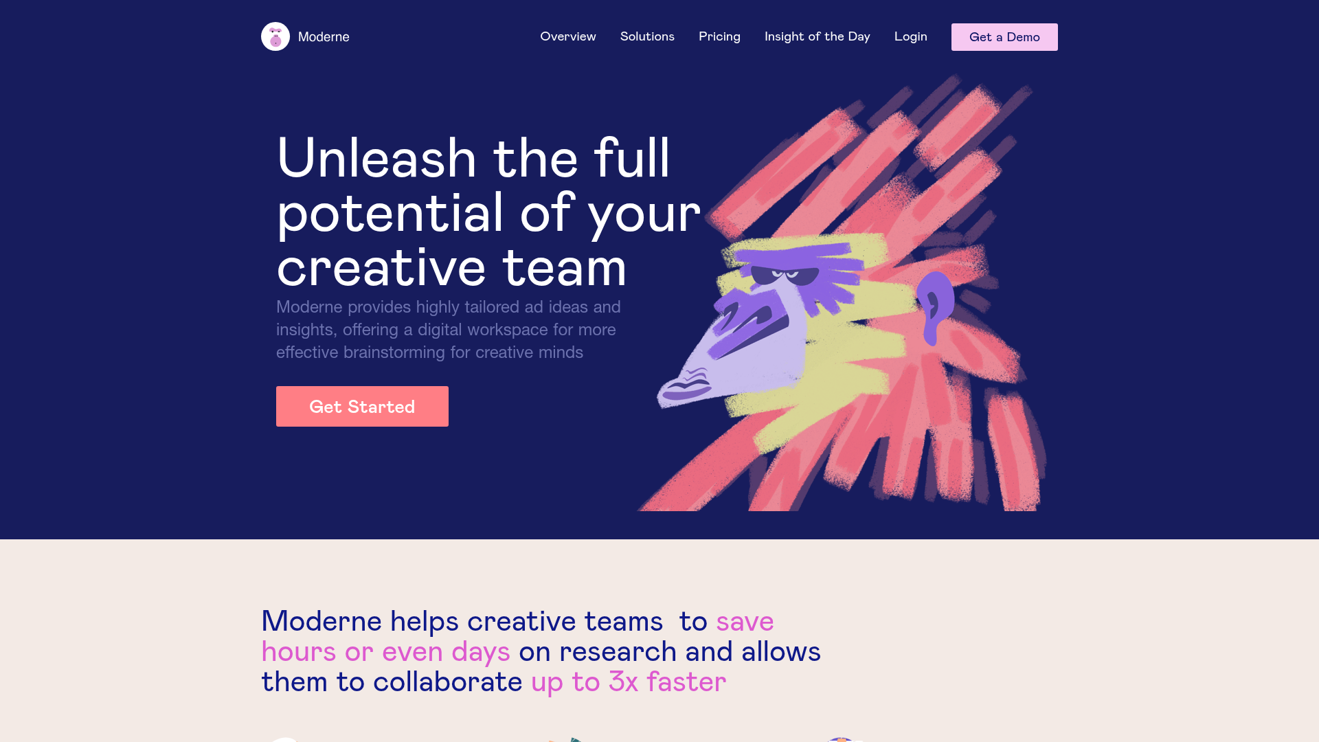
Moderne Creative Landing Page
A high-contrast landing page featuring a dark hero section with an artistic illustration overlay, distinct alternating content blocks, and a visual comparison bar chart component.
