EarlyDog Managed Ops Landing Page
A minimalist landing page featuring a bold geometric hero illustration, asymmetrical grid layouts, and clean typography for service-based businesses.
Overview
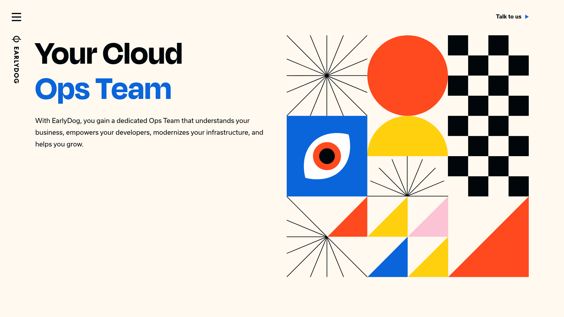
This landing page is a masterclass in minimalist B2B service positioning, utilizing bold Bauhaus-inspired geometric illustrations to visualizes complex cloud concepts. It is a strong reference for creators who want to communicate high-end technical expertise without relying on cliché stock photos or generic dashboards.
Design System
- Color Palette & Visual Hierarchy: A clean off-white (#FAF7F2 or similar) background provides a high-contrast base for primary-colored geometric accents (Cobalt Blue, Bright Red, Golden Yellow). Hierarchy is established through size; the blue "Ops Team" span and the massive vector illustration immediate draw the eye before leading to the secondary body text.
- Typography System: The site uses a clean, grotesque Sans-Serif (likely Inter or a custom variant). Headings feature tight letter spacing and heavy weights (Extrabold for H1). Body copy is generously spaced with high line-height for readability.
- Page Structure & Section Flow: The layout follows a classic Z-pattern but remains asymmetrical. It begins with a hero section where text and illustration share a grid-split, followed by alternating zig-zag sections of illustrations and feature text, concluding with a large-scale CTA.
- Reusable Components:
- Link Buttons: Minimalist text links with small arrow icons (
link-with-arrow) and framed action buttons. - Geometric Illustrations: Scalable SVG blocks that can be swapped while maintaining the grid alignment.
- Vertical Sidebar: A unique vertical brand label ("EARLYDOG") that acts as a decorative fixed-position element.
- Link Buttons: Minimalist text links with small arrow icons (
- Responsive Behavior: The HTML reveal a Tailwind CSS approach (
sm:grid-cols-6,md:grid-cols-12). On mobile, themd:row-span-3layout collapses into a single vertical column where the illustration typically moves below the heading to prioritize the value proposition. - Implementation Clues: The code uses utility-first CSS (Tailwind) and Alpine.js (indicated by
:class="{ 'xs:hidden': menuOpen }") for state-based interactions like the mobile menu toggle.
Use Cases
- Who should clone this: Engineering agencies, SaaS infrastructure tools, developer secondaries, and boutique consulting firms seeking a "sophisticated technical" aesthetic.
- Remix Directions: Swap the primary Cobalt Blue for a brand-specific accent color; replace the Bauhaus SVGs with isometric 3D renders for a more modern tech feel; or keep the grid structure but use the high-contrast typography for a portfolio site.
- Suggested Clone Scope: The hero section alone is a perfect starting point for any high-conversion landing page. The alternating feature grid is highly reusable across any service-based website. A full-page clone is recommended for those wanting to maintain the rigorous whitespace and balance of the original design.
Related Inspirations
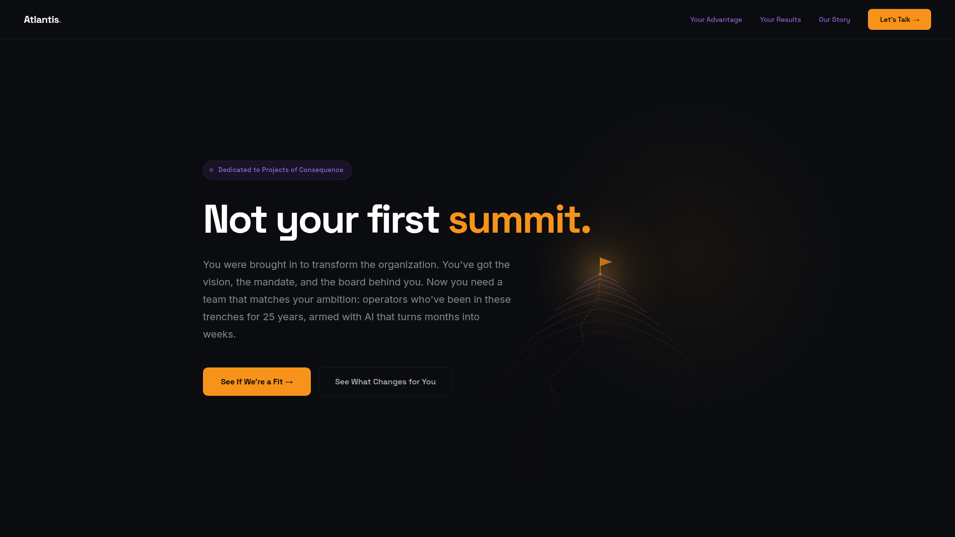
Atlantis Tech Engineering Services Landing Page
A dark-themed professional services layout featuring a custom SVG mountain hero, logo cloud, benefits grid, process timeline, and a dual-column 'fit' comparison section.

Good Glyphs Font Showcase Landing Page
A single-page layout featuring an interactive type tester, donation form with custom amount logic, and a contributor gallery using swiper-based glyph previews.
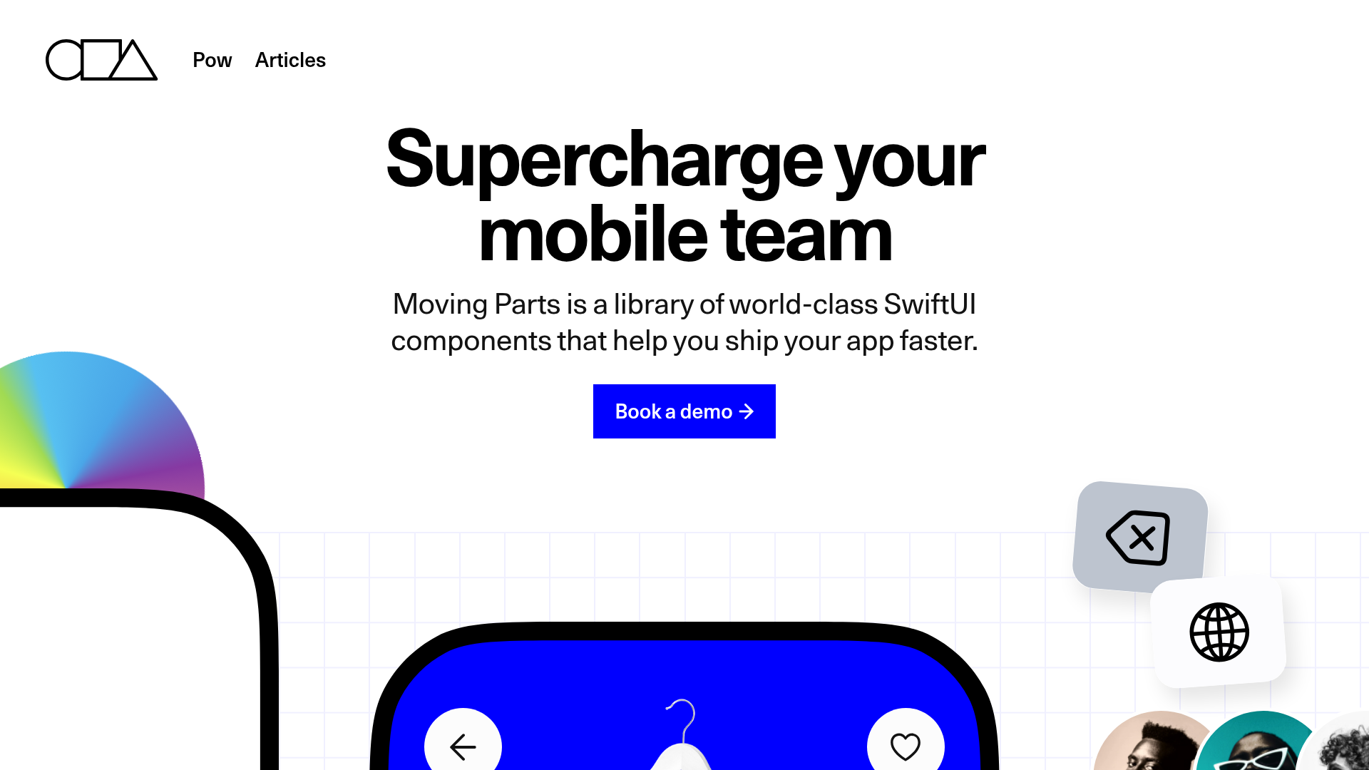
Moving Parts SwiftUI Component Library
A high-performance landing page featuring a interactive code comparison toggle, animated mobile UI previews, and a clean minimalist aesthetic for developer tools.
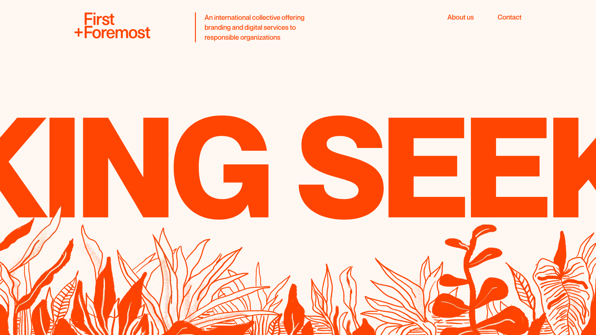
First+Foremost Agency Landing Page
A bold agency site featuring high-contrast typography, an animated botanical hero section, horizontal scroll product sliders, and accordion-style service explorers.
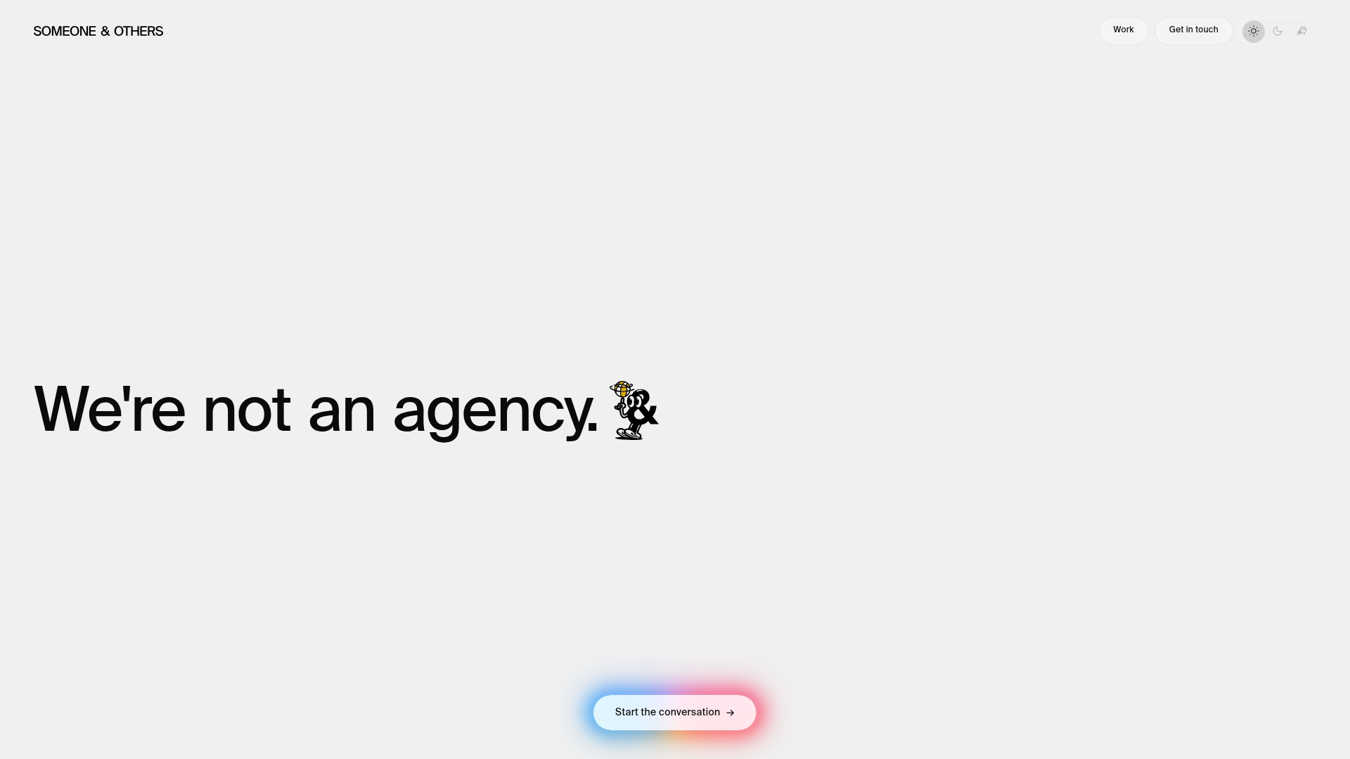
Someone & Others Studio Landing Page
A minimalist studio portfolio featuring scroll-reveal typography, overlapping sticky case study cards, and a vibrant glassmorphism CTA with animated glow rings.
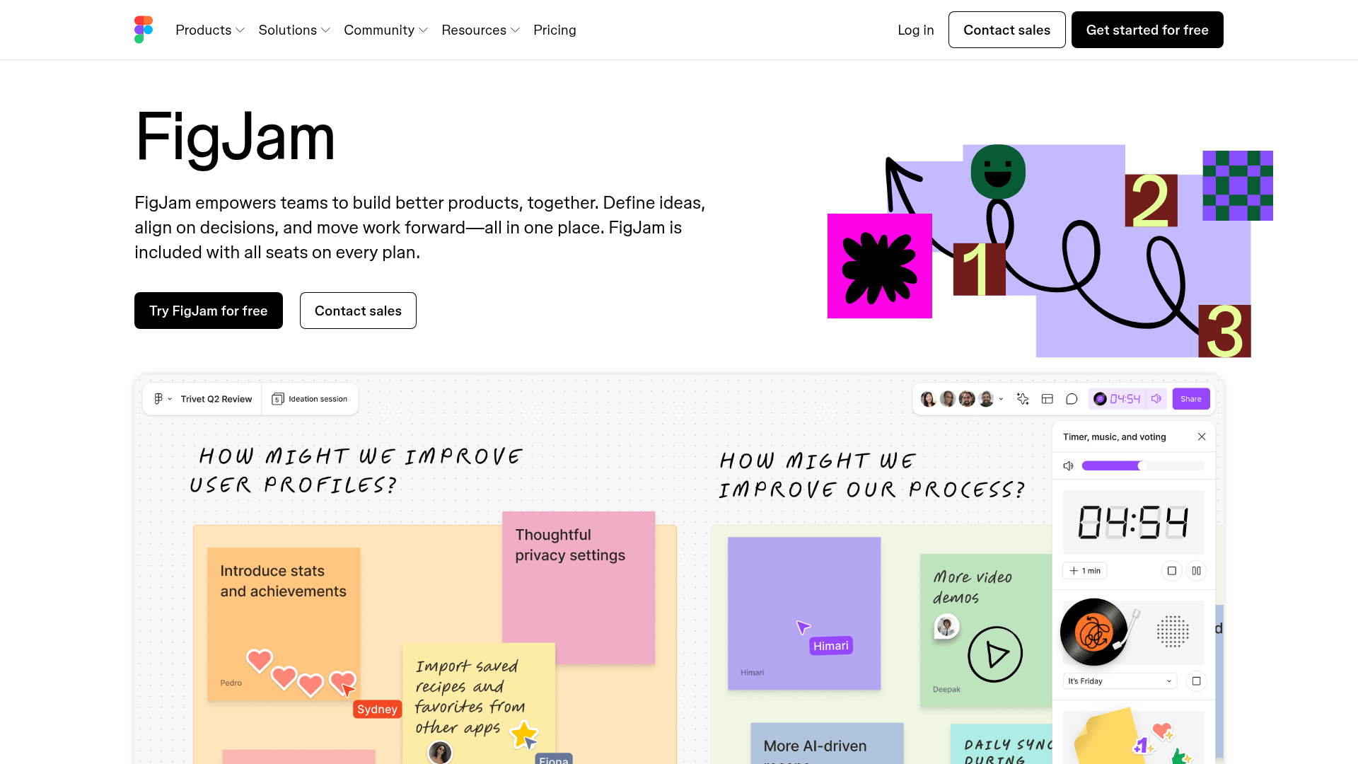
FigJam Product Landing Page
A collaborative tool showcase featuring a centered hero section, logo marquee, vertical tabbed feature switcher, and interactive carousel for templates.
