DNCO Agency Portfolio Case Studies
A high-impact portfolio featuring an animated full-screen hero video, a multi-category filtering menu, and a clean grid of project tiles with hover-state transitions.
Overview
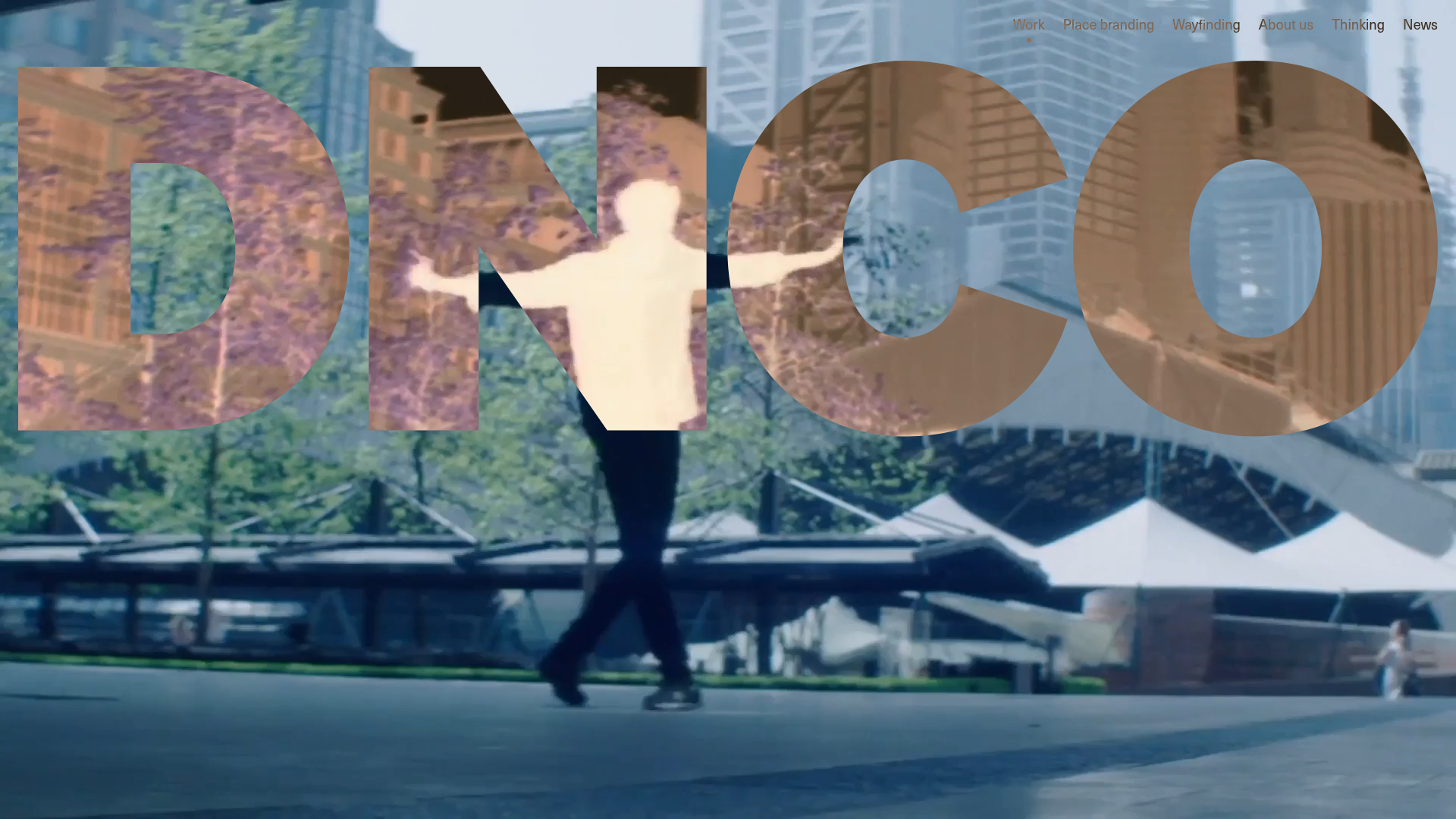
This high-impact agency portfolio uses a full-screen, atmospheric hero video and large-scale typography to establish immediate brand authority. It is an excellent reference for builders wanting to combine immersive media with a sophisticated, data-driven filtering system for a large volume of case studies.
Design System
- Color Palette & Visual Hierarchy: A high-contrast monochrome base (black/white) is used throughout. A unique implementation of
mix-blend-differenceon fixed navigation elements ensures readability against both light images and dark video backgrounds. Secondary hierarchy is established with neutral grays (text-neutral-400) for project descriptions. - Typography: The design uses a bold, large-scale sans-serif for impact. Headers feature tight line-heights (
leading-none), while subheaders and body text maintain a minimalist aesthetic. The DNCO logo and primary headings occupy significant negative space to emphasize scale. - Page Structure: The layout follows a linear narrative: a full-height cinematic hero section, a large-text mission statement, a structured filtering menu, and finally an dense grid of project tiles.
- Reusable Components:
- Hero Video: Uses an absolute-inset video with an object-cover fit for a cinematic look.
- Filtering Menu: A categorized vertical and horizontal list (
menutag) using opacity changes (opacity-50toopacity-100) to indicate active states. - Project Cards: A responsive grid using
aspect-[3/2]containers that mix static images and auto-playing looped MP4 thumbnails. - Lozenges: Small, categorized tags (
dnco--lozenge) used for quick project classification.
- Interactions & Motion: Hover states are central to the experience. Portfolio tiles use a subtle scale-up transition (
group-hover:scale-105) combined with an opacity reduction on the media to reveal depth. Text transitions from gray to black on hover. - Responsive Behavior: The grid adapts from a single column on mobile to a dense 4-column or 8-column layout on larger viewports. The navigation shifts from a top-right horizontal list to a dedicated mobile menu trigger.
Use Cases
- Who should clone this: Creative agencies, architectural firms, and high-end production studios that need to showcase a large volume of visual-heavy work without feeling cluttered.
- Effective Remixes: This pattern works well for e-commerce lookbooks or premium real estate listings where visual immersion and category-based navigation (by location or style) are paramount.
- Remix Directions: Replace the specific filter categories (Sector, Location) with product attributes; swap the heavy video backgrounds for high-resolution static photography for faster load times; or extract only the "mix-blend" fixed navigation for a modern single-page site.
- Clone Scope: For a fast win, clone the project grid and the specific hover-state logic. For a comprehensive build, replicate the interactive filtering logic which dynamically reveals sub-category lists.
Related Inspirations

Christopher Doyle Agency Portfolio Layout
A minimalist, typography-led portfolio featuring a wide-margin grid system, smooth fade-in animations, and simple image-focused project cards.

Clase Agency Branding Portfolio
A minimalist design agency portfolio featuring a typographic hero section, full-width image articles, sticky title bars, and integrated scrolling text marquees for a clean editorial layout.
Something Else Portfolio Slideshow
A minimalist design studio portfolio featuring a full-width image and video slideshow with large-scale typography, sticky navigation, and centered captions.
David Fiz Visual Design Portfolio
A minimalist portfolio featuring a fixed sidebar navigation paired with an immersive, full-screen media showcase and interactive project-specific image carousels.

Lundqvist & Dallyn Studio Portfolio
Minimalist design studio portfolio featuring a custom video loader, world clock navigation, and a fluid masonry-style grid for high-quality photography and type design showcases.

AcolorBright Design Agency Portfolio
Minimalist bento-style portfolio layout featuring numerical section headers, horizontally scrolling project teasers, and a clean grayscale client logo grid.
