Ino Jewelry Minimalist E-commerce Showcase
A minimalist Shopify storefront featuring a full-screen parallax hero, a filterable product grid with interactive hover states, and smooth locomotive scrolling.
Overview
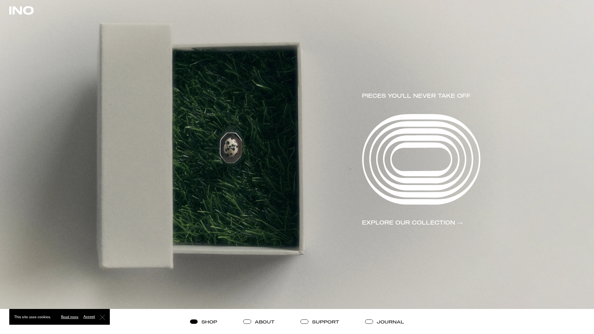
This minimalist Shopify storefront for Ino Jewelry is a masterclass in editorial-style e-commerce. It utilizes a high-impact, full-screen parallax hero section and a sophisticated typography-led layout that transforms a standard product catalog into a high-end brand experience. It is an excellent reference for developers wanting to implement smooth locomotive scrolling and advanced hover-triggered image states in a clean, professional context.
Design System
- Color Palette & Visual Hierarchy: The site uses an ultra-muted, neutral palette consisting of off-white (#F2F2F2 style), soft greys, and deep blacks for text. The imagery provides the primary color (grass green, gold, silver), while the UI elements rely on negative space to create a premium feel.
- Typography System: A bold, wide sans-serif typeface (as seen in the "INO" logo) defines the brand identity. Product titles and prices use a functional, wide Grotesk-style font at a smaller scale, creating a structured, architectural aesthetic. The "Explore Our Collection →" link uses a classic serif or high-contrast sans for an editorial touch.
- Page Structure:
- Parallax Hero: A split-screen section with a central product image overlapping an organic, grass-textured background.
- Horizontal Navigation Bar: A sticky bottom-anchored menu containing "SHOP", "ABOUT", "SUPPORT", and "JOURNAL".
- Filterable Grid: A dense product grid with category filters (Necklaces, Rings, etc.) at the top.
- In-line Editorial Content: Journal articles are interspersed within the product grid to break commercial monotony.
- Reusable Components:
- Interactive Product Cards: Each card features a
product-featuredandproduct-hoverimage class, facilitating a seamless transition between product shots on mouseover. - Sticky Header/Search: A minimalist fixed search input at the top and a floating cookie banner at the bottom left.
- Geometric UI Elements: Distinctive pill-shaped and octagonal button indicators for menu items.
- Interactive Product Cards: Each card features a
- Motion Patterns: The site relies on the
data-scroll-speedattribute for parallax effects. Page transitions use matrix3d transforms, indicating the use of Locomotive Scroll for a "weighted" scrolling sensation. Hover states on products are instantaneous but smooth, swapping static images for GIFs or alternative angles. - Implementation Clues: Developed on Shopify, the code utilizes custom data attributes (
data-component="hero-image",data-tags="Rings") for client-side filtering and script-based layout management.
Use Cases
- Who should clone this: Small-batch jewelry brands, high-end accessories designers, or boutique fragrance houses who want an editorial "lookbook" feel rather than a standard commercial grid.
- Effective Remixes: Adapt this layout for a luxury furniture brand by swapping the grass-textured hero for architectural photography. The filterable grid can be easily remixed to showcase portfolio projects for creative agencies.
- Practical Directions: Builders should focus on the Product Card Component first, as the hover image swap is highly effective for any visual product. The Sticky Bottom Menu is a unique UX pattern that can be reused for mobile-first navigation on any site.
- Clone Scope: A full-page clone is recommended to maintain the specific scroll rhythm, but the Hero Section alone is worth cloning for its successful blend of static text over parallax imagery.
Related Inspirations
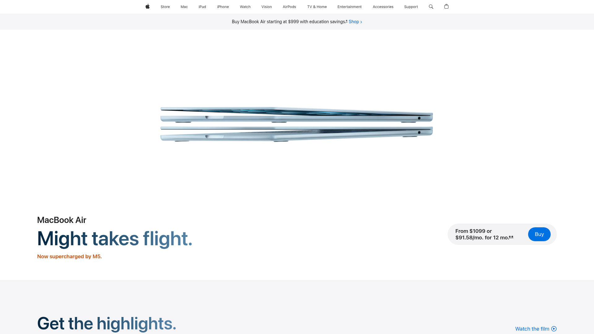
Apple MacBook Air Product Page Layout
A high-fidelity landing page featuring a minimalist product hero section, sticky top navigation, and clear call-to-action pricing components.

Isla Beauty Skincare E-commerce Store
A clean Shopify-based storefront featuring a split-hero landing page, a step-by-step product system carousel, and a split-screen testimonial section with localized product image sidebars.
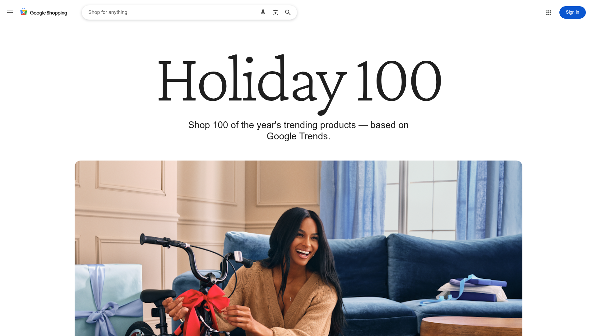
Google Holiday 100 Curator Landing Page
A minimalist e-commerce showcase featuring a wide hero section, clean search integration, and a bold typography-driven header designed for trending product collections.

Finn Pet Supplements Landing Page
An e-commerce landing page featuring high-contrast typography, a sticky brand logo banner, parallax scroll effects on product headers, and a clean product grid.
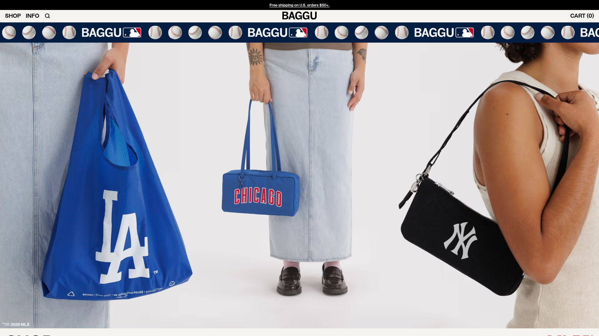
BAGGU Minimalist E-commerce Hero Template
A clean retail landing page layout featuring a full-width high-impact hero section, a sticky integrated banner, and a minimalist navigation header optimized for product launches.
Graf Lantz Minimalist E-commerce 404
A clean Shopify-based error page featuring a full-width video hero with a CTA button, a detailed multi-column footer, and a sophisticated slide-out cart drawer.
