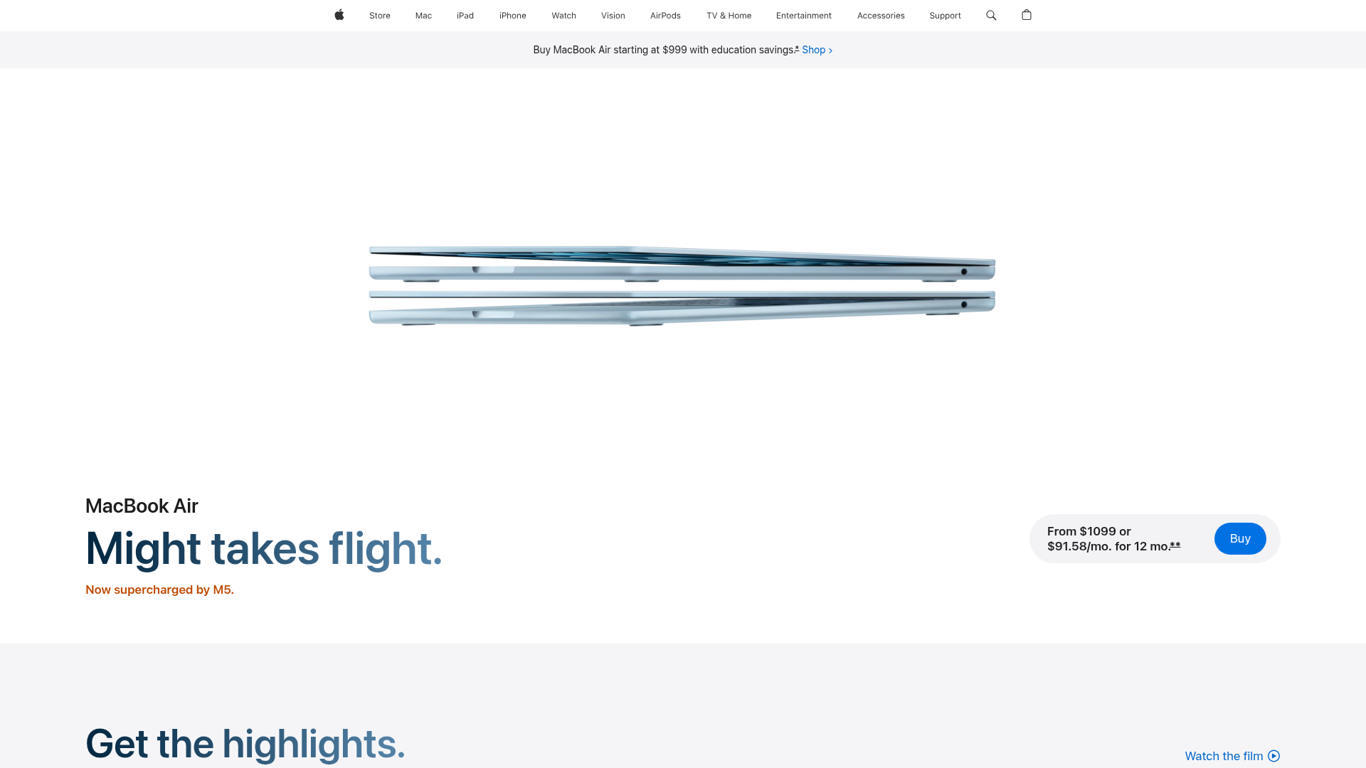
Apple MacBook Air Product Page Layout
A high-fidelity landing page featuring a minimalist product hero section, sticky top navigation, and clear call-to-action pricing components.
Overview
This landing page is a masterclass in high-end product marketing, utilizing extreme whitespace and a minimalist layout to emphasize industrial design. It is a prime reference for builders looking to implement a premium 'Apple-style' aesthetic characterized by clean typography and a highly structured visual hierarchy.
Design System
- Color Palette & Visual Hierarchy: The site uses a monochrome base (pure white #FFFFFF background and light gray #F5F5F7 offsets) to allow the metallic pastel colors of the MacBook Air to pop. Contrast is used strategically; primary headings use dark charcoal, while sub-indications use a vibrant orange to highlight the new M3 chip.
- Typography System: A neo-grotesque sans-serif (SF Pro style) is used across all levels. The hero features a large, semi-bold display font for the tagline, while price and financing options are kept small and grouped to reduce cognitive load.
- Page Structure: The layout follows a top-down scroll: a utility navigation bar, a thin promotional banner, a central product hero featuring floating devices, and a footer-style action bar tucked to the side of the main copy.
- Reusable Components:
- Navigation Bar: A global sticky header with low-contrast icons.
- Price Pill: A rounded, light-gray container that groups the price, financing options, and a high-contrast 'Buy' blue call-to-action button.
- Typography Clusters: Left-aligned text groups that stack product name, headline, and sub-headline with consistent vertical rhythm.
- Implementation Clues: The HTML structure uses semantic landmarks and utility-driven styling (likely custom CSS for flexible grid layouts) to maintain perfectly centered product imagery while keeping text elements aligned to the left margins.
Use Cases
- Who should clone this: Developers building landing pages for hardware, consumer electronics, or high-end physical products where the aesthetic of the item is the main draw.
- Remix Potential: Software-as-a-Service (SaaS) companies can remix this by swapping the hardware image for high-fidelity dashboard screenshots or product walkthrough animations.
- Practical Directions: Builders should clone the 'Price Pill' component as a modular piece for any e-commerce checkout flow. For a quick project, focus on cloning the hero section's layout logic—specifically how the large imagery is balanced against the asymmetrical text block to the left.
- Suggested Scope: A full-page clone is ideal for brand-centric releases, while a section clone of the navigation and hero area is sufficient for standard product detail pages (PDPs).
Related Inspirations
Ino Jewelry Minimalist E-commerce Showcase
A minimalist Shopify storefront featuring a full-screen parallax hero, a filterable product grid with interactive hover states, and smooth locomotive scrolling.

Isla Beauty Skincare E-commerce Store
A clean Shopify-based storefront featuring a split-hero landing page, a step-by-step product system carousel, and a split-screen testimonial section with localized product image sidebars.

Google Holiday 100 Curator Landing Page
A minimalist e-commerce showcase featuring a wide hero section, clean search integration, and a bold typography-driven header designed for trending product collections.

Finn Pet Supplements Landing Page
An e-commerce landing page featuring high-contrast typography, a sticky brand logo banner, parallax scroll effects on product headers, and a clean product grid.
BAGGU Minimalist E-commerce Hero Template
A clean retail landing page layout featuring a full-width high-impact hero section, a sticky integrated banner, and a minimalist navigation header optimized for product launches.
Graf Lantz Minimalist E-commerce 404
A clean Shopify-based error page featuring a full-width video hero with a CTA button, a detailed multi-column footer, and a sophisticated slide-out cart drawer.
