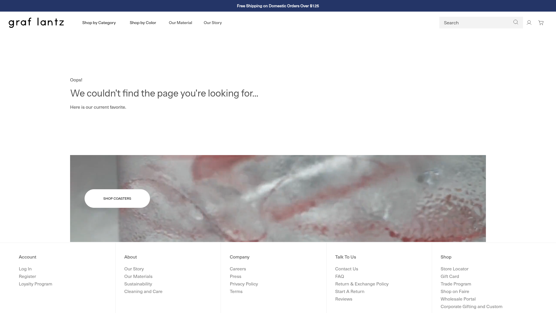
Graf Lantz Minimalist E-commerce 404
A clean Shopify-based error page featuring a full-width video hero with a CTA button, a detailed multi-column footer, and a sophisticated slide-out cart drawer.
Overview
This 404 error page from Graf Lantz demonstrates how to maintain brand authority and drive conversions even on missing pages. It replaces the standard dead-end with a sophisticated minimalist layout featuring a high-impact video hero and a complete e-commerce navigation framework. It is a strong reference for creators looking to turn technical errors into discovery opportunities through curated "favorites" and a robust footer architecture.
Design System
- Color Palette & Visual Hierarchy: The design uses a high-contrast monochromatic base (pure white backgrounds with deep charcoal text) accented by a navy blue announcement bar. Visual weight is heavily focused on the full-width media section in the center, which serves as the primary visual anchor.
- Typography: The system relies on a clean, modern sans-serif (Instrument Sans per the source code). Hierarchy is established through generous letter-spacing on subheadings and weight shifts, using large, thin-weight headers for error messaging and bold uppercase for calls to action.
- Page Structure: The flow follows a structured e-commerce template: global announcement bar -> clean header with search and utility icons -> centered error message -> full-width video/image hero with pill-shaped CTA -> multi-column information-dense footer.
- Reusable Components:
- Header/Nav: Minimalist logo with a text-based search input field.
- Pill Button: A rounded "pill" style button overlaying media with subtle hover states.
- Multi-column Footer: A 5-column grid layout for deep site mapping (Account, About, Company, Talk To Us, Shop).
- Slide-out Cart: The source code indicates a sophisticated
cart-dropdownwith gift-note options and "Pair with" cross-sell widgets.
- Interaction Patterns: The design utilizes subtle fade-in animations (AOS attributes visible in HTML) and a video background for dynamic texture without high cognitive load.
- Implementation Clues: Built on the Shopify engine, it uses a "section-based" architecture. Notable utilities include
flickityfor the announcement slider ands-accordionfor mobile navigation elements.
Use Cases
- Who should clone this: E-commerce developers building Shopify themes or custom headless storefronts who want a professional, high-retention 404 strategy.
- Product Remixing: Perfectly suited for premium lifestyle brands, home goods, or minimalist fashion labels where visual aesthetics are as important as the utility.
- Remix Directions:
- Discovery-led: Swap the "Shop Coasters" video hero for a personalized product recommendation grid based on the user's recent history.
- Support-led: Replace the video with a simplified contact form or a searchable FAQ widget while keeping the minimalist header/footer.
- Clone Scope: A full-page clone is recommended to capture the seamless integration between the technical error messaging and the complex footer/navigation hierarchy that ensures the user never feels "lost."
Related Inspirations

Isla Beauty Skincare E-commerce Store
A clean Shopify-based storefront featuring a split-hero landing page, a step-by-step product system carousel, and a split-screen testimonial section with localized product image sidebars.
LAK Gallery Minimalist E-commerce Showcase
A clean collectible design shop featuring an alphabetical grid layout, category-driven horizontal scrolls, and high-contrast typography for luxury product catalogs.
Apple iPhone Product Showcase Landing Page
Minimalist tech storefront featuring a clean icon-based navigation menu, horizontal device lineup cards, and high-quality hero imagery for hardware product marketing.

Context Gallery High-End Furniture Landing Page
A minimal editorial layout featuring a multi-column product carousel, designer biographies with image-text pairings, and a magazine-style content grid for curated design stories.

Glein Minimalistic Bento Grid eCommerce
A clean, modular layout using a bento-style responsive grid of text teasers and large-scale product imagery for lookbooks and collection browsing.

Stojo Collapsible E-commerce Storefront
A Shopify layout featuring a prominent discount modal, mosaic grid hero sections, and clean product cards with integrated color swatches and quick-buy functionality.
