Spline 3D Design Software Footer
A dark-themed website footer and navigation layout featuring a multi-column site map, social media icon integration, and a sleek top announcement bar.
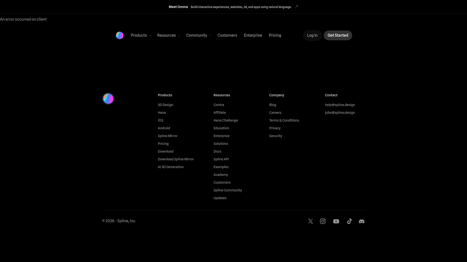
Overview
This landing page fragment demonstrates a sophisticated dark-mode UI for a high-tech design software, Spline. It serves as an excellent reference for builders looking to implement a structured, information-dense footer and sticky navigation layout that maintains high legibility and brand consistency.
Design System
- Color Palette & Visual Hierarchy: The design uses a deep black (#000000) background to emphasize white and light-gray content. Brand identity is reinforced with vibrant, iridescent spherical logos. Hierarchy is established through font weight and gray-scaling: headers are bold white, while sub-links use a softer gray to reduce visual noise.
- Typography: Sans-serif typography is used throughout with a tight, modern aesthetic. The system utilizes a hierarchical scale: bold sans for column headers (e.g., "Products", "Resources") and a regular weight for footer links and the top announcement bar text.
- Page Structure: The layout follows a classic SaaS hierarchy starting with a top announcement bar for external cross-promotion, followed by a primary navigation header with nested dropdown indicators, and ending with a four-column site map footer.
- Reusable Components:
- Navigation Bar: Feature-rich header with logo, dropdown menus, and distinct button styles (outline "Log In" vs. solid, rounded "Get Started").
- Multi-column Footer: A balanced layout segmenting product links, resources, company info, and contact details.
- Social Icon Strip: Minimalist monochrome icon set for horizontal integration at the base of the page.
- Implementation Clues: The HTML confirms the use of Next.js (
id="__next") and SCSS modules for styling. The announcement bar is structured as a dedicated container (TIhqCa__container) that switches between desktop and mobile-specific anchor tags for responsive visibility.
Use Cases
- SaaS & Tooling Products: Ideal for software platforms that need to organize complex documentation, community resources, and multiple product tiers within a single navigational structure.
- Portfolio & Agency Sites: The minimalist dark theme and sophisticated typography can be easily adapted to showcase creative services or technical portfolios.
- Remix Directions:
- Brand Swap: Replace the iridescent logos with your own brand assets and adjust the accent colors of the solid buttons.
- Architecture Adaptation: Modify the four-column footer content into a three or five-column layout depending on the depth of your site's information architecture.
- Selective Cloning: Builders should prioritize cloning the footer and the announcement bar as standalone modules that can be dropped into any existing modern web project.
Related Inspirations
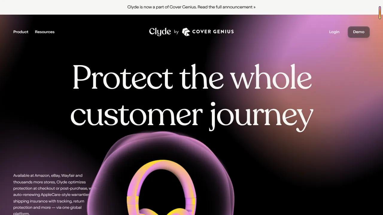
Clyde Insurance Landing Page with Animated Hero
A dark-themed landing page featuring a prominent serif headline, a product-focused animated blob hero, and a clean minimalist navigation bar.
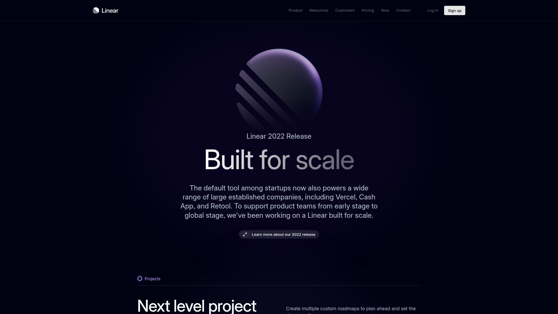
Linear 2022 Product Release Page
A high-end dark mode product launch page featuring a 3D glassmorphic logo, sleek typography, and a structured layout for feature announcements.
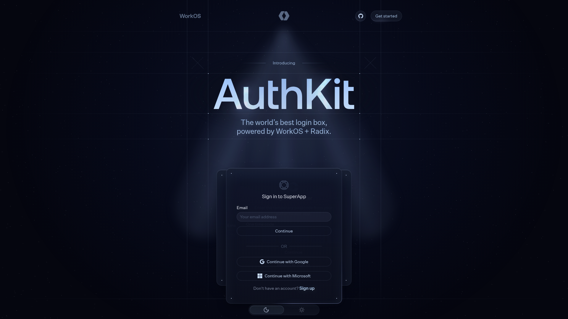
AuthKit Dark Mode Product Landing Page
A high-end dark themed landing page featuring animated auth-state cards, a grid-based hero section, a horizontal feature slider, and interactive customization pickers.
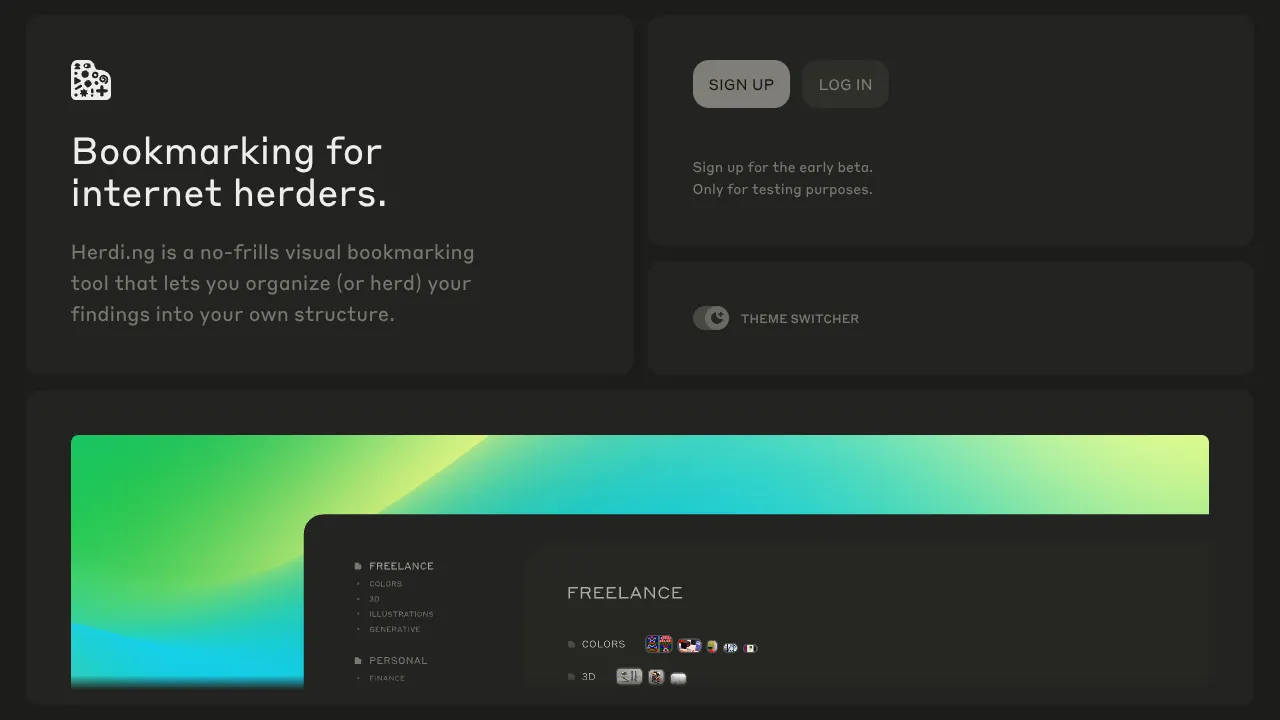
Herding Visual Bookmark Bento Layout
A dark-themed landing page featuring a sophisticated bento grid layout with drag-and-drop interactive components, smooth state transitions, and a custom theme switcher.
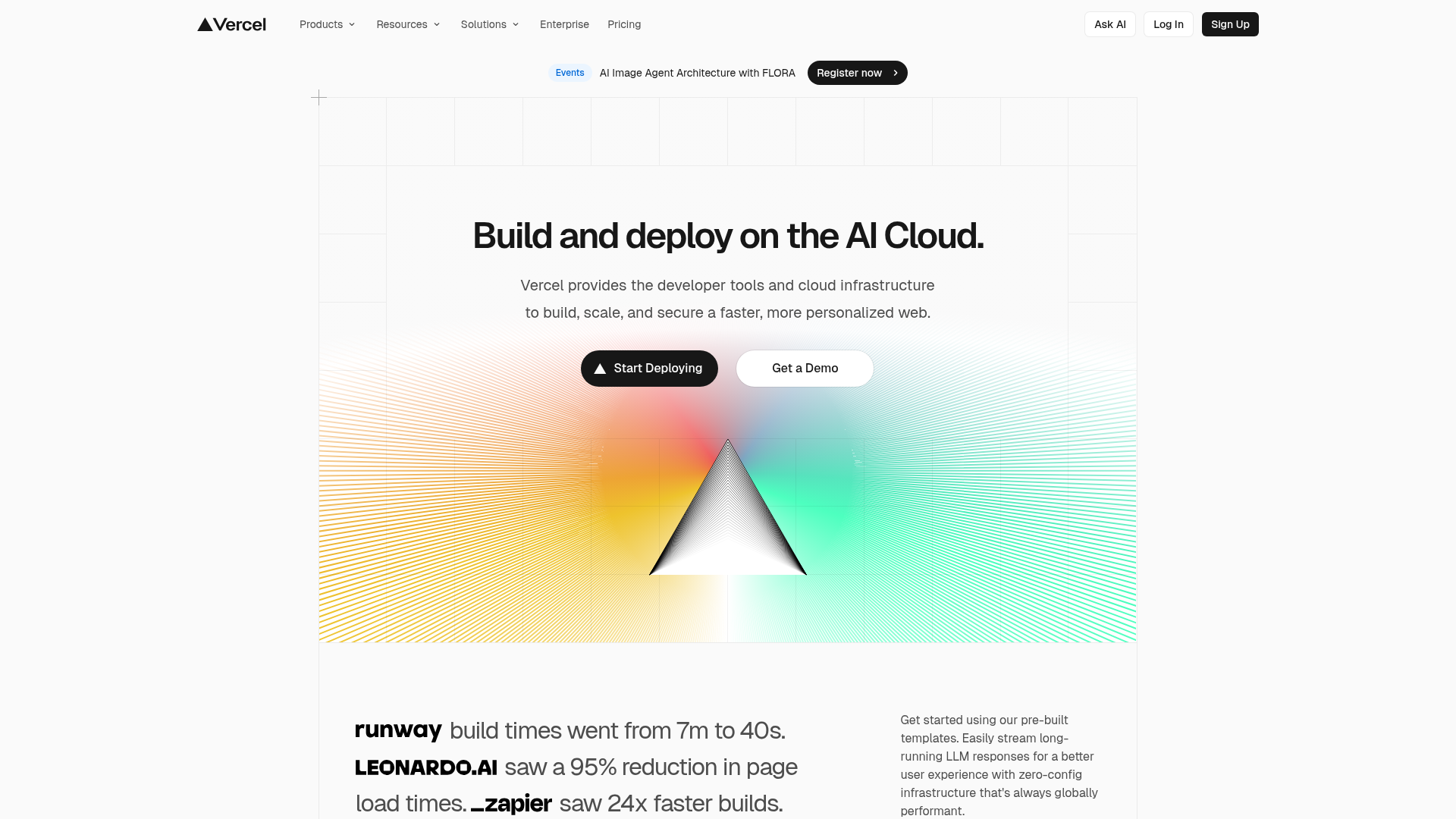
Vercel AI Cloud Landing Page
A modern landing page featuring a minimalist dark-themed navbar, a grid-overlay hero section with radial color gradients, and high-contrast typography for customer success stories.
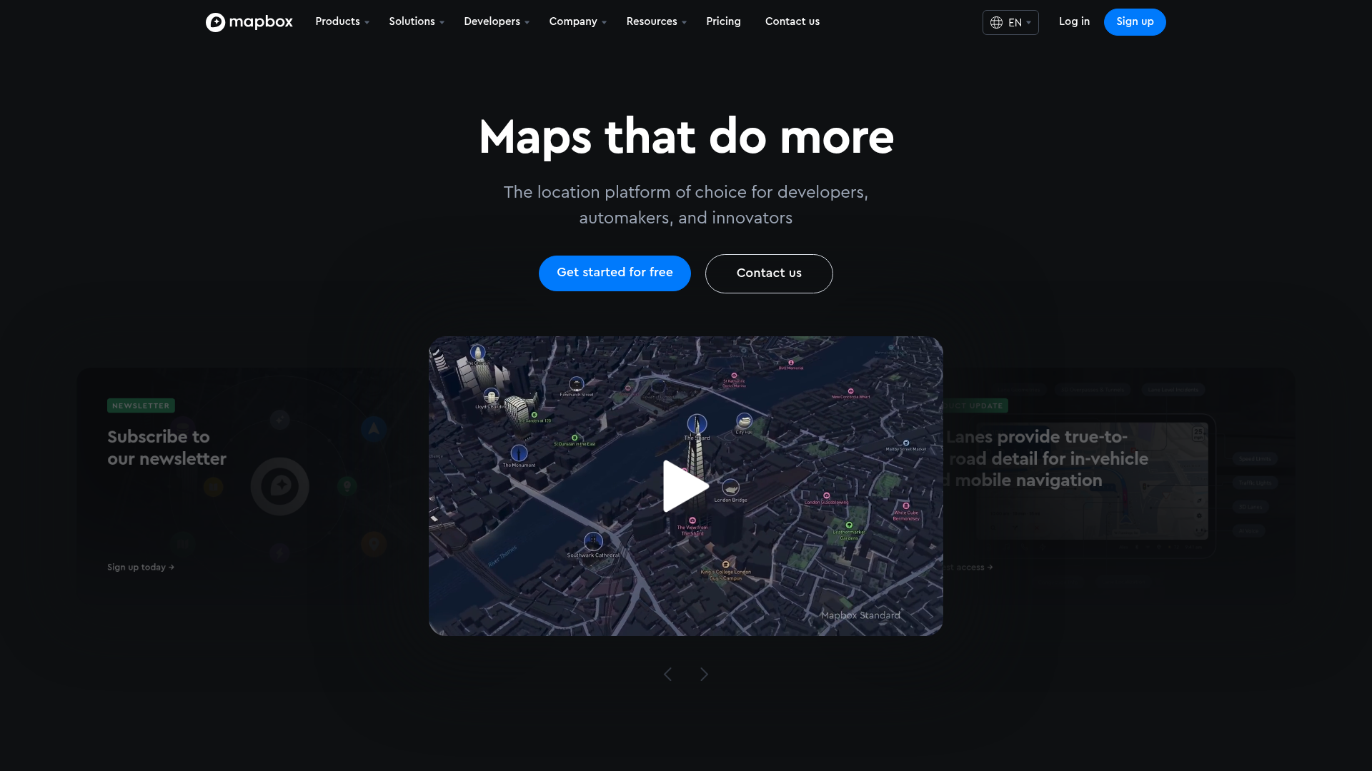
Mapbox SaaS Hero and Showcase Landing
A dark-themed landing page featuring a 3D-effect carousel, layered product highlight cards, tabbed customer stories, and a logo proof grid.
