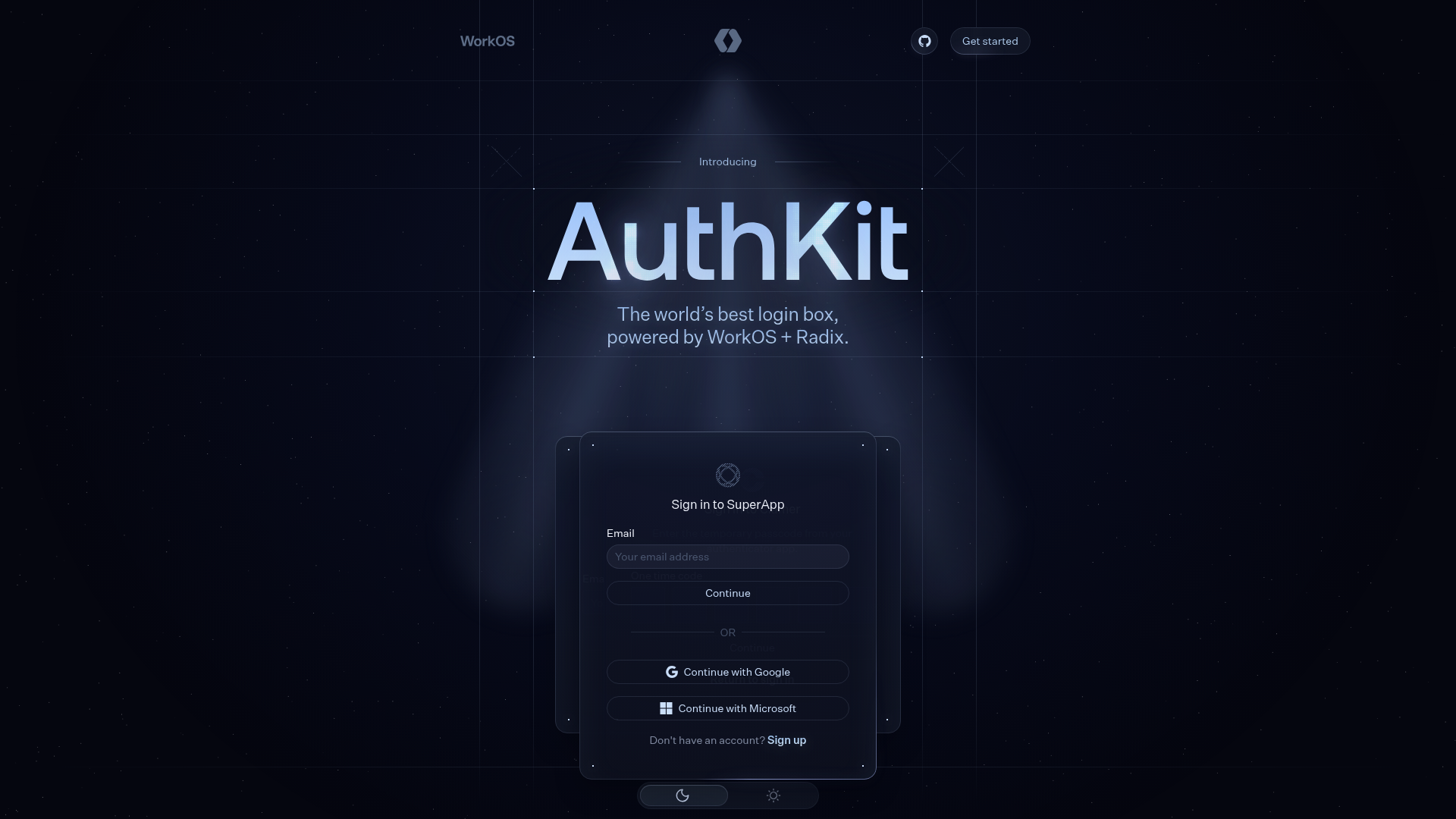
AuthKit Dark Mode Product Landing Page
A high-end dark themed landing page featuring animated auth-state cards, a grid-based hero section, a horizontal feature slider, and interactive customization pickers.
Overview
This is a high-end dark-themed product landing page for AuthKit, featuring sophisticated lighting effects, grid-based layouts, and interactive component previews. It is an excellent clone reference for developers looking to implement 'developer-tool' aesthetics characterized by precision, motion, and deep dark-mode styling.
Design System
- Color Palette & Visual Hierarchy: A deep midnight background (#000 or near-black) serves as the primary canvas, accented by a radial "spotlight" gradient effect in the hero section. Primary action elements use white or light-blue gradients, while secondary UI uses muted grays. High-contrast white text is reserved for headings and primary labels.
- Typography: The system uses a clean sans-serif typeface (likely Inter or similar) with a focus on hierarchy through scale and weight. Headers utilize large
h2andh4sizes with subtle text gradients, while body copy maintains high readability with generous line heights. - Page Structure & Flow: The layout follows a classic vertical stack:
- Hero: A centered logotype and headline over a grid-pattern with animated glassmorphism cards.
- Feature Slider: A horizontal, auto-scrolling row of feature icons.
- Dashboard Animation: A central visual explaining technical architecture through animated lines.
- Interactive Customizer: A "browser" preview section with color and radius pickers.
- Security & Tech Proof: Grid-based feature cards and framework integration sections.
- Reusable Components:
- Auth Cards: Highly polished login and OTP cards with subtle borders and glow effects (
card-module). - Outline Boxes: Dot-patterned containers and dividers used for section headers.
- Theme Switcher: A minimalist toggle for light/dark mode preview.
- Glowing Buttons: Primary CTAs with an internal animated glow effect.
- Auth Cards: Highly polished login and OTP cards with subtle borders and glow effects (
- Motion Patterns: The page utilizes
canvas-based background noise, CSS-driven spotlights that rotate (--rotate), and transition delays on input elements to simulate data flow within the architecture diagrams. - Implementation Clues: Built using Next.js (indicated by
_next/static) with CSS Modules for scoping. It leverages Radix UI for accessible primitives and uses a CSS variable-driven system for dynamic customization (e.g.,--brand-radius).
Use Cases
- Target Builders: SaaS startups, developer tools, cybersecurity firms, and fintech companies aiming for a premium, trustworthy look.
- Effective Remixes:
- Developer Documentation: Adaptation of the grid and typography for high-density technical info.
- Product Showcases: Using the interactive color/radius pickers to demonstrate a customizable product or API.
- Marketing Landers: Stripping the complex animations to use the "Auth Card" components as reusable UI elements for sign-up flows.
- Clone Scope:
- Quick Scope: Clone the hero section and the "Auth Card" components to create a stunning landing fold.
- Full Scope: Replicate the entire page to master complex CSS layout patterns, including the animated "between-lines" dividers and the interactive customizer logic.
Related Inspirations
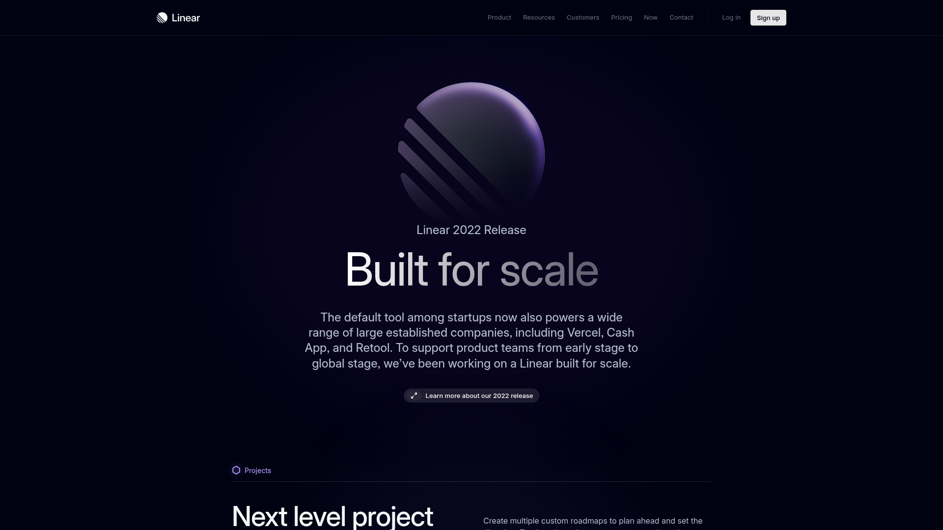
Linear 2022 Product Release Page
A high-end dark mode product launch page featuring a 3D glassmorphic logo, sleek typography, and a structured layout for feature announcements.
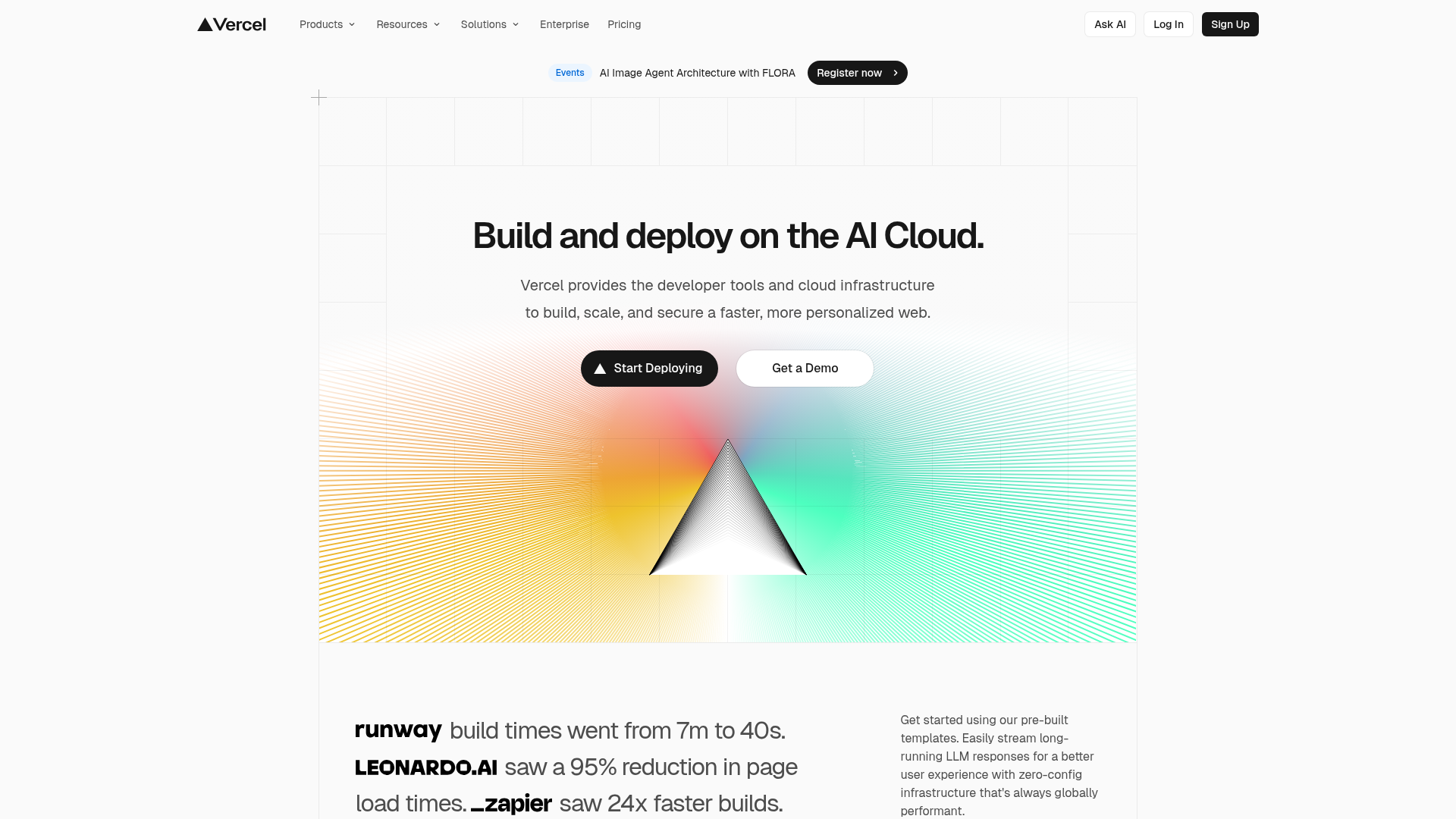
Vercel AI Cloud Landing Page
A modern landing page featuring a minimalist dark-themed navbar, a grid-overlay hero section with radial color gradients, and high-contrast typography for customer success stories.
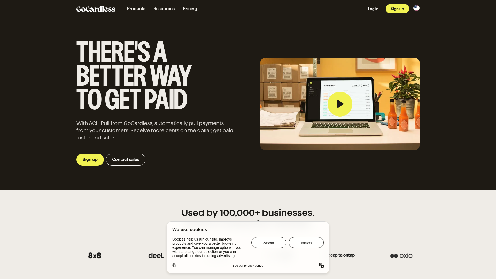
GoCardless Payments Platform Landing Page
A dark-themed fintech landing page featuring a split-screen video hero, bento-style feature cards, a horizontal logo slider, and step-by-step accordion guides.
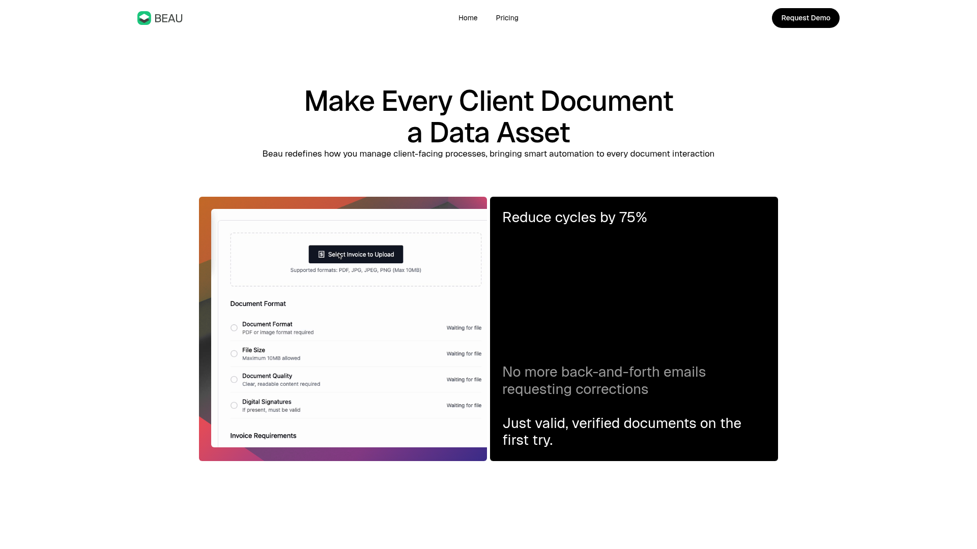
Beau Document Automation Landing Page
A modern software landing page featuring a bento-grid layout, split-screen hero assets with animated checkmarks, a step-by-step process guide, and a clean two-tier pricing table.
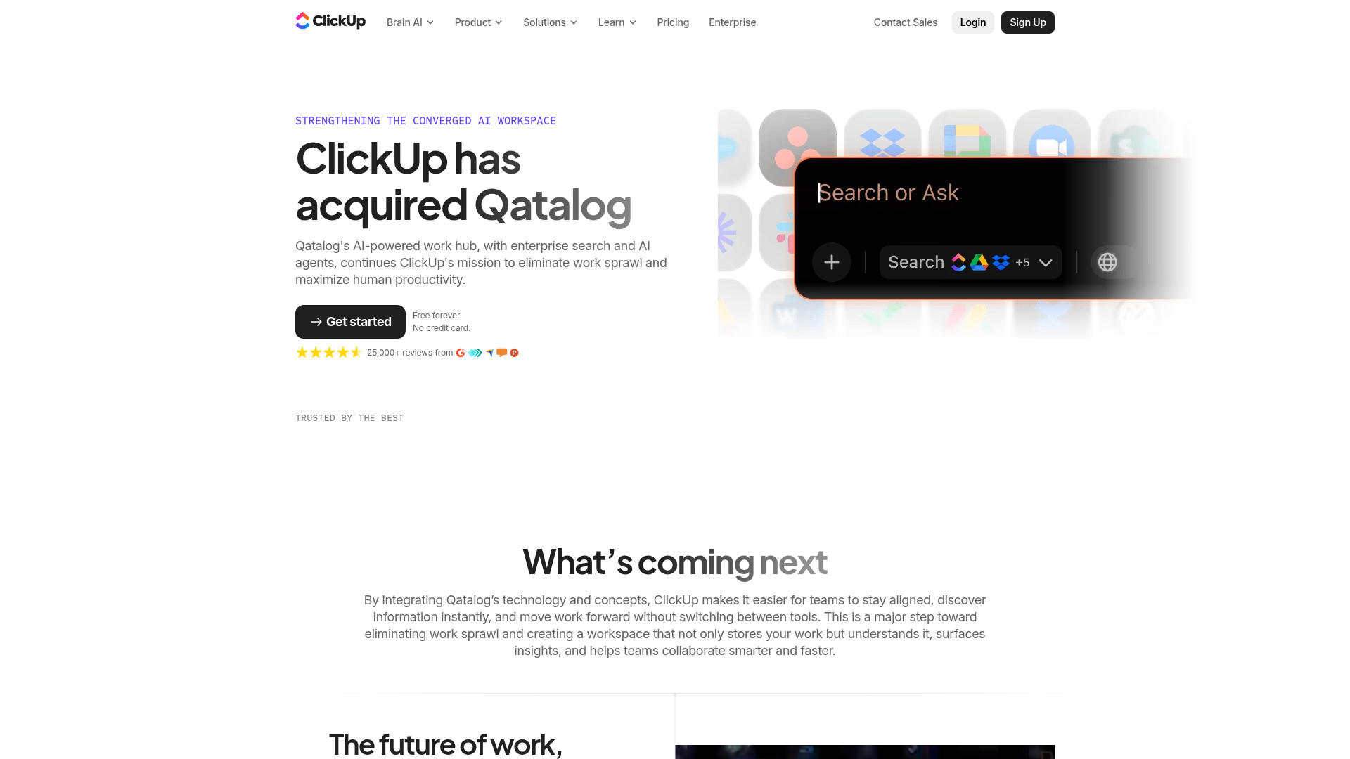
ClickUp Acquisition Hero Landing Page
Features a modern dark-themed hero section with a search UI graphic, bento-style feature grid, and a high-contrast CTA section with decorative gradients.
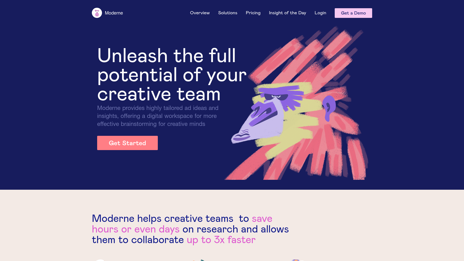
Moderne Creative Landing Page
A high-contrast landing page featuring a dark hero section with an artistic illustration overlay, distinct alternating content blocks, and a visual comparison bar chart component.
