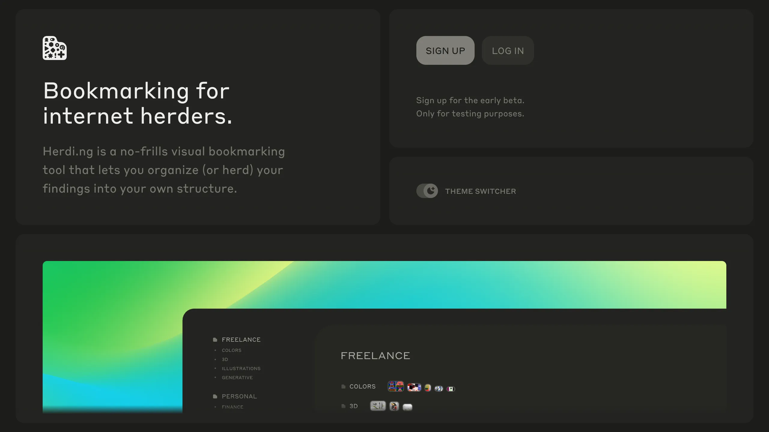
Herding Visual Bookmark Bento Layout
A dark-themed landing page featuring a sophisticated bento grid layout with drag-and-drop interactive components, smooth state transitions, and a custom theme switcher.
Overview
Herdi.ng is a visually striking, dark-mode landing page that utilizes a sophisticated bento grid layout to showcase a digital bookmarking tool. Its strength as a reference lies in its elegant use of "elevated containers" (the bento boxes), high-contrast accessibility, and interactive drag-and-drop elements that reflect the product's core functionality directly on the landing page.
Design System
- Color Palette & Visual Hierarchy: The system uses a deep charcoal and near-black background (
#1A1A1Arange) with subtle borders and shadows to create depth. Primary accent colors are vibrant greens and cyans, appearing as glowing gradients and hover states to guide the eye toward call-to-action (CTA) buttons and secondary branding elements. - Typography: The design utilizes a clean, geometric sans-serif font. It employs a clear scale: large, prominent headlines for value propositions (size-6), secondary text in a muted grey for descriptions (size-4), and monospace or small-caps for utility elements like the "Theme Switcher."
- Page Structure: The layout follows a modular bento grid flow:
- Hero Grid: Split into a branding/tagline block and a login/signup utility block.
- Feature Visualization: A wide, full-bleed container or large grid item containing interactive canvases or complex sorting animations.
- Use Case Tabs: A vertical tabbed system on the left that updates content on the right to show different user personas.
- Reusable Components: Notable items include the
c-btQDswgrid containers with "before/after" pseudo-elements for sophisticated border styling, the high-gloss gradient buttons (c-EcBxD), and the custom-styled toggle switch (role="switch"). - Interaction & Motion: The UI is heavy on stateful animation. It features a manual theme switcher, interactive drag-and-drop (dnd-kit) lists for bookmark reordering, and canvas-based animations for "copy & paste" demonstrations. Hover states include scaling transforms and opacity shifts on cards.
- Implementation Clues: The HTML reveals a React-based structure using a CSS-in-JS library (likely Stitches or Radix UI, given the
c-class prefixing pattern), emphasizing accessible primitives like ARIA-labeled regions and focused state management for interactive lists.
Use Cases
- Who should clone this: This pattern is ideal for SaaS builders, utility tool developers, or portfolio sites that need to demonstrate a "workspace" feel or organizational features through their marketing layout.
- Effective Remixes: It can be adapted for digital asset managers, task trackers, or curated directory sites. The grid is highly flexible; swapping the dark backgrounds for a "glassmorphism" light mode would significantly change the brand vibe while keeping the information architecture intact.
- Remix Directions: Builders can extract the person-based tab system (
Useful for Designers/Builders) to showcase different plan tiers or customer segments. The drag-and-drop UI component is a standalone piece of code that could be reused in any dashboard project. - Clone Scope: A full-page clone is best for those wanting to maintain a cohesive, high-end "Next.js" aesthetic. For a quicker win, clone only the Bento Grid logic and the interactive Persona list.
Related Inspirations
Beau Document Automation Landing Page
A modern software landing page featuring a bento-grid layout, split-screen hero assets with animated checkmarks, a step-by-step process guide, and a clean two-tier pricing table.
Linear 2022 Product Release Page
A high-end dark mode product launch page featuring a 3D glassmorphic logo, sleek typography, and a structured layout for feature announcements.
Evervault Security & Fintech Landing Page
A dark-themed developer site featuring an animated encryption hero, bento grid-style solution highlights, interactive code tabs, and a data-driven service integration ring.
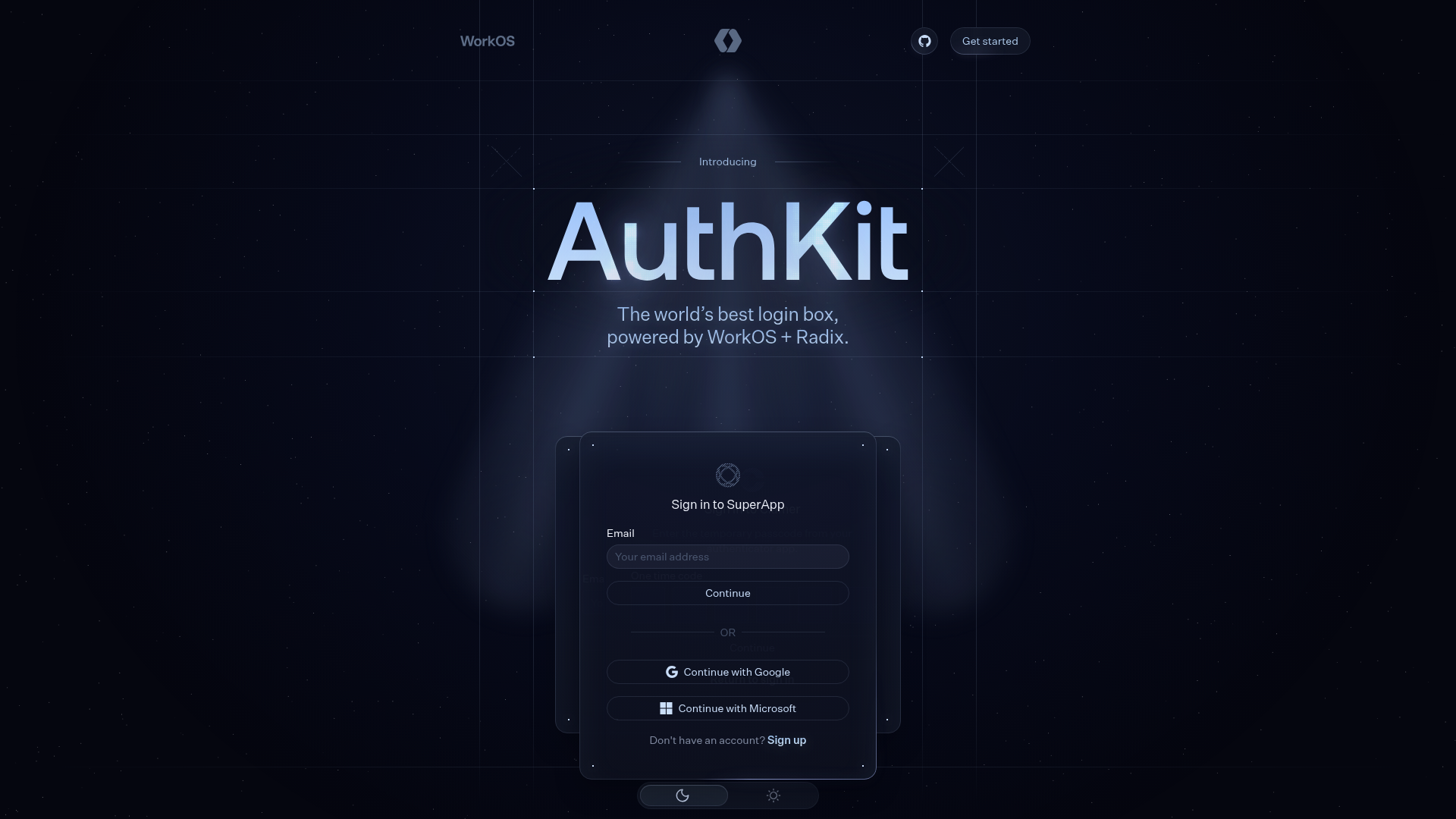
AuthKit Dark Mode Product Landing Page
A high-end dark themed landing page featuring animated auth-state cards, a grid-based hero section, a horizontal feature slider, and interactive customization pickers.
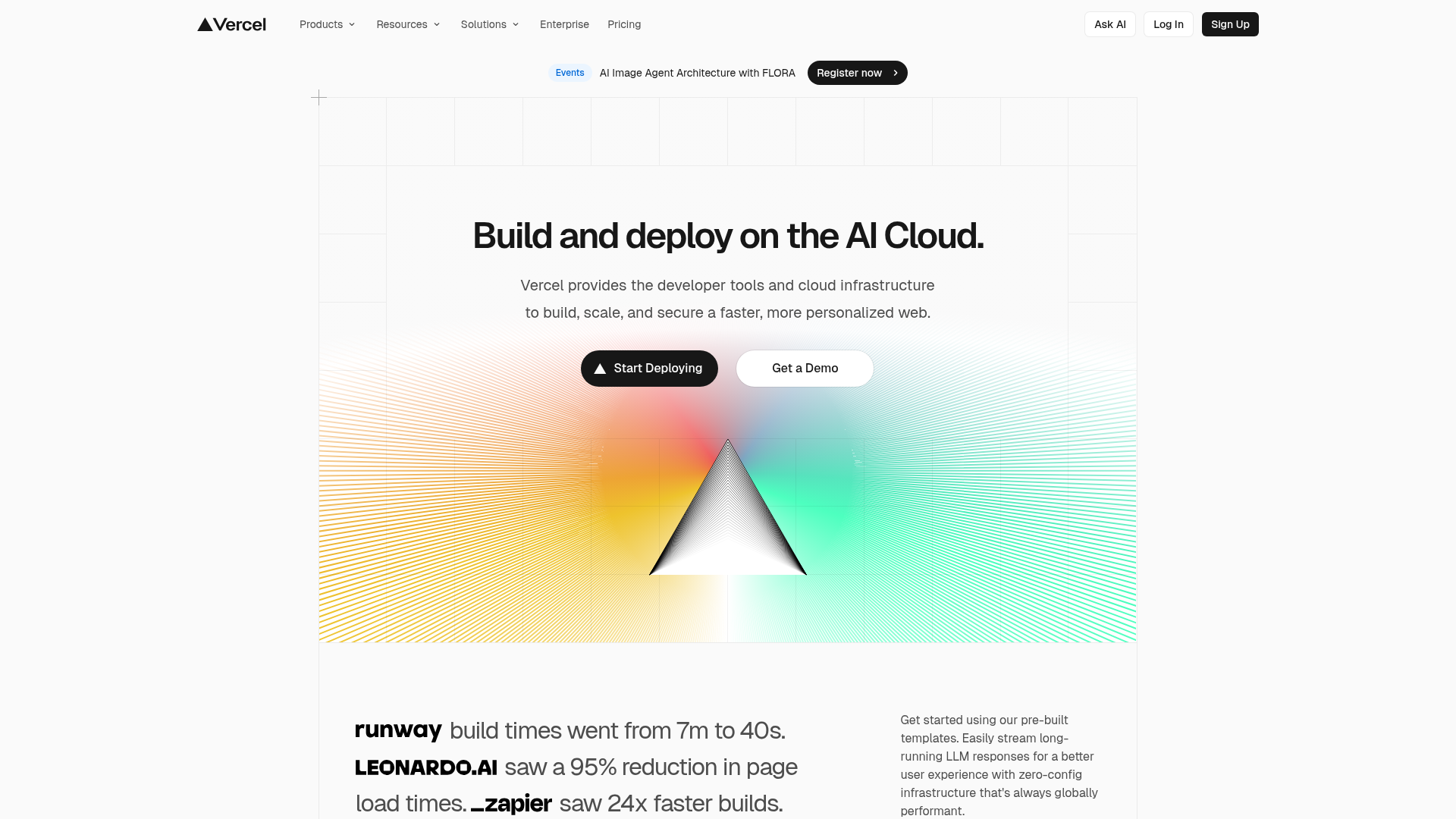
Vercel AI Cloud Landing Page
A modern landing page featuring a minimalist dark-themed navbar, a grid-overlay hero section with radial color gradients, and high-contrast typography for customer success stories.
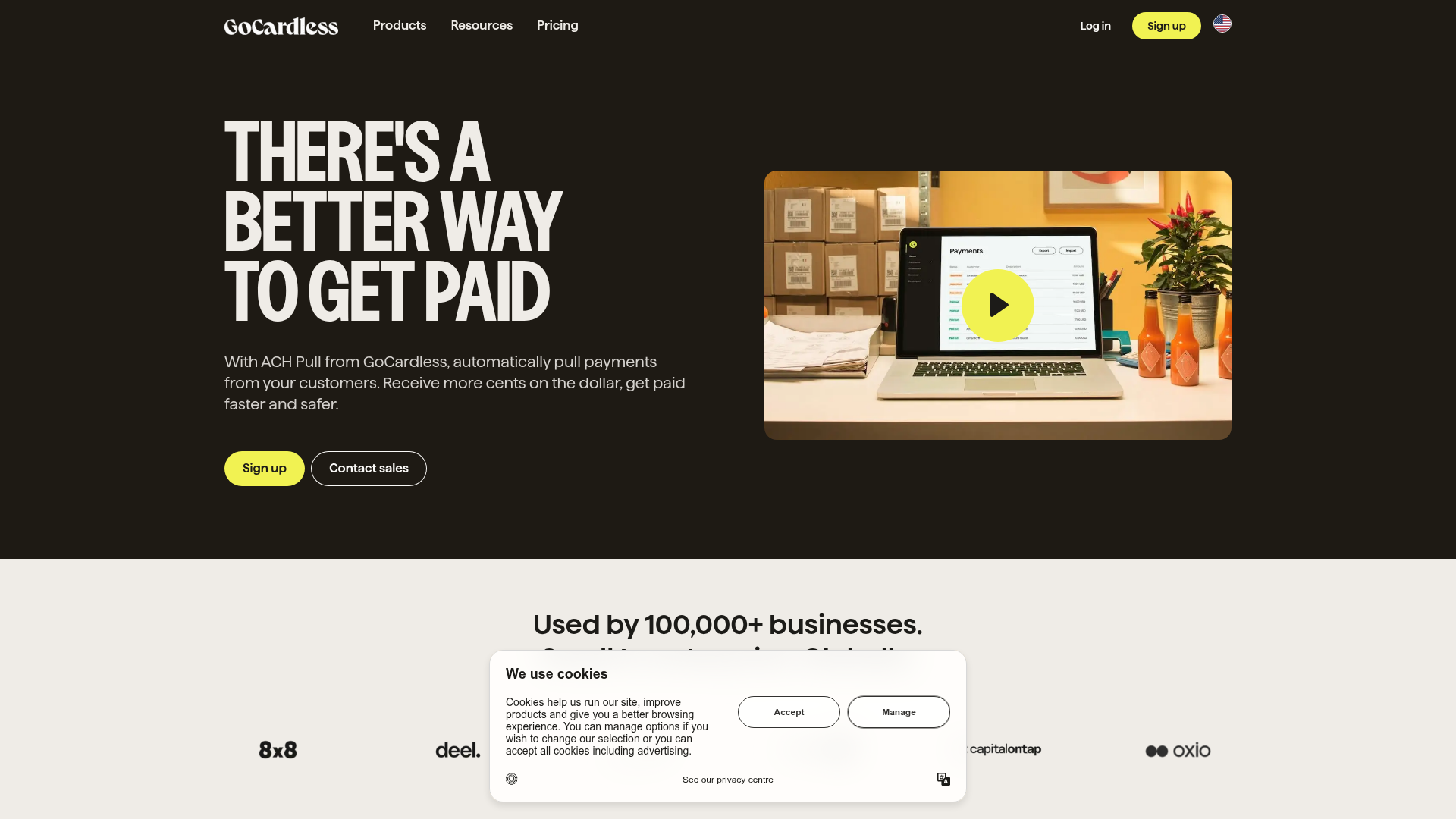
GoCardless Payments Platform Landing Page
A dark-themed fintech landing page featuring a split-screen video hero, bento-style feature cards, a horizontal logo slider, and step-by-step accordion guides.
