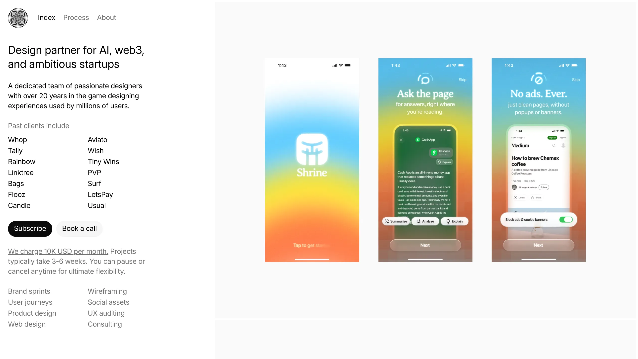
Endless Design Agency Portfolio
A split-screen layout featuring a fixed minimalist sidebar for navigation and service details alongside a scrollable vertical feed of large-scale case study images.
Overview
This portfolio for Endless Design utilizes a master-detail split-screen layout, where a high-information sidebar remains fixed while a content-rich feed of case study imagery scrolls alongside it. It is an excellent reference for designers or agencies who want to prioritize visual work immediately while keeping critical business information—like pricing, service lists, and CTA buttons—accessible at all times.
Design System
- Color Palette & Visual Hierarchy: The design follows a strict minimalist aesthetic using a high-contrast black-on-white base. Accents are kept to a minimum (neutral-500 for secondary text and neutral-100 for secondary buttons), allowing the vibrant, full-color case study images to provide the visual energy.
- Typography: The site uses a clean, sans-serif stack. The primary headline uses a larger scale (22px) with tight leading to command attention, while body text and service lists use a consistent 14px (text-sm) size for a dense, professional feel.
- Page Structure: The layout is divided into a fixed
<aside>(288px wide) containing the brand logo, navigation, value proposition, client list, specific service pricing, and primary CTAs. The<main>section occupies 66vw of the width, functioning as a continuous vertical scroll of edge-to-edge<picture>elements. - Reusable Components:
- Pill Buttons: High-contrast black and light-gray rounded-full buttons for primary/secondary actions.
- Two-Column Data Grids: Used for both client lists and service offerings, providing a clean way to display many text items in a compact space.
- Sticky Navigation: A simple top-bar nav within the sidebar that remains visible during the scroll.
- Implementation Details: The HTML reveals a Tailwind CSS implementation using utility classes like
fixed,flex-col, andgrid-cols-2. It also utilizes ascrollbar-hideclass on the sidebar to maintain a clean UI even if the content overflows. - Responsive Behavior: For viewports below 960px, the layout shifts from a side-by-side view to a standard vertical stack where the sidebar content precedes the image feed.
Use Cases
- Who should clone this: Independent creatives, boutique agencies, and high-end studios that rely on a visual-first sales approach where work proof is the primary converter.
- Effective Remixes: This pattern works well for photography portfolios, architectural firms, or even high-end e-commerce landing pages where the product details remain fixed while the user scrolls through gallery shots.
- Practical Remix Directions:
- Brand Swap: Change the background of the
<main>section to a dark mode or specific brand color to instantly shift the mood. - IA Adaptation: Replace the client list grid with a small contact form or a link-in-bio style link list.
- Section Reuse: Clone the sidebar component specifically to use as a navigation drawer or a permanent site info panel on larger dashboards.
- Brand Swap: Change the background of the
- Suggested Clone Scope: High value is found in the full-page layout structure (the 1/3 to 2/3 distribution); however, the typography and button styles are easily extractable for smaller UI kits.
Related Inspirations
Studio Lathe Minimalist Portfolio List
A high-contrast, minimalist portfolio layout featuring a dense list-based project index with flexible category labeling and a full-screen yellow background.

Niklas Rosén Designer Portfolio Index
A minimalist, responsive grid-based portfolio index featuring a clean 16-column layout, typographic list components, and a custom dark mode transition.

Clase Agency Branding Portfolio
A minimalist design agency portfolio featuring a typographic hero section, full-width image articles, sticky title bars, and integrated scrolling text marquees for a clean editorial layout.

Lundqvist & Dallyn Studio Portfolio
Minimalist design studio portfolio featuring a custom video loader, world clock navigation, and a fluid masonry-style grid for high-quality photography and type design showcases.

Baubauwerk Minimal Agency Portfolio Homepage
A clean studio site featuring a centered text hero, scatter-plot filterable project gallery, and full-bleed image sections for case studies.

AcolorBright Design Agency Portfolio
Minimalist bento-style portfolio layout featuring numerical section headers, horizontally scrolling project teasers, and a clean grayscale client logo grid.
