Generic Unavailable Store Error Page
A minimal error screen featuring a stacked information layout, warning icon, and simple navigation links for handling site-wide downtime.
Overview
This is a minimalist error page designed for a Shopify-style store that is currently unavailable. It serves as a standard reference for functional 404/500 error messaging, focusing on clear communication and user path recovery through a stripped-back, high-contrast layout.
Design System
- Color Palette & Visual Hierarchy: The design uses a high-contrast monochromatic base with black text (#202223) on a white background. A yellow warning icon provides the only high-visibility accent, signaling a system state change. The hierarchy is strictly vertical, using whitespace to separate the summary, explanation, and action steps.
- Typography System: The typography is clean and sans-serif. It uses a structured scale where the primary error message is weighted more heavily (
content--desc-large), followed by smaller H3 headers for categorization, and standard body text for the explanation. - Page Structure & Section Flow: The content is centered both vertically and horizontally. It follows a logical flow: Error Icon -> Main Status Label -> "What happened?" section with context -> "What can I do?" section with actionable navigation.
- Reusable Components: The primary reusable asset is the ‘Error Block’ pattern. This includes the SVG icon integration, the underlined header style for specific queries, and the consistent footer-aligned 'Request ID' string for backend debugging.
- Interaction Patterns: The single interactive element is a text link with a hover state (standard blue underline) intended to navigate the user away from the dead end.
- Implementation Clues: Based on the HTML, the site uses a
wrapperclass with a internalcontent--blockstructure. The layout uses standard semantic elements like<h3>and<ul>within a modular div container, making it highly portable to any CSS framework like Tailwind or Bootstrap.
Use Cases
- Who should clone this pattern: Developers building E-commerce platforms or SaaS dashboards that need a fail-safe, low-resource error page for server downtime or maintenance modes.
- Effective Remixes: While the current version is generic, it can be remixed by swapping the yellow triangle for brand-specific illustrations or 3D mascots. The 'Request ID' component is particularly useful for enterprise apps to help customer support teams trace logs.
- Remix Directions: Swap the simple blue link for a prominent primary button to drive traffic back to a homepage or a status page. You can also adapt the info architecture by adding a 'Contact Support' button alongside the 'Return' link.
- Recommended Scope: This is a perfect candidate for a quick single-page shell clone. It provides a robust starting point for any 'Maintenance' or 'Access Denied' screen.
Related Inspirations
Minimal Error Page with Troubleshooting
A clean, functional maintenance or error page layout featuring a warning icon, descriptive text sections, and simple navigation links for user recovery.

Isla Beauty Skincare E-commerce Store
A clean Shopify-based storefront featuring a split-hero landing page, a step-by-step product system carousel, and a split-screen testimonial section with localized product image sidebars.

Google Holiday 100 Curator Landing Page
A minimalist e-commerce showcase featuring a wide hero section, clean search integration, and a bold typography-driven header designed for trending product collections.

Finn Pet Supplements Landing Page
An e-commerce landing page featuring high-contrast typography, a sticky brand logo banner, parallax scroll effects on product headers, and a clean product grid.
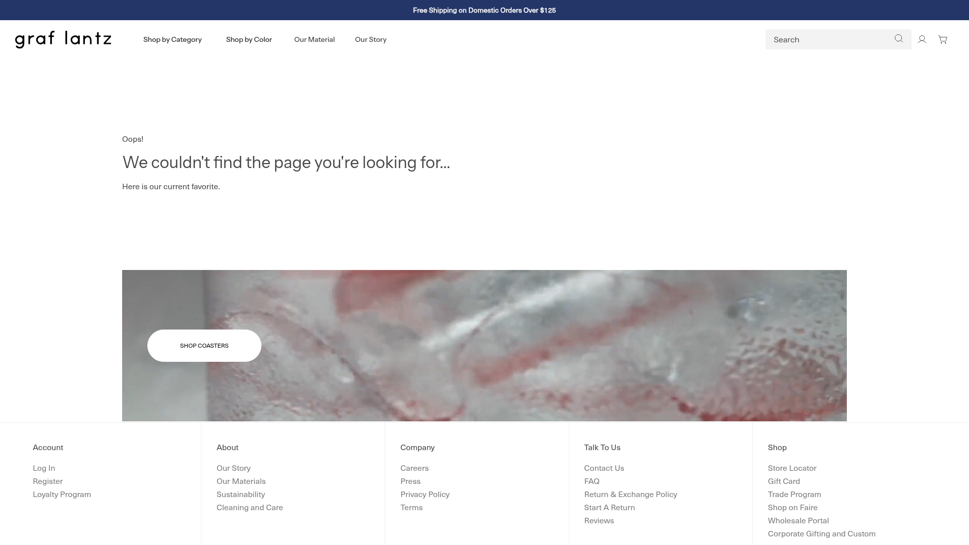
Graf Lantz Minimalist E-commerce 404
A clean Shopify-based error page featuring a full-width video hero with a CTA button, a detailed multi-column footer, and a sophisticated slide-out cart drawer.
Platform Art E-commerce Gallery Page
A minimalist art marketplace featuring a full-bleed image hero, horizontal scroll product carousels with countdown timers, and hover-triggered image swaps.
