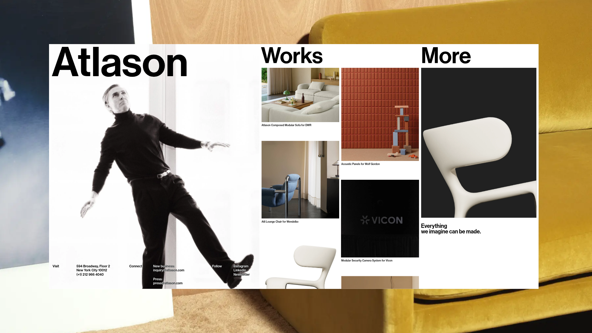
Atlason Design Studio Portfolio Layout
A minimalist three-column menu design featuring a vertical bento-style masonry grid, sticky navigation headers, and large-scale typography for high-end product showcasing.
Overview
Atlason’s portfolio features a high-impact, three-column layout that serves as a multi-functional hub for brand identity, project showcasing, and curated insights. It is a powerful reference for builders seeking a non-traditional, non-scrolling landing page that uses vertical masonry and oversized typography to create a luxury editorial feel.
Design System
- Color Palette & Visual Hierarchy: A high-contrast monochrome base (pure black and white) is accented by professional product photography. Hierarchy is established through extreme scale—large headers dominate the top third, while small-scale metadata provides utility at the bottom.
- Typography System: The design utilizes a bold Sans-Serif font (Inter-like). It features a diverse scale: massive display text for brand names (~16vw), medium text for navigation headers, and small, condensed sans-serif for contact details and image captions to maintain an architectural aesthetic.
- Page Structure & Section Flow: The layout is divided into three distinct vertical columns:
- Atlason: Brand identity with a large hero image and sticky contact details (Visit, Connect, Follow).
- Works: A vertical scrollable masonry grid using a
b-masonrycomponent to display project cards. - More: Editorial links and a featured product showcase section.
- Reusable Components:
- Masonry Grid: A two-wide project grid (
grid-item) with variable aspect ratios (work-ratio-1towork-ratio-3). - Split Headers: Consistent column-top headers ("Atlason", "Works", "More") that anchor the user’s location.
- Contact Row: A structured footer grid within the first column for densifying navigation and business info.
- Masonry Grid: A two-wide project grid (
- Interaction & Motion Patterns: The HTML reveals a
barba-wrapperfor seamless page transitions and a custom cursor element (b-cursor). Images use transparent.webpassets to allow background blending. Hover states are likely managed through scaling wrappers (the-menu-scale-down). - Responsive Behavior: On mobile, the columns stack vertically or collapse into an accordion-style filter system (
b-accordion) as evidenced by themd:hiddenutility classes in the code.
Use Cases
- Who should clone this: Independent creative studios, industrial designers, architects, and high-end fashion brands who want to show history, projects, and philosophy on a single screen.
- Effective Remixes: This pattern works well for luxury e-commerce landing pages—remix the "Works" column into a featured product feed and the "More" column into a lookbook or blog archive.
- Practical Remix Directions: Swap the monochromatic color palette for a brand-specific duo-tone. Adapt the information architecture by changing the columns to "Services," "Portfolio," and "Testimonials."
- Clone Scope: A full-page clone is recommended to capture the synchronized column behavior, but the vertical masonry project grid is a high-value individual component for any portfolio project.
Related Inspirations

Clase Agency Branding Portfolio
A minimalist design agency portfolio featuring a typographic hero section, full-width image articles, sticky title bars, and integrated scrolling text marquees for a clean editorial layout.

Lundqvist & Dallyn Studio Portfolio
Minimalist design studio portfolio featuring a custom video loader, world clock navigation, and a fluid masonry-style grid for high-quality photography and type design showcases.

AcolorBright Design Agency Portfolio
Minimalist bento-style portfolio layout featuring numerical section headers, horizontally scrolling project teasers, and a clean grayscale client logo grid.
Manna Architects Minimalist Portfolio Grid
A clean, single-page architecture portfolio featuring a centered intro, a varied multi-column image gallery with captions, and a detailed project service breakdown.
Websmith Studio Portfolio Site Template
A clean studio portfolio featuring a responsive bento-style project grid, interactive process cards, and a split-screen testimonial section built with Tailwind CSS.
The Communication Studio Portfolio Grid
A minimalist creative agency portfolio featuring a gapless image grid with image-swap hover effects and Tailwind-based reveal animations.
