Mostlikely Architecture Portfolio Site
A minimalist portfolio layout featuring a multi-layered cube interaction, vertical image scrolling with lazy-loading, and a grid-based screensaver view for design and research projects.

Overview
This website for Mostlikely Architecture is a minimalist portfolio that uses an unconventional 3D cube metaphor for navigation. It is a strong reference for builders looking to implement highly immersive, non-standard navigation patterns without sacrificing a clean, high-end aesthetic. The site balances large-scale imagery with an experimental grid-based 'screensaver' background.
Design System
- Color Palette & Visual Hierarchy: The palette is strictly monochromatic (black and white). High contrast is used to create a stark, architectural feel. Layout priority is given to full-width or large-scale images, with text reduced to a secondary functional role in thin-stroke borders.
- Typography System: A clean, sans-serif typeface (likely a variant of Helvetica or Inter) is used in a single weight. The hierarchy is extremely flat; navigation labels like "Architecture" and "Design" share equal visual weight, emphasizing a category-led browsing experience.
- Page Structure & Section Flow: The site uses a multi-layered structure. The
ml_cubediv acts as a specialized container for different content types (front and back sides). Scrolling is handled within these cube faces rather than the standard window scroll. A unique#screensaverlayer sits behind or appears under specific conditions, displaying an massive 19x8 CSS grid of project thumbnails. - Reusable Components: The most valuable component is the vertical navigation list with thin horizontal separators (
border-bottom: 1px solid black). Theprogressbarat the top provides a subtle but essential orientation tool for the non-standard scroll zones. - Interaction & Motion Patterns: The key interaction is the transition between "faces" of the cube, likely triggered by navigation clicks. Imagery uses lazy-loading (
class="lazyload") to maintain performance during high-speed vertical scrolling. There is an inverted color scheme variant (ms-inv) suggesting a light/dark toggle or section-specific theme flipping. - Implementation Clues: The HTML reveals a reliance on a custom 3D wrapper (
#ml_cube) and a heavy use ofdata-srcfor image handling. It utilizes aviewport-detectorandprogressbarto manage complex scroll states within local overflow containers.
Use Cases
- Who should clone this: Architects, experimental photographers, and high-end design agencies who want to emphasize a cohesive 'world-building' feel over standard linear scrolling.
- Effective Remixes: This pattern is perfect for digital lookbooks or furniture catalogs where the product category (Architecture vs. Design) is as important as the individual items.
- Remix Directions: Builders can adapt the 3D cube logic by mapping the 'faces' to different project years or client types. The grid-based screensaver could be repurposed as an interactive 'all-projects' index page.
- Clone Scope: A full-page clone is recommended for those wanting to maintain the 3D interaction logic. For a quicker remix, the lazy-loading vertical image feed with top-aligned progress indicators is a highly reusable pattern for any image-heavy landing page.
Related Inspirations
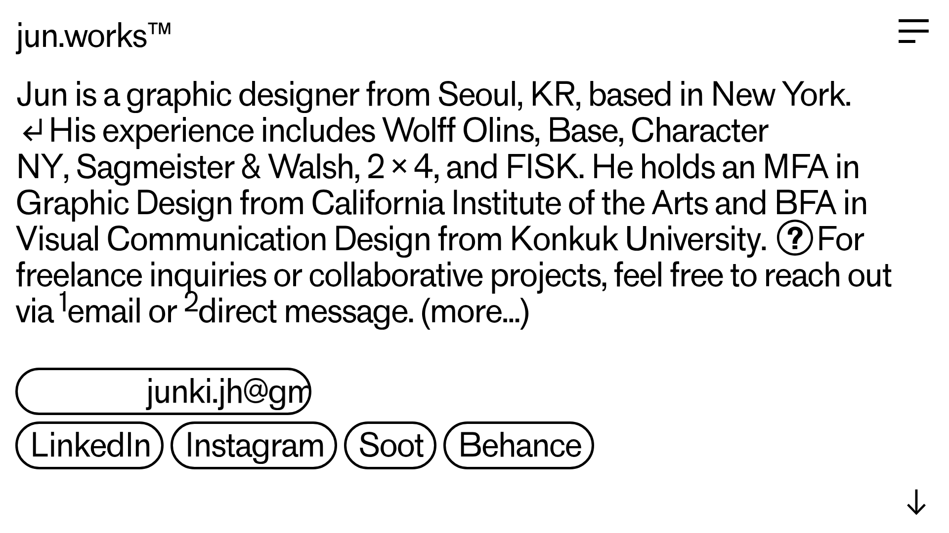
Jun Works Portfolio Landing Page
Minimalist graphic design portfolio featuring a text-heavy layout with image-on-hover tooltips, a pill-shaped marquee contact card, and a categorized hashtag tag cloud for project navigation.

Ekipa Agency Artist Roster Site
A minimalist agency portfolio featuring a dynamic block-based logo, colorful background transitions, and a hover-activated image preview grid for an artist roster.
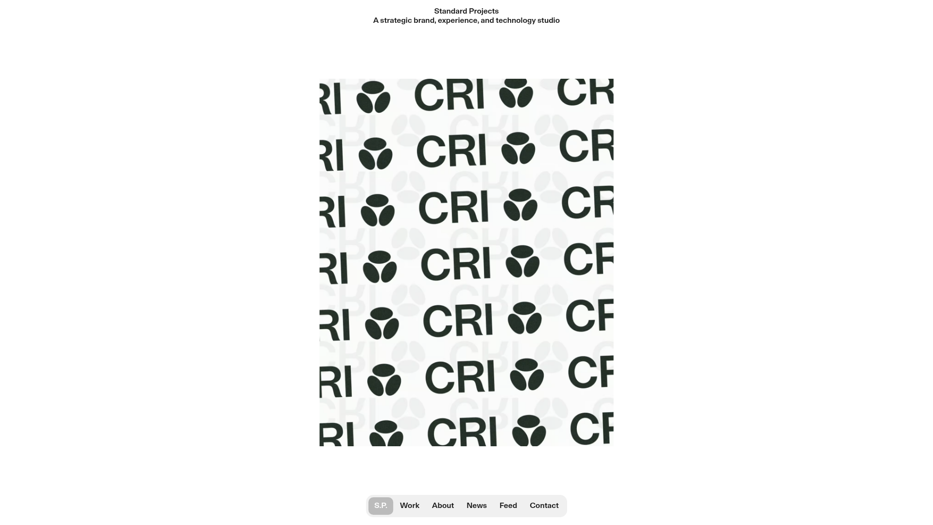
Standard Projects Portfolio with Sticky Hero
A minimalist studio layout featuring a full-height animated carousel, sticky header typography, and a dynamic masonry element grid for case studies.
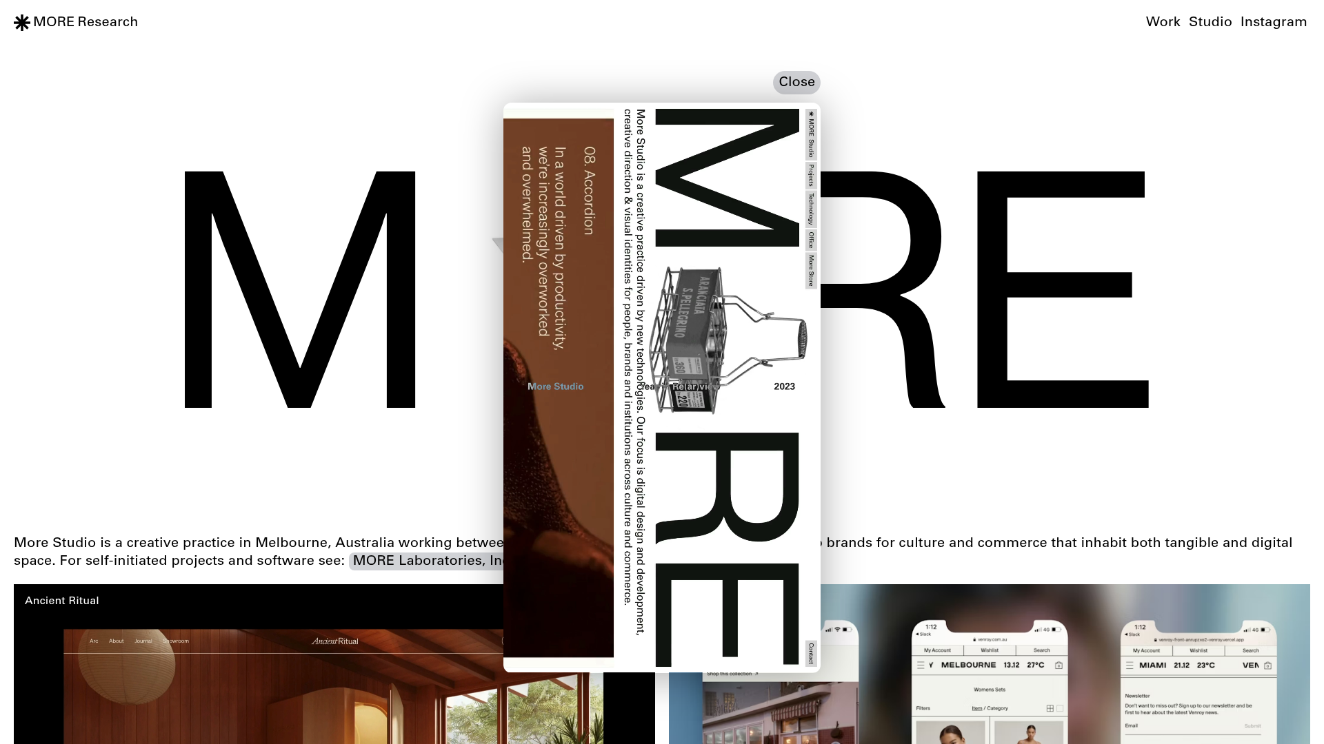
More Studio Creative Agency Portfolio
A high-end creative portfolio featuring oversized experimental typography, immersive video modals, accordion-based project lists, and unique cursor-following hover effects.
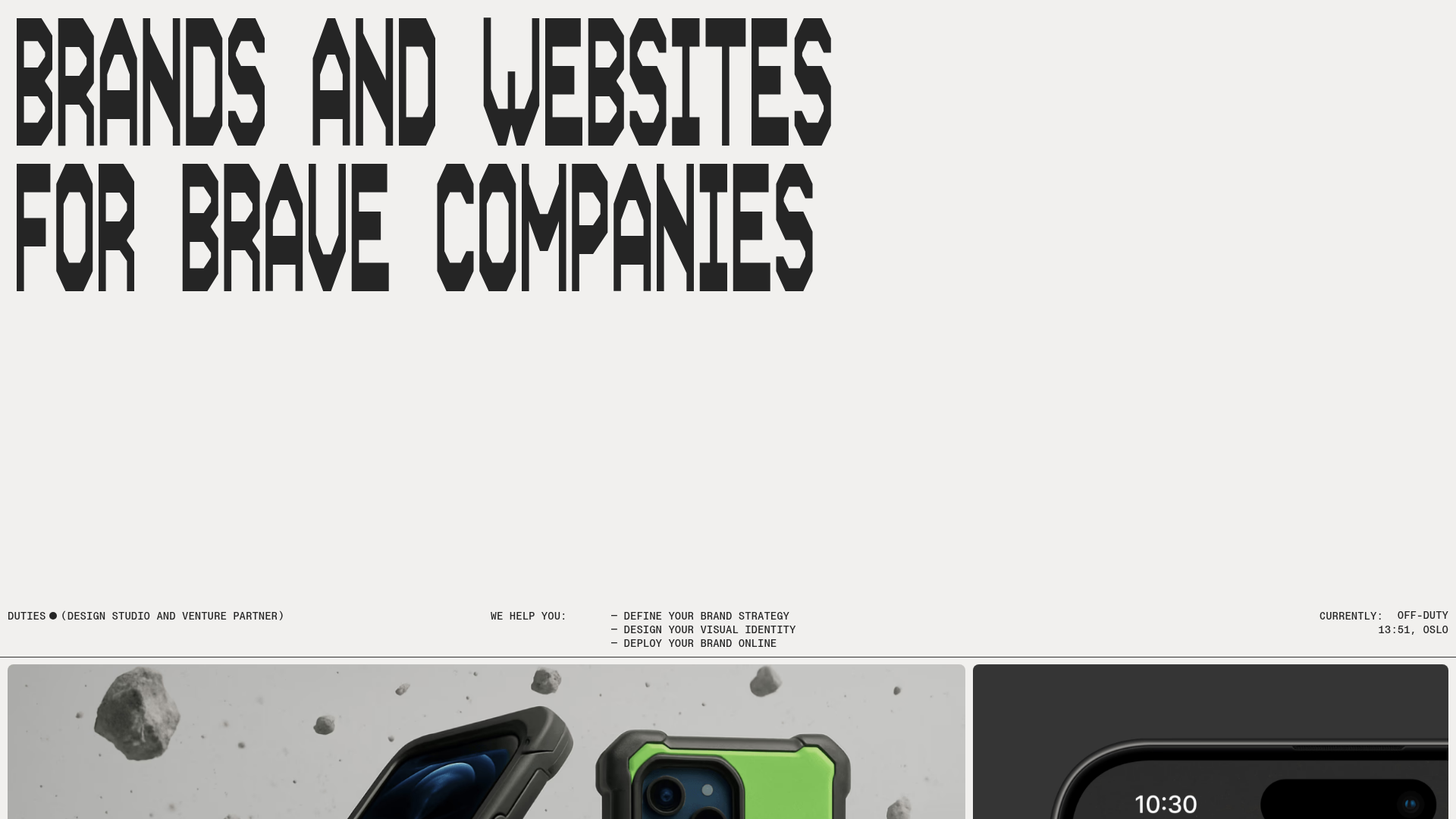
Duties Studio Agency Landing Page
A high-impact agency template featuring bold typography, a minimal technical footer, and a clean grid layout for visual case studies.

Studio Lathe Minimalist Portfolio List
A high-contrast, minimalist portfolio layout featuring a dense list-based project index with flexible category labeling and a full-screen yellow background.
