Duties Studio Agency Landing Page
A high-impact agency template featuring bold typography, a minimal technical footer, and a clean grid layout for visual case studies.
Overview
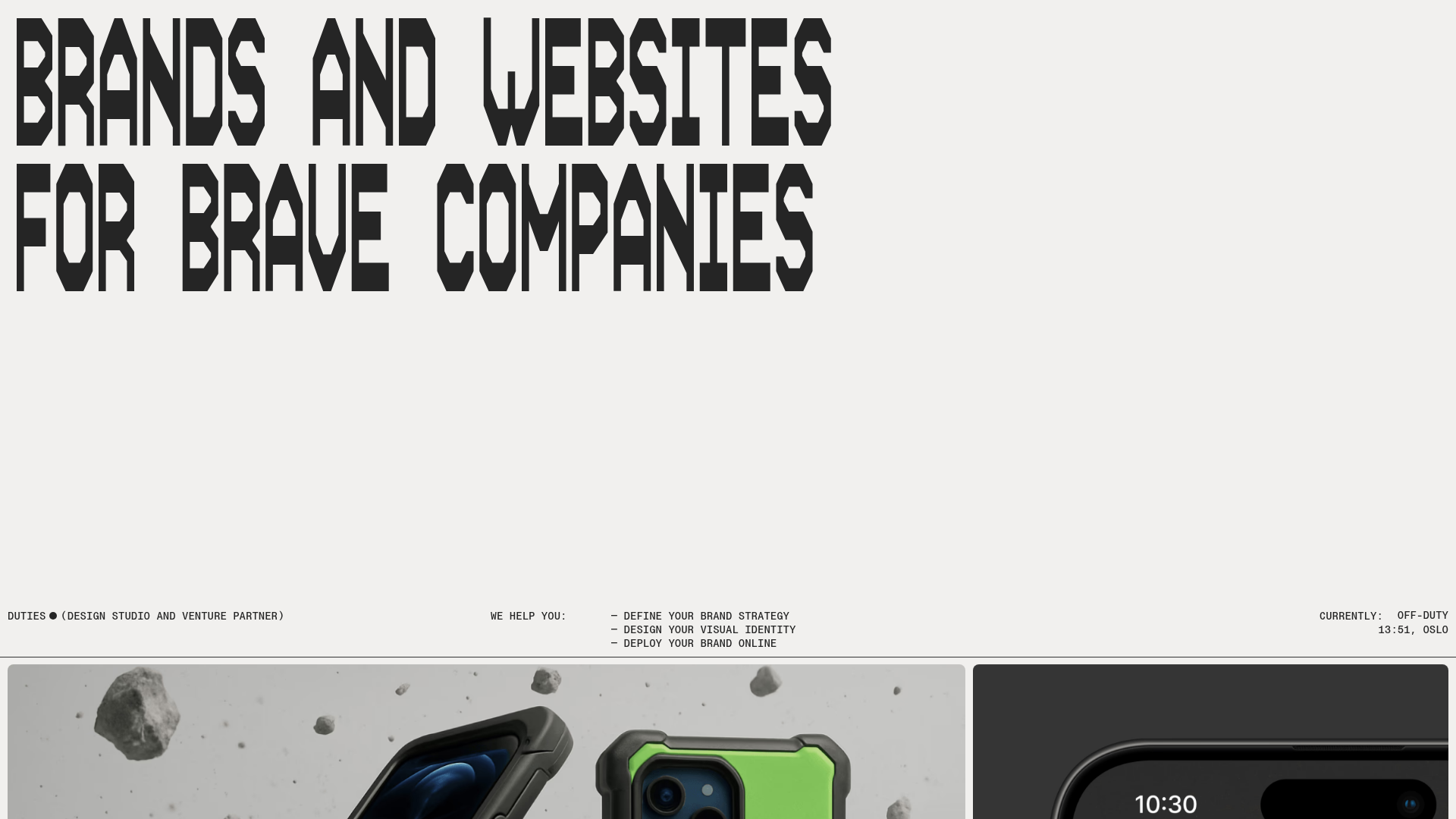
This agency landing page is a masterclass in high-impact minimalism, utilizing brutalist typography and a spacious grid to establish a bold brand identity. It is a strong reference for designers who want to move away from standard SaaS templates toward a more editorial, avant-garde aesthetic that emphasizes visual portfolio work over heavy copy.
Design System
- Color Palette & Visual Hierarchy: The site uses a monochrome base (off-white/light grey background with black text) to ensure the bold typography and high-definition project imagery take center stage. Hierarchy is established through extreme contrast in text scale rather than color variation.
- Typography System: The design features a custom, ultra-bold, geometric display typeface for the primary hero section ("BRANDS AND WEBSITES FOR BRAVE COMPANIES"). This is paired with a monospace font for technical details and utility text (e.g., "DUTIES", "WE HELP YOU"), creating a "hacked" or technical aesthetic common in boutique creative studios.
- Page Structure & Flow: The layout follows a top-down hierarchy: a massive hero message, followed by a thin utility bar containing service descriptions and metadata (time, location), leading directly into a large-scale masonry or grid-based portfolio gallery.
- Reusable Components: Key components to clone include the "pinned" style utility bar that separates hero text from the gallery, and the image-led project cards that use rounded corners and subtle shadows to pop against the flat background.
- Implementation Clues: Based on the HTML structure, the site prioritizes a clean DOM with semantic markers for sections like project grids. The interaction model focuses on high-impact static layouts, suggesting a lean implementation using modern CSS Grid and Flexbox for the alignment of the utility bar and portfolio items.
Use Cases
- Who should clone this: Independent creative directors, boutique design studios, or niche technology consultancies that want a "developer-centric" or brutalist look.
- Ideal products for remixing: High-end physical products (industrial design), tech-forward portfolio sites, or launch pages for experimental software tools.
- Remix directions: Swap the heavy display font for a sophisticated serif to pivot from "brutalist" to "luxury"; adapt the utility bar to function as a sticky navigation header; or keep the technical footer metadata (currently showing location and time) for a "live operations" feel.
- Suggested clone scope: The hero section and the metadata utility bar are the most unique elements. A quick section clone of the hero typography and technical bar is enough to transform the vibe of an existing landing page without needing to re-engineer an entire site structure.
Related Inspirations
Jun Works Portfolio Landing Page
Minimalist graphic design portfolio featuring a text-heavy layout with image-on-hover tooltips, a pill-shaped marquee contact card, and a categorized hashtag tag cloud for project navigation.
Ekipa Agency Artist Roster Site
A minimalist agency portfolio featuring a dynamic block-based logo, colorful background transitions, and a hover-activated image preview grid for an artist roster.
Standard Projects Portfolio with Sticky Hero
A minimalist studio layout featuring a full-height animated carousel, sticky header typography, and a dynamic masonry element grid for case studies.
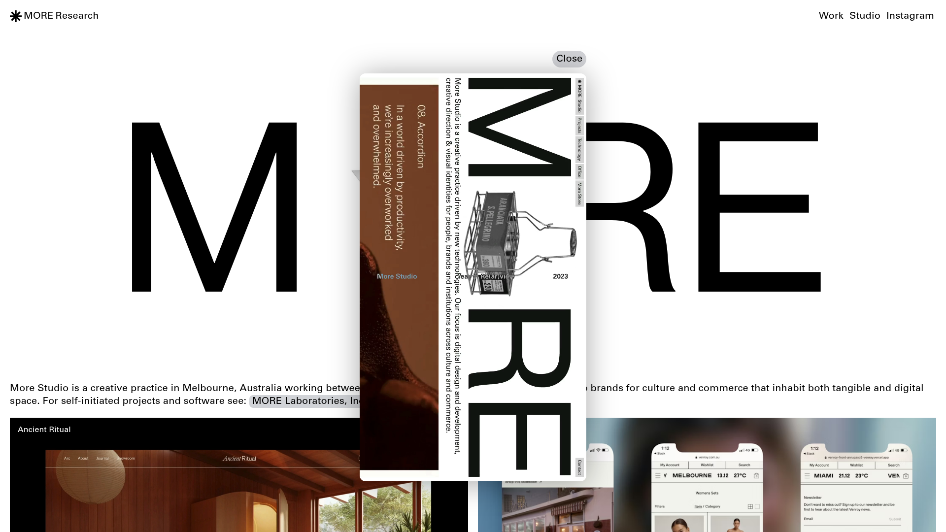
More Studio Creative Agency Portfolio
A high-end creative portfolio featuring oversized experimental typography, immersive video modals, accordion-based project lists, and unique cursor-following hover effects.
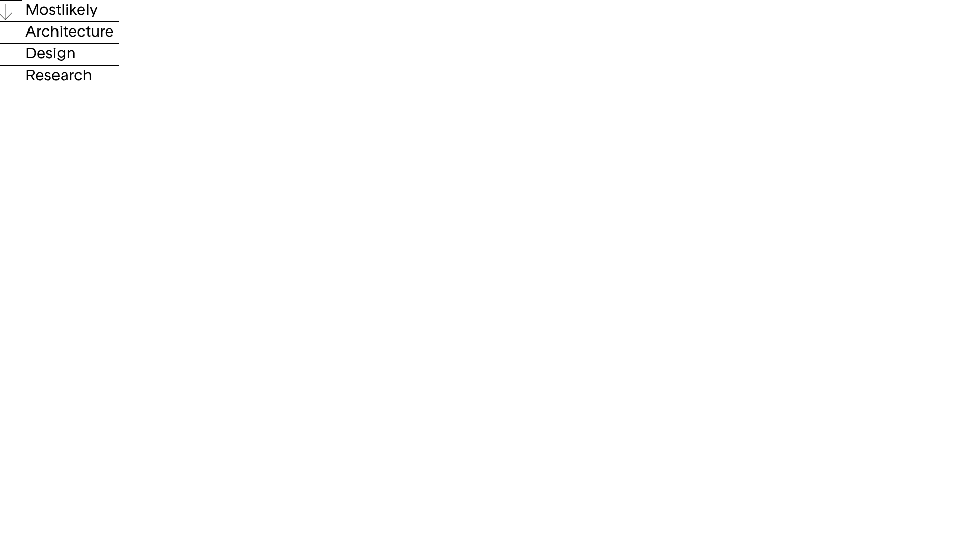
Mostlikely Architecture Portfolio Site
A minimalist portfolio layout featuring a multi-layered cube interaction, vertical image scrolling with lazy-loading, and a grid-based screensaver view for design and research projects.
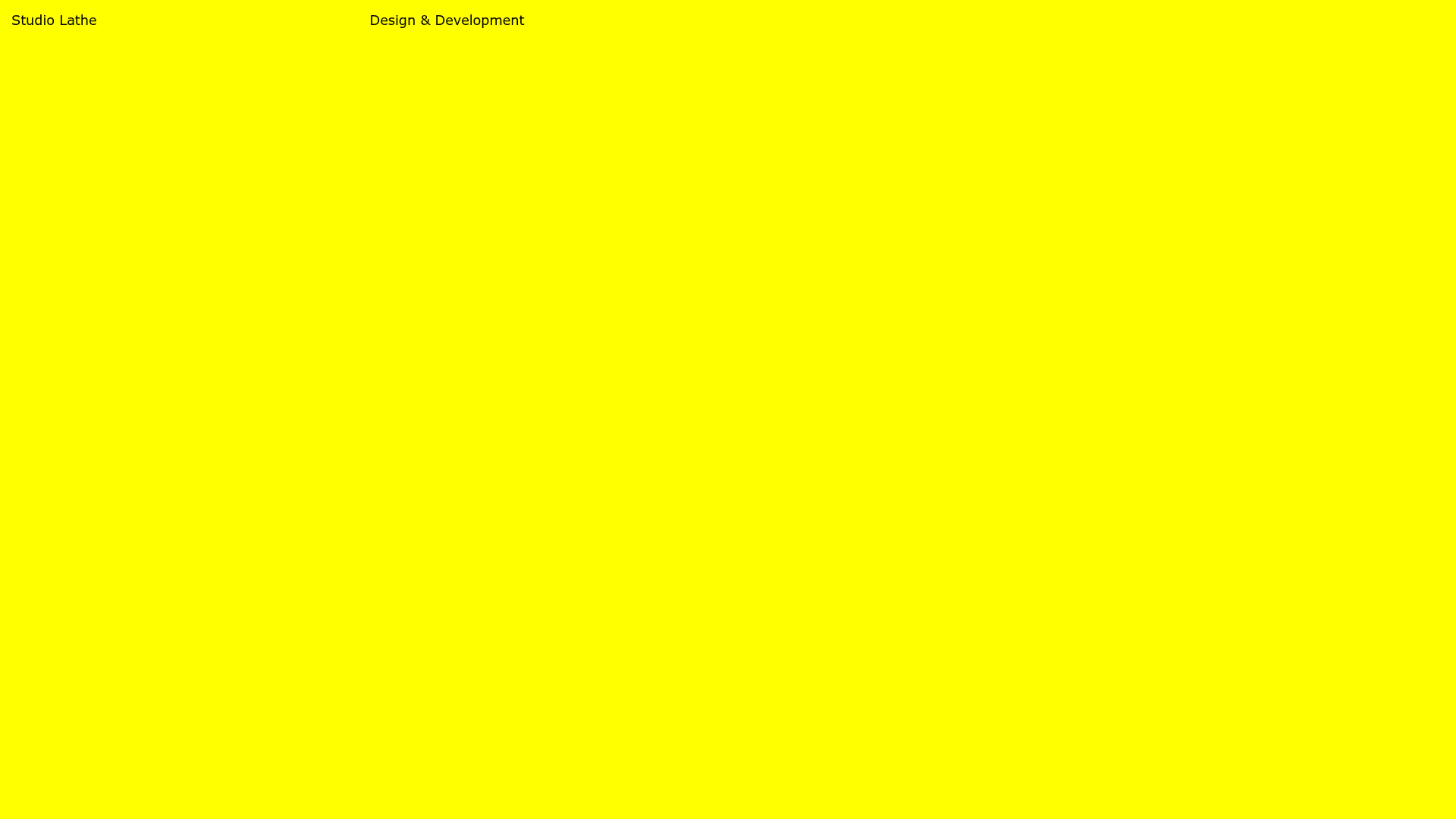
Studio Lathe Minimalist Portfolio List
A high-contrast, minimalist portfolio layout featuring a dense list-based project index with flexible category labeling and a full-screen yellow background.
