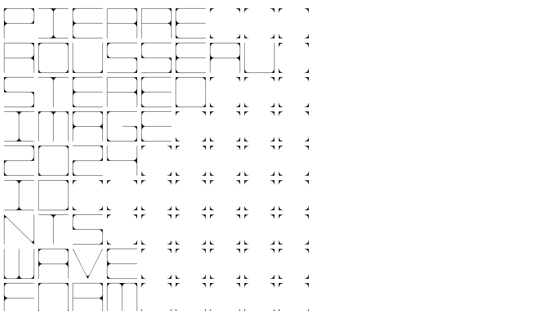
Pierre Rousseau Minimalist Portfolio Grid
A brutalist, monochromatic portfolio featuring a reactive typography grid, hidden project drawers with lazy-loaded media, and a distinctive 'stutter-step' asterisk titling system.
Overview
This portfolio for composer Pierre Rousseau uses a stark, brutalist grid to organize a dense archive of sound design and music production projects. It is a premier reference for an unconventional typography-centric layout that transforms a standard list of links into a highly interactive, rhythmic visual experience.
Design System
- Color Palette & Visual Hierarchy: A strictly monochromatic (black and white) scheme. Hierarchy is established not through color, but through custom glyphs (asterisks) and variable font weights. The background is pure white (#FFFFFF) providing maximum contrast for the thin-stroke, wide-aperture black typography.
- Typography System: The core of the identity is a proprietary or highly customized sans-serif font characterized by ultra-wide proportions and squared-off counters. For project titles, a unique 'stutter-step' asterisk system (e.g.,
Pierre*** Rousseau*) acts as a rhythmic filler to ensure text stretches to fill the horizontal grid lanes. Project descriptions within drawers revert to a legible, standard sans-serif. - Page Structure: The site is a single-column stack of expanding "project-item" containers. Each item consists of a title link (the trigger) and a hidden
project-contentdiv. When active, these drawers slide open to reveal text descriptions and lazy-loaded media (YouTube embeds or image galleries). - Reusable Components:
- The Stretchy Grid Header: A responsive text block that uses
display: flexwithjustify-content: space-betweento force words to the edges while filling the gap with symbols. - Expanding Content Drawers: A clean implementation of a project-based accordion where content is hidden until the user clicks a specific title.
- Media placeholders: Uses an
innerclass with aspect-ratio padding (e.g.,padding-bottom: 56.25%for 16:9 video) to prevent layout shift during lazy loading.
- The Stretchy Grid Header: A responsive text block that uses
- Interaction and Motion: The site uses a "turn-yang" class logic for link states. Hovering over a project title reveals the project image (using
project-imageabsolute positioning) or expands the drawer to display the embedded YouTube iframe. - Responsive Behavior: On mobile, the
project-image-mobileclass ensures that thumbnails, which are hidden or floating on desktop, become part of the vertical flow to maintain legibility and touch-friendliness.
Use Cases
- Who should clone this: Sound designers, experimental architects, or conceptual artists who have a high volume of text-based credits and want to display them without the clutter of a standard thumbnail grid.
- Effective Remixes: Agencies can use the 'asterisk-fill' typography system for landing page headers to create a custom, high-fashion editorial feel. The drawer system is ideal for FAQs or deep-dive case studies where you want to keep the initial page view extremely clean.
- Remix Directions: Swap the monochrome for a two-tone high-contrast brand color (e.g., Electric Blue and White). Adapt the information architecture by replacing the asterisks with data points, such as bitrates or timestamps, to suit a technical documentation site.
- Clone Scope: A full-page clone is recommended for portfolios, while the specific "flex-text with filler symbols" header component is a high-value quick clone for hero sections.
Related Inspirations
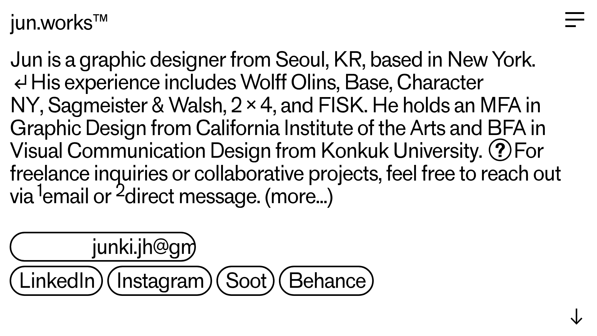
Jun Works Portfolio Landing Page
Minimalist graphic design portfolio featuring a text-heavy layout with image-on-hover tooltips, a pill-shaped marquee contact card, and a categorized hashtag tag cloud for project navigation.
Ekipa Agency Artist Roster Site
A minimalist agency portfolio featuring a dynamic block-based logo, colorful background transitions, and a hover-activated image preview grid for an artist roster.
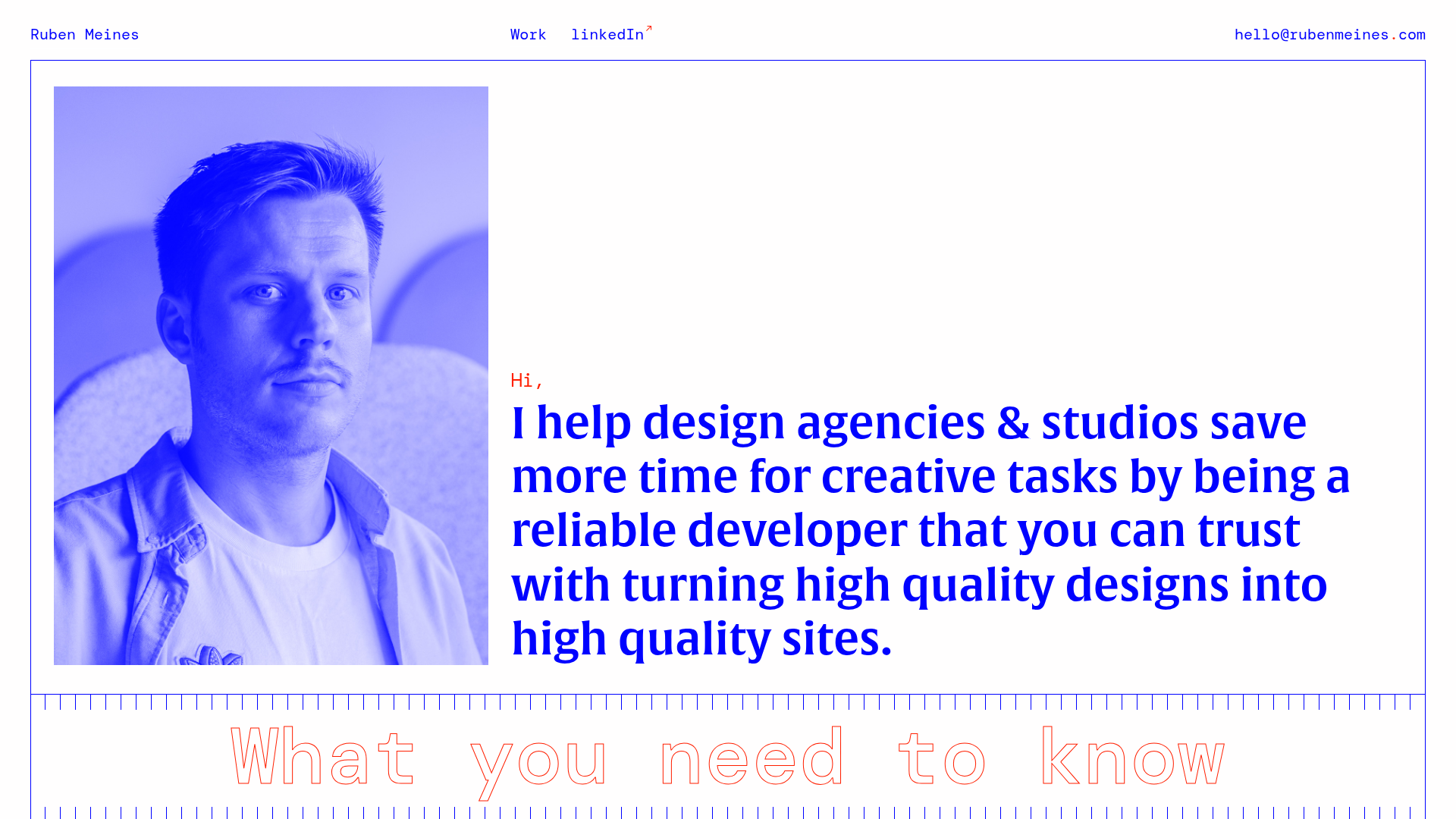
Ruben Meines Minimalist Developer Portfolio
A clean typography-focused layout featuring a duotone hero image, a decorative CSS grid border system, and a structured service list with outlined custom typography.
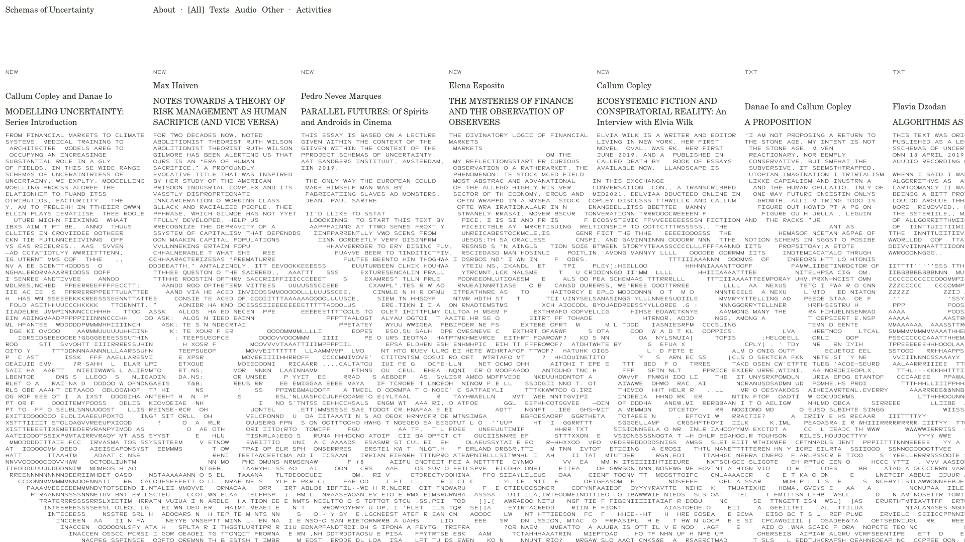
Schemas of Uncertainty Monogram Grid
A brutalist multi-column layout for text-heavy content featuring high-contrast typography, minimalist navigation, and a rhythmic vertical grid of essays.
Minimal Text-Based Creative Director Portfolio
A clean, typography-focused landing page featuring a multi-column layout for bio, links, and client lists using simple CSS flex or grid structures.
Standard Projects Portfolio with Sticky Hero
A minimalist studio layout featuring a full-height animated carousel, sticky header typography, and a dynamic masonry element grid for case studies.
