Schemas of Uncertainty Monogram Grid
A brutalist multi-column layout for text-heavy content featuring high-contrast typography, minimalist navigation, and a rhythmic vertical grid of essays.
Overview
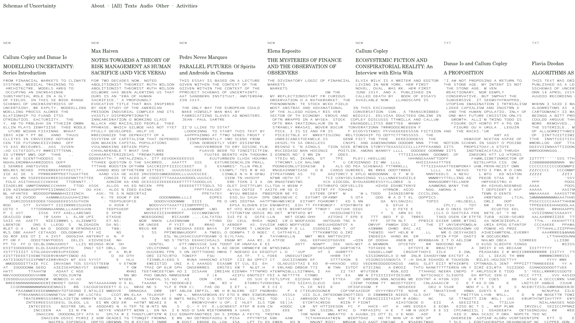
Schemas of Uncertainty is a high-density, text-centric website utilizing a brutalist grid and horizontal scroll to organize a collection of research essays. It is a premier reference for clone-and-remix projects that prioritize academic or experimental content where the focus is on raw information and rhythmic typography rather than imagery.
Design System
- Color Palette & Visual Hierarchy: A strictly monochromatic, high-contrast black-on-white palette. Visual hierarchy is achieved through text density and rigid vertical lines rather than color, creating a "wall of text" aesthetic that feels both authoritative and experimental.
- Typography: The primary typeface is a fixed-width sans-serif (Next Mono), used in all-caps for headers and body text. Small caps and character-level spacing are used to define information categories (e.g., "NEW", "TXT", "AUD") at the top of each column.
- Page Structure & Section Flow: The layout is a horizontal multi-column grid. Each column acts as a preview or a container for an entire essay. Navigation is fixed at the top, allowing users to filter content by "Texts," "Audio," or "Other," which presumably updates the grid dynamically.
- Reusable Components:
- Monogram Grid Column: A fixed-width container (
css-8n9oob) featuring a status tag (TXT/NEW), author name, capitalized title, and a dense block of text. - Minimalist Filter Nav: A simple text-based menu with mid-dot separators and active states indicated by brackets (e.g.,
[All]). - Hidden Scroll Container: The main content resides in a
translateXcontainer that spans thousands of pixels, creating a unique horizontal-only browsing experience.
- Monogram Grid Column: A fixed-width container (
- Interaction & Motion Patterns: The interface relies on horizontal scrolling and a
cursor: pointerstate on the grid items. The HTML indicates a canvas element (e1xtex680) likely used for background effects or managing the custom horizontal scroll logic. - Implementation Clues: Built using React (evidenced by the
#appmount point and specific data-page props) with a utility-first or styled-component styling approach (generic classes likecss-1p35msf).
Use Cases
- Who Should Clone: Curators of digital libraries, experimental journals, and academic researchers looking for a non-linear way to present deep-form text.
- Effective Remixes: Online literary magazines could swap the monospace font for a sleek serif but keep the horizontal grid to simulate a physical gallery experience. Portfolio sites for architects or writers can use this to display long-form project descriptions or manifestos.
- Remix Directions: Replace the text density with large images to create a horizontal photography portfolio, or adapt the filtering system to sort by tags rather than file types.
- Clone Scope: The horizontal grid column component is the high-value clone here. A full-page clone is recommended only for projects rejecting traditional vertical mobile-first paradigms in favor of a desktop-priority experimental UI.
Related Inspirations
Julia Johnson Photography Portfolio Website
A creative portfolio featuring a masonry-style image grid, overlapping oversized typography, and a minimalist full-screen navigation overlay.
Gawker Minimalist News Landing Page
A clean, centered layout featuring a bold SVG logo, high-contrast typography, and a distinct bordered call-to-action card with a split-grid button design.
Cup of Couple Editorial Portfolio
A high-fashion editorial layout featuring a sticky compartmentalized header, a horizontal marquee carousel, and a mixed-width masonry grid with marquee typography effects.
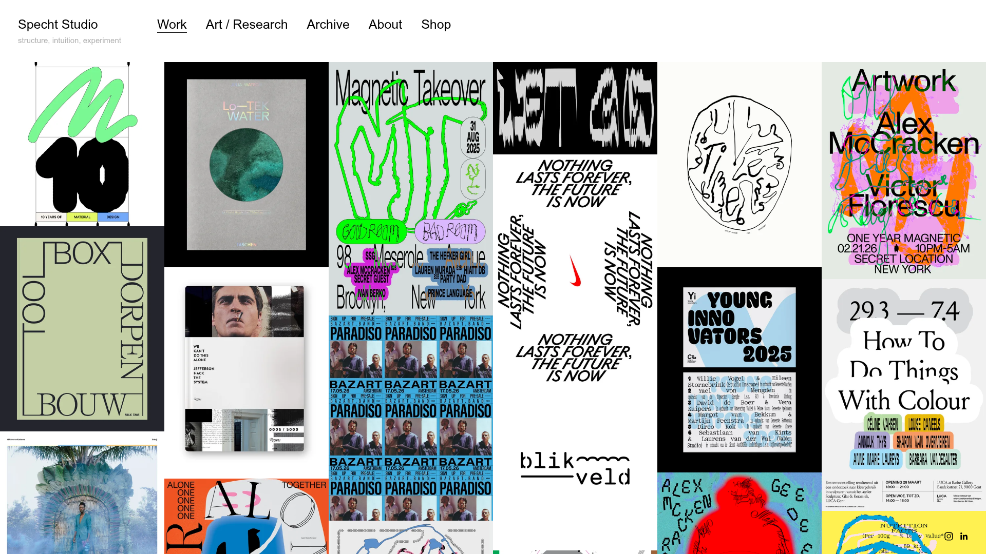
Specht Studio Portfolio Masonry Grid
A minimalist graphic design portfolio featuring an irregular masonry image gallery with high-contrast typography, hidden project details, and a top-aligned persistent navigation bar.
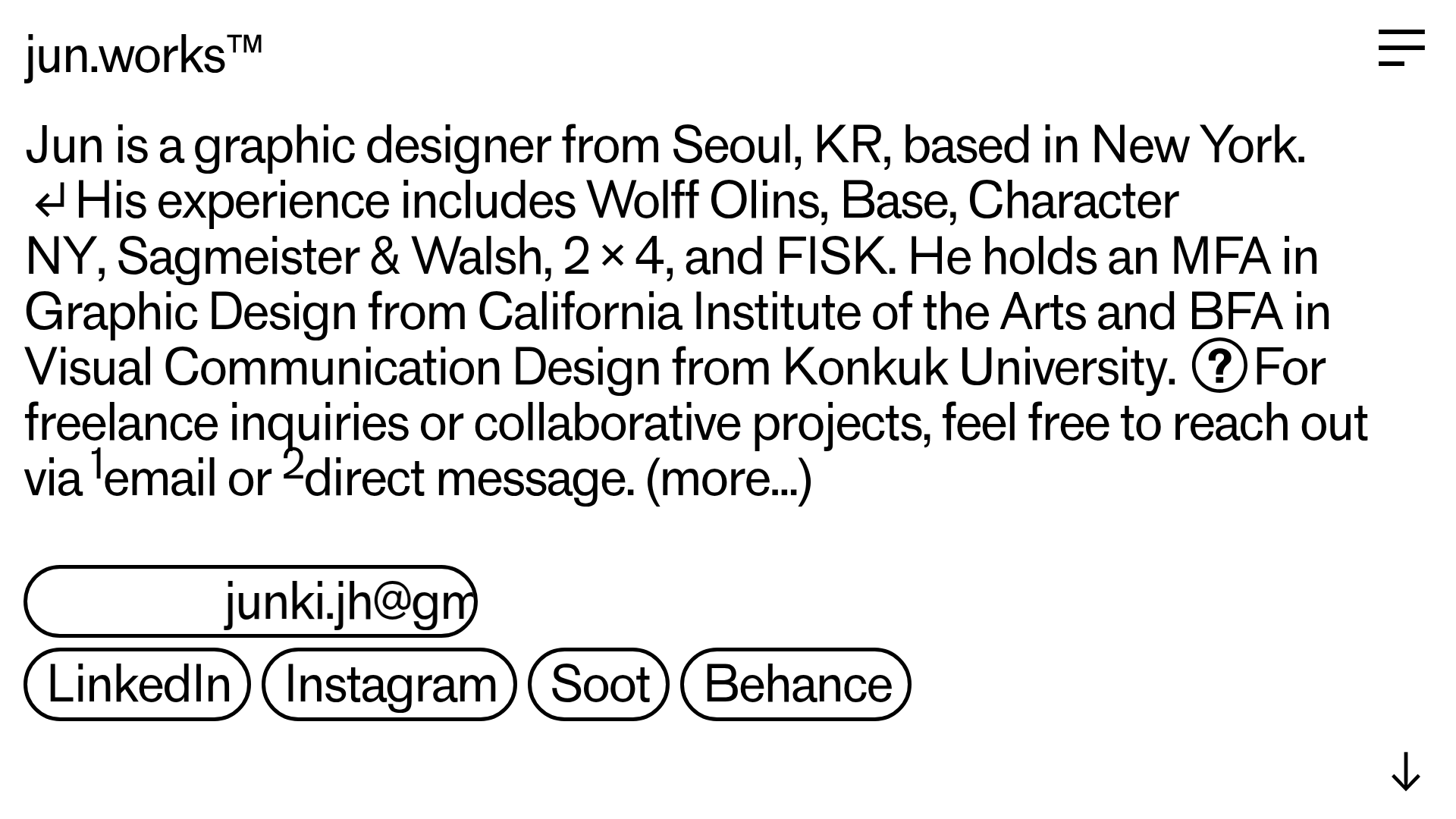
Jun Works Portfolio Landing Page
Minimalist graphic design portfolio featuring a text-heavy layout with image-on-hover tooltips, a pill-shaped marquee contact card, and a categorized hashtag tag cloud for project navigation.
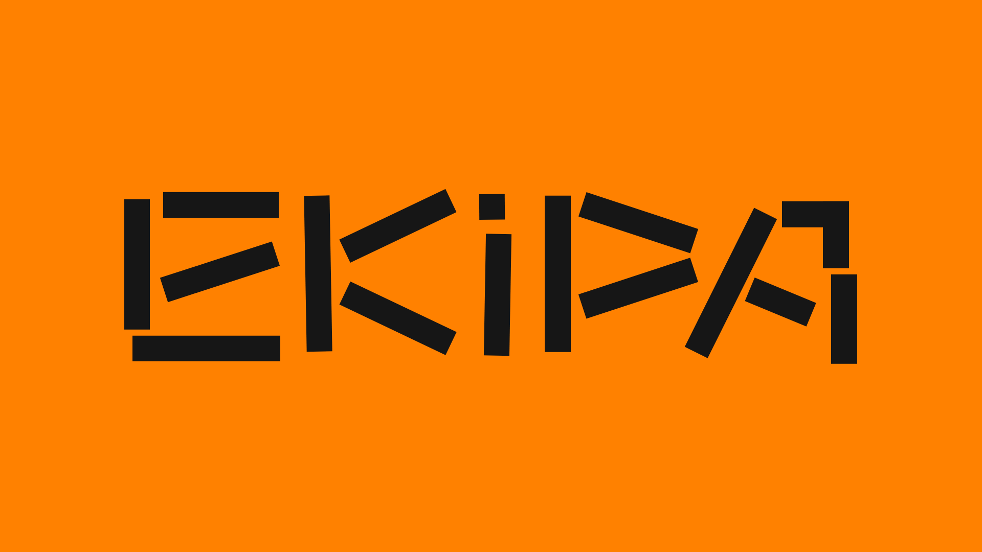
Ekipa Agency Artist Roster Site
A minimalist agency portfolio featuring a dynamic block-based logo, colorful background transitions, and a hover-activated image preview grid for an artist roster.
