V-A-C Foundation Event Gallery
A minimalist art gallery layout utilizing a dense, multi-column grid of image and video cards with date-specific meta information and a side-aligned vertical navigation menu.

Overview
This website is a minimalist, high-density event gallery for a cultural foundation, featuring a sophisticated multi-column grid that manages large volumes of image and video content. It is an excellent clone reference for building content-heavy portfolios or event listings where the visual media must lead without overwhelming the informational hierarchy. The layout skillfully balances a strict vertical navigation with a fluid, masonry-style content area.
Design System
- Color Palette & Visual Hierarchy: The design uses a high-contrast, minimalist Monochrome palette (pure white backgrounds with black text). Hierarchy is established through dense imagery and bold, black typography, using whitespace to define the boundaries of the grid rather than borders.
- Typography System: A clean, sans-serif typeface is used throughout. Captions and meta-information (like dates and categories) use a smaller scale with medium-weight emphasis, while the 'Events' header and card titles utilize a larger, bold weight to anchor the user’s eye.
- Page Structure: The layout consists of a fixed or side-aligned vertical navigation menu on the far right, a primary content area containing a title and a flexible 4-5 column grid of event cards, and a 'Load more' action at the bottom.
- Reusable Components:
- Event Cards: Highly reusable
articlecomponents that support both static images and auto-playing background videos, containing nested meta-tags (e.g., ' Installation') and titles. - Vertical Nav: A persistent sidebar with text-based links rotated or aligned vertically to save horizontal space.
- Language/Utility Switcher: A floating or fixed text-based toggle (ru/en) that maintains a minimal footprint.
- Event Cards: Highly reusable
- Interaction & Motion: The presence of
videotags within the card structure indicates a 'silent autoplay' hover or scroll state. The layout utilizes acanvaselement (visible in HTML) suggesting smooth, non-standard scroll transitions or cursor interactions. - Implementation Clues: Built with React (indicated by
data-reactrootand__nextID) and Styled Components (seen in thesc-prefixed class names), ensuring a modular, component-based architecture that is easy to remix.
Use Cases
- Who should clone this: Digital art galleries, film festival organizers, and design agencies looking for a 'brutalist-light' aesthetic that prioritizes visual media over descriptive text.
- Effective Remixes: This pattern can be effectively adapted for e-commerce lookbooks, architectural portfolios, or news aggregators specializing in high-quality photography.
- Remix Directions: Swap the monochrome palette for brand-specific colors, or adapt the information architecture to include price tags or 'Buy Ticket' buttons directly on the cards. For a lighter version, the vertical side navigation could be converted into a standard top header.
- Clone Scope: A full-page clone is recommended to capture the spatial relationship between the side navigation and the dense grid, but the individual card component and its video-handling logic are excellent candidates for a quick section-only clone.
Related Inspirations

Clase Agency Branding Portfolio
A minimalist design agency portfolio featuring a typographic hero section, full-width image articles, sticky title bars, and integrated scrolling text marquees for a clean editorial layout.
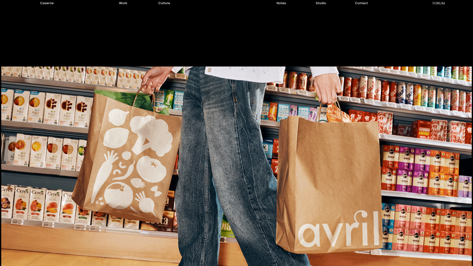
Caserne Design Studio Portfolio
A minimalist, high-impact portfolio featuring a dynamic masonry grid of project thumbnails with overlay text and a clean, oversized typography-driven footer.

Lundqvist & Dallyn Studio Portfolio
Minimalist design studio portfolio featuring a custom video loader, world clock navigation, and a fluid masonry-style grid for high-quality photography and type design showcases.

AcolorBright Design Agency Portfolio
Minimalist bento-style portfolio layout featuring numerical section headers, horizontally scrolling project teasers, and a clean grayscale client logo grid.
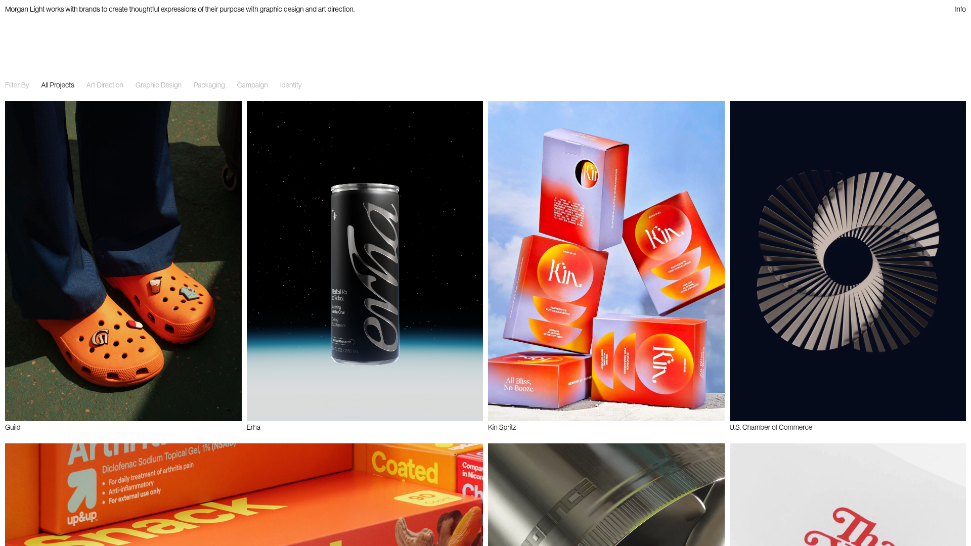
Morgan Light Design Portfolio Grid
A minimalist portfolio layout featuring a multi-column masonry-style grid with categorised project filters, image-based hover states, and smooth slide-based navigation.
Manna Architects Minimalist Portfolio Grid
A clean, single-page architecture portfolio featuring a centered intro, a varied multi-column image gallery with captions, and a detailed project service breakdown.
