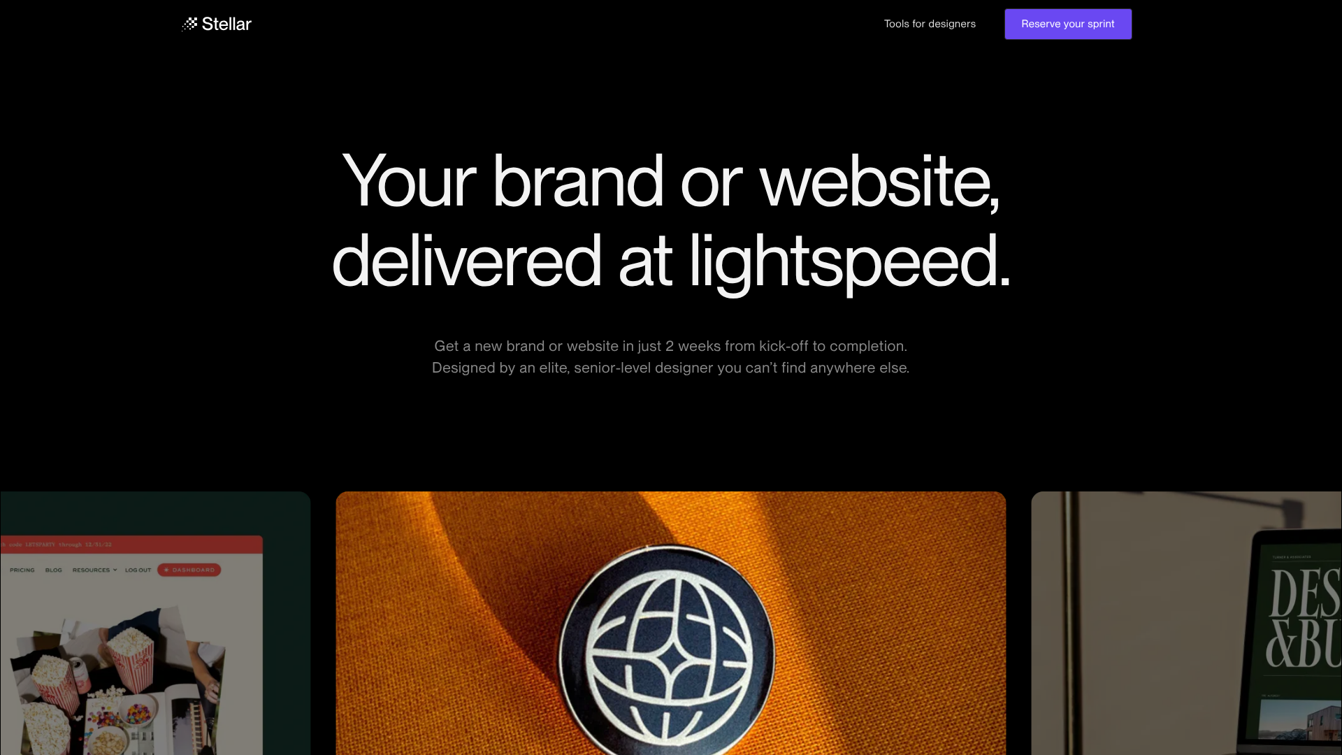
Stellar agency landing page
Dark-mode design agency landing page featuring a horizontal scroll gallery, tabbed CMS portfolios, and a unique button animation pattern with integrated availability status.
Overview
Stellar is a design agency landing page built for high-trust conversions using a sleek dark-mode aesthetic. It serves as a premier reference for agencies and product-driven services due to its expert use of white space, sophisticated tabbed CMS portfolios, and integrated availability indicators that create psychological urgency.
Design System
- Color Palette & Visual Hierarchy: The site uses a pure black background (#000000) with a monochromatic gray scale for text (gray-900 for emphasis, gray-500/600 for secondary descriptions). Vibrant accents are limited to a signature purple (via buttons) and a green 'pulse' indicator for status, ensuring the portfolio imagery remains the focal point.
- Typography: Features a modern sans-serif typeface (Inter-like) with high contrast in weight. The 'heading-mega' class provides large, bold statements, while body text uses a generous
text-size-largefor readability against the dark background. - Page Structure:
- Hero Section: Centered high-impact value proposition with small supporting text.
- Service Sprints: Alternating two-column layouts pairing descriptive lists with high-quality device mockups.
- Stellar Work: A tabbed interface switching between 'Branding' and 'Web Design' categories with a horizontal scroll/slider component.
- Trust/Mechanism Section: Background video branding paired with explanatory copy on the agency's methodology.
- Horizontal Scroll Process: A unique 'How it works' section with numbered visual cards (01–04).
- CTA Footer: Centered 'heading-xxlarge' lead magnet and a multi-column gray-themed footer.
- Reusable Components:
- The Animated Button (
cc-animated): A sophisticated pattern where the button text swaps between a call-to-action (e.g., "Start a brand sprint") and pricing/info (e.g., "Two weeks, $15k") on hover or interaction. - Availability Badge: A pulse-animated green dot paired with dynamic text ("3 spots left in April") for real-time social proof.
- Stripe/List Items: Square bullet icons with
text-size-mediumfor clean feature listing.
- The Animated Button (
- Interaction Patterns: The site heavily utilizes the Webflow interactions engine (
data-w-id) for entrance animations (scrolling laps), tab transitions, and hover-triggered text changes in buttons. A horizontal-to-vertical scroll wrapper handles the 'How it works' cards. - Implementation Clues: Optimized for Webflow, utilizing
fs-cmsslider(Finsweet) for CMS-driven portfolios andfs-scrolldisable-elementfor modal control within the login flow.
Use Cases
- Who should clone this: Small agencies, solo-productized services, and high-end consultancies wanting to transition from a generic 'marketing' look to a 'premium studio' feel.
- Effective Remixes: Software-as-a-Service (SaaS) platforms could remix the 'Service Sprint' layouts to showcase platform features, while photographers could repurpose the tabbed work sliders for categorical galleries.
- Remix Directions: Swap the monochromatic scheme for a high-contrast white/navy 'Enterprise' brand style; replace the 'availability pulse' with an 'active users' count; or extract just the horizontal-scrolling card section for a simplified 'Our Story' timeline.
- Clone Scope: A full-page clone is ideal for those needing a complete sales funnel with integrated client login (as seen in the
login-modalHTML). Alternatively, the 'Animated Button' and 'Availability' component pair is a high-value snippet for any existing site.
Related Inspirations
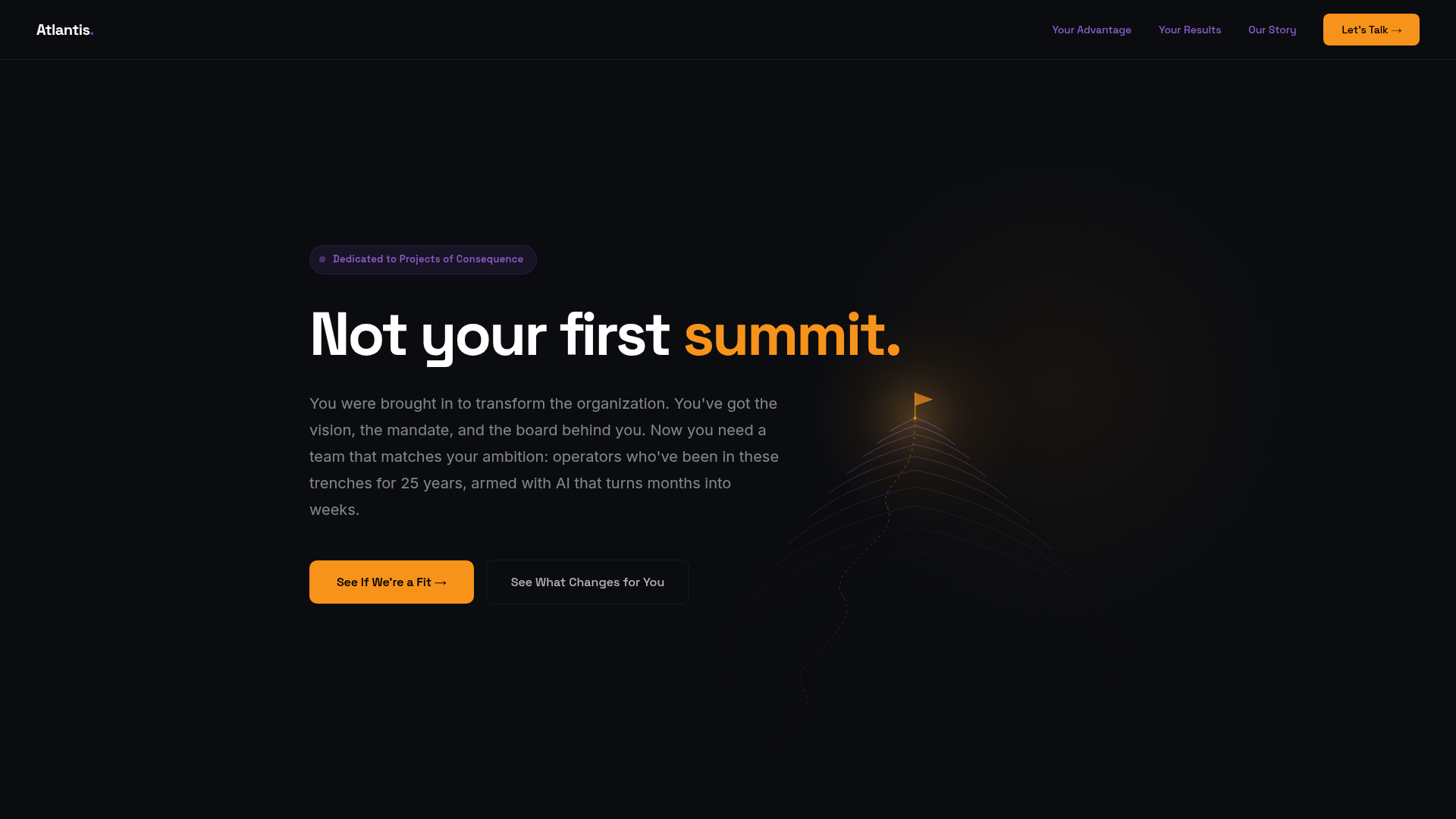
Atlantis Tech Engineering Services Landing Page
A dark-themed professional services layout featuring a custom SVG mountain hero, logo cloud, benefits grid, process timeline, and a dual-column 'fit' comparison section.
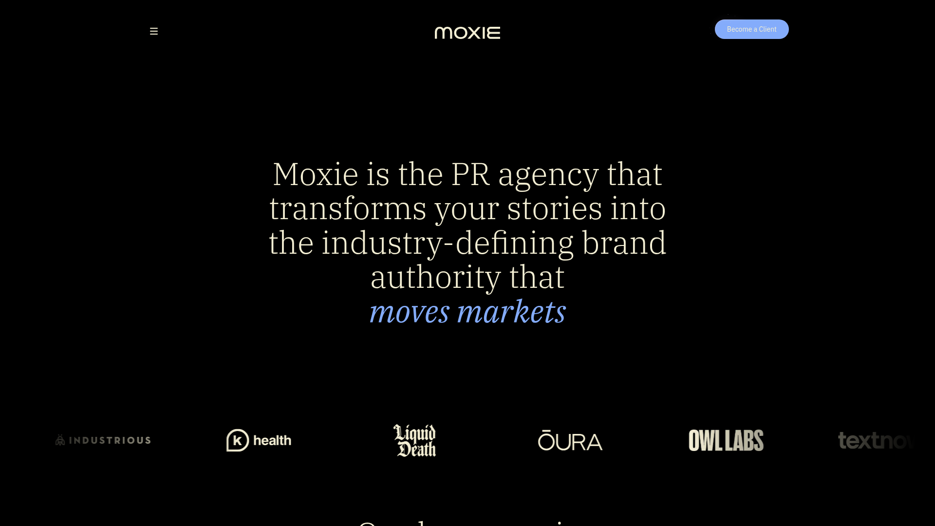
Moxie PR Agency Landing Page
A dark-themed agency site featuring an animated typewriter hero, ticker-style marquee, interactive case study cards with video backgrounds, and a vertical sticky services section.

Niklas Rosén Designer Portfolio Index
A minimalist, responsive grid-based portfolio index featuring a clean 16-column layout, typographic list components, and a custom dark mode transition.
Minimalist Dark Mode Loading Screen
A clean, dark-themed redirection page featuring a centered typography layout and a CSS circular loading spinner for asynchronous processing states.

GoCardless Payments Platform Landing Page
A dark-themed fintech landing page featuring a split-screen video hero, bento-style feature cards, a horizontal logo slider, and step-by-step accordion guides.
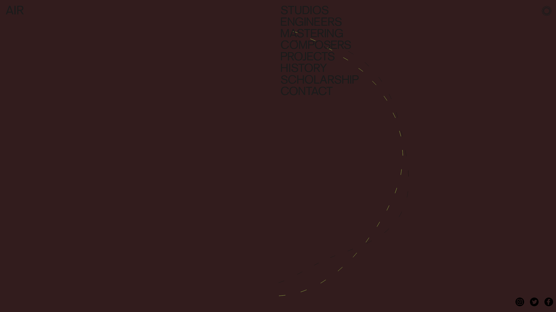
AIR Studios Minimalist Navigation Landing
A dark, minimalist layout featuring a vertical text-based navigation menu, a full-screen background video wrapper, and a dynamic canvas-based interactive drawing layer.
