Antonio Luvé Portfolio Image Grid
A minimalist portfolio featuring a mouse-tracking cursor, dynamic image grid with hover-state background colors, and a clean minimalist navigation layout.

Overview
This portfolio belongs to illustrator Antonio Luvé and serves as a masterclass in minimalist, high-impact grid design. It uses a bold primary yellow background and a dynamic, multi-column image grid that prioritizes visual content over text. It is a strong reference for builders looking to implement custom cursor interactions and color-coordinated hover states to create a playful, tactile user experience.
Design System
- Color Palette & Visual Hierarchy: The dominant background is a vibrant yellow (#FFC900). Interactive elements use a specific "hover-state" color strategy where each grid item is assigned a unique background color—such as purple (#9966FF), orange (#FF5E00), and green (#019273)—visible only when the mouse interacts with the image. The logo and navigation text are black, providing high contrast against the bright background.
- Typography: The site uses a clean, modern sans-serif typeface (likely a variant of Poppins or similar) with generous letter spacing. The hierarchy is extremely flat; navigation links ("Info", "Projects") and project titles (H3) share similar weights, allowing the artwork to lead the visual hierarchy.
- Page Structure: The layout features a persistent top navigation bar with the logo centered between two utility links. Below this, a large-text lead-in section ("Illustrations & silly animations") transitions into a dense, alternating grid of images and GIFs.
- Reusable Components:
- Dynamic Grid Cards: Components (
div.box) containing an image and a hiddena.box_hoveroverlay that appears on hover. - Top Navigation: A minimalist header with a central animated SVG/GIF logo and corner-aligned text links.
- Mouse Follower: A custom cursor element (
div.mouse) that tracks movement and likely scales or changes color upon entering grid items.
- Dynamic Grid Cards: Components (
- Interactions & Motion: The primary interaction is the hover state on grid items. When a user hovers, the image is replaced or overlaid by a solid color block containing the project title. The HTML class
mouseFollowindicates that the cursor logic is tied to individual grid containers to handle scale and proximity effects. - Responsive Behavior: The HTML structure uses a flexible column-based system (
div.colanddiv.b), suggesting the grid reflows from a multi-column desktop layout to a single or double-column mobile view while maintaining the aspect ratio of the images.
Use Cases
- Who should clone this: Illustrators, graphic designers, and photographers who want their work to be the primary focus without the distraction of heavy UI elements or complex navigation.
- Effective Remixes: Creative agencies can adapt this grid for Case Studies, or e-commerce brands could use this layout for a "Lookbook" feature where hover states reveal product names and prices.
- Practical Remix Directions:
- Brand Swap: Replace the yellow background with a dark mode or neutral palette while keeping the vibrant hover colors.
- Architecture: Use the top-corner navigation style for one-page scrolling sites.
- Sectional Reuse: Clone only the
mouseFollowgrid logic to display a gallery within a more traditional corporate site.
- Suggested Clone Scope: A full-page clone is recommended to capture the relationship between the custom cursor, the background-color transitions, and the minimalist header.
Related Inspirations
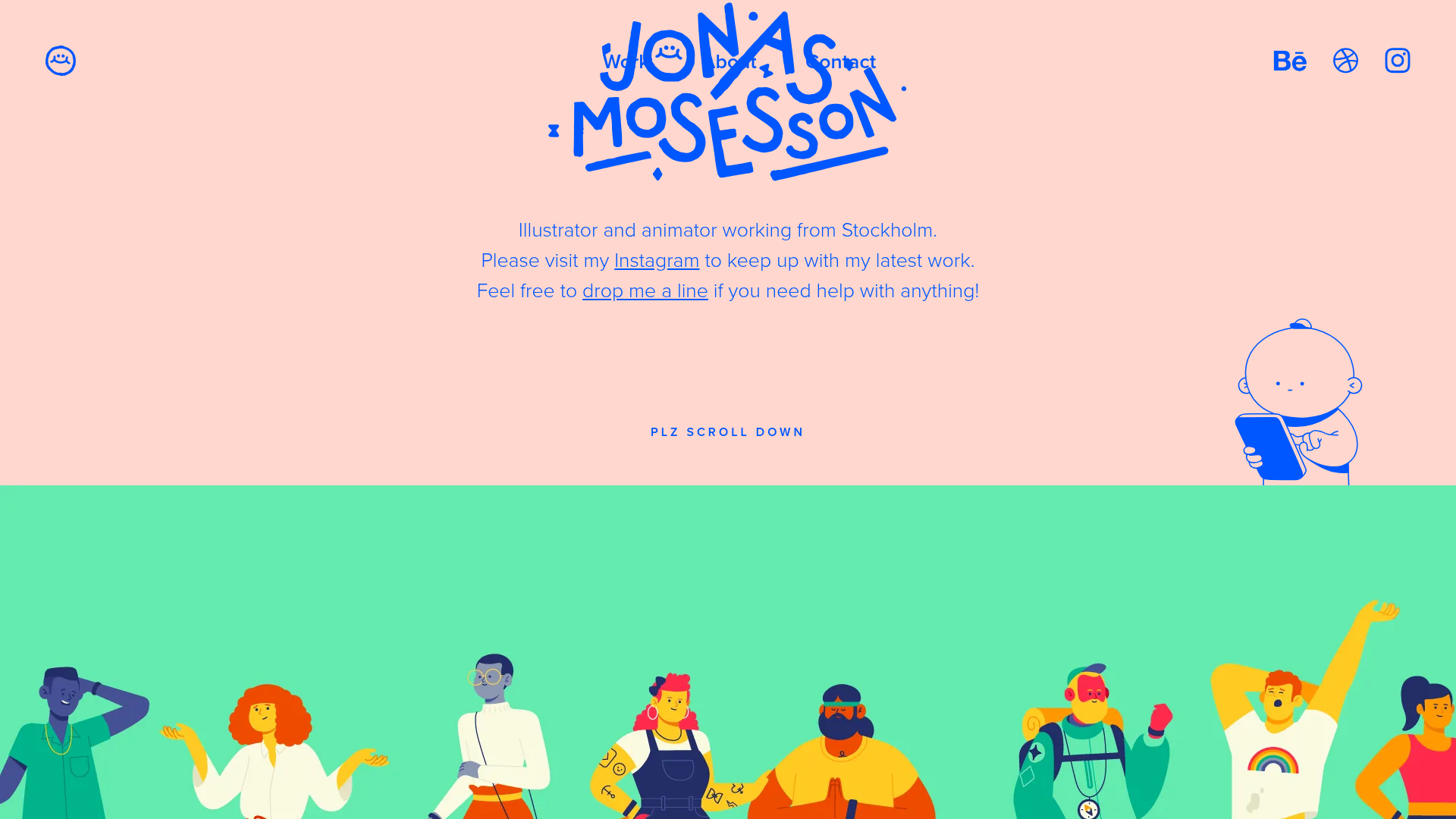
Jonas Mosesson Illustrator Portfolio Layout
A playful portfolio featuring a custom-animated logo header, a responsive multi-column project grid with hover-revealed details, and a distinct minimalist sectioned about page.
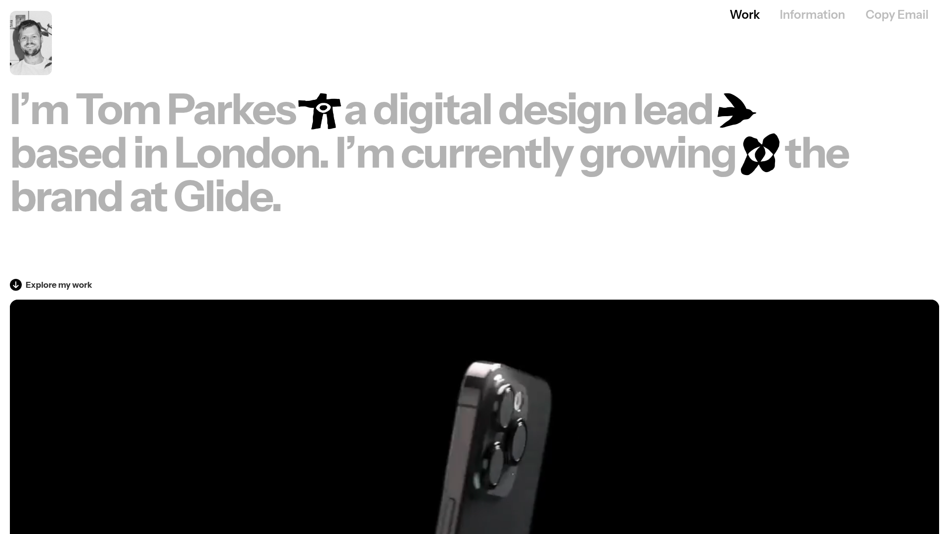
Tom Parkes Portfolio Design Gallery
A minimalist portfolio layout featuring a typography-focused hero section with inline icons, full-width video scroll reveals, and a dense masonry grid for visual assets.
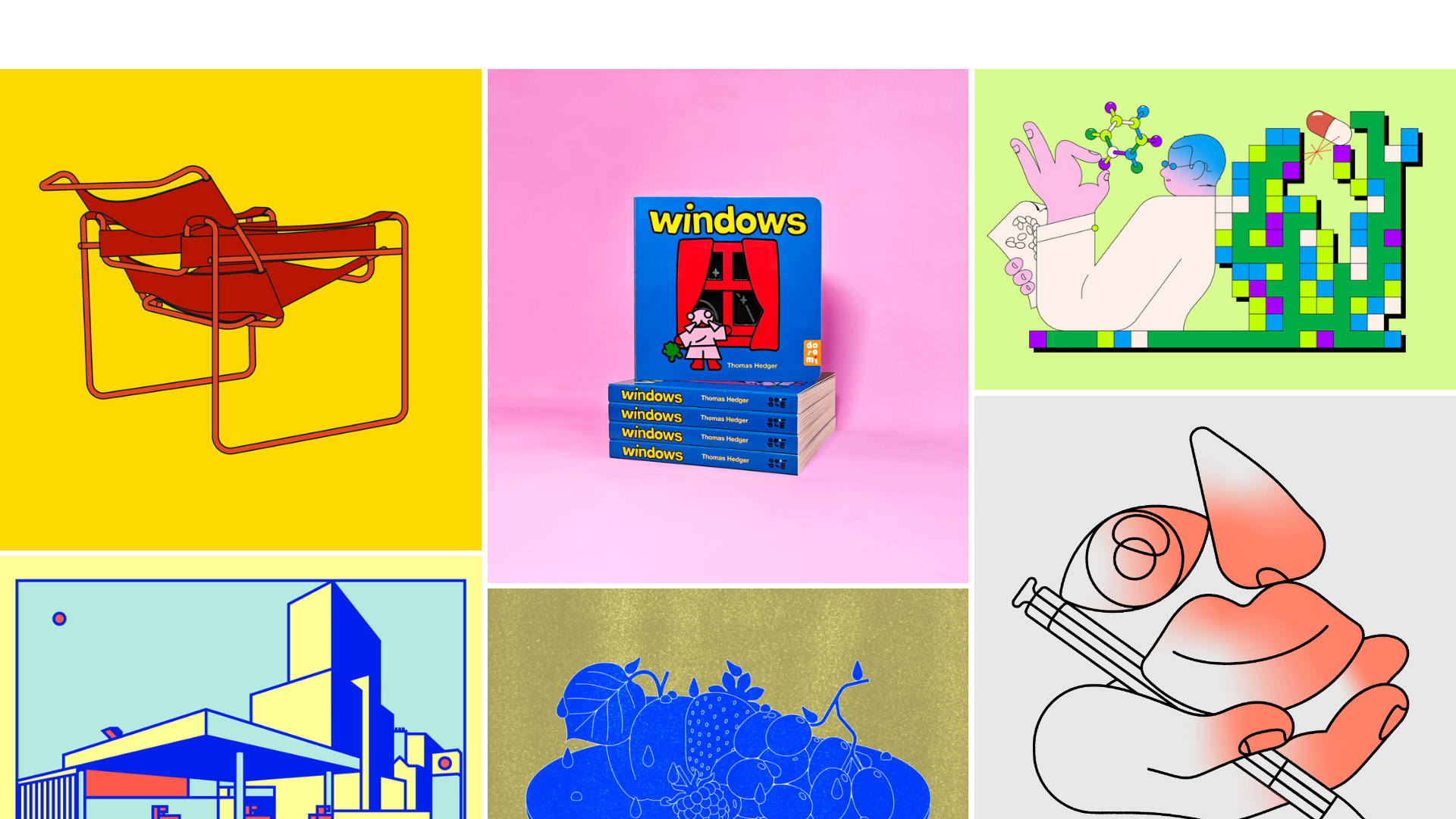
Thomas Hedger Illustration Portfolio Gallery
A minimalist three-column masonry grid layout featuring scroll-fade transitions, responsive image galleries, and external project linking for creative portfolios.
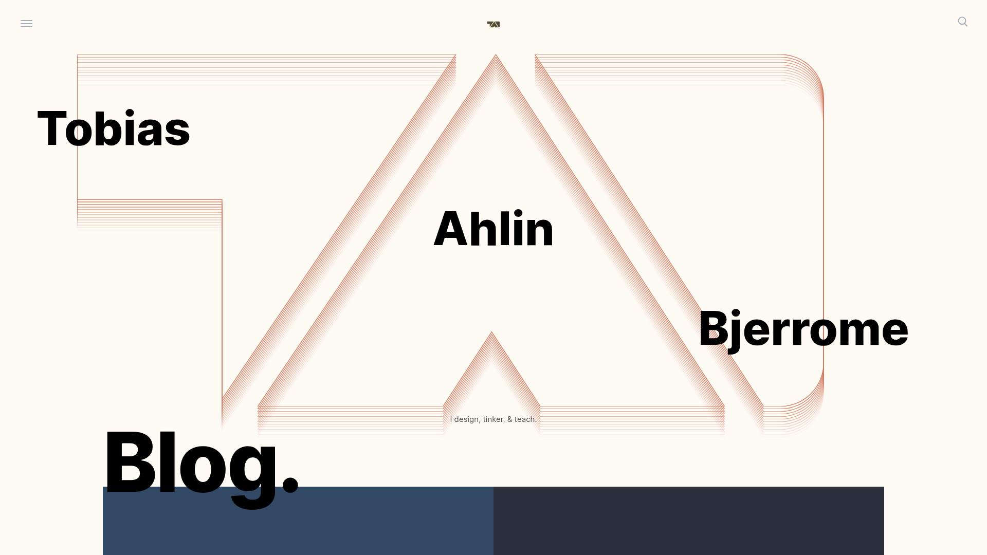
Tobias Ahlin Portfolio Design Portfolio
A layout-driven portfolio featuring a geometric animated hero, custom SVG typography transitions, and a responsive grid of card-based blog posts and project highlights.
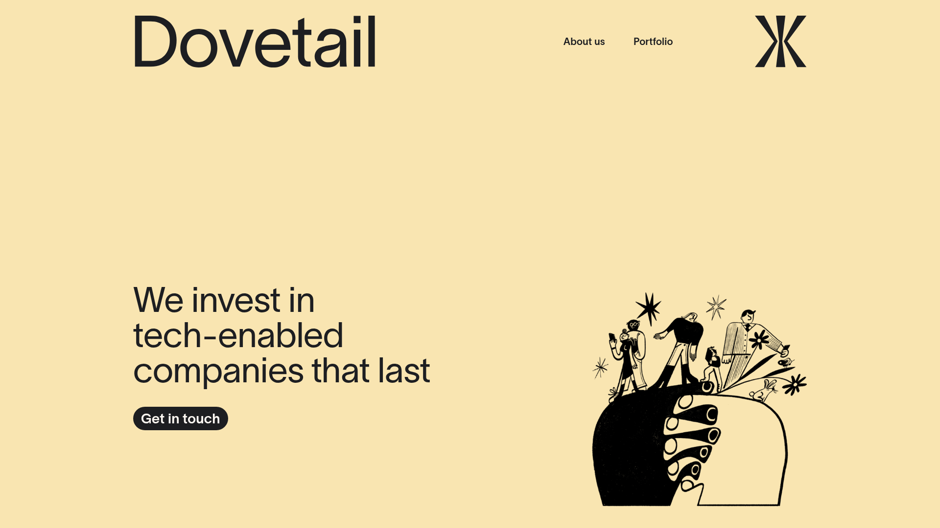
Dovetail Venture Portfolio Landing Page
A minimalist investment site featuring a warm pastel palette, distinctive hand-drawn illustrations, horizontal carousel for project cases, and a clean typography-focused grid layout.
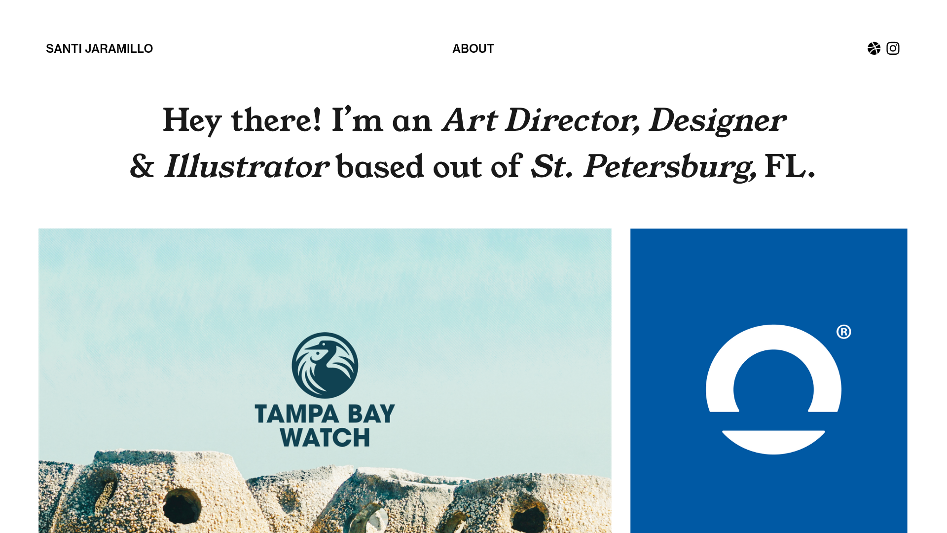
Santi Jaramillo Design Portfolio Page
A minimalist portfolio layout featuring a large typography-driven hero section with hover-triggered GIFs and an asymmetrical justified grid for project thumbnails.
