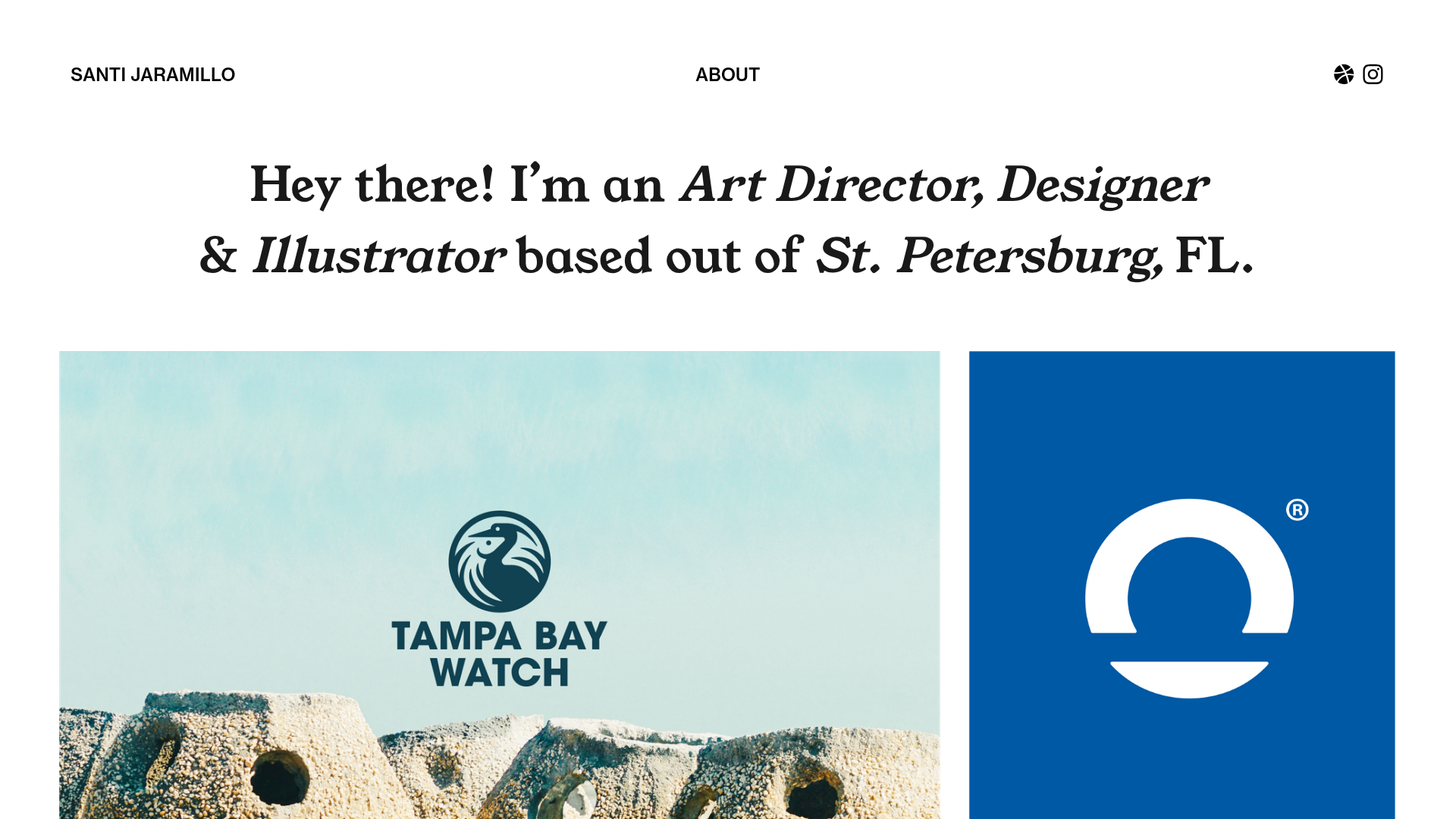
Santi Jaramillo Design Portfolio Page
A minimalist portfolio layout featuring a large typography-driven hero section with hover-triggered GIFs and an asymmetrical justified grid for project thumbnails.
Overview
This design is a high-impact, minimalist portfolio for creative professionals that balances elegant serif typography with a dynamic, asymmetrical grid. It is an excellent clone reference for those looking to create an 'editorial-style' personal brand that prioritizes large-scale imagery and interactive micro-moments.
Design System
- Color Palette & Visual Hierarchy: The site uses a clean, high-contrast white background with black primary text. Visual interest is generated purely through project thumbnails, creating a system where the work provides the color while the interface remains neutral and sophisticated.
- Typography: The hero section uses a large-scale serif font (likely high-contrast display serif) with heavy use of italics for emphasis. The header text uses a clean sans-serif for utility links like 'About' and 'Santi Jaramillo,' creating a clear distinction between brand name and creative statement.
- Page Structure: The layout follows a top-down flow: a slim utility navigation bar, a massive typographic hero area (occupying significant vertical space), and a 'justified' thumbnail grid where project blocks vary in width but maintain a consistent horizontal alignment within rows.
- Reusable Components: The
grid-rowandgrid-colstructure from the HTML is a key component to clone, as it handles the uneven thumbnail widths (e.g., a 64% width image paired with a 31% width image). The hover-trigger system for GIFs is a highly reusable patterned component for adding personality to text. - Interaction & Motion: The standout feature is the
hover-titleandhover-imagerelationship seen in the HTML code. Hovering over specific italicized terms in the hero text triggers the visibility of floating GIF layers (giphy-2.gif). Additionally, thumbnails utilize ascroll-transition-fadeclass for smooth entry as the user moves down the page. - Responsive Behavior: The HTML indicates a liquid layout using percentage-based widths (e.g.,
width: 64.4251%) anddata-elementresizer, suggesting a layout that fluidly scales before stacking into a single column for mobile devices.
Use Cases
- Who should clone this: Art directors, graphic designers, and photographers who want a 'portfolio-as-gallery' feel that showcases a high volume of work without feeling cluttered.
- Effective Remixes: This pattern can be remixed for high-end digital agencies or boutique architectural firms by swapping the playful GIFs for professional project snippets or technical drawings.
- Remix Directions: One could adapt the information architecture by replacing the 'justified' grid with a strict 3-column masonry layout while keeping the typographic hero section. The hover-triggered GIF logic could be reused for an 'About' page to reveal team headshots or studio culture photos.
- Clone Scope: For a fast setup, clone the hero section to immediately establish a strong brand voice. For a comprehensive project, a full-page clone is recommended to capture the specific math behind the asymmetrical thumbnail grid.
Related Inspirations
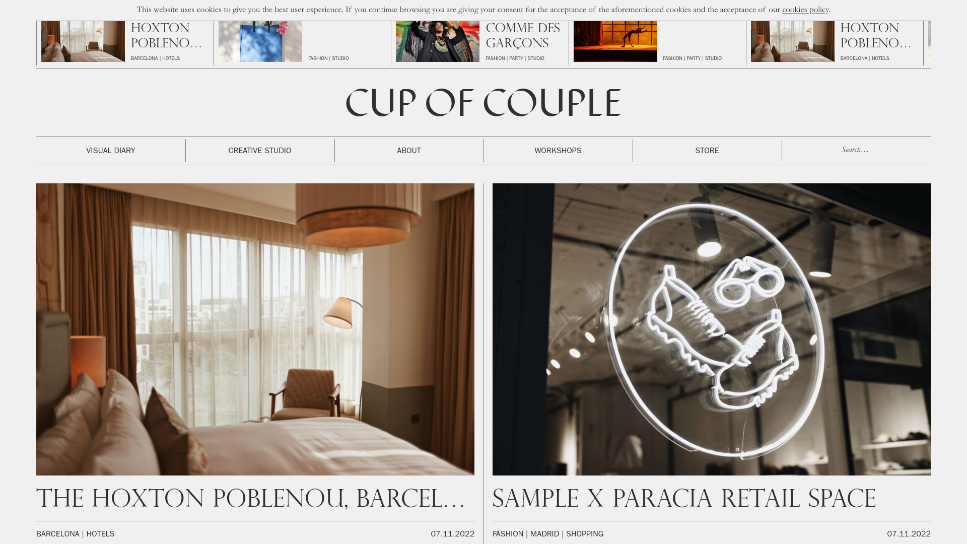
Cup of Couple Editorial Portfolio
A high-fashion editorial layout featuring a sticky compartmentalized header, a horizontal marquee carousel, and a mixed-width masonry grid with marquee typography effects.
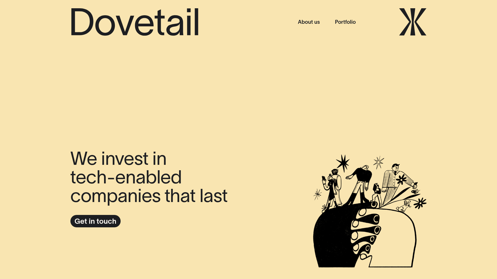
Dovetail Venture Portfolio Landing Page
A minimalist investment site featuring a warm pastel palette, distinctive hand-drawn illustrations, horizontal carousel for project cases, and a clean typography-focused grid layout.
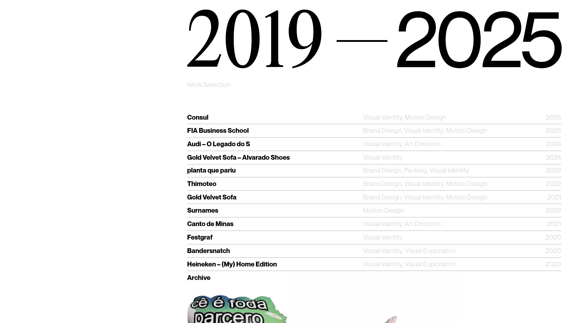
Gustavo Faria Minimalist Portfolio Index
A clean, list-based portfolio layout featuring hover-triggered image previews, a sticky sidebar with biography, and a typography-driven project archive.
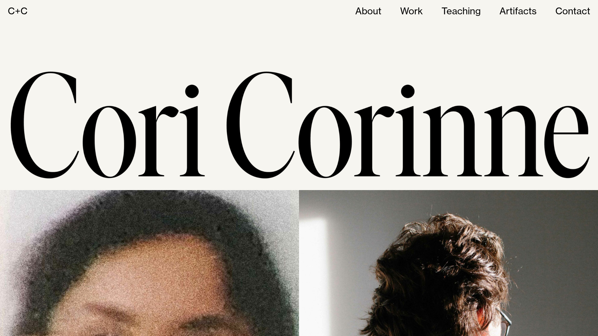
Cori Corinne Minimalist Portfolio Home
A clean, typography-focused layout featuring a massive serif hero header, two-column image grid, and text-based navigation for a high-end editorial feel.
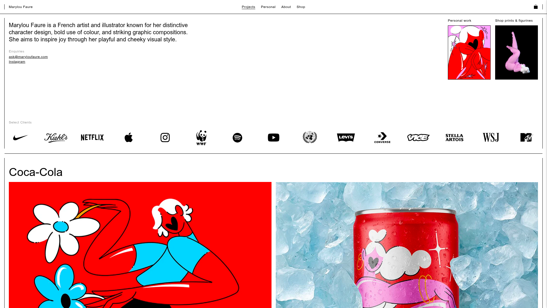
Marylou Faure Illustration Portfolio
A minimalist Shopify-based portfolio featuring a grid-based project layout, sticky navigation, a client logo marquee, and image-rich project carousels.
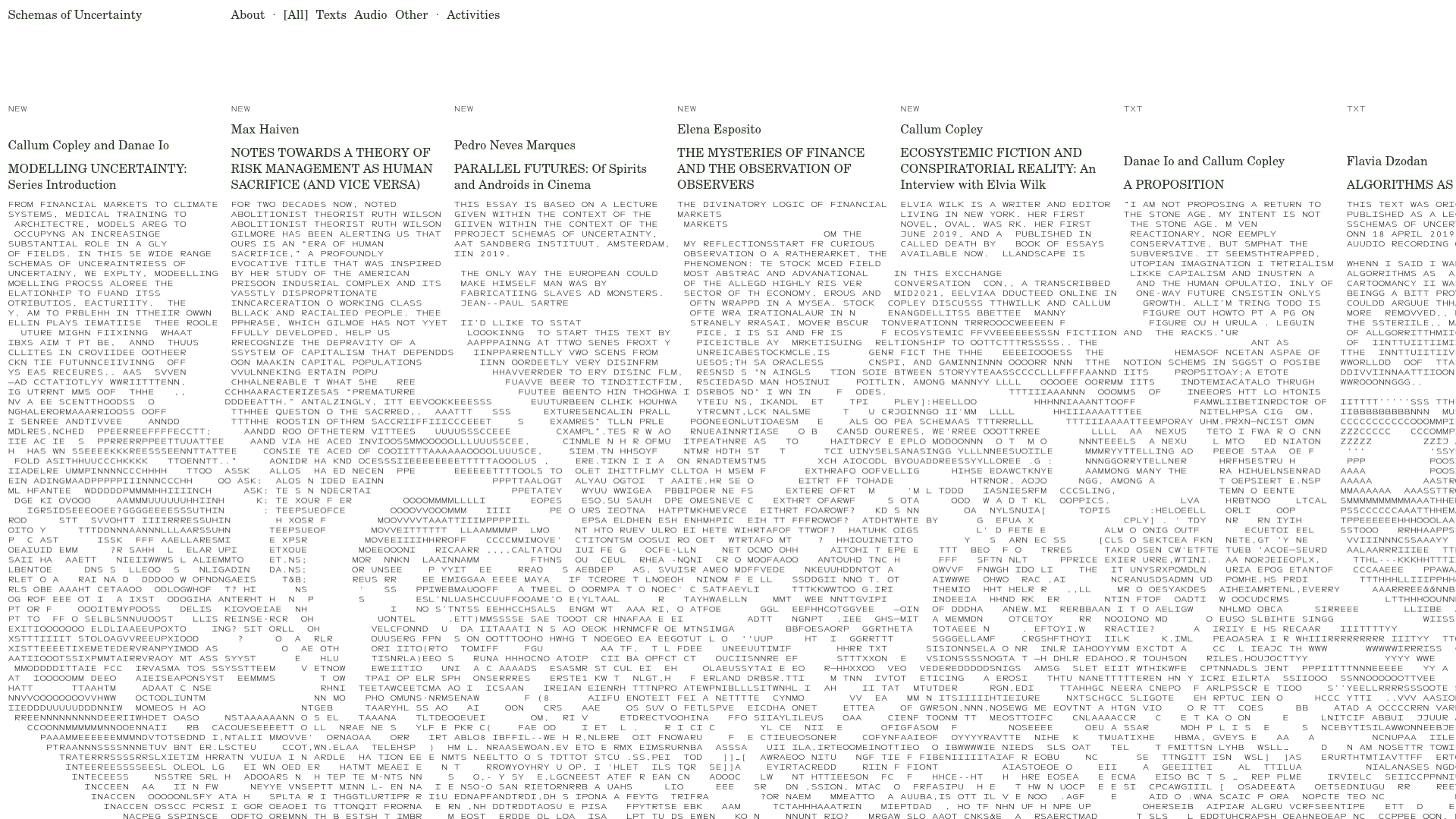
Schemas of Uncertainty Monogram Grid
A brutalist multi-column layout for text-heavy content featuring high-contrast typography, minimalist navigation, and a rhythmic vertical grid of essays.
