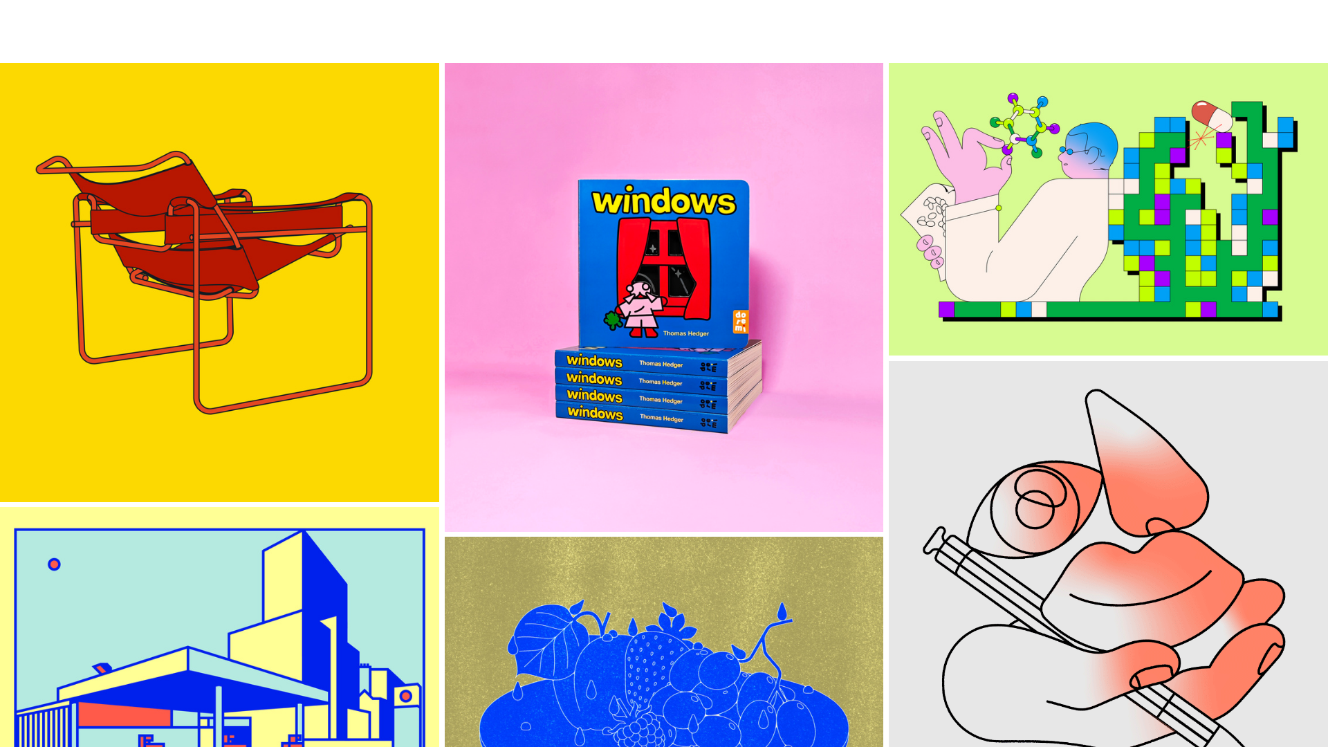
Thomas Hedger Illustration Portfolio Gallery
A minimalist three-column masonry grid layout featuring scroll-fade transitions, responsive image galleries, and external project linking for creative portfolios.
Overview
This portfolio site showcases high-impact illustration work using a clean, minimalist three-column masonry grid that prioritizes visual content over interface chrome. It is an excellent reference for builders wanting to showcase diverse media types (images and GIFs) in a fluid, high-density layout without clutter. The site's primary strength lies in its seamless blend of a responsive gallery with external project linking.
Design System
- Color Palette & Visual Hierarchy: The UI uses a strictly neutral baseline (likely white or light gray background) to let the vibrant colors of the illustrations define the page's energy. Hierarchy is flat; there are no text labels or headers on the main grid, making each image a primary entry point.
- Typography: Though minimalist, the 'Cart' button and menu icons suggest a sans-serif system font or a clean geometric sans. The gallery relies on the 'windows' book cover and titles within images to communicate brand voice rather than HTML text.
- Page Structure: A single-page flow consisting of a truncated header/loading area followed by a
main_container. The core content is housed in a.image-gallerydiv subdivided into three equal columns (column="1",column="2",column="3"). - Reusable Components:
- Gallery Card: An
<a>tag ordivwrapper with the class.gallery_cardcontaining images with specific aspect ratio padding (e.g.,padding-bottom: 100%for squares) to ensure grid stability. - Floating Menu: The
#site_menu_buttonis a fixed-position element (top-right) that keeps the interface clear.
- Gallery Card: An
- Interaction and Motion: The site uses a
scroll-transition-fadeclass. Elements are initially marked asbelow-viewportand fade in as the user scrolls. The HTML reveals an.image-zoomclass, indicating a lightbox or scale-up effect on click for non-linked items. - Responsive Behavior: The gallery is configured for desktop (3 columns) and mobile (1 column) specifically through the
data-galleryJSON attribute, which setsmobile_data:{"columns":"1"}and handles image padding transitions from0.5to1on smaller screens. - Implementation Clues: Built using the Cargo Collective platform, evidenced by
data-type="cargo_menu"and specificlocal-styleIDs. It utilizes a masonry-style logic where images are manually or dynamically sorted into three distinct column containers rather than a single flex-wrap container.
Use Cases
- Who should clone this: Digital artists, editorial illustrators, and photographers who need a "visual-first" landing page that acts as a portal to multiple external platforms (Behance, shop links, or articles).
- Remix Directions:
- E-commerce Hook: Replace external project links in the
.gallery_cardwith a direct "Add to Cart" AJAX trigger. - Style Swap: Change the background to a dark mode aesthetic; the existing
scroll-transition-fadewill work effectively against a black background for a cinematic feel. - Info Overlay: Hover states could be remixed to show project titles and years using absolute-positioned text overlays which are currently absent.
- E-commerce Hook: Replace external project links in the
- Clone Scope: A quick section clone of the 3-column masonry grid is ideal for those who already have a header/footer. A full-page clone is recommended for high-impact, minimalist portfolio launches where the images are the brand.
Related Inspirations

Baubauwerk Minimal Agency Portfolio Homepage
A clean studio site featuring a centered text hero, scatter-plot filterable project gallery, and full-bleed image sections for case studies.
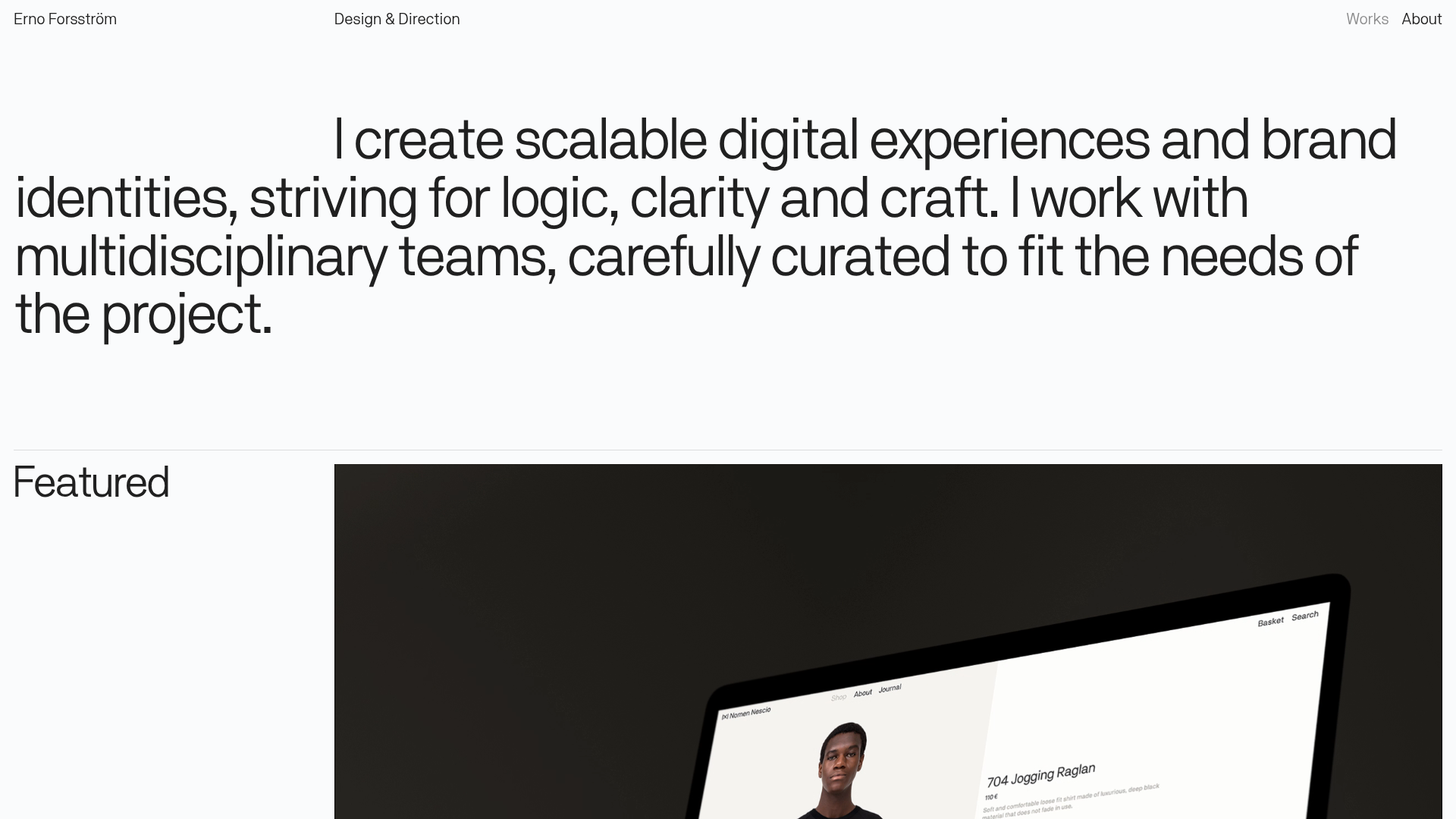
Erno Works Minimalist Design Portfolio
A clean, typography-focused portfolio featuring a sticky grid layout, large editorial headers, and integrated video project thumbnails for dynamic case study previews.
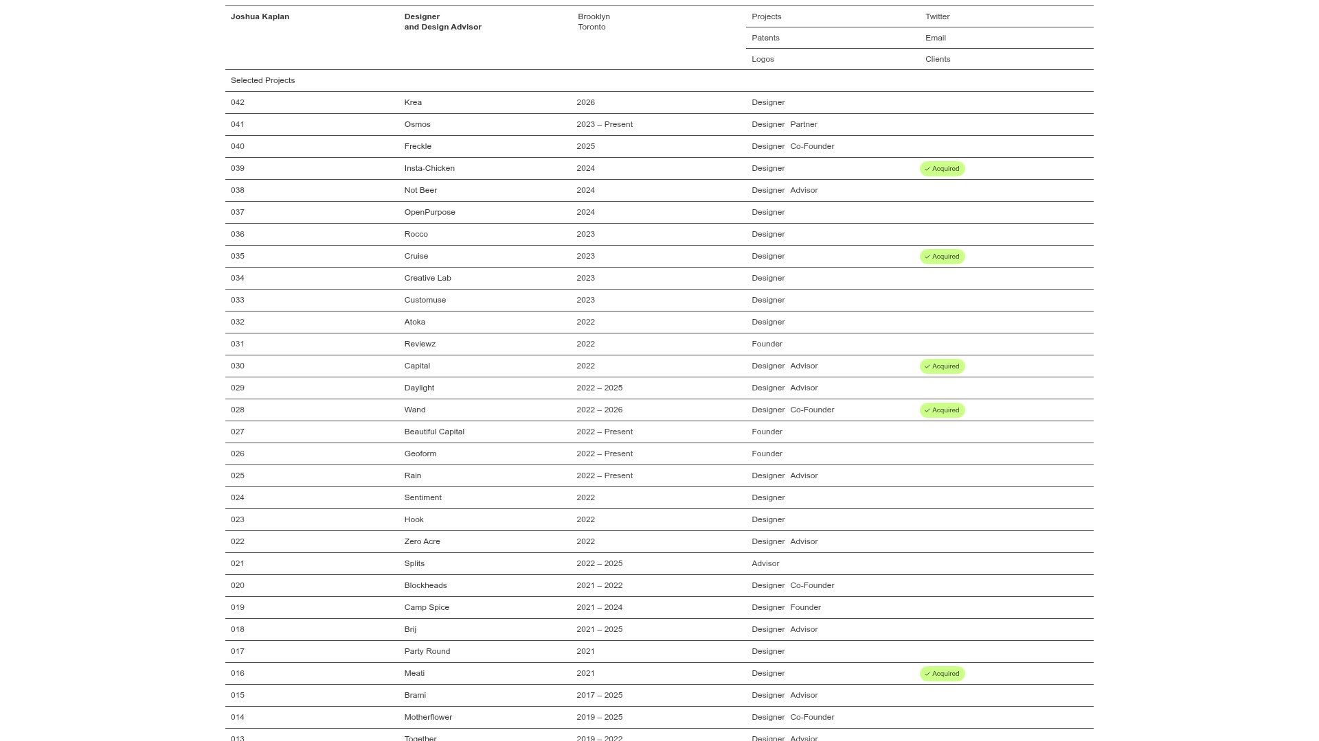
Joshua Kaplan Portfolio Index
A minimalist, text-only portfolio layout featuring an expansive tabular list of projects with horizontal rule separators and clean typography.
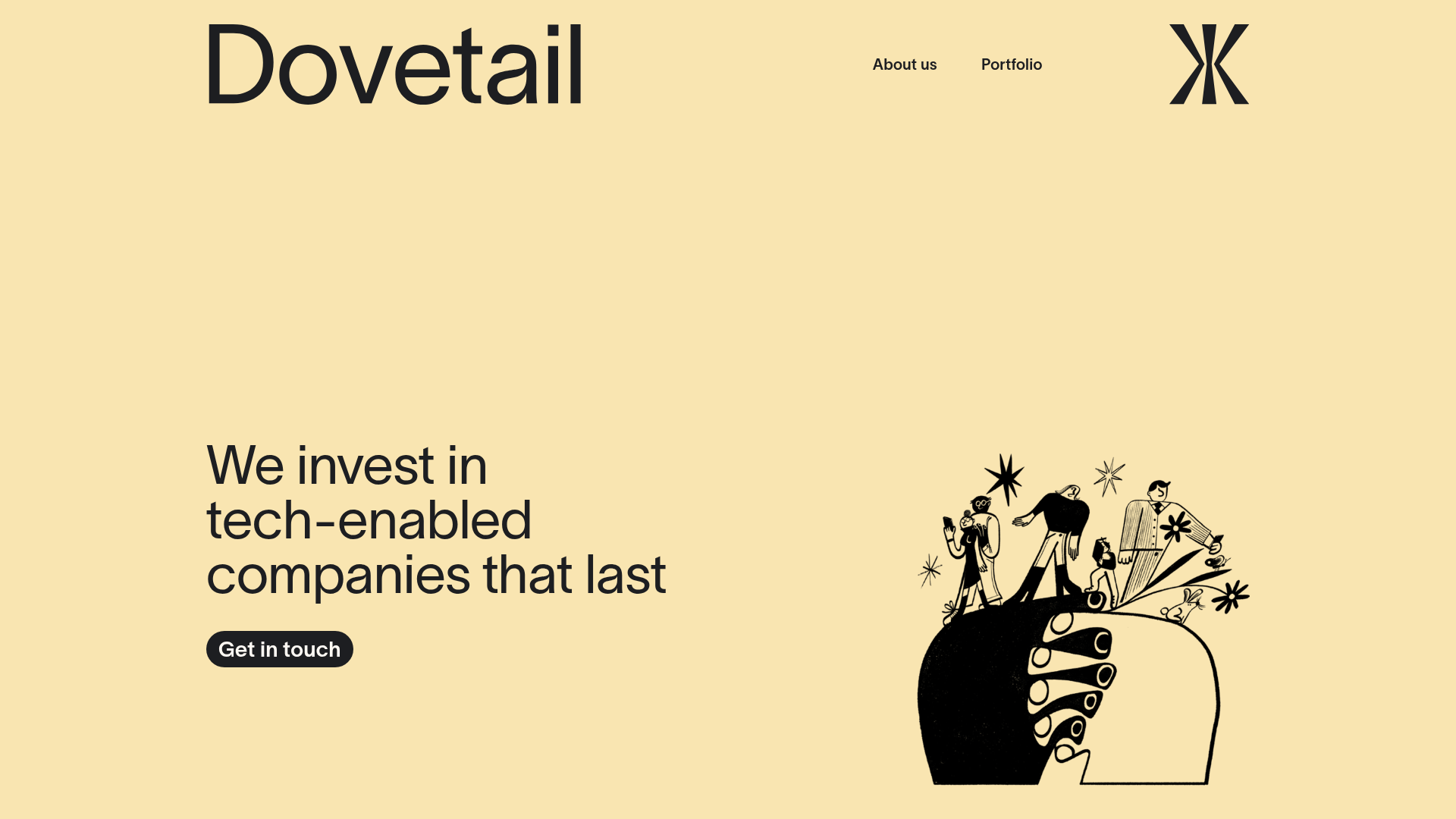
Dovetail Venture Portfolio Landing Page
A minimalist investment site featuring a warm pastel palette, distinctive hand-drawn illustrations, horizontal carousel for project cases, and a clean typography-focused grid layout.
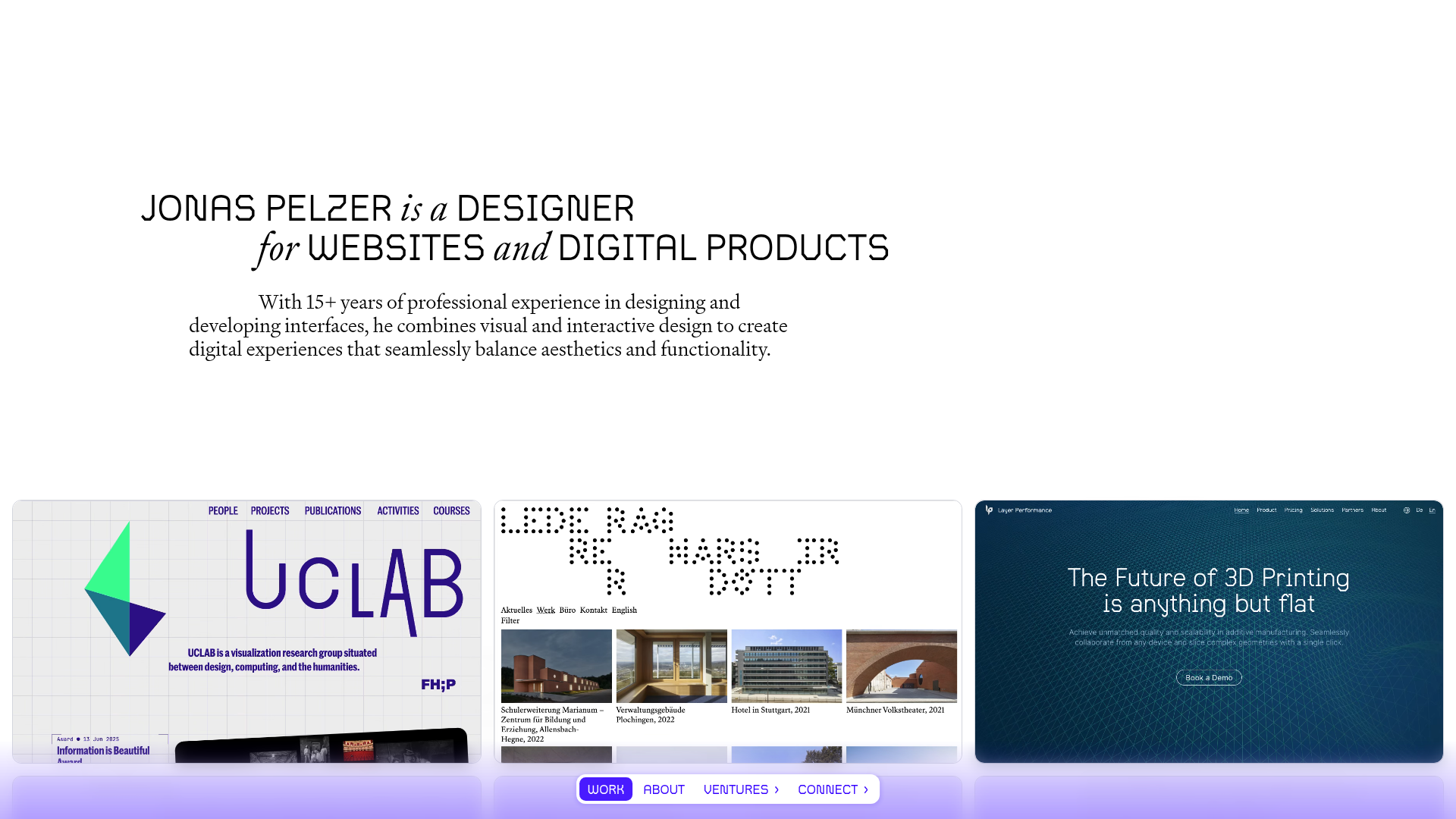
Jonas Pelzer Portfolio Showcase
A minimalist design portfolio featuring a large typography hero, a staggered video project grid, and a sticky tab-based navigation bar for content switching.
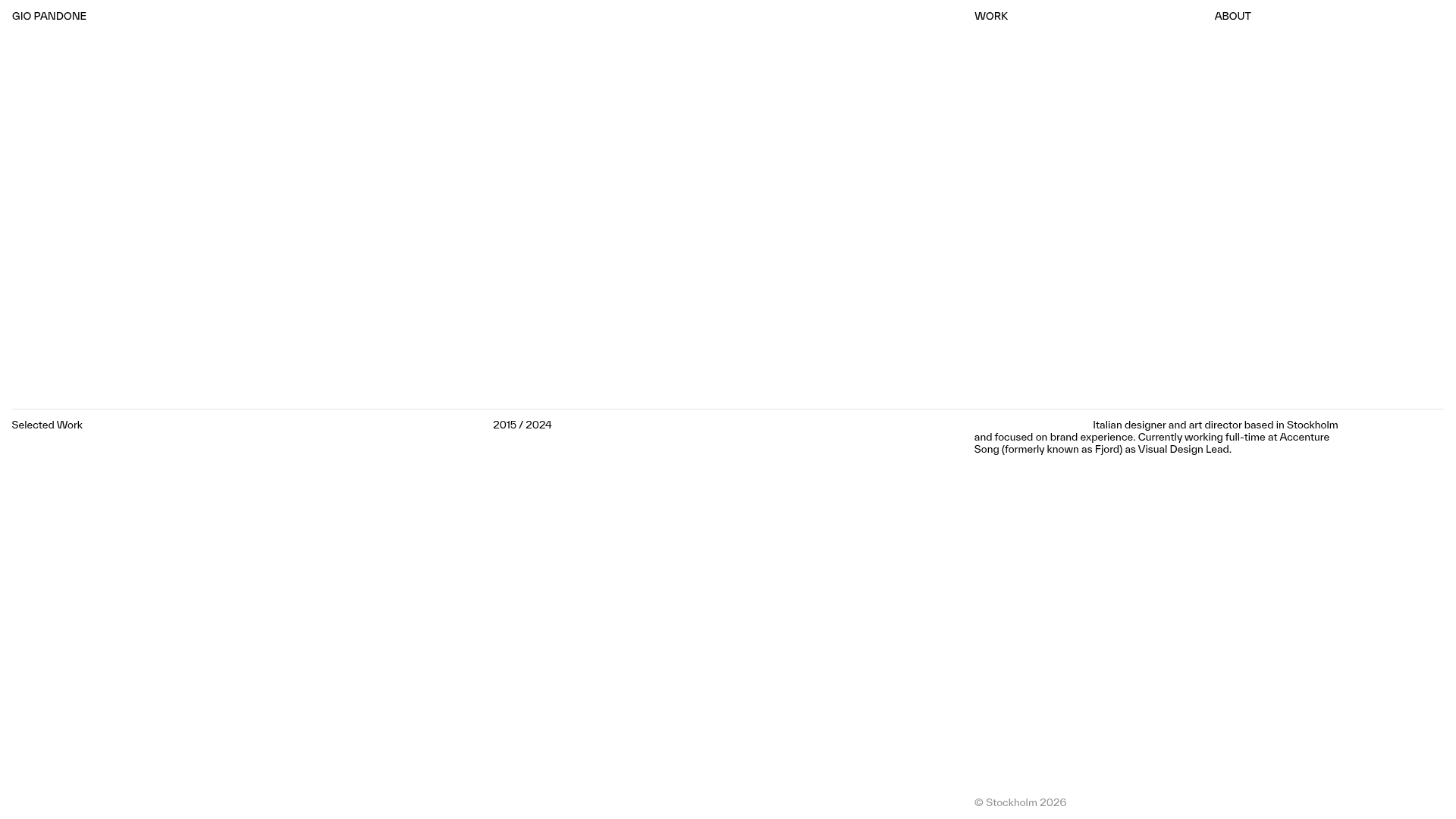
Gio Pandone Minimalist Portfolio Template
A clean, grid-based designer portfolio featuring a sticky minimalist navigation, scroll-triggered entrance animations, and a responsive 12-column work gallery with embedded video previews.
