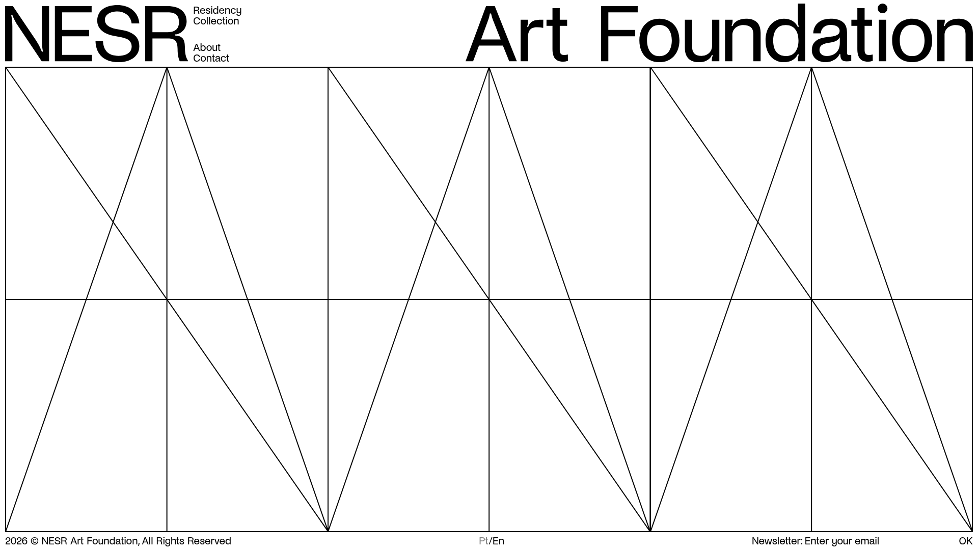
NESR Art Foundation Gallery Site
A minimalist art foundation template featuring a geometric wireframe background, modular content drawers for artist residencies, and custom image carousels.
Overview
This website for the NESR Art Foundation is a masterclass in minimalist, high-contrast digital brutalism. It uses a rigorous geometric grid and typography-led navigation to create an immersive, gallery-like experience that effectively organizes large volumes of artistic data without clutter. It is an excellent clone reference for sites requiring a "high fashion" or "fine art" aesthetic while maintaining functional complexity.
Design System
- Color Palette & Visual Hierarchy: A strict monochromatic palette (#000000 black on #FFFFFF white). The hierarchy is established through extreme scale: oversized headings for global navigation contrasted with smaller, dense serif and sans-serif text for metadata.
- Typography System: The system relies on a bold, high-impact Sans-Serif (reminiscent of Helvetica or Inter) set with tight kerning for main headers like "NESR" and "Art Foundation." Content uses a mix of bold sans-serif for internal triggers and standard weights for body copy.
- Page Structure & Section Flow: The layout is built on a custom 12-cell geometric wireframe overlay. Navigation is positioned in the top-left and top-center, while content is hidden behind "drawers." When a category like "Residency" is triggered, a sliding content module (
div.content-module) obscures a portion of the grid to display text and carousels. - Reusable Components:
- Grid Backdrop: A series of SVG vectors (
frame-svg) that provide a structural skeleton. - Drawer Content Modules: High-impact text blocks linked to specific artist data.
- Swiper Carousels: Modular image galleries (
swiper-container) integrated directly into text lists for seamless portfolio viewing. - Newsletter Footer: A minimalist form embedded into the baseline navigation.
- Grid Backdrop: A series of SVG vectors (
- Interactions & Motion: The design uses
before-linktriggers for state changes. Elements expansion into full biography/gallery views suggests the use of CSS transitions or JavaScript-controlled widths for the content drawers. - Mobile Behavior: The HTML reveals a dedicated
#mobile-menu-containerwith a vertical stack for triggers and an adapted Swiper implementation (swiper-container-mobile) that ensures the portfolio remains navigable on touch devices.
Use Cases
- Target Audience: Independent galleries, architecture firms, high-end editorial magazines, and creative portfolios.
- Remix Potential: This pattern is perfect for products that need to showcase a "Collection" vs. "About" binary. A developer can remix this by replacing the harsh white with a soft cream/black pairing for a more heritage-luxury feel.
- Remix Directions: Swap the geometric SVG background for a more organic line-art style to soften the brutalism, or adapt the "drawer" system for a technical documentation site where users need to toggle between complex datasets.
- Clone Scope: Builders should first clone the baseline grid and the sliding content-module logic. For a quick win, reuse the minimalist typography-only navigation headers.
Related Inspirations
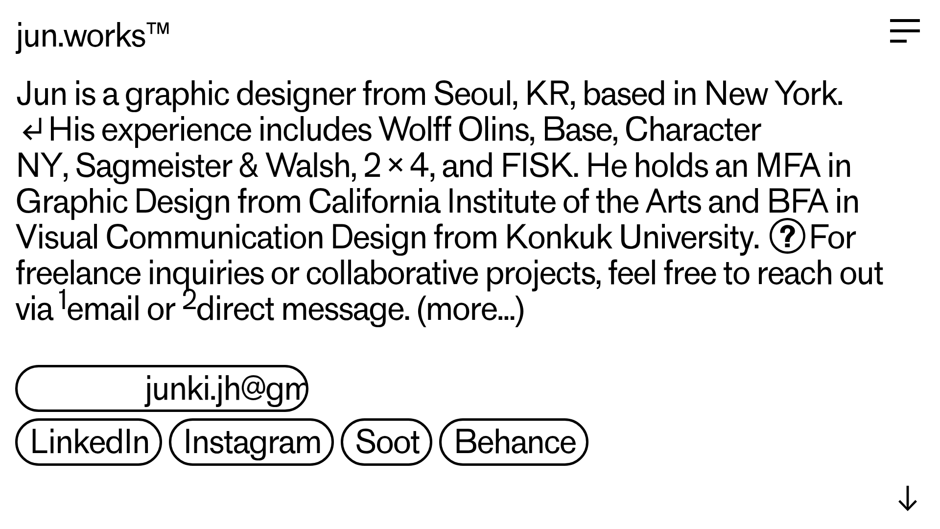
Jun Works Portfolio Landing Page
Minimalist graphic design portfolio featuring a text-heavy layout with image-on-hover tooltips, a pill-shaped marquee contact card, and a categorized hashtag tag cloud for project navigation.
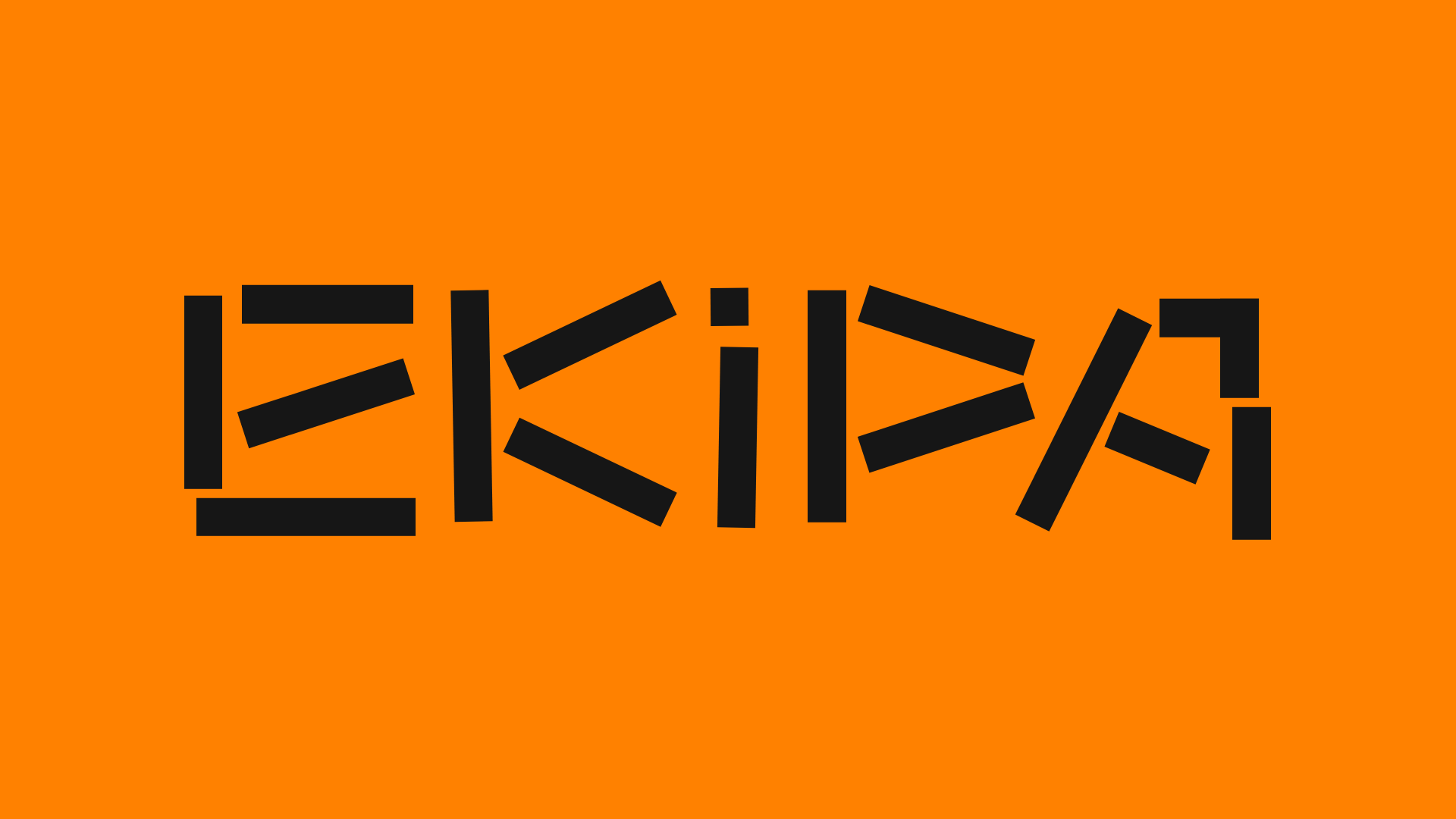
Ekipa Agency Artist Roster Site
A minimalist agency portfolio featuring a dynamic block-based logo, colorful background transitions, and a hover-activated image preview grid for an artist roster.
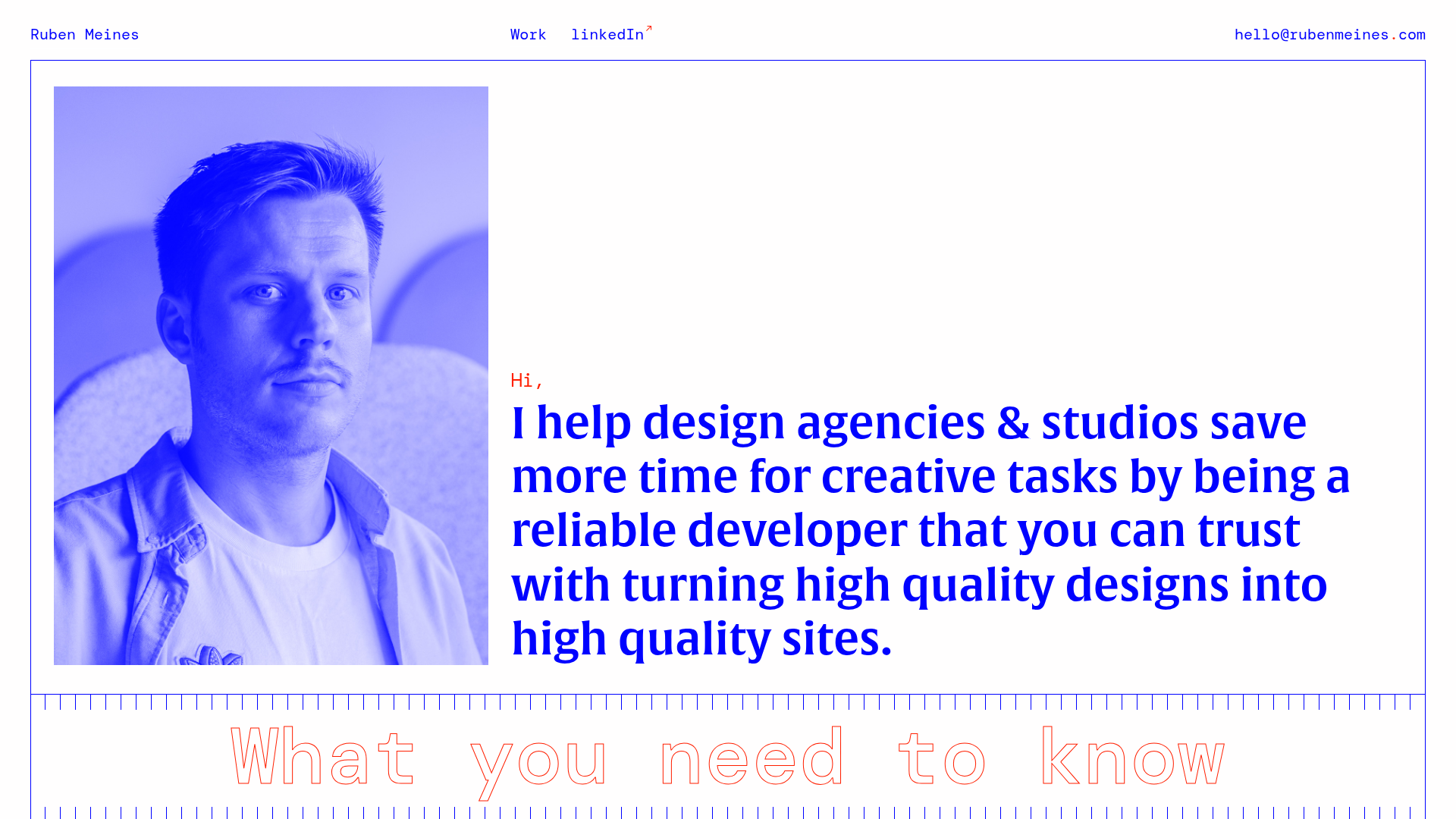
Ruben Meines Minimalist Developer Portfolio
A clean typography-focused layout featuring a duotone hero image, a decorative CSS grid border system, and a structured service list with outlined custom typography.
Schemas of Uncertainty Monogram Grid
A brutalist multi-column layout for text-heavy content featuring high-contrast typography, minimalist navigation, and a rhythmic vertical grid of essays.
Minimal Text-Based Creative Director Portfolio
A clean, typography-focused landing page featuring a multi-column layout for bio, links, and client lists using simple CSS flex or grid structures.
Standard Projects Portfolio with Sticky Hero
A minimalist studio layout featuring a full-height animated carousel, sticky header typography, and a dynamic masonry element grid for case studies.
