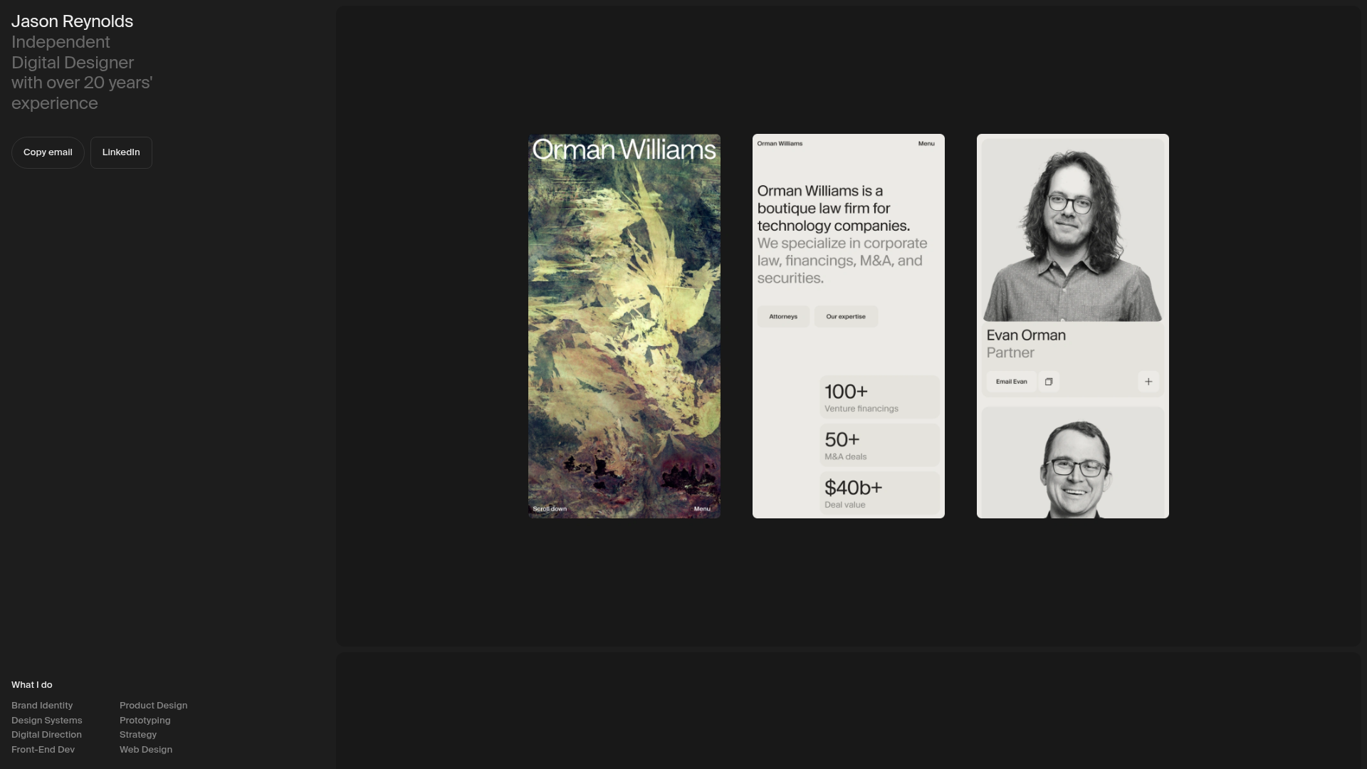
Jason Reynolds Designer Portfolio Layout
A split-screen portfolio featuring a fixed sidebar for bio and services alongside a scrollable gallery of bento-style project cards, image carousels, and embedded video clips.
Overview
This portfolio design utilizes a high-impact, two-column split-screen layout that balances a fixed information sidebar with an expansive, scrollable media gallery. It is an excellent reference for designers or studios wanting to showcase visual work through a mix of high-fidelity images, auto-playing video clips, and carousels without complex sub-page navigation.
Design System
- Color Palette & Visual Hierarchy: The site uses a sophisticated dark-mode foundation with a deep charcoal/black background (
#1a1a1aor similar) for the sidebar, creating a stark contrast with the light-themed media content (whites, creams, and earthy tones). Hierarchy is established through size and font weight rather than color. - Typography: The system relies on a clean, modern sans-serif. The
hero-headingfeatures a large-scale name with a secondary weight for professional descriptors. List items under "What I do" are set in a smaller, uniform scale arranged in a multi-column grid for high readability. - Page Structure: The layout is divided into two main sections: a fixed
col--primaryon the left containing biographical data and contact buttons, and a scrollablecol--mediaon the right which hosts the project showcase. - Reusable Components:
- Fixed Sidebar: A container utilizing
stickyorfixedpositioning to keep bio and contact options accessible. - Media Containers: Standardized classes (
image-container,media-video-container) that manage aspect ratios for vertical and horizontal project previews. - Bento-style Buttons: Minimalist buttons with rounded corners and distinct labels for "Copy email" and "LinkedIn."
- Fixed Sidebar: A container utilizing
- Interaction Patterns: The HTML reveals a
carousel-containerwith anactiveclass, indicating a scripted or CSS-based image rotation. Videos are set toautoplay,muted, andloop, providing a dynamic "living document" feel as the user scrolls. - Responsive Behavior: The code includes specific classes for
media-image--desktopandmedia-image--mobile, suggesting an adaptive strategy where different optimized assets are served based on the viewport size.
Use Cases
- Who should clone this: Individual creatives (photographers, motion designers, UI/UX designers) who want a single-page presence that feels premium and content-heavy.
- Practical Remix Directions:
- Portfolio to Studio: Replace the personal bio with studio capabilities and the "What I do" list with specialized service offerings.
- Brand Showcase: Adapt the right-hand scrollable section to serve as a digital brand guideline, swapping project images for logo variations and typography samples.
- Architecture/Real Estate: Use the persistent sidebar for property specs and price, while the gallery displays high-resolution walkthroughs and floor plans.
- Suggested Clone Scope: A full-page clone is recommended to capture the dual-column interaction. However, the
services-gridand themedia-video-containerpatterns are easily extracted for use within more traditional multi-page CMS sites.
Related Inspirations
Minimalist Dark Designer Portfolio Grid
A clean, dark-themed portfolio featuring a bold typography hero section and a staggered two-column image grid with subtle entrance animations.

Palazzo Monti Minimalist Artist Residency Portfolio
A high-end editorial layout featuring scroll-triggered text animations, smooth preloader transitions, image-reveal hover effects on list items, and a draggable bubble-based press section.
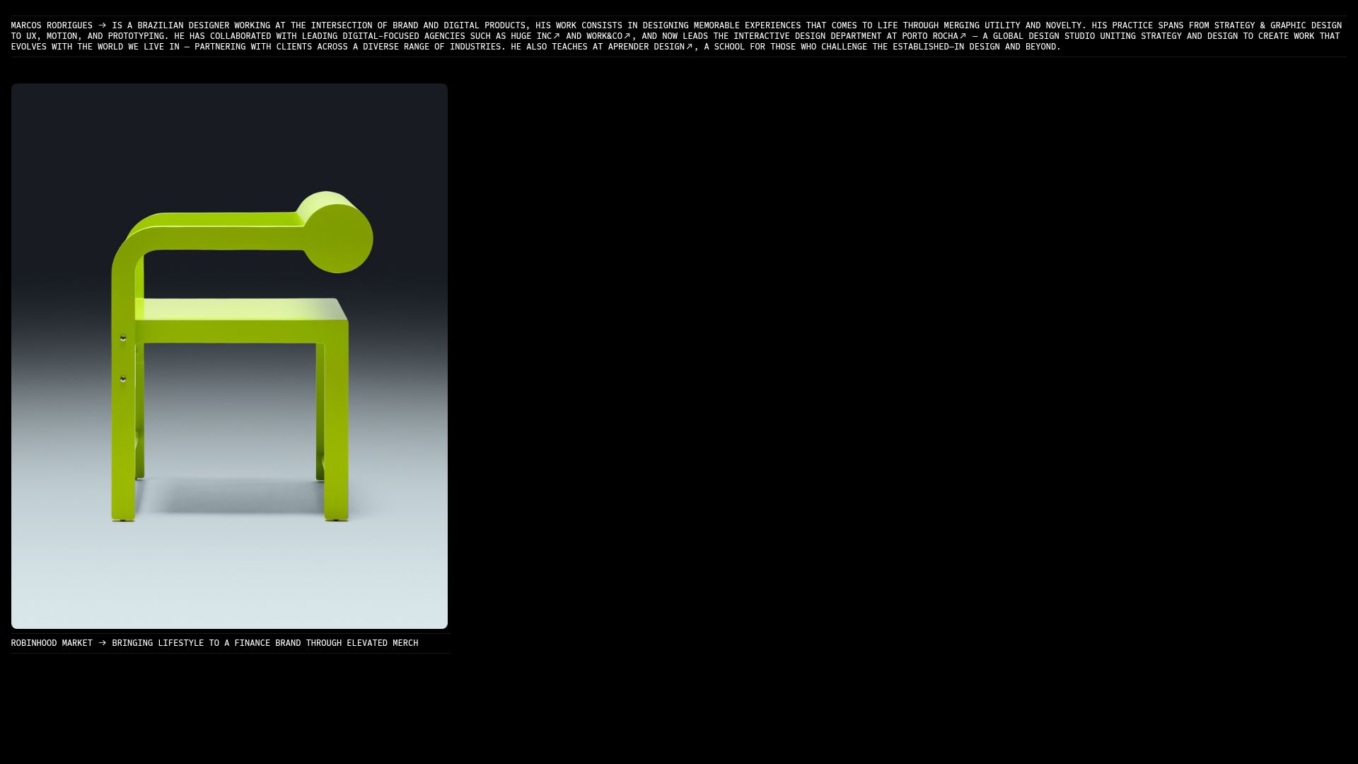
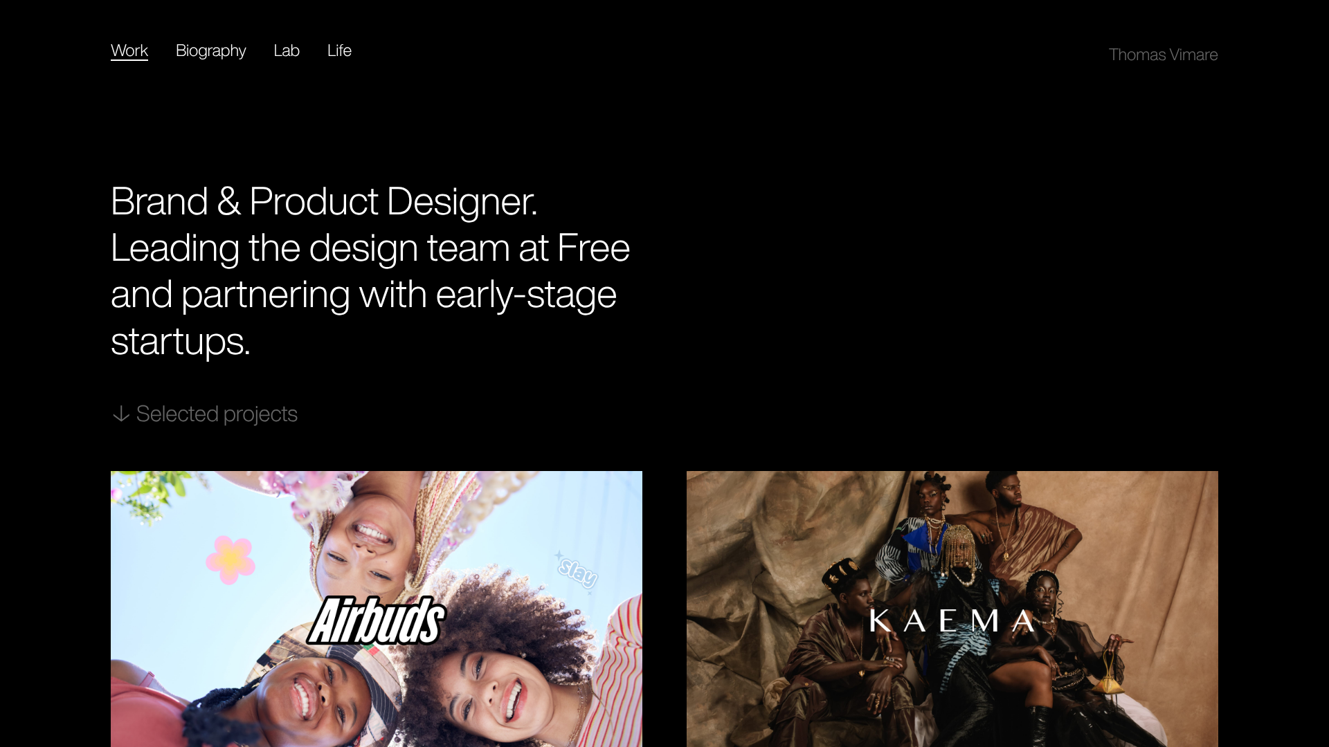
Marcos Rodriguez Minimalist Design Portfolio
A dark-themed personal site featuring a high-contrast monospaced header, a full-height centered image/video slideshow, and minimal thin-rule horizontal dividers.

Dima Kutsenko Photography Portfolio Hero
A refined dark-mode portfolio featuring a full-screen image loader, tiered typography animations, and creative text-distortion hover effects for high-end fashion branding.

Niklas Rosén Designer Portfolio Index
A minimalist, responsive grid-based portfolio index featuring a clean 16-column layout, typographic list components, and a custom dark mode transition.

Christopher Doyle Agency Portfolio Layout
A minimalist, typography-led portfolio featuring a wide-margin grid system, smooth fade-in animations, and simple image-focused project cards.
