Marcos Rodriguez Minimalist Design Portfolio
A dark-themed personal site featuring a high-contrast monospaced header, a full-height centered image/video slideshow, and minimal thin-rule horizontal dividers.
Overview
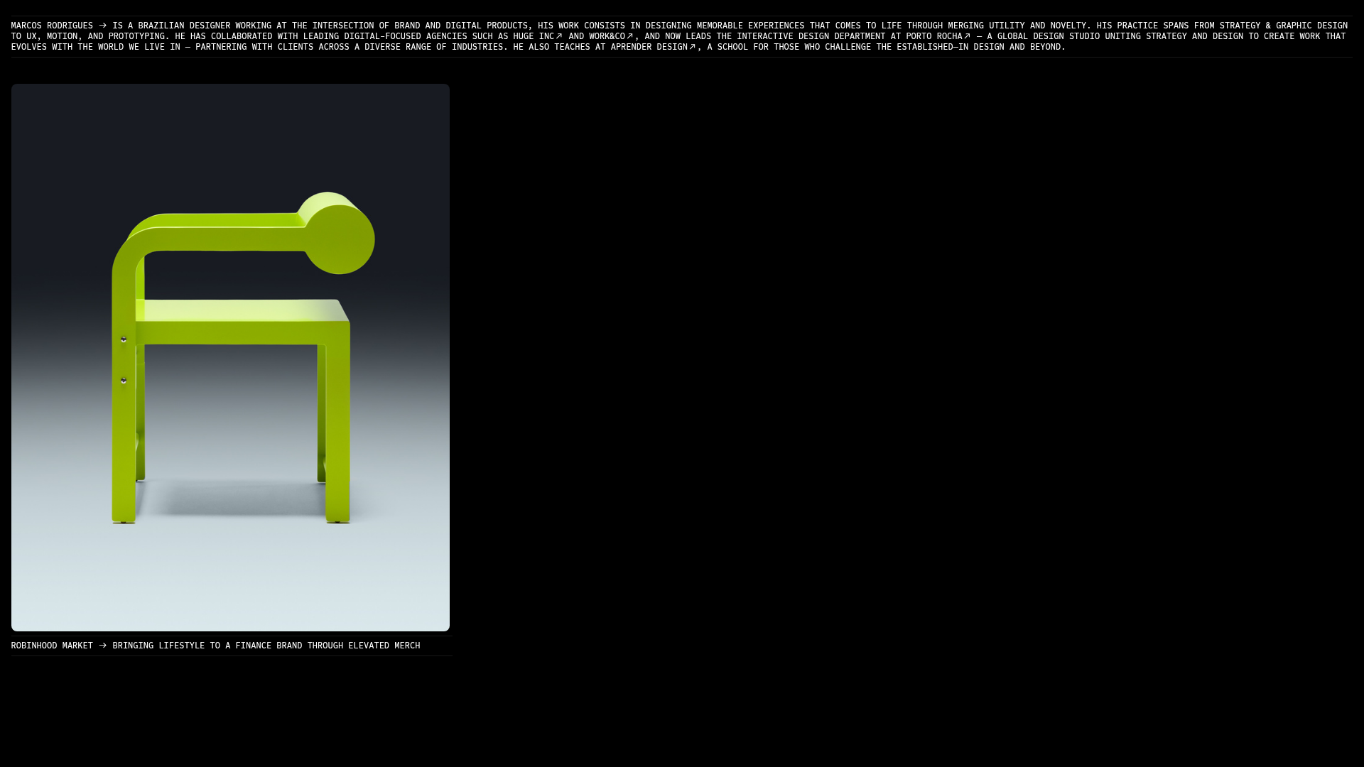
This website is a high-end minimalist portfolio for Marcos Rodriguez, a design director at Porto Rocha. It stands as a premier reference for cloning because of its sophisticated use of dark mode, monospaced typography, and a structured vertical flow that treats each project as a full-screen immersive experience using a mix of static imagery and auto-playing video.
Design System
- Color Palette & Visual Hierarchy: The site uses a deep black background (
#000000) with high-contrast white text for maximum legibility. Minimalist thin horizontal rules (<hr>) are used to create a clear skeletal structure, separating the biographical header from the project blocks. - Typography: The system relies heavily on a monospaced typeface (appearing as a customized monospace or Courier-like variant), utilizing all-caps for the introductory bio and project titles to evoke a technical, "under construction" or "system-level" aesthetic. Information density is low, favoring large tracking and line height.
- Page Structure: The layout follows a linear, single-column stack. Each module consists of:
- A top horizontal rule.
- A project title/description line with a symbolic arrow glyph (
/ →). - a large-scale media gallery/slideshow.
- A bottom horizontal rule.
- Reusable Components:
- Scrubbing Slideshow: A slick-carousel based component (
.image-gallery.slick.scrub) that allows users to cycle through project images and Vimeo-hosted videos. - Text-Link Headers: Minimalist navigation-style lines that combine a title with an external link, using a consistent arrow icon for call-to-action.
- Scrubbing Slideshow: A slick-carousel based component (
- Interaction Patterns: The design utilizes a "scrub" transition type for the galleries, creating a smooth, tactile feel when navigating media. HTML attributes like
scroll-transition-fadeindicate that elements fade into view as the user scrolls down the page. - Implementation Clues: The site is built on the Cargo Collective platform, evidenced by classes like
bodycopy,cargo_menu, and layout-specific attributes likegrid-rowandgrid-col="x12". It uses the Slick slider library for project media handling.
Use Cases
- Who should clone this: Independent designers, creative directors, and boutique agencies who want a "low-noise, high-signal" portfolio that focuses entirely on visual work.
- Product Remixing: This pattern is highly effective for high-fashion lookbooks, architectural project archives, or experimental digital product case studies where process videos are as important as final renders.
- Remix Directions: A builder could swap the monospaced font for a bold serif to shift the brand from "technical/digital" to "luxury/editorial." The layout could also be adapted into a landing page by replacing the image galleries with product feature blocks while keeping the strict horizontal rule separators.
- Clone Scope: A full-page clone is recommended to maintain the rhythmic balance between text and large media. However, the specific header pattern (Text + Arrow + Rule) is a great quick-clone for minimal navigation menus.
Related Inspirations
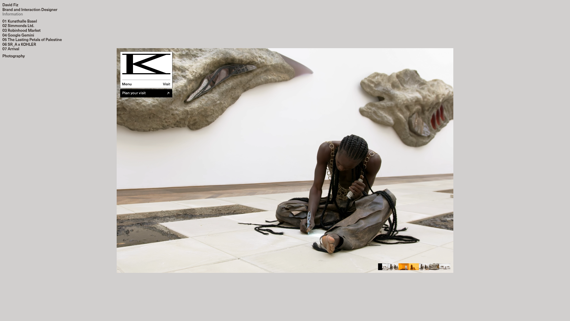
David Fiz Visual Design Portfolio
A minimalist portfolio featuring a fixed sidebar navigation paired with an immersive, full-screen media showcase and interactive project-specific image carousels.
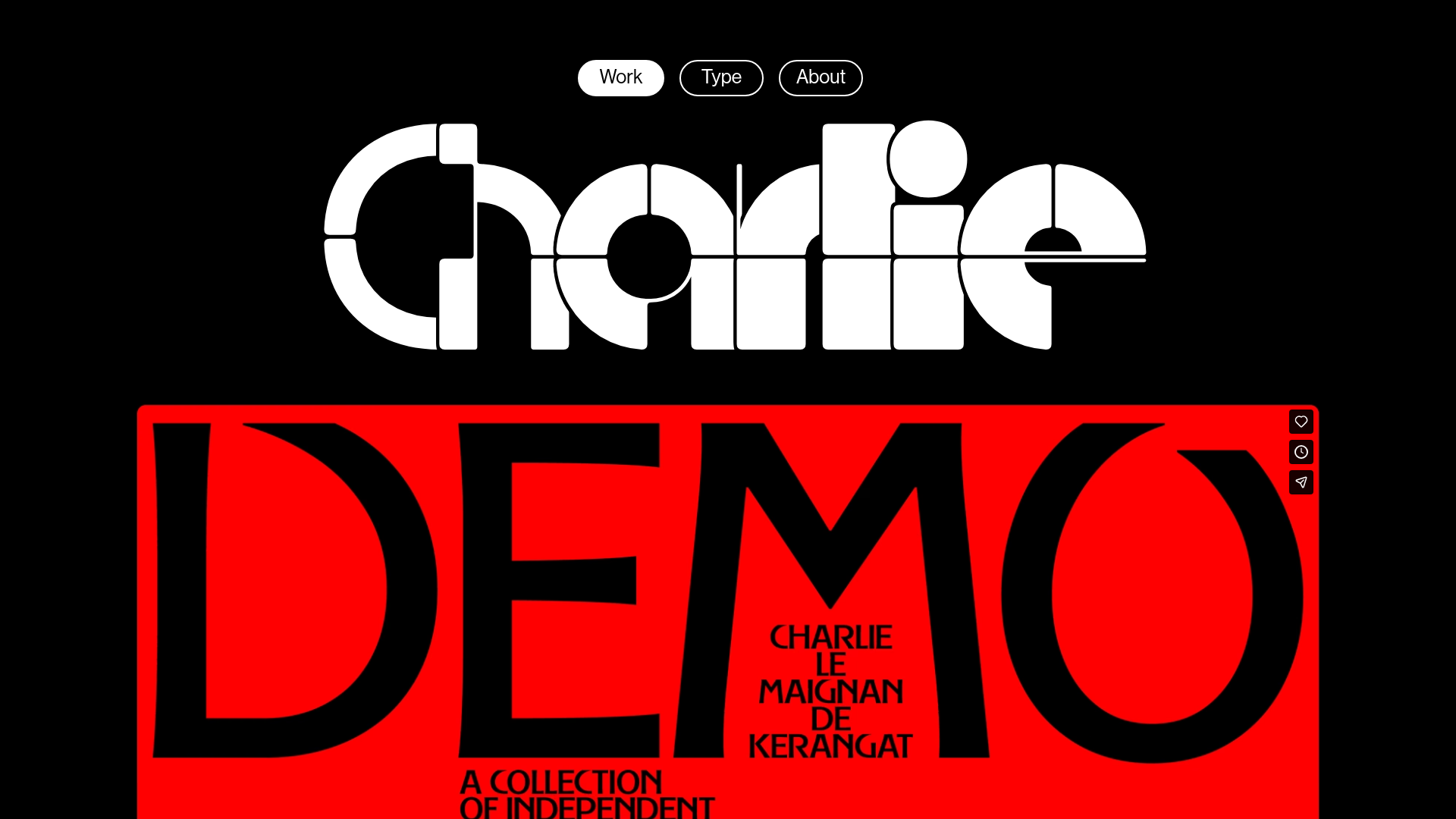
Charlie Le Maignan Portfolio Archive
A minimalist dark-mode portfolio featuring high-contrast typography, a geometric logo header, and an integrated full-width video gallery showcasing independent creative work.
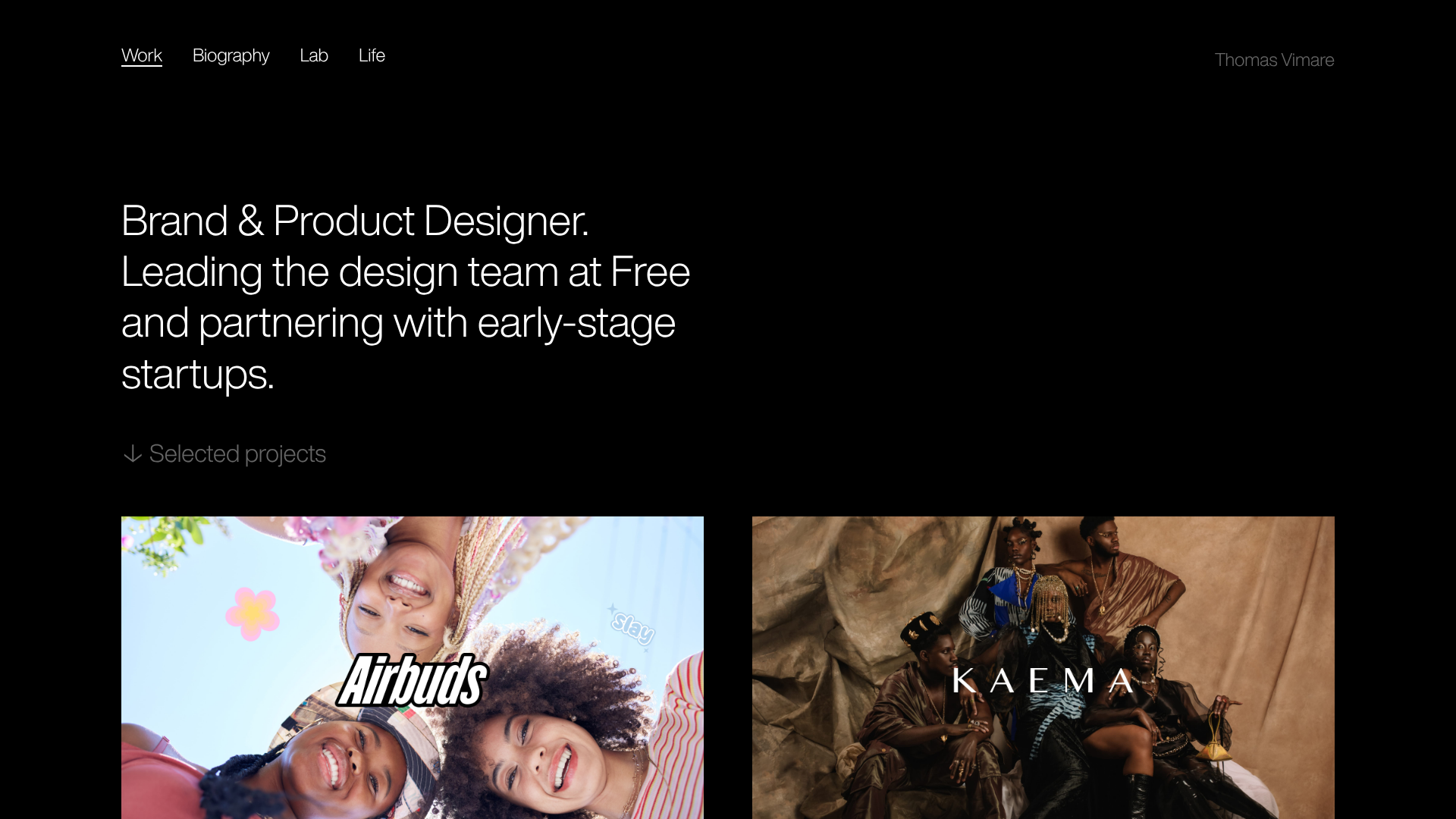
Minimalist Dark Designer Portfolio Grid
A clean, dark-themed portfolio featuring a bold typography hero section and a staggered two-column image grid with subtle entrance animations.
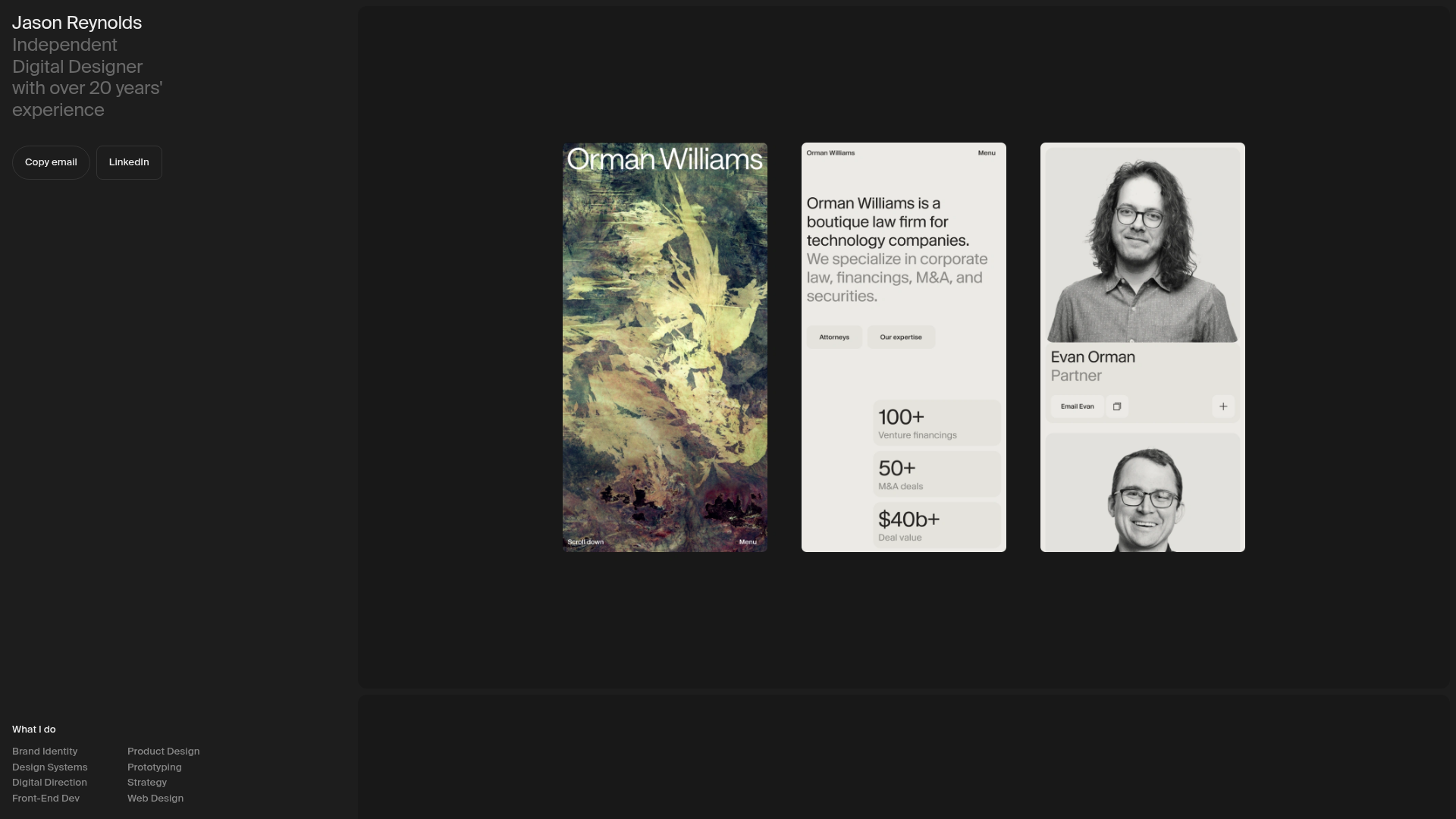
Jason Reynolds Designer Portfolio Layout
A split-screen portfolio featuring a fixed sidebar for bio and services alongside a scrollable gallery of bento-style project cards, image carousels, and embedded video clips.
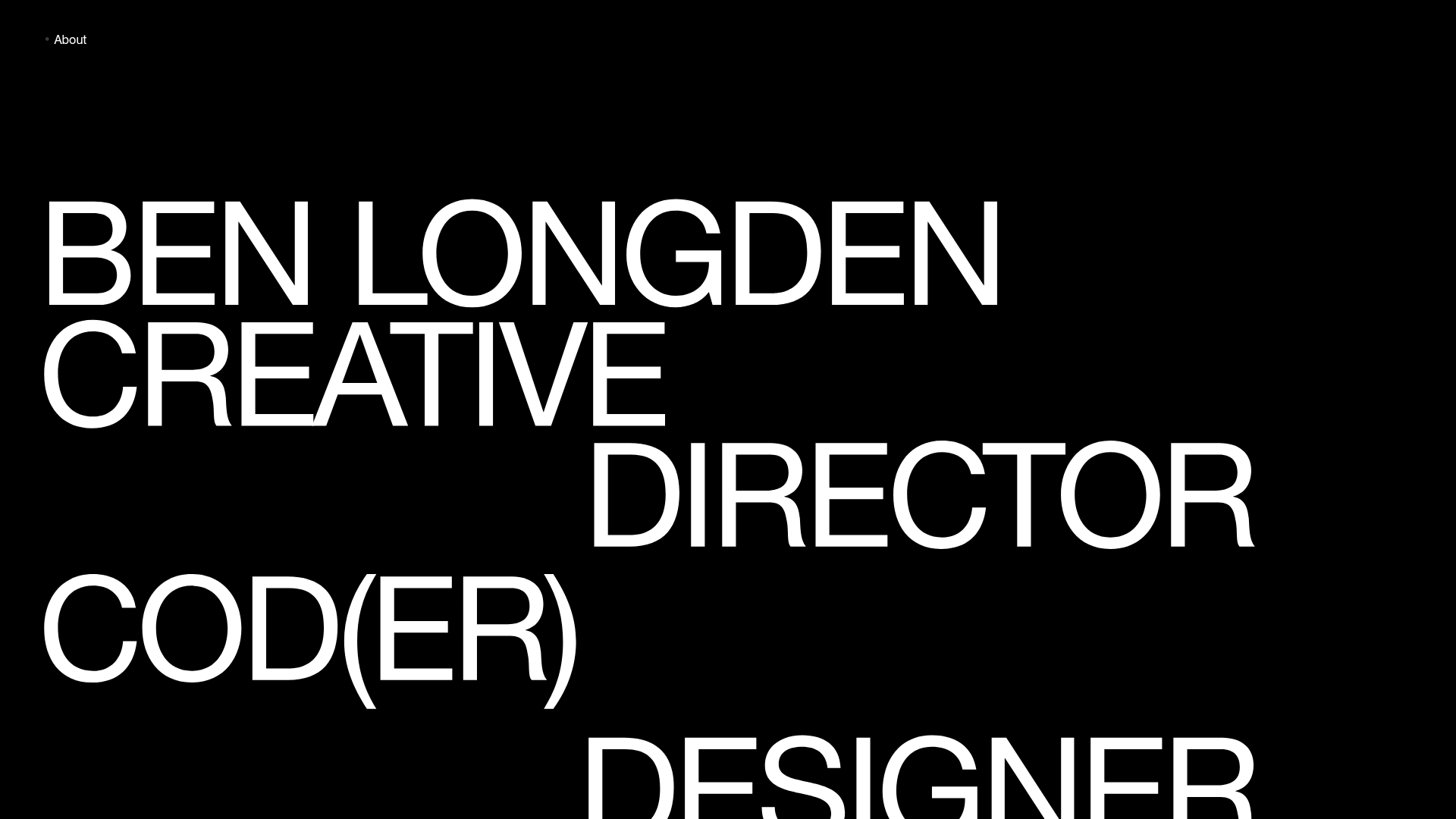
Ben Longden Minimalist Creative Portfolio
A bold typography-focused site featuring a large-scale overlapping hero section, horizontal image carousels for projects, and a scrolling text marquee footer.

Palazzo Monti Minimalist Artist Residency Portfolio
A high-end editorial layout featuring scroll-triggered text animations, smooth preloader transitions, image-reveal hover effects on list items, and a draggable bubble-based press section.
