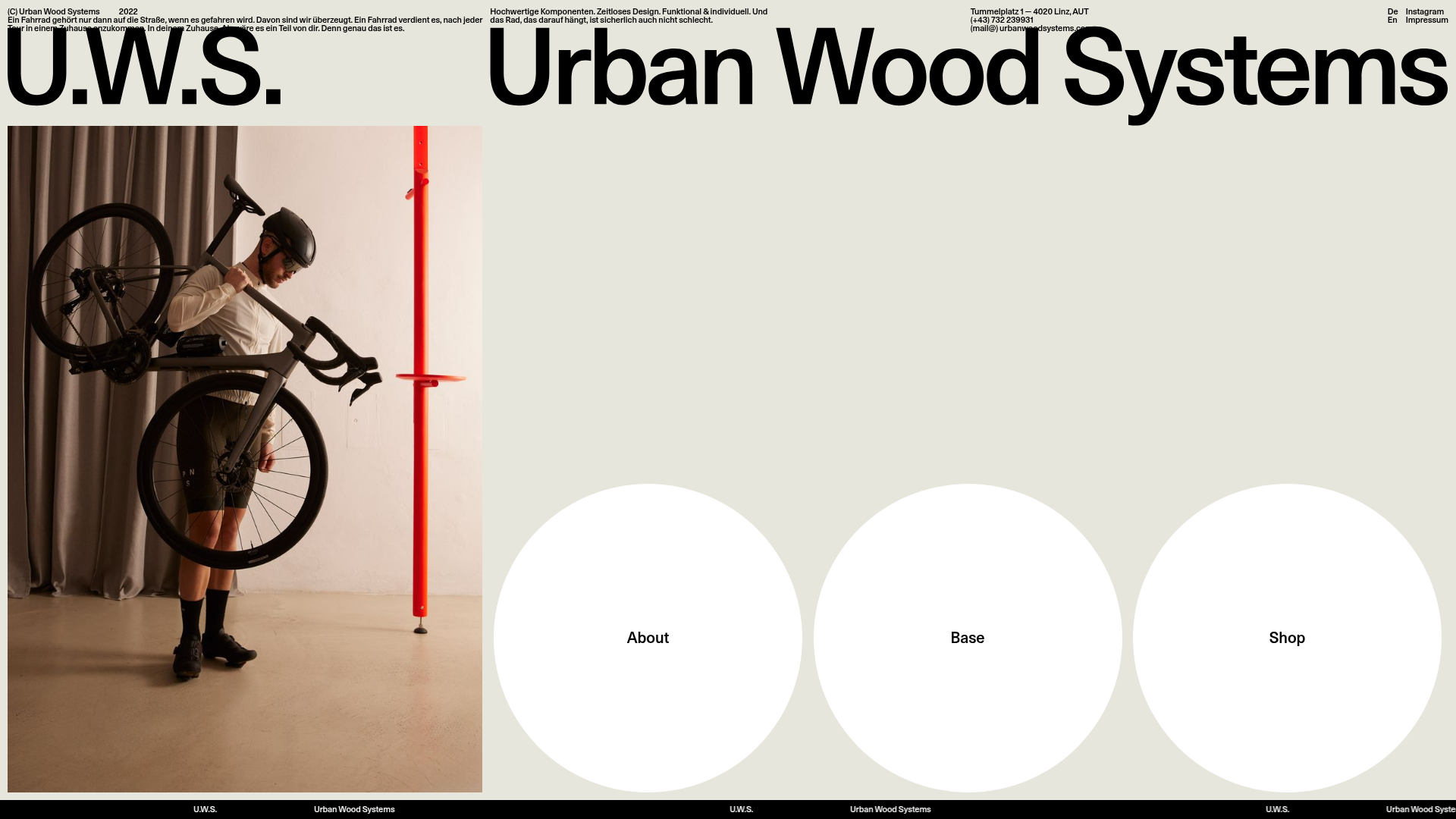
Urban Wood Systems Minimal Landing Page
A minimalist layout featuring a large-scale SVG header, a scrolling text ticker footer, and a clean navigation grid with large circular hover-active buttons.
Overview
Urban Wood Systems features a high-impact, minimalist landing page that prioritizes large-scale typography and bold visual anchors. It is a premier reference for cloning a "brutalist-lite" aesthetic that uses whitespace and scale rather than complex ornaments to establish premium brand positioning.
Design System
- Color Palette & Visual Hierarchy: The site uses a muted, sophisticated 'Beige' (#E5E4DB) background paired with high-contrast black (#000000) for text and SVG elements. A single accent color—a vibrant red-orange—is introduced via the hero photography, creating a focal point against the neutral canvas.
- Typography: The typography is dominated by oversized, sans-serif SVG wordmarks ("U.W.S." and "Urban Wood Systems") that serve as the primary header. Secondary metadata and body copy use a clean, mid-weight sans-serif with generous letter spacing and line heights (e.g., the
.textand.text_60classes). - Page Structure: The layout follows a non-traditional grid. The top section consists of a dense informational header (address, contact, bio), followed by the massive logo block. The middle section splits the screen horizontally between a tall portrait image-block and a navigation cluster of three large circular buttons.
- Reusable Components:
- Circular Nav Buttons: Large white circles (
.button-start) that change color or scale on hover. - Text Ticker: A continuous scrolling footer (
.line-move) containing repeating brand names, perfect for adding dynamic movement without distracting from the main content. - Multi-Column Header: A responsive utility-style header (
.nav-columns) that cleanly separates contact info, philosophy, and language switching.
- Circular Nav Buttons: Large white circles (
- Interaction & Motion: The marquee ticker uses a
translate3dloop for smooth performance. The circular buttons are designed as large hit areas for a tactile, mobile-first feel on desktop. - Responsive Behavior: The HTML reveals specific mobile-only classes (
.nav-small-mobile,.nav-big-mobile) indicating a design that swaps large SVG headers for optimized mobile versions to maintain legibility and performance.
Use Cases
- Who Should Clone This: Designers building portfolios, high-end furniture boutiques, or architectural studios looking for a "less-is-more" digital presence that feels like a physical gallery.
- Remix Directions: Replace the SVG logo block with a project title to create a striking portfolio landing page. The three-circle navigation grid is highly adaptable; it can be remixed as a category selector for an e-commerce store or a menu for a creative agency.
- Practical Application: Developers can clone the marquee footer separately for a quick branding win on any project. For a full-page clone, it is best suited for sites with high-quality, professional photography that can anchor the minimalist layout.
Related Inspirations
Vibrants Wellbeing E-commerce Landing Page
A clean Shopify-style landing page featuring a full-width hero with overlaid product cards, a horizontal product slider, and interactive cart drawer with utility progress bars.
Fable Pets E-commerce Landing Page
A minimalist lifestyle pet brand template featuring a high-impact hero section, a clean logo trust bar, and a centered navigation menu.
Pauli & Sisters Landing Page
A minimalist e-commerce design featuring a full-width hero image with large overlapping serif text, an interactive ingredient explorer, and a clean split-block layout.
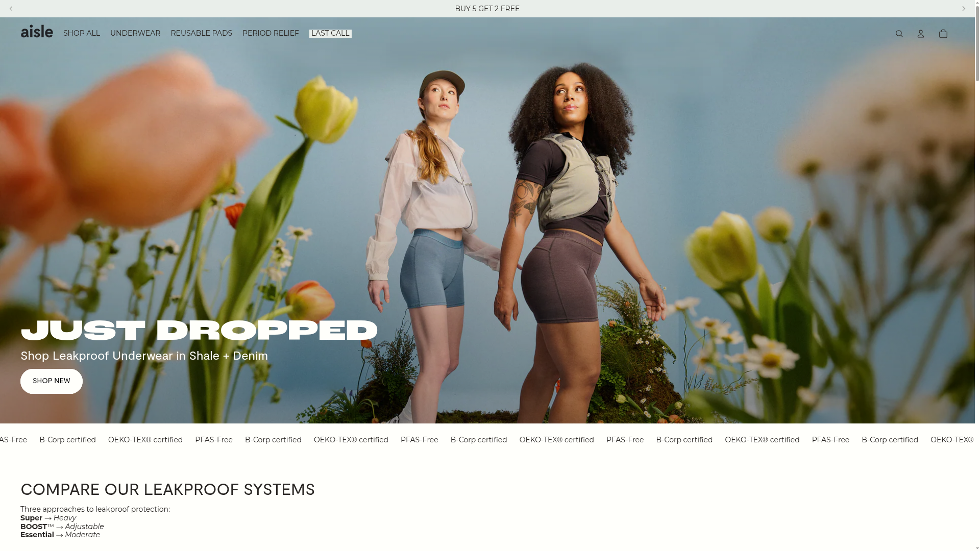
Aisle E-commerce Landing Page
A clean Shopify-based layout featuring a high-impact split hero section, a scrolling marquee for trust badges, and interactive product cards with variant swatches and image carousels.
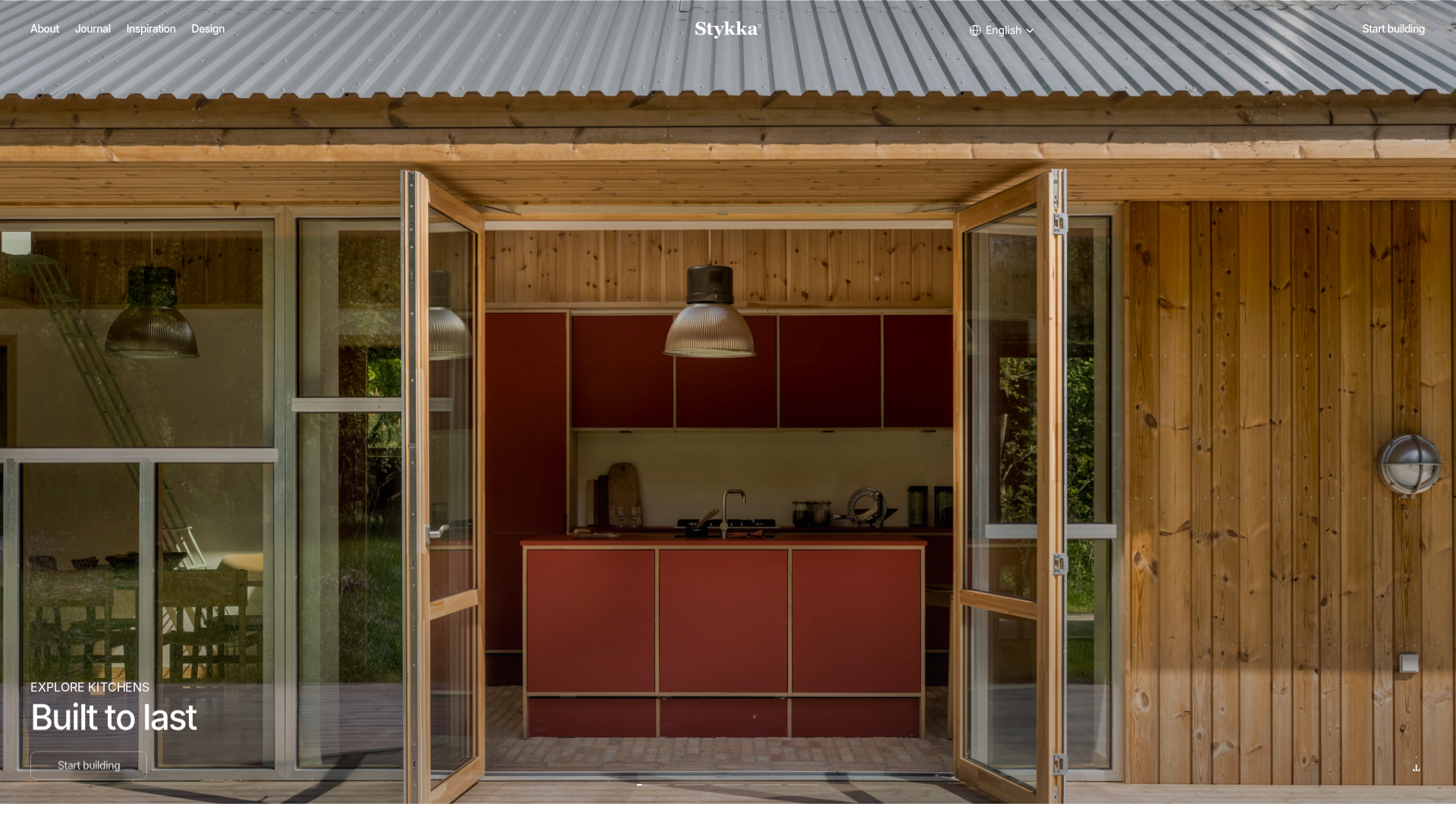
Stykka Modular Furniture Landing Page
A minimalist industrial design featuring a full-screen vertical navigation slider, oversized imagery, and interactive content cards for modular product storytelling.
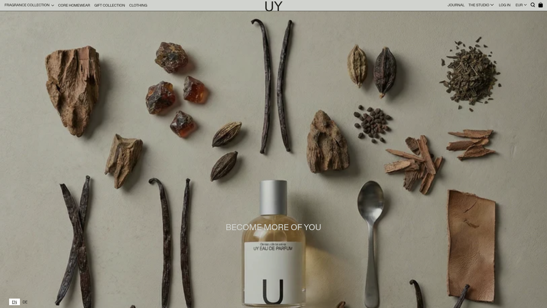
UY Studio Fragrance Landing Page
A minimalist e-commerce layout featuring a high-resolution hero image with ingredient flat-lay aesthetic and a uniform product grid for specialized retail collections.
