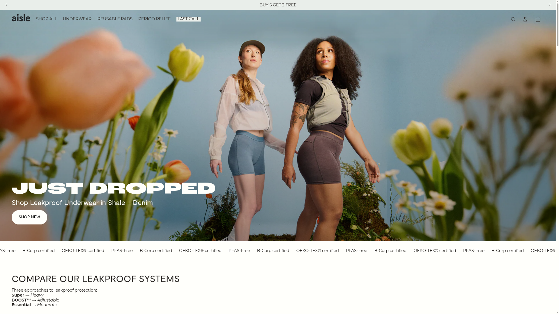
Aisle E-commerce Landing Page
A clean Shopify-based layout featuring a high-impact split hero section, a scrolling marquee for trust badges, and interactive product cards with variant swatches and image carousels.
Overview
Aisle's e-commerce landing page is a masterclass in modern DTC branding, utilizing high-focal-point photography and an airy, breathable layout to sell lifestyle-oriented functional products. It is an excellent reference for builders looking to implement a clean, Shopify-style structure that prioritizes visual storytelling alongside clear product classification and social proof.
Design System
- Color Palette & Visual Hierarchy: The palette is neutral and sophisticated, using off-whites and soft grays to let vibrant product photography stand out. Hierarchy is established through size and font weight; the hero section uses high-contrast white-on-image text, while the shopping sections shift to dark-on-light for readability.
- Typography: The system combines a bold, sans-serif display font for impact («JUST DROPPED») with a clean, lightweight sans-serif for navigation and product titles. HTML evidence shows use of
h1,h2, andh3classes with specific CSS variables (--max-width--body-normal) to maintain consistent line lengths across text blocks. - Page Structure & Flow: The layout follows a classic conversion funnel: an immersive Hero announcement, a scrolling trust-badge marquee for immediate social proof/certification (OEKO-TEX, B-Corp), and a functional comparison block ("Compare our leakproof systems") leading into a horizontal product carousel.
- Reusable Components:
- Product Cards: Highly complex and worth cloning; they feature integrated image slideshows, color swatches with CSS gradients or image backgrounds, and a dual-button "Add/Choose" system.
- The Marquee: A reusable
marquee-componentfor continuous horizontal scrolling of certifications. - The Hero: A centered split-layout hero that uses the
hero__media-gridclass to handle large-scale background assets.
- Interaction & Motion: Key features include image carousel navigation within individual product cards, variant switching via swatches, and a sticky navigation header. The use of
fetchpriority="high"on the hero image and lazy-loading for the carousel suggests a focus on performance. - Implementation Clues: The structure is built using Shopify's Liquid architecture (visible through
shopify-sectionIDs). It uses a custom-property heavy CSS system (e.g.,--swatch-background,--hero-min-height) allowing for highly dynamic theme styling.
Use Cases
- Who should clone this: DTC brands in health, wellness, or fashion who want to balance medical/functional information with a high-end aesthetic.
- Effective remixes: This pattern works well for products with many variants (colors/sizes) due to the robust swatch and carousel components. Personal care, activewear, and home goods are ideal candidates.
- Remix Directions: Builders can swap the feminine/floral art direction for a more technical or masculine vibe while keeping the information architecture intact. The "Compare Systems" section is a practical way to explain technical tiers for any complex product line.
- Clone Scope: A full-page clone is recommended for those setting up a new Shopify store, but the Product Card Carousel and Trust Marquee are the most valuable individual sections to extract for existing sites.
Related Inspirations

Vibrants Wellbeing E-commerce Landing Page
A clean Shopify-style landing page featuring a full-width hero with overlaid product cards, a horizontal product slider, and interactive cart drawer with utility progress bars.
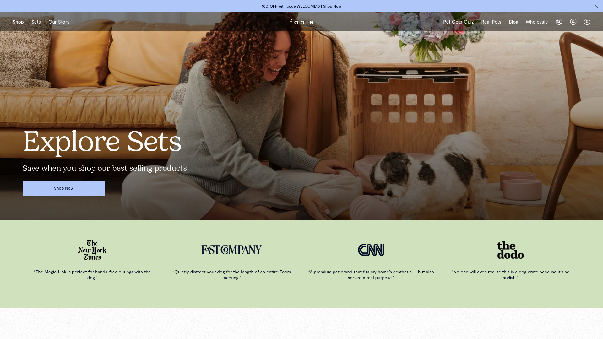
Fable Pets E-commerce Landing Page
A minimalist lifestyle pet brand template featuring a high-impact hero section, a clean logo trust bar, and a centered navigation menu.
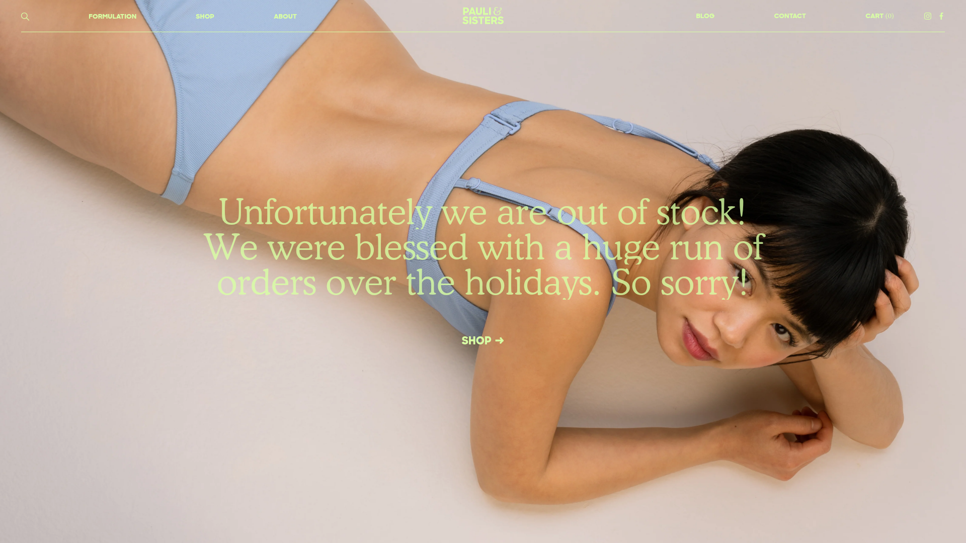
Pauli & Sisters Landing Page
A minimalist e-commerce design featuring a full-width hero image with large overlapping serif text, an interactive ingredient explorer, and a clean split-block layout.
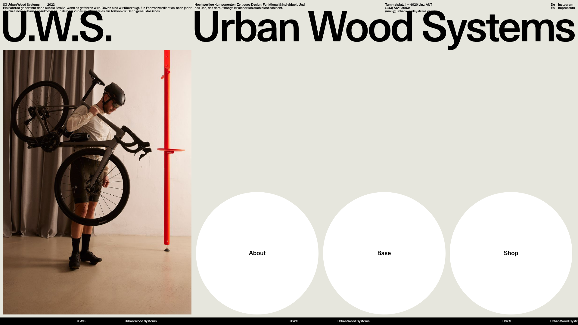
Urban Wood Systems Minimal Landing Page
A minimalist layout featuring a large-scale SVG header, a scrolling text ticker footer, and a clean navigation grid with large circular hover-active buttons.
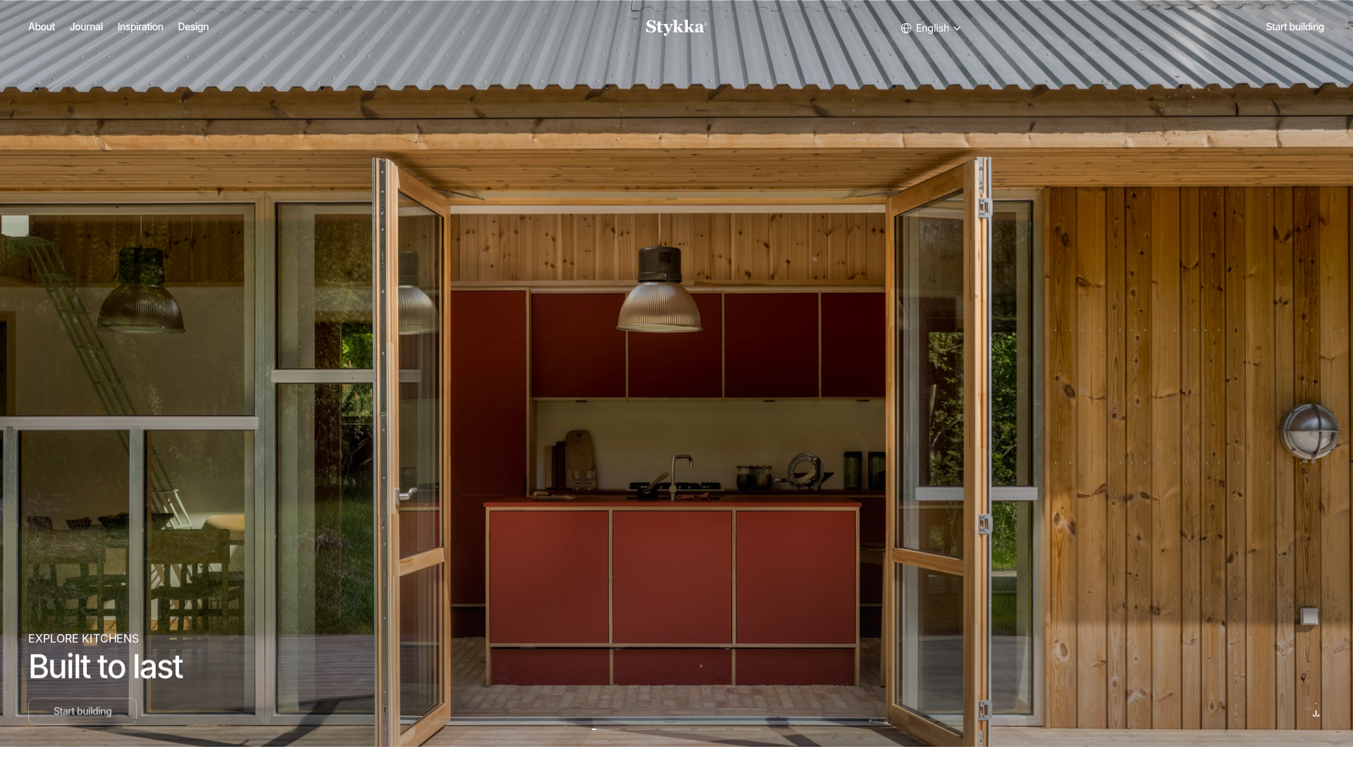
Stykka Modular Furniture Landing Page
A minimalist industrial design featuring a full-screen vertical navigation slider, oversized imagery, and interactive content cards for modular product storytelling.
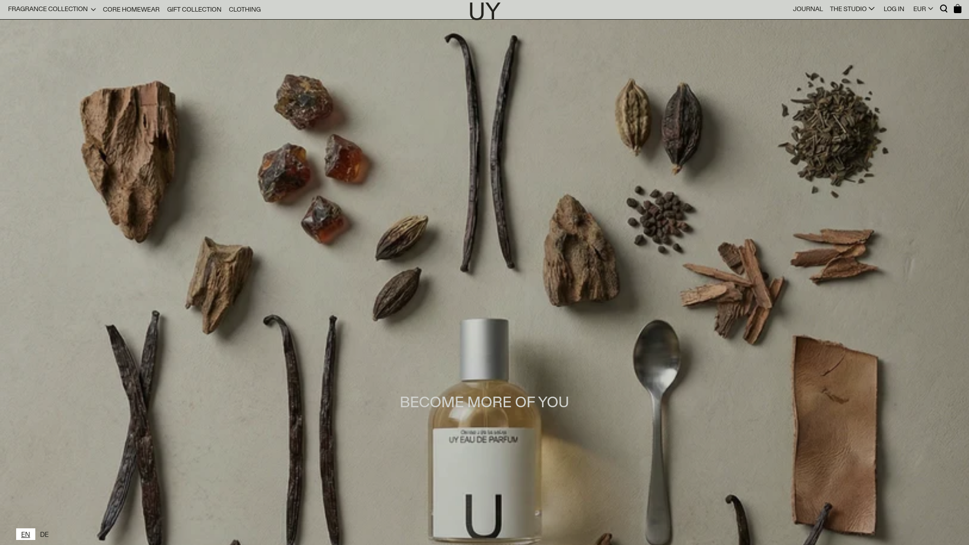
UY Studio Fragrance Landing Page
A minimalist e-commerce layout featuring a high-resolution hero image with ingredient flat-lay aesthetic and a uniform product grid for specialized retail collections.
