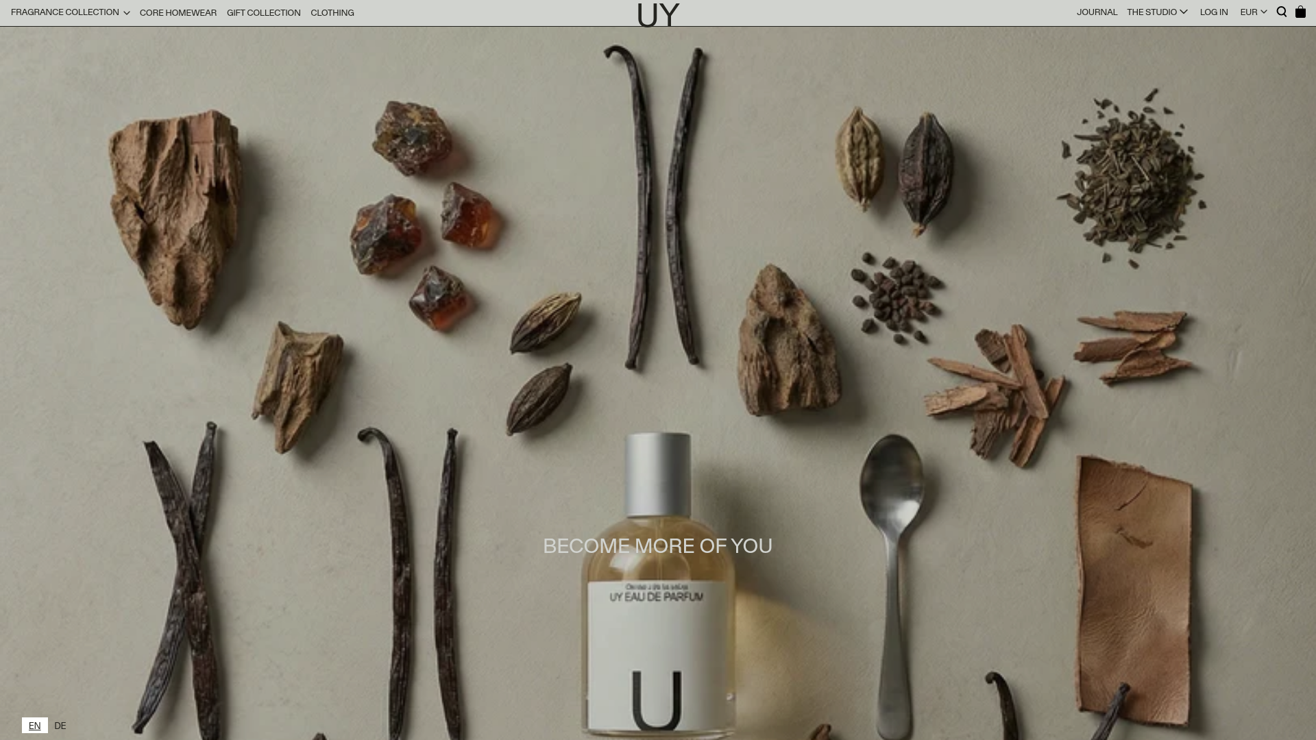
UY Studio Fragrance Landing Page
A minimalist e-commerce layout featuring a high-resolution hero image with ingredient flat-lay aesthetic and a uniform product grid for specialized retail collections.
Overview
UY Studio’s landing page is a masterclass in minimalist luxury e-commerce, utilizing a high-impact, ingredient-focused hero section to establish atmosphere before transitioning into a functional product grid. It is an excellent reference for designers looking to blend editorial storytelling with high-conversion Shopify layouts, particularly for niche lifestyle and beauty brands.
Design System
- Color Palette & Visual Hierarchy: The site uses a neutral, desaturated aesthetic. A muted beige/stone background provides a soft foundation for the high-contrast product photography and crisp black typography. Hierarchy is driven by scale and white space rather than vibrant colors.
- Typography system: A clean, technical Sans-Serif font (resembling Helvetica or Akzidenz-Grotesk) is used in all-caps for navigation and calls to action. Header sizes are strictly controlled to maintain a flat, modern architectural feel.
- Page Structure & Flow: The layout follows an "Atmosphere first, Utility second" flow:
- Global minimalist header featuring a centered brand logo.
- Full-bleed hero image with centered serif-style text overlay ("BECOME MORE OF YOU").
- Uniform 5-column product grid with minimal metadata (Vendor, Title, Price).
- Left-aligned newsletter subscription block featuring high-contrast typography.
- Reusable Components:
- Modular Hero: A simple
divwrapper for a large image paired with centered text. - Uniform Product Cards: Standardized tiles that use a fixed aspect ratio for thumbnails to ensure alignment regardless of image shape.
- Contextual Currency Switcher: Located in the top-right navigation for easy localization.
- Modular Hero: A simple
- Implementation Clues: The HTML reveals a Shopify-based architecture using the
shopify-sectionlogic. It leverages utility classes for positioning (e.g.,text-positioned-center) and features apxs-newslettermodule for email capture.
Use Cases
- Who should clone this pattern: Artisanal fragrance houses, high-end skincare brands, or boutique apparel studios that prioritize a "gallery" feel over a traditional supermarket layout.
- Effective Product Remixes: Home goods, curated jewelry collections, or high-concept furniture catalogs would benefit from this grid-heavy, distraction-free interface.
- Remix Directions:
- Hero Swap: Replace the ingredient flat-lay with a lifestyle video to keep the structure while changing the energy.
- Grid Customization: The 5-column grid can be shifted to 2 or 3 columns to emphasize larger product details for higher-ticket items.
- Info Architecture: Use the minimalist header structure but add mega-menu functionality if the product catalog is deep.
- Suggested Clone Scope: Start with a full-page clone to capture the specific spacing and padding ratios (white space management), as the minimalist effect relies heavily on the exact gutters between images and the margin of the newsletter block.
Related Inspirations

Vibrants Wellbeing E-commerce Landing Page
A clean Shopify-style landing page featuring a full-width hero with overlaid product cards, a horizontal product slider, and interactive cart drawer with utility progress bars.
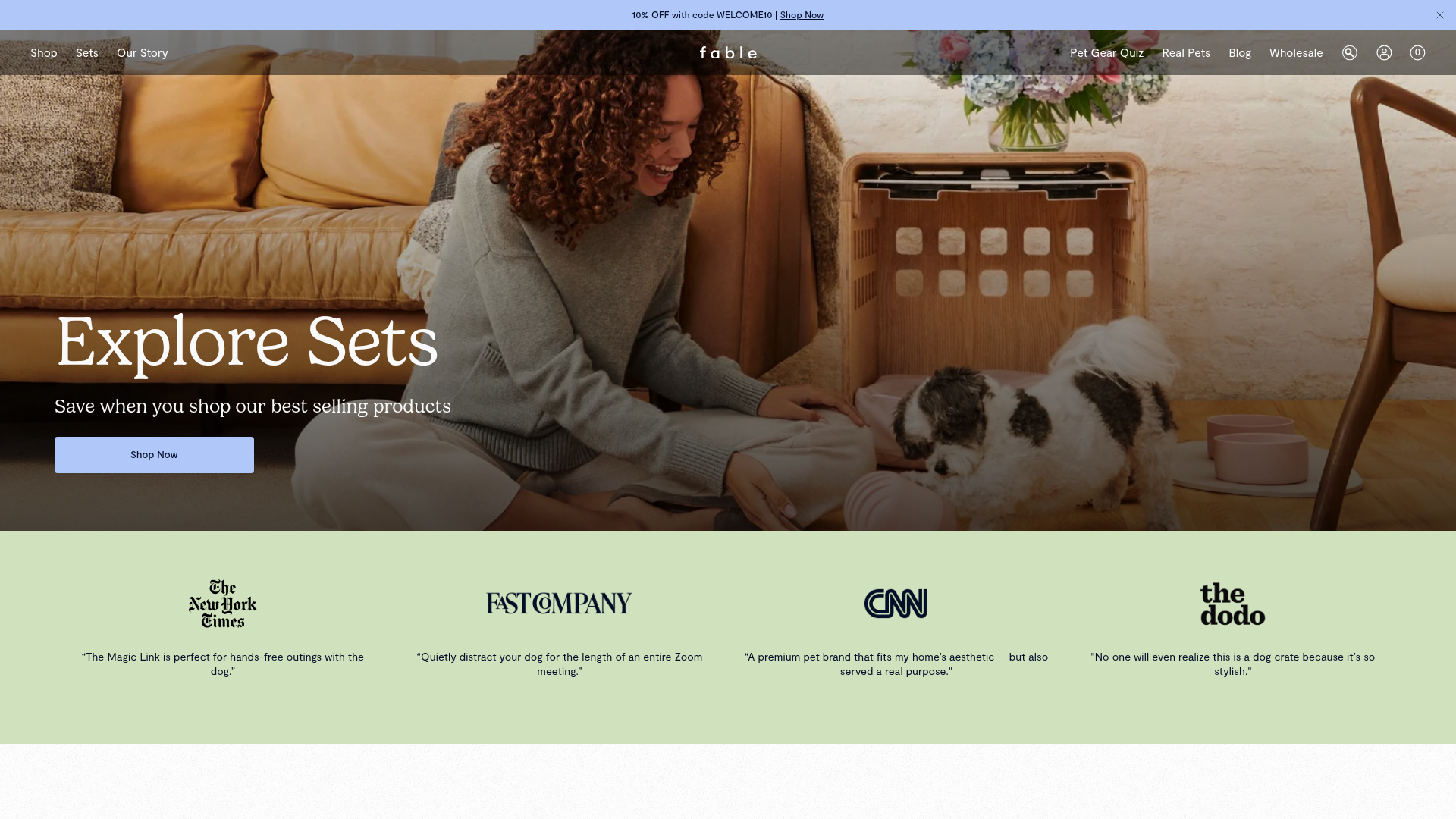
Fable Pets E-commerce Landing Page
A minimalist lifestyle pet brand template featuring a high-impact hero section, a clean logo trust bar, and a centered navigation menu.
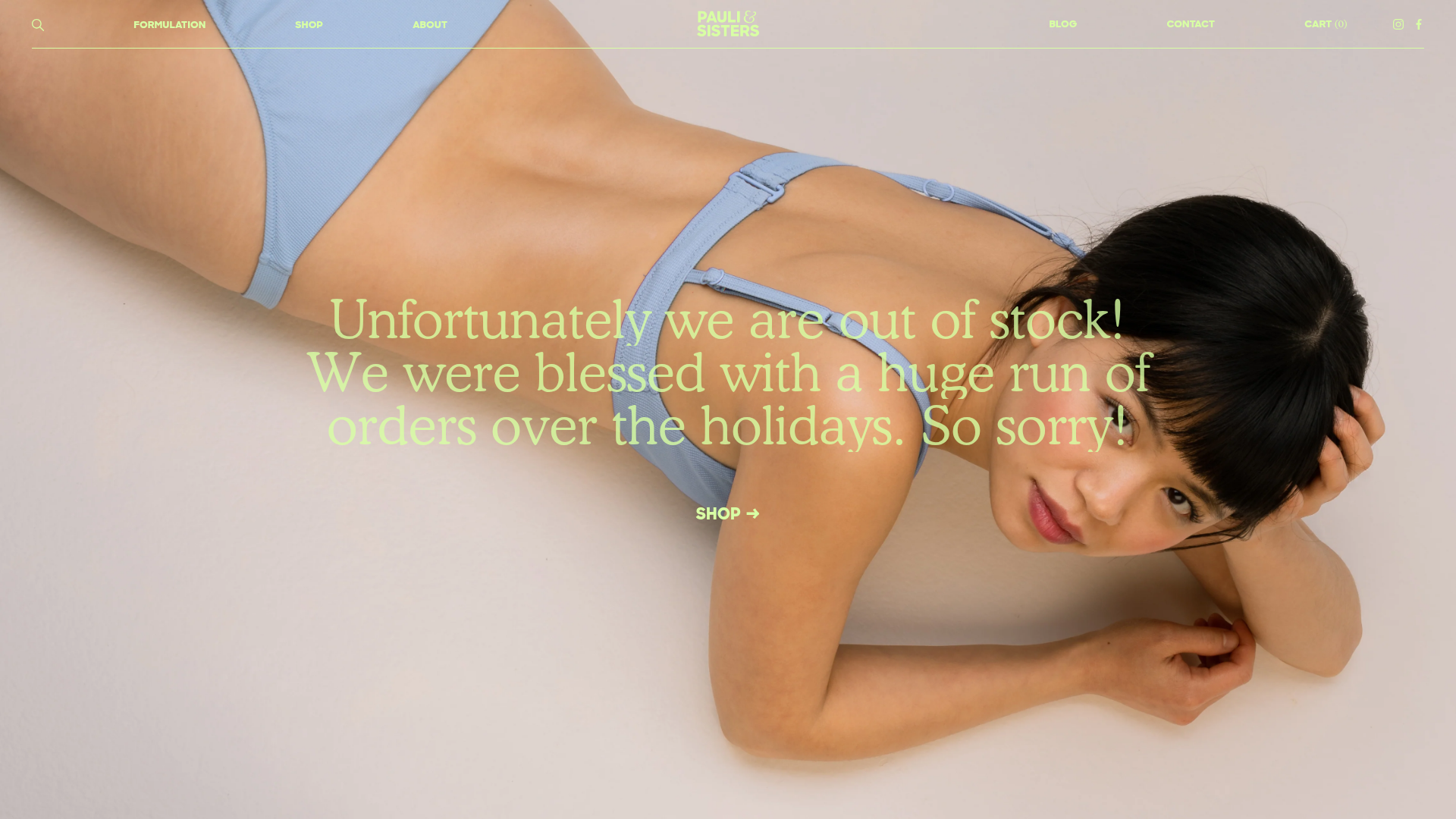
Pauli & Sisters Landing Page
A minimalist e-commerce design featuring a full-width hero image with large overlapping serif text, an interactive ingredient explorer, and a clean split-block layout.
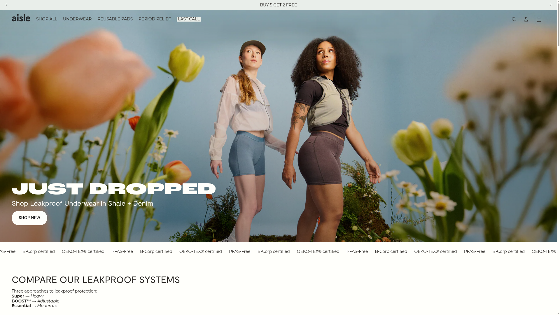
Aisle E-commerce Landing Page
A clean Shopify-based layout featuring a high-impact split hero section, a scrolling marquee for trust badges, and interactive product cards with variant swatches and image carousels.
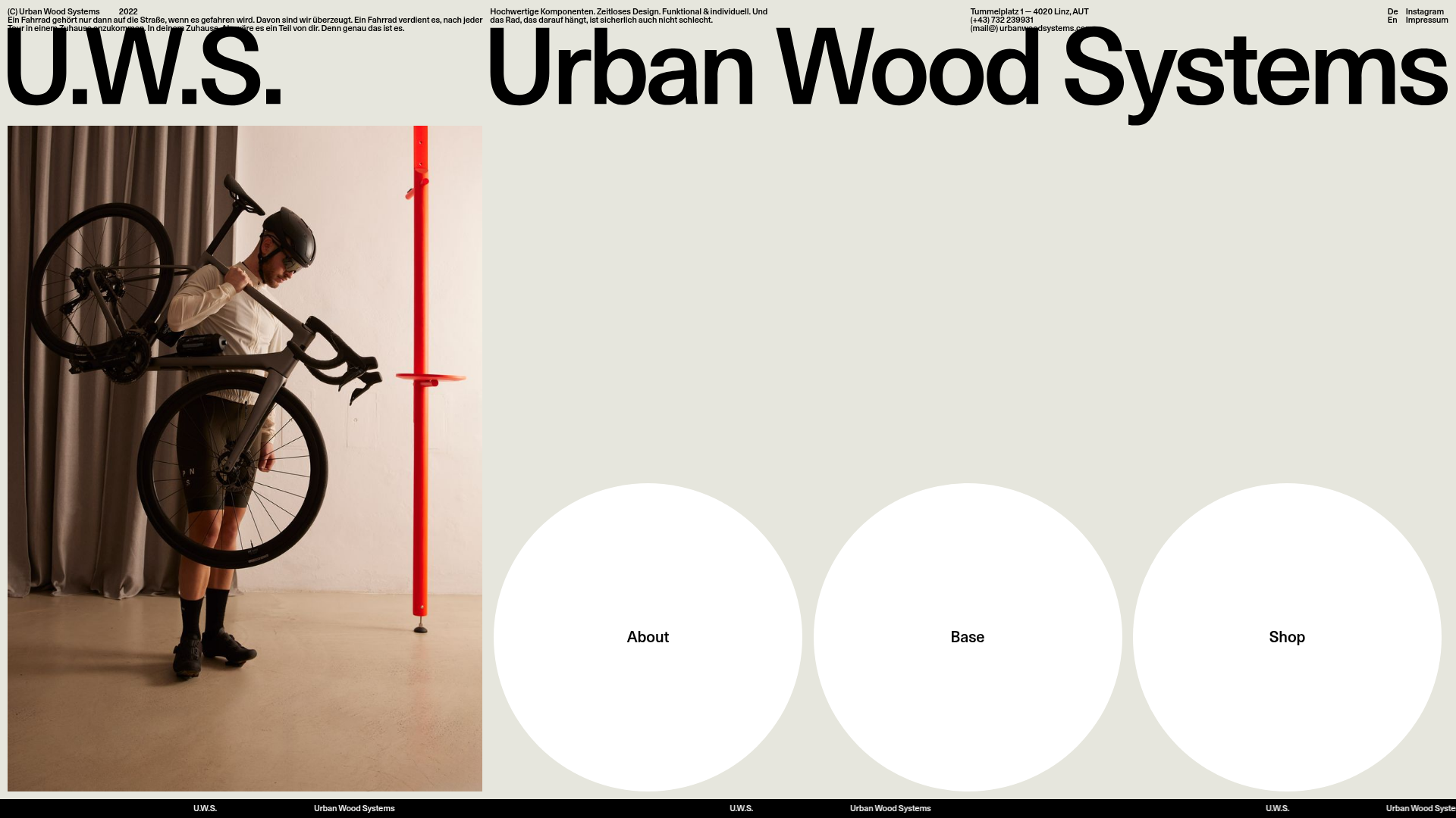
Urban Wood Systems Minimal Landing Page
A minimalist layout featuring a large-scale SVG header, a scrolling text ticker footer, and a clean navigation grid with large circular hover-active buttons.
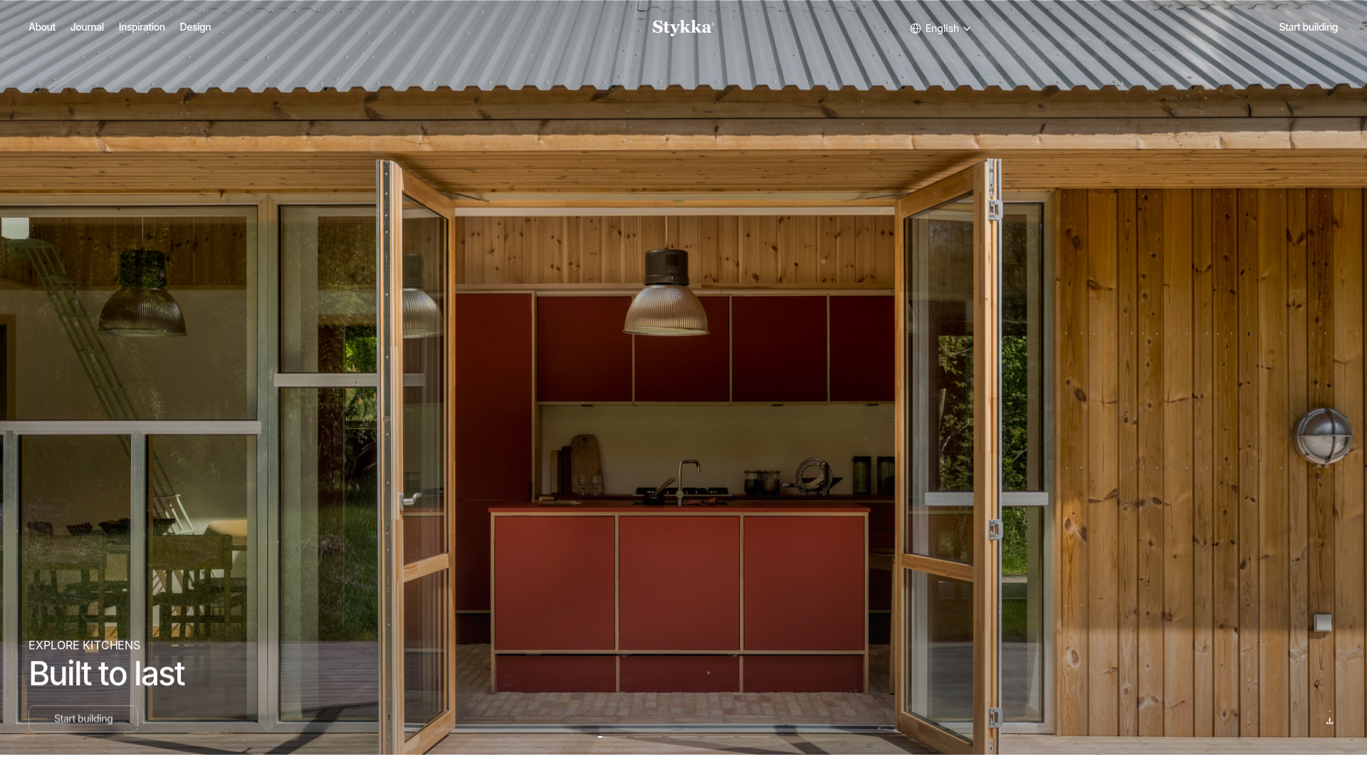
Stykka Modular Furniture Landing Page
A minimalist industrial design featuring a full-screen vertical navigation slider, oversized imagery, and interactive content cards for modular product storytelling.
