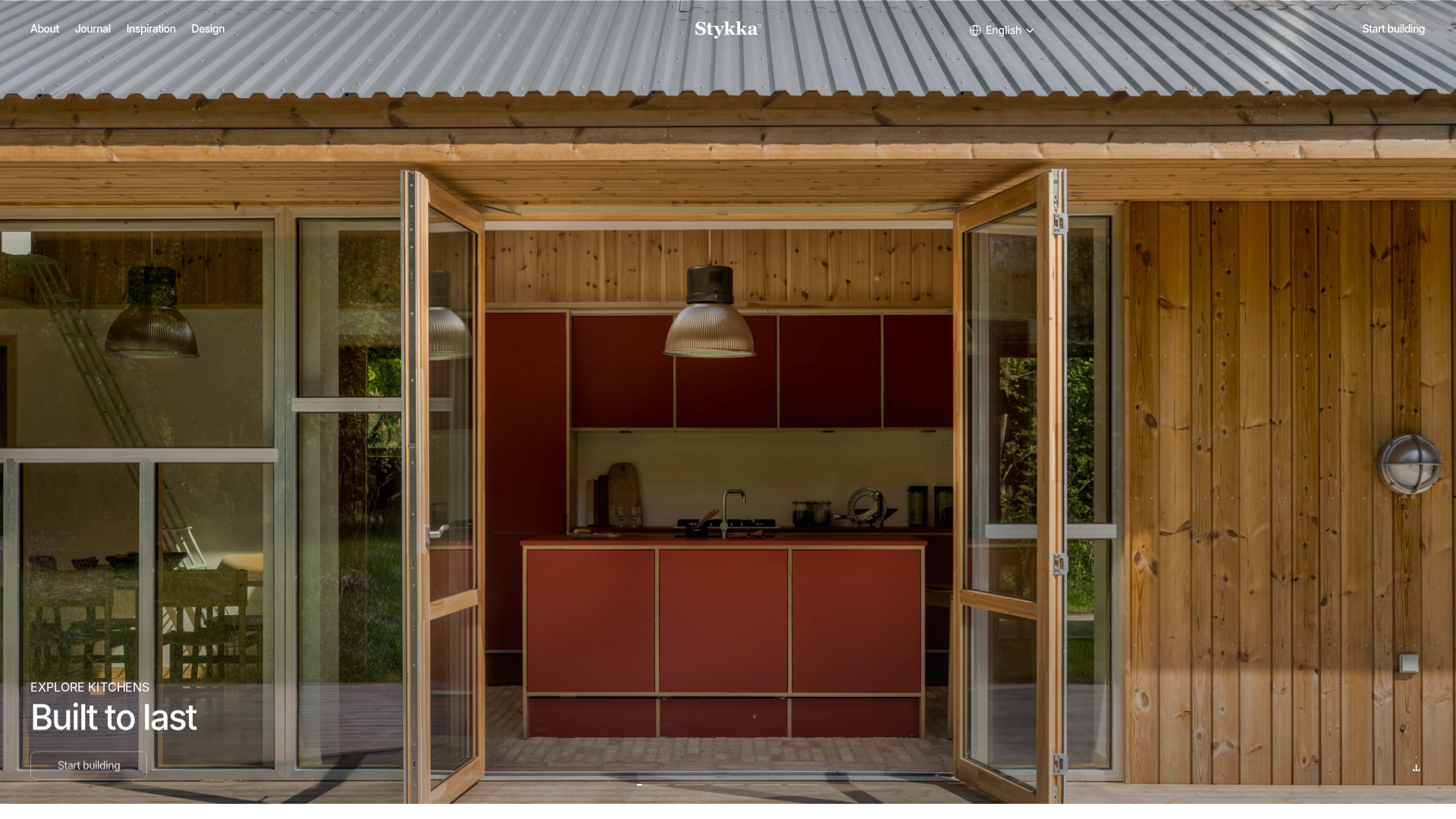
Stykka Modular Furniture Landing Page
A minimalist industrial design featuring a full-screen vertical navigation slider, oversized imagery, and interactive content cards for modular product storytelling.
Overview
Stykka.com is a sophisticated landing page for modular furniture characterized by a brutalist yet industrial aesthetic. It serves as an excellent reference for builders wanting to combine high-end editorial photography with a rigid, grid-based interface and high-performance scrolling mechanics.
Design System
- Color Palette & Visual Hierarchy: The site uses a neutral foundation of deep blacks and stark whites, allowing vibrant product colors (like the terracotta kitchen units in the hero) to define the visual interest. Hierarchy is established through oversized typography and ample negative space.
- Typography System: The system relies on a clean sans-serif for UI elements and navigation, paired with a specialized monospace font (Azeret Mono) for utilitarian indicators like arrows and secondary labels. Headlines use large, bold weights to anchor full-screen imagery.
- Page Structure: The layout follows a vertical linear flow: a full-screen hero slideshow, followed by a "History Card" grid explaining brand values, and concluding with large-scale "Page Link Cards" for user-segment navigation (Home, Architects, Developers).
- Reusable Components:
- Vertical Slider Navigation: A thin, functional indicator bar on the left for hero navigation.
- History Cards: Vertical image-and-text components with a minimal horizontal divider line.
- Overlay Link Cards: Image-heavy blocks with centered text and hover-active SVG arrows.
- Glassmorphism Client Grid: A bottom grid using backdrop-blur and low-opacity white backgrounds for logo presentation.
- Interaction and Motion: The HTML indicates a Framer-powered site with heavy use of
will-change: transformfor scroll-triggered entrance animations (specificallytranslateYandscaleeffects). Slideshow transitions appear to use high-precision scaling on background images to create depth. - Responsive Behavior: The design utilizes clear breakpoints (e.g., 1200px, 810px) to stack the multi-column card grids into single-column layouts for mobile, ensuring imagery remains the primary focus.
Use Cases
- Who should clone this pattern: Designers creating portfolios or high-ticket physical product pages where the primary selling point is the visual quality and material honesty of the item.
- Product Remixing: This pattern effectively suits architectural studios, high-end fashion lines, or industrial design firms. The "History Card" grid is particularly useful for storytelling-heavy brands.
- Practical Remix Directions: Swap the industrial terracotta/black palette for softer pastels to adapt it for a boutique lifestyle brand, or replace the product focus with case studies to create a minimalist agency portfolio.
- Suggested Clone Scope: For a fast implementation, the full-screen hero slider and the "History Card" section provide the highest design value. For a complete brand overhaul, cloning the entire page structure ensures a cohesive industrial UX.
Related Inspirations
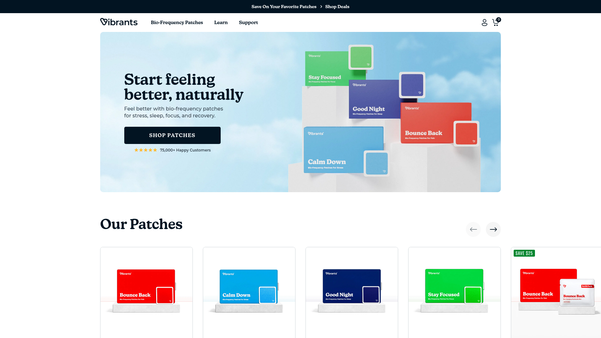
Vibrants Wellbeing E-commerce Landing Page
A clean Shopify-style landing page featuring a full-width hero with overlaid product cards, a horizontal product slider, and interactive cart drawer with utility progress bars.
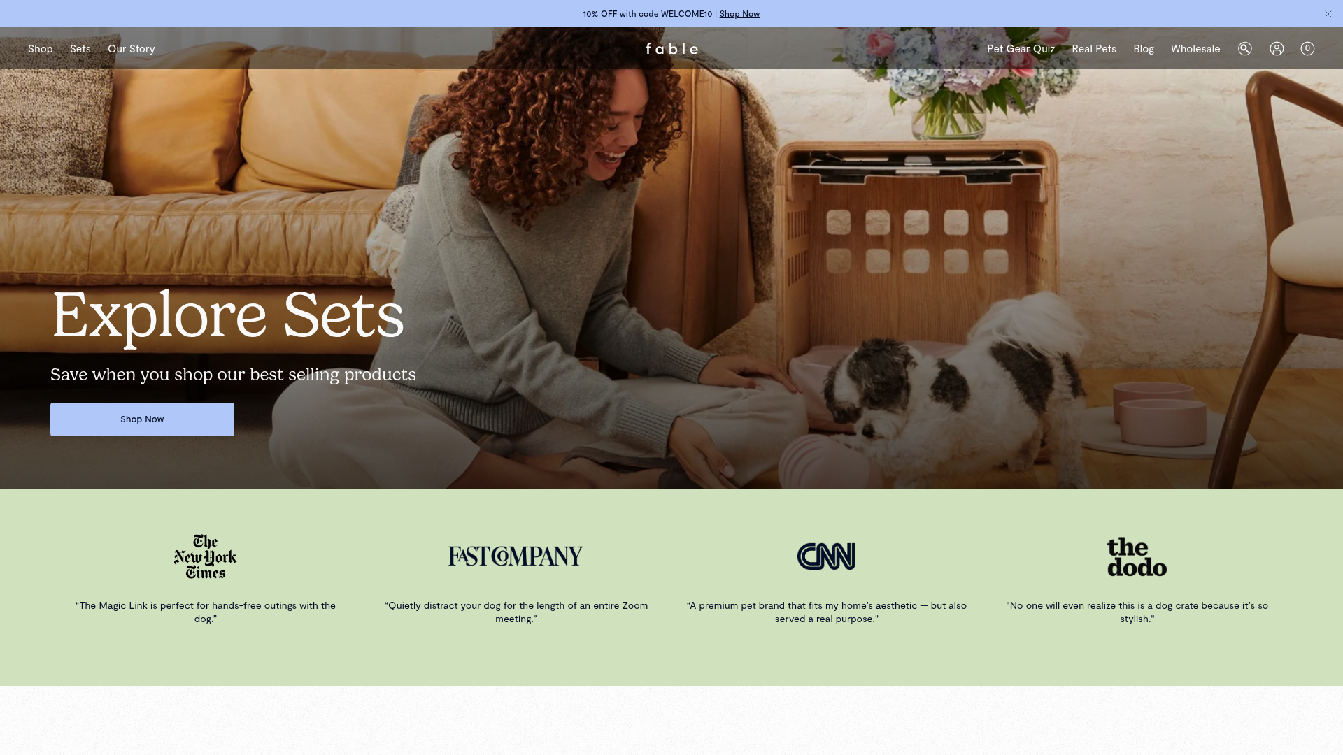
Fable Pets E-commerce Landing Page
A minimalist lifestyle pet brand template featuring a high-impact hero section, a clean logo trust bar, and a centered navigation menu.
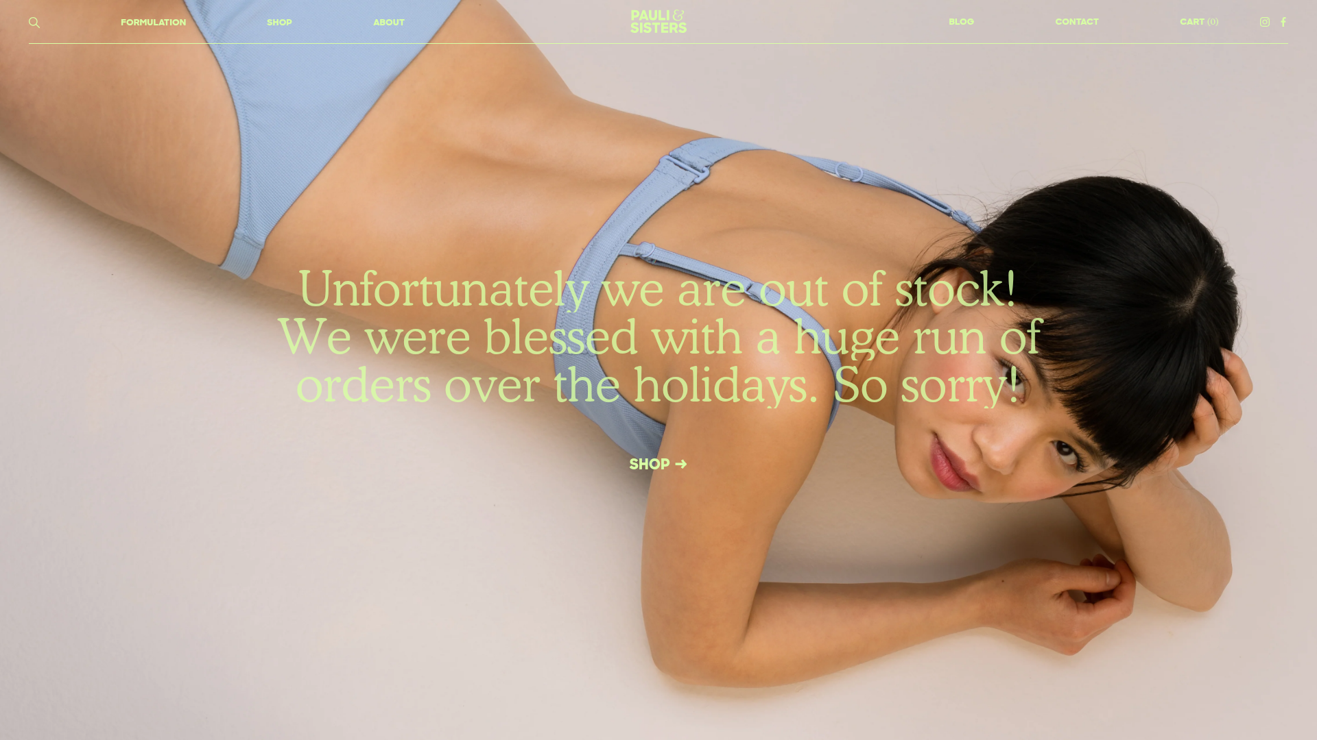
Pauli & Sisters Landing Page
A minimalist e-commerce design featuring a full-width hero image with large overlapping serif text, an interactive ingredient explorer, and a clean split-block layout.
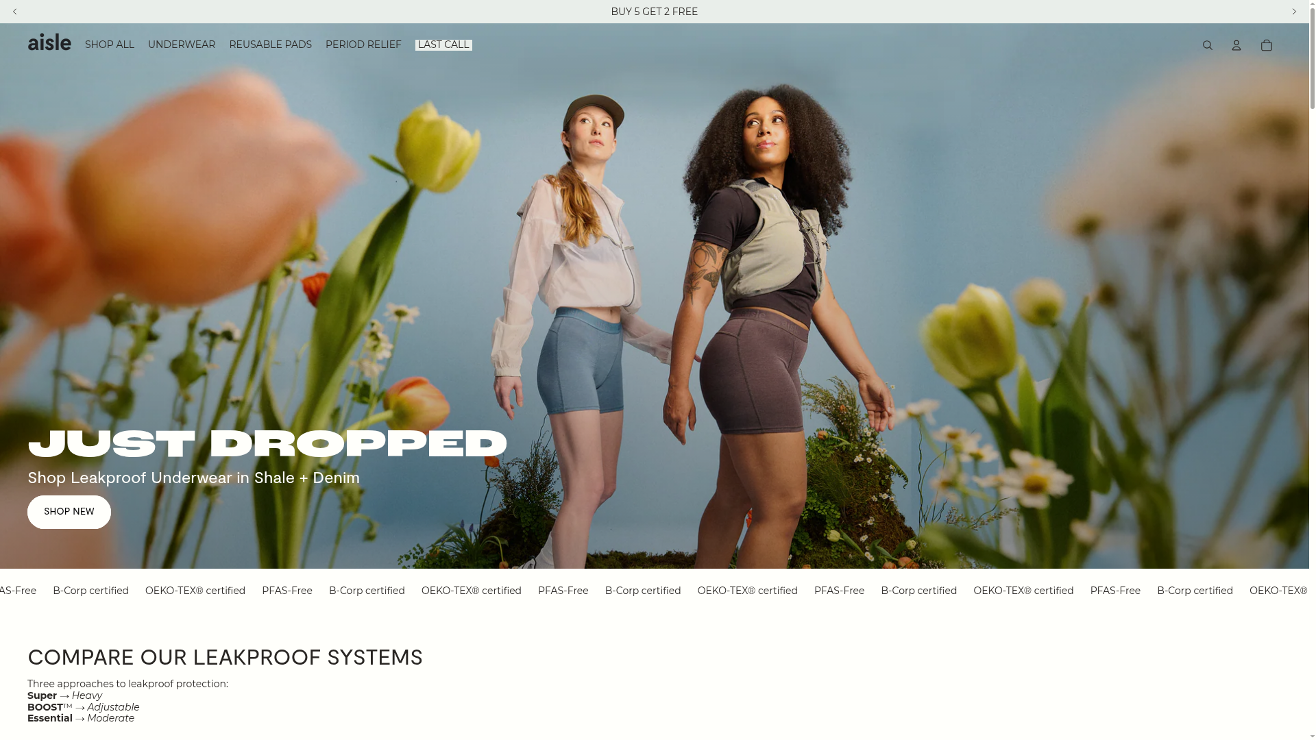
Aisle E-commerce Landing Page
A clean Shopify-based layout featuring a high-impact split hero section, a scrolling marquee for trust badges, and interactive product cards with variant swatches and image carousels.
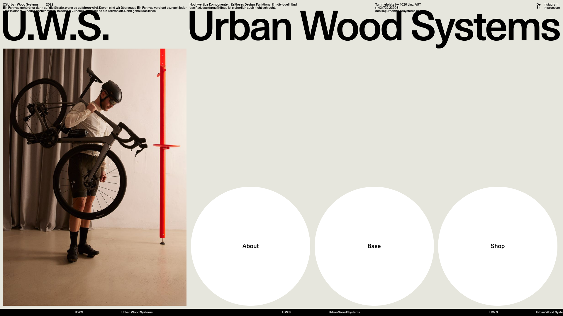
Urban Wood Systems Minimal Landing Page
A minimalist layout featuring a large-scale SVG header, a scrolling text ticker footer, and a clean navigation grid with large circular hover-active buttons.
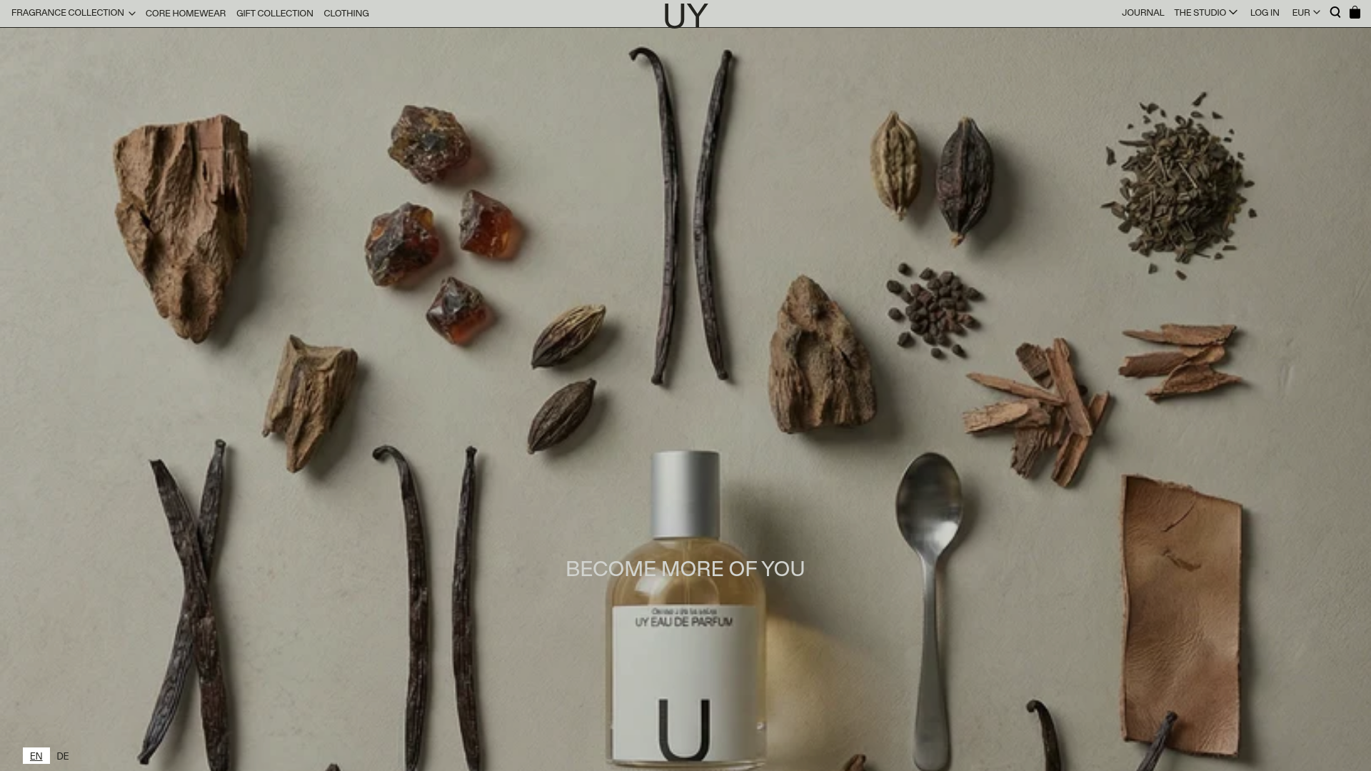
UY Studio Fragrance Landing Page
A minimalist e-commerce layout featuring a high-resolution hero image with ingredient flat-lay aesthetic and a uniform product grid for specialized retail collections.
