Next.js Application Error Landing Page
A minimal client-side error fallback page featuring centered typography and system-ui font stacks for graceful failure handling.
Overview
This is a minimal Next.js client-side error fallback page designed to provide a graceful failure state when an application exception occurs. It serves as a strong clone reference for developers building robust SPAs (Single Page Applications) who need a lightweight, system-standard template for error boundaries and catastrophic failure handling.
Design System
- Color Palette & Visual Hierarchy: The design uses a high-contrast, black-on-white aesthetic. The background is pure white (#FFFFFF) with black text (#000000), ensuring the absolute maximum level of accessibility and clarity during a technical error.
- Typography System: The layout utilizes a comprehensive system-ui font stack (
system-ui,Segoe UI,Roboto,Helvetica,Arial,sans-serif) to ensure it looks native and loads instantly without external assets. The typography is set at a small scale (14px font size) with a medium line height (28px) for a technical, utility-first feel. - Page Structure & Flow: The layout utilizes a full-viewport flex container (
100vh) with content precisely centered both horizontally and vertically. It is a single-element structure intended to minimize DOM complexity. - Reusable Components: The primary component to clone is the Flexbox-based layout wrapper that ensures vertical and horizontal centering across any screen size. Another critical element is the
next-route-announcerscreen reader implementation for accessibility during an error state. - Implementation Clues: Hard-coded inline styles are used rather than external CSS, indicating this is designed to be rendered even if CSS bundles fail to load. It uses a semantic
<h2>tag for the error message to maintain document structure.
Use Cases
- Who Should Clone: Software engineers and product designers building React or Next.js applications that require a "Safety Net" page to catch runtime crashes.
- Effective Remixes: While the default is minimal, this can be remixed into a custom branded 404 page, a "Maintenance Mode" screen, or a dedicated "Subscription Required" gateway.
- Remix Directions: Developers should swap the generic system font for a brand-specific typeface, add a "Return Home" call-to-action button, or include a "Copy Error Log" utility to improve the developer experience for end-users.
- Clone Scope: This is ideal for a full-page clone. Because it is a utility page, the entire component structure should be captured to maintain the centered, responsive framing.
Related Inspirations
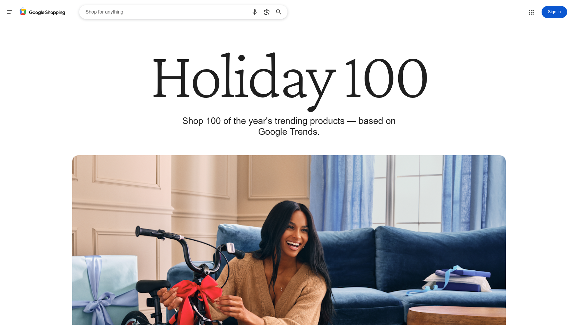
Google Holiday 100 Curator Landing Page
A minimalist e-commerce showcase featuring a wide hero section, clean search integration, and a bold typography-driven header designed for trending product collections.

Finn Pet Supplements Landing Page
An e-commerce landing page featuring high-contrast typography, a sticky brand logo banner, parallax scroll effects on product headers, and a clean product grid.
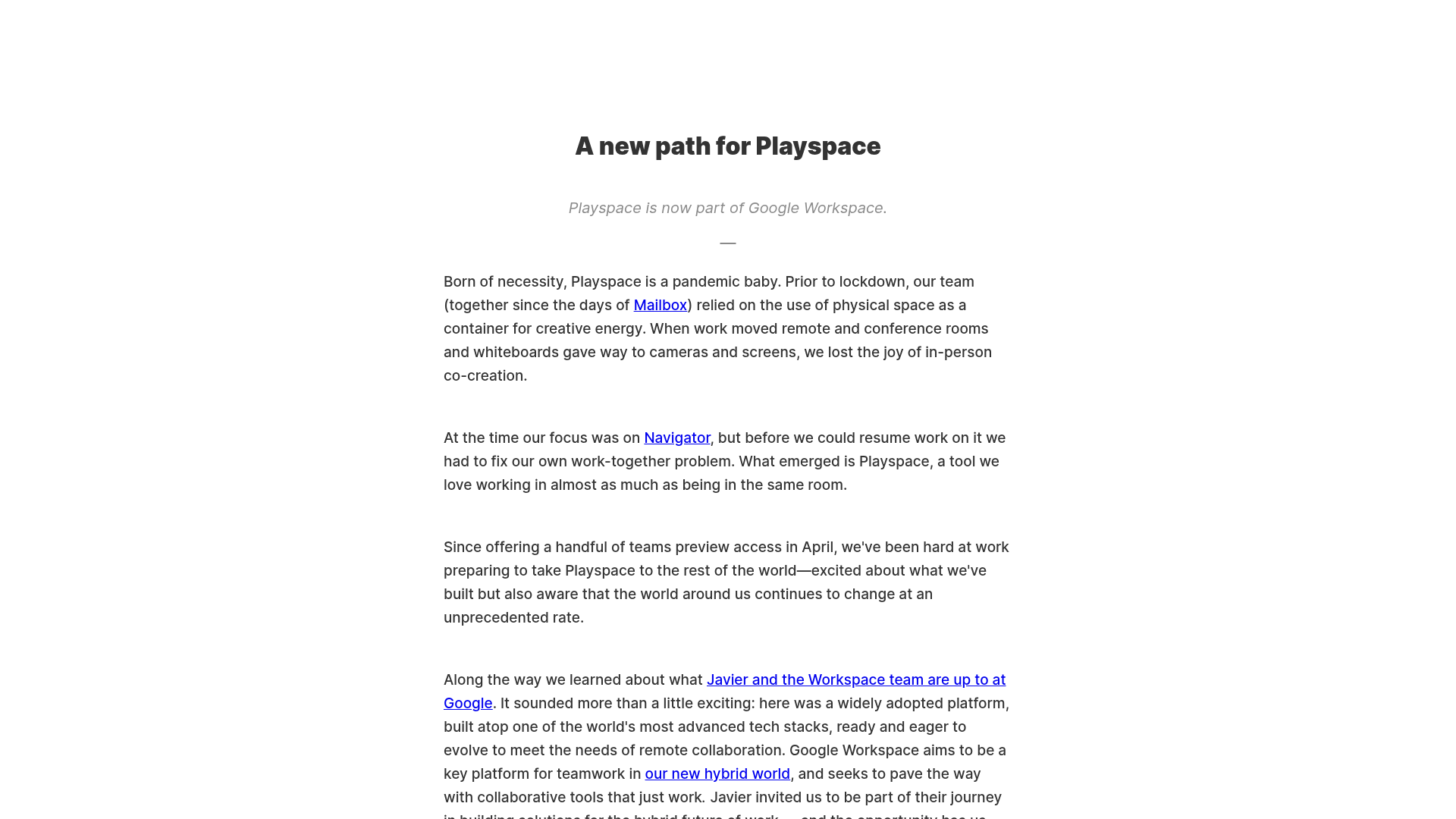
Playspace Acquisition Announcement Minimalist Layout
A clean, center-aligned announcement template featuring a vertical stack of rich text content and linked text elements on a neutral background.
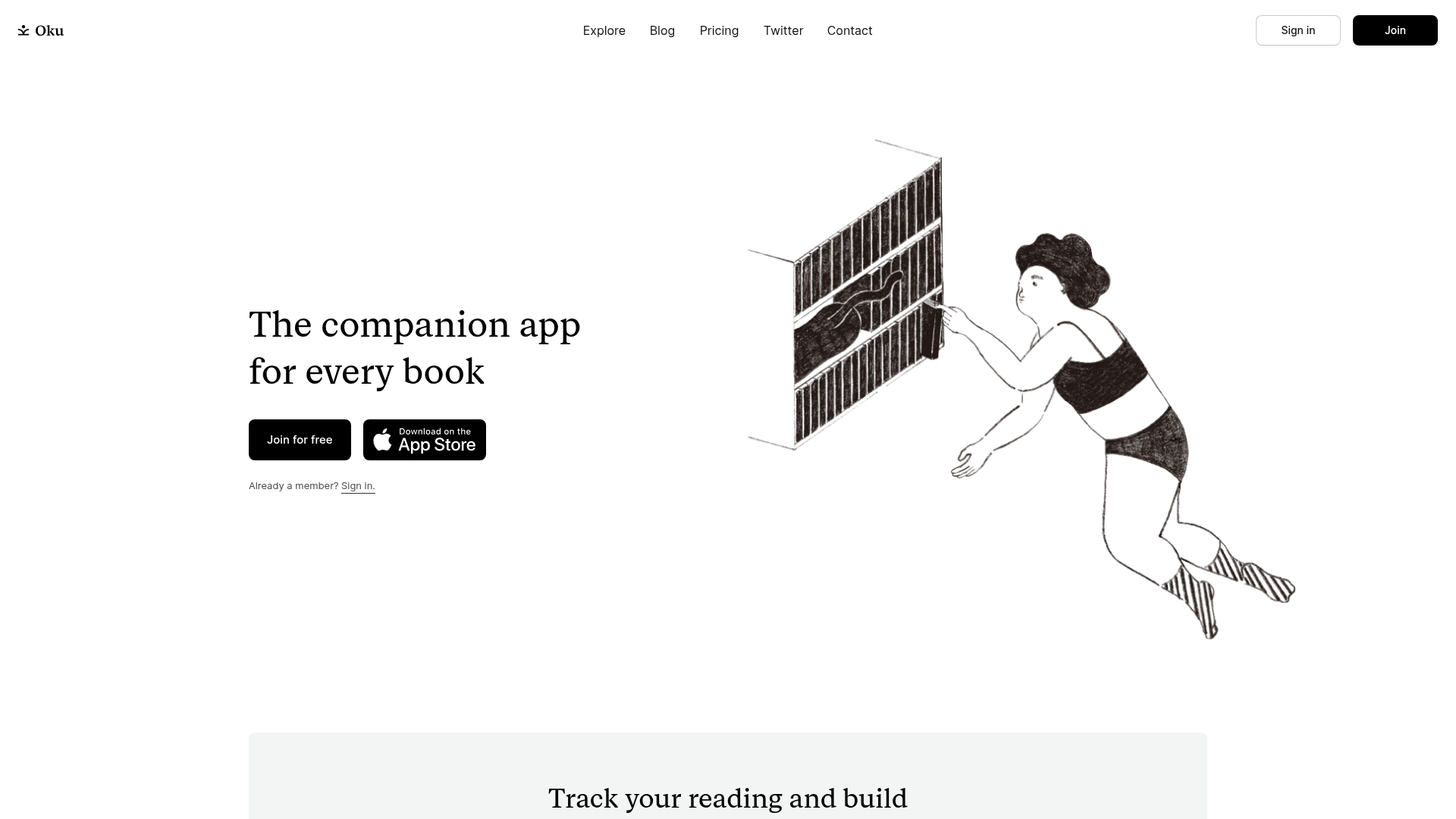
Oku Minimalist Book Tracking Landing Page
A clean, typography-focused landing page featuring a minimalist header, illustrated hero section, and clear call-to-action buttons for app downloads.
OpenWeb B2B Service Landing Page
A professional landing page layout featuring a central animated hero area, data visualization counters, a client logo grid, testimonial slider, and tabbed lead generation forms.

Slite SaaS Knowledge Base Landing Page
A clean SaaS hero section with a conversational headline, secondary call-to-action buttons, and a structured software interface preview featuring user testimonials.
