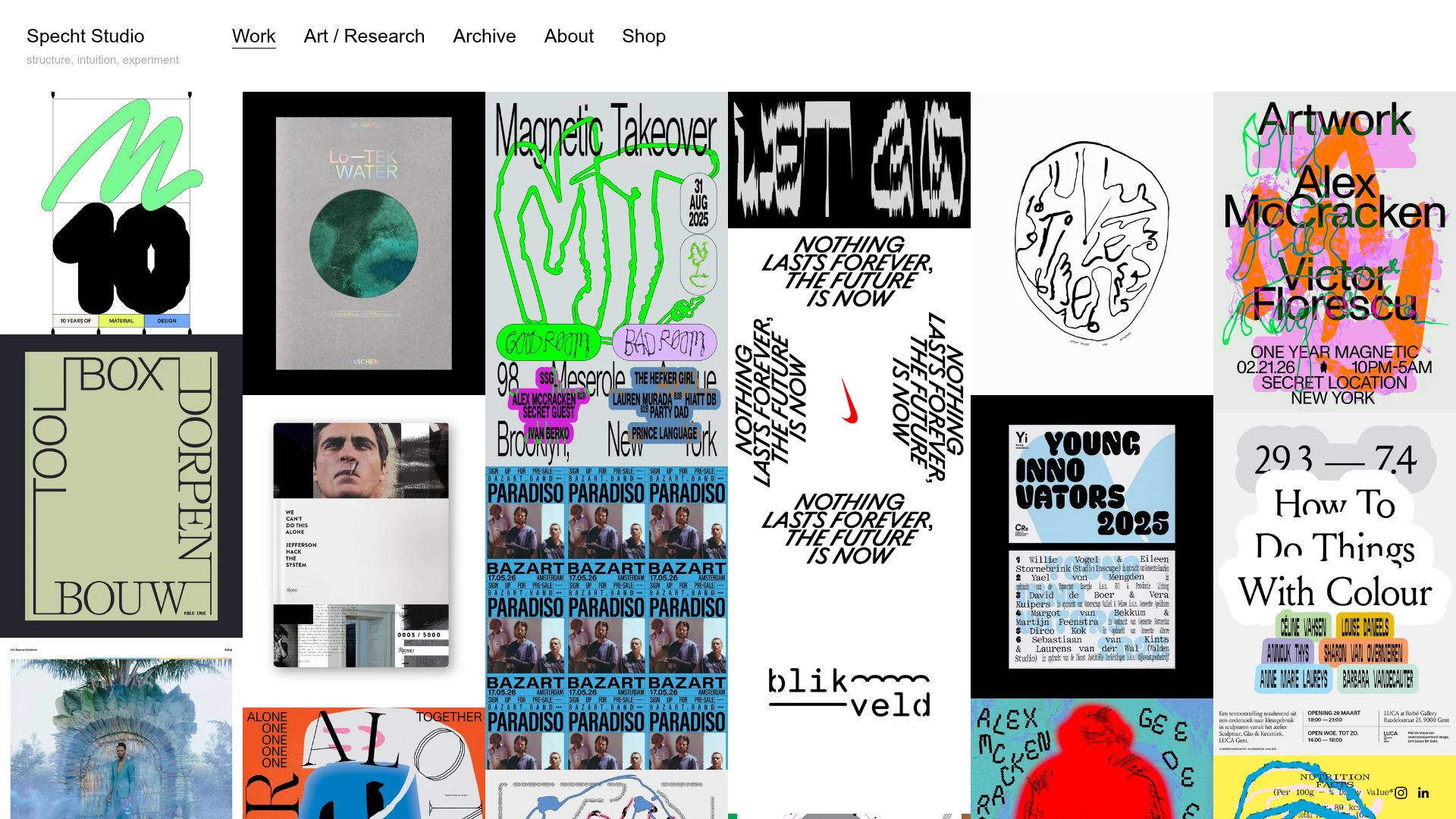
Specht Studio Portfolio Masonry Grid
A minimalist graphic design portfolio featuring an irregular masonry image gallery with high-contrast typography, hidden project details, and a top-aligned persistent navigation bar.
Overview
Specht Studio's portfolio is a masterclass in minimalist, typography-driven curation, utilizing an irregular masonry grid to showcase graphic design work. It is an exceptional reference for builders who want to create a high-impact creative portfolio where the visuals take center stage, supported by a strictly structured navigation and hidden metadata system.
Design System
- Color Palette & Visual Hierarchy: The UI follows a strict monochromatic theme (pure white background, black text) to ensure the vibrant, multi-colored artwork remains the focal point. Visual hierarchy is established through a spacious top header that separates global navigation from the dense experiential gallery below.
- Typography System: The design uses a clean, sans-serif font (appearing to be a grotesque or geometric face like Helvetica or Repro). Navigation links in the header use a larger, bold font size compared to the smaller, lower-case sub-text under the logo. Proportional sizing is used for project titles (
<h2>) and sub-labels (<h3>) within hidden hover states. - Page Structure & flow: Persistent top-aligned navigation containing the logo (Specht Studio) and five primary links (Work, Art/Research, Archive, About, Shop). Below the header, a full-width container (
#container) houses a dynamic masonry grid (#grid) where items are positioned absolutely with variable heights, creating an organic, non-linear flow. - Reusable Components:
- Masonry Grid Item: A wrapper containing an image and a hidden
project-titlediv that overlays on selection/hover. - Metadata Panels: Hidden
<div class="project-item clearfix visually-hidden">blocks containing structured HTML for project type, client, year, and credits. This allows for fast, dynamic loading of data without page refreshes. - Persistent Header: A minimalist top bar with wide letter-spacing and clear active-state indicators.
- Masonry Grid Item: A wrapper containing an image and a hidden
- Interaction & Motion: The site uses "hidden metadata" patterns. Projects appear in the grid; clicking them triggers a dynamic content swap (
data-dynamic-receiver) that populates the detail view. The HTML reveals a custom "switcher" component (.switcher) for navigating between projects (Prev/Home/Next). - Responsive Behavior: The grid is built as an
autocolumnsdesign, which adjusts the number of columns based on viewport width. On smaller screens, the absolute positioning of the masonry items recalculates to maintain a tight, gapless visual stack. - Implementation Clues: Built using Squarespace as the underlying engine, it utilizes YUI (Yahoo User Interface) libraries for grid management and dynamic loading. The layout relies heavily on absolute positioning (
top,leftproperties on grid items) calculated via JavaScript.
Use Cases
- Who should clone this: Independent designers, architecture firms, and experimental photographers who have a diverse range of visual assets with non-uniform aspect ratios.
- Ideal Products for Remixing: Digital art galleries, fashion lookbooks, or design agency case-study pages that prioritize visual rhythm over standardized row-based structures.
- Practical Remix Directions:
- IA Swap: Replace the the "metadata" style with a more commercial approach by moving the client/year info from a hidden state to a permanent caption below each image.
- Style Remix: Transition the white background to a dark "night mode" while maintaining the high-contrast typography to suit a cinematic or motion-design portfolio.
- Inspiration Only: Reuse the minimalist top-aligned header as a clean utility bar for complex, data-heavy applications.
- Suggested Clone Scope: A quick section clone of the masonry grid logic is ideal for those with existing site frameworks; a full-page clone is recommended for users building a brand-new "visual-first" portfolio from scratch.
Related Inspirations
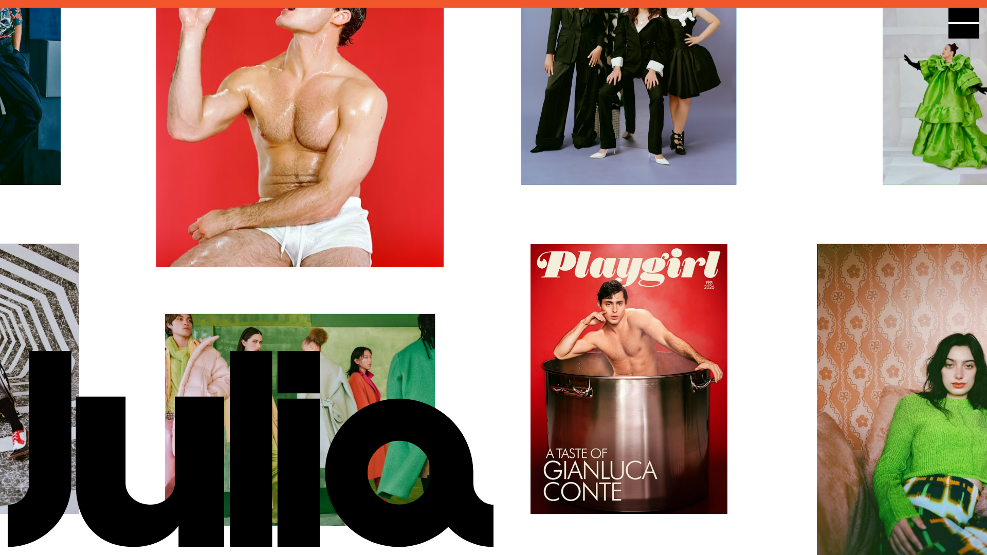
Julia Johnson Photography Portfolio Website
A creative portfolio featuring a masonry-style image grid, overlapping oversized typography, and a minimalist full-screen navigation overlay.
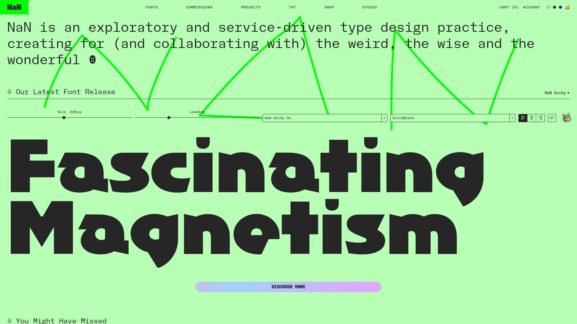
NaN Type Foundry Typography Showcase
A font-centric layout featuring a signature interactive type tester, a minimalist grid-based font gallery with hover effects, and a bold, high-contrast aesthetic.
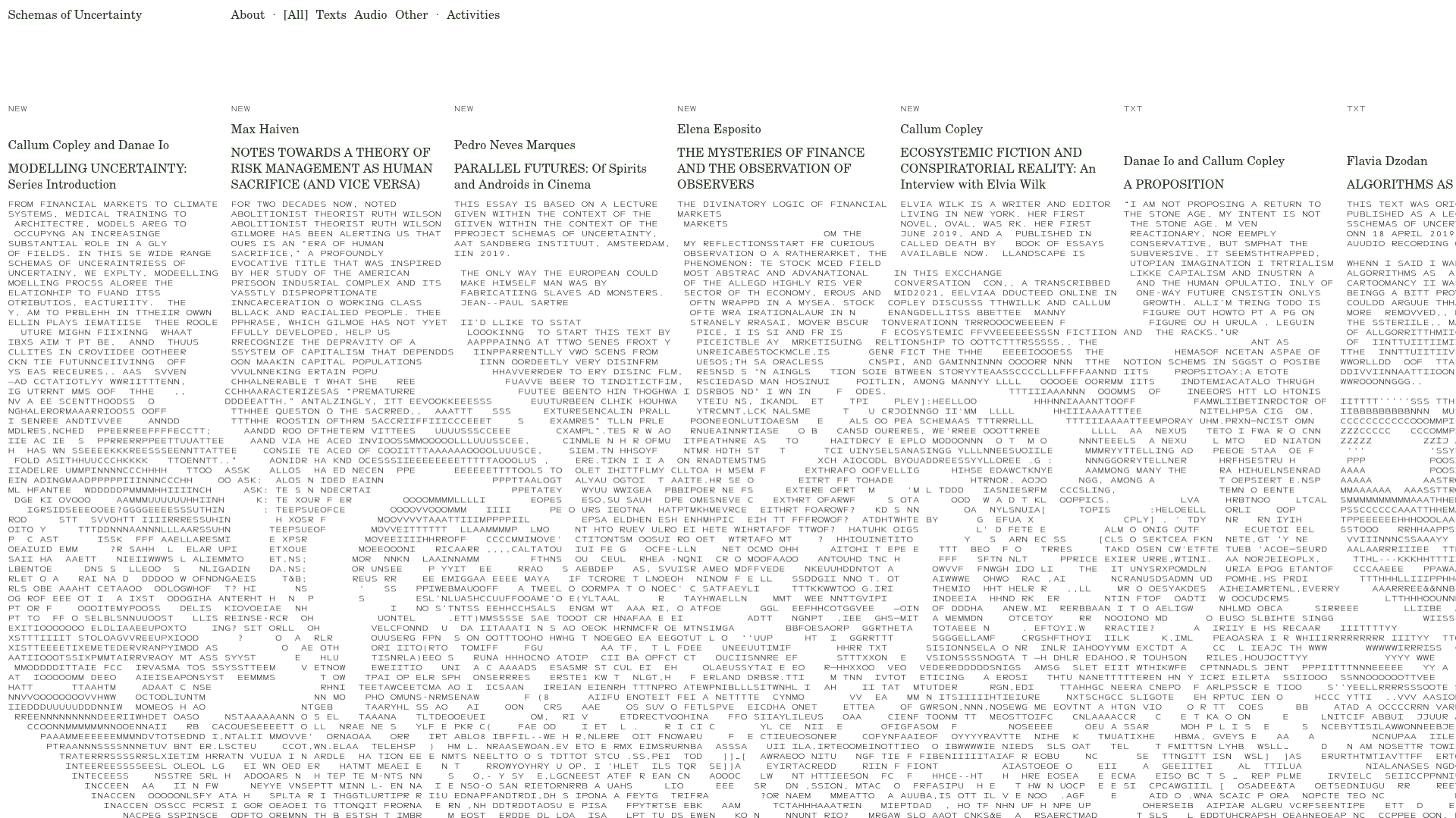
Schemas of Uncertainty Monogram Grid
A brutalist multi-column layout for text-heavy content featuring high-contrast typography, minimalist navigation, and a rhythmic vertical grid of essays.

Infringe Hair Culture Portfolio Gallery
A minimalist, high-impact portfolio featuring a vertical sticky marquee sidebar and full-screen image scrolls that toggle between desktop and mobile assets.
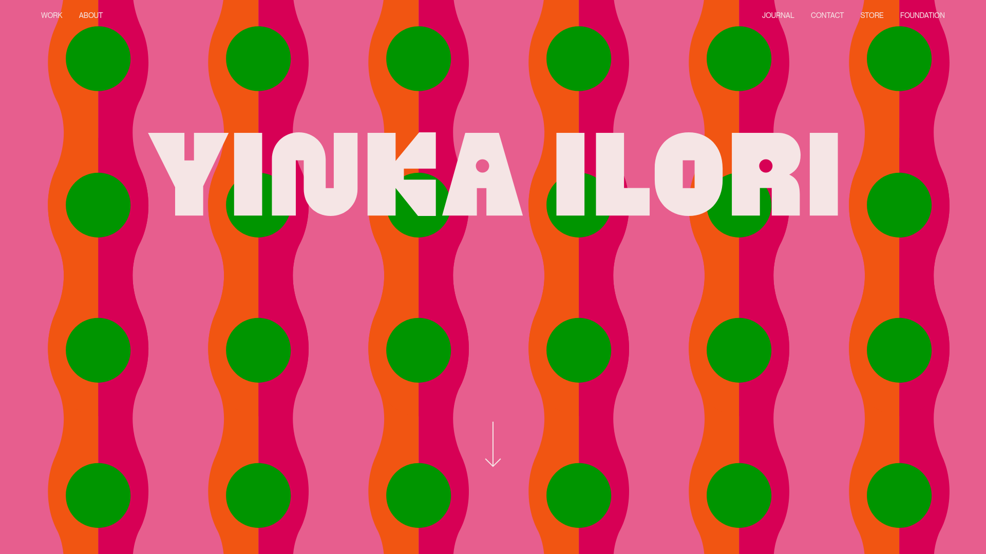
Yinka Ilori Portfolio Mosaic Grid
A vibrant portfolio featuring a scroll-activated parallax hero, bold typography, and a staggered mosaic image grid with asymmetric layouts and fade-in animations.
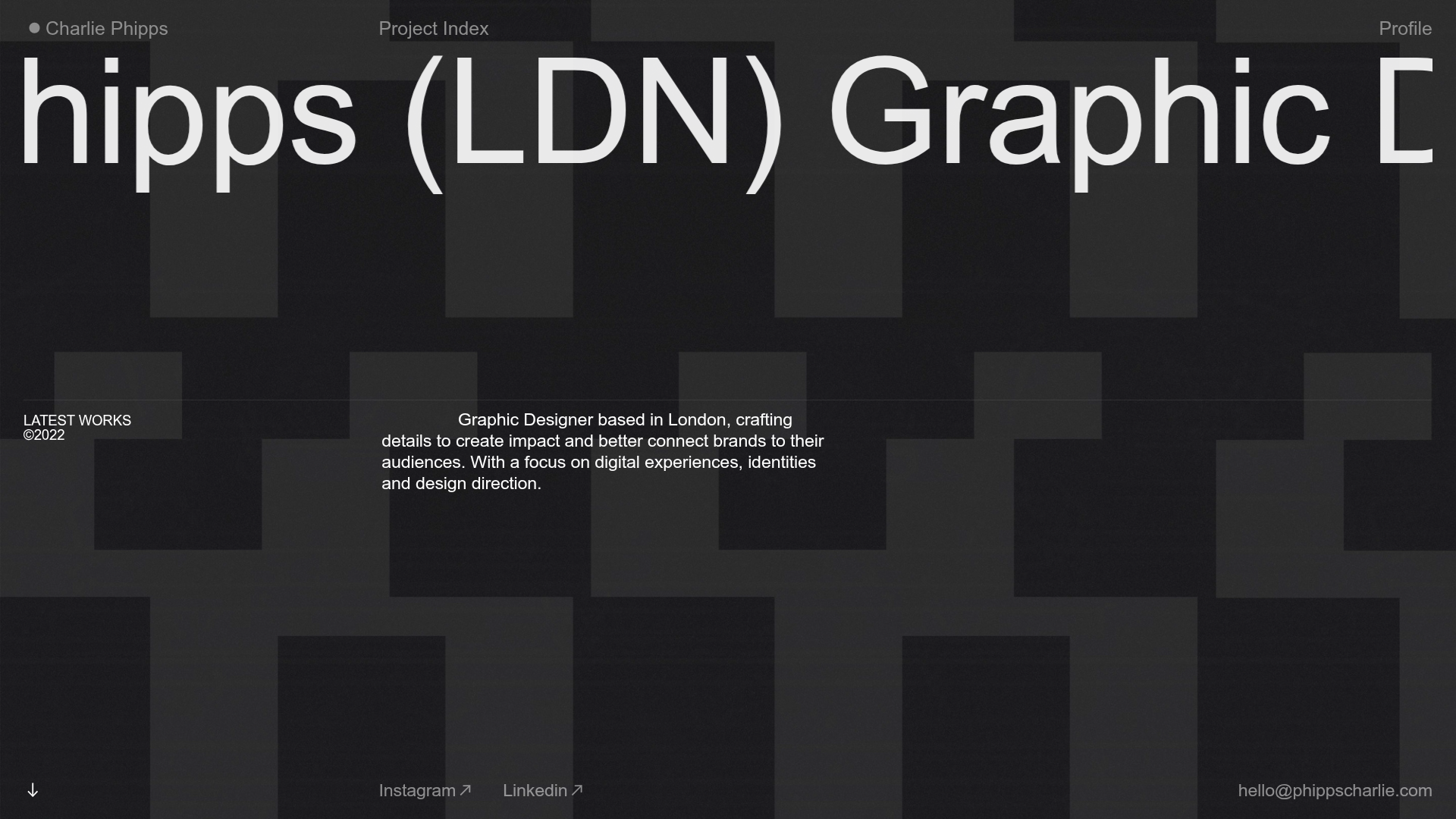
Charlie Phipps Portfolio Hero Layout
A dark-themed portfolio featuring a large horizontal scrolling marquee header, full-bleed video backgrounds, and a clean typography-focused grid for case studies.
