JP Works Template Gallery Landing Page
A clean directory layout featuring a category filter bar, high-impact image grid, and minimalist call-to-action sections suitable for portfolio or asset marketplaces.
Overview
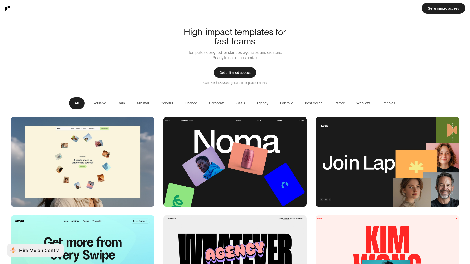
This landing page is a high-impact directory and marketplace for website templates, designed to facilitate quick browsing and high conversion. It serves as an excellent clone reference for its clean implementation of a category-filtered asset grid and minimalist hero section that prioritizes visual content over heavy copy.
Design System
- Color Palette & Hierarchy: The layout uses a high-contrast monochromatic base (pure white background, #191919 black for primary actions and text) to ensure that the vibrant, colorful template previews stand out as the primary focal point.
- Typography: A robust sans-serif system (likely Inter or similar) is used with tight letter spacing for headings. Visual hierarchy is established through extreme scale—large display headers for the value proposition and small, all-caps or muted text for secondary metadata and filters.
- Page Structure: The flow follows a standard conversion funnel: a centered hero title and twin CTAs, followed by a persistent category filter bar (All, Exclusive, Dark, Minimal, etc.), and a dense, masonry-style grid of large-format image cards.
- Reusable Components:
- Filter Pills: Stylized oval buttons with active/inactive states (solid black vs. transparent) that are essential for any directory.
- High-Impact Cards: Large-scale image cards with subtle rounded corners that act as windows into the product.
- Pill Buttons: Rounded 'Get unlimited access' buttons that maintain a consistent brand shape across the header and hero.
- Interactions: Based on the layout, the primary interactions are state-based filter selections. The design implies a 'sticky' or fixed header for the primary CTA and likely a hover-scale or overlay effect for the grid images to reveal more details.
- Implementation Clues: The HTML structure reveals a clean, containerized layout with a heavy reliance on a flexible grid system to handle the responsive transition from 3-column rows to single-column mobile views.
Use Cases
- Who should clone this: Designers and developers launching digital product marketplaces, UI kit libraries, or creative portfolio sites.
- Effective Remixes: This pattern can be effectively adapted for font foundries, photography stock sites, or even a 'Link-in-bio' style resource hub.
- Remix Directions: Replace the high-contrast aesthetic with a brutalist or glassmorphic style for a different vibe. The information architecture is easily adaptable: swap 'Templates' for 'Case Studies' to transform it into a professional agency portfolio.
- Suggested Scope: A full-page clone is ideal for those needing an end-to-end directory solution. However, the filter bar and the responsive image grid are the most valuable individual sections to extract for existing projects.
Related Inspirations
Studio Lathe Minimalist Portfolio List
A high-contrast, minimalist portfolio layout featuring a dense list-based project index with flexible category labeling and a full-screen yellow background.

Niklas Rosén Designer Portfolio Index
A minimalist, responsive grid-based portfolio index featuring a clean 16-column layout, typographic list components, and a custom dark mode transition.

Clase Agency Branding Portfolio
A minimalist design agency portfolio featuring a typographic hero section, full-width image articles, sticky title bars, and integrated scrolling text marquees for a clean editorial layout.

Lundqvist & Dallyn Studio Portfolio
Minimalist design studio portfolio featuring a custom video loader, world clock navigation, and a fluid masonry-style grid for high-quality photography and type design showcases.

Baubauwerk Minimal Agency Portfolio Homepage
A clean studio site featuring a centered text hero, scatter-plot filterable project gallery, and full-bleed image sections for case studies.

AcolorBright Design Agency Portfolio
Minimalist bento-style portfolio layout featuring numerical section headers, horizontally scrolling project teasers, and a clean grayscale client logo grid.
