Opal Camera Tech Showcase Landing Page
A minimalist hardware-focused layout featuring a full-width hero image, a clean navigation menu with multi-column dropdowns, and a three-column product grid with rounded action buttons.
Overview
This website for Opal Camera is a masterclass in minimalist product marketing, blending high-quality lifestyle photography with a sophisticated, Swiss-style typography layout. It serves as a premiere reference for cloning because it demonstrates how to use a mix-blend-mode navigation system and a highly structured grid to present high-end hardware with professional clarity.
Design System
- Color Palette & Visual Hierarchy: The site uses a monochrome base (pure black and white) accented by a single high-visibility "digital yellow" (
#f7e300approximately) for call-to-action buttons. Visual hierarchy is achieved through extreme negative space and oversized, high-contrast typography against fluid, full-bleed images. - Typography System: The design relies on a clean, geometric sans-serif (Inter or similar). Headlines use a tight tracking (
tracking-commonin HTML) with a scale that ranges from 24px on mobile to 48px on large desktops. Subtitles use a medium weight (font-500) to distinguish between headings and body text. - Page Structure & Section Flow: The layout begins with a full-viewport hero section featuring a split-focus image and left-aligned text. This is followed by a perfectly balanced 3-column product grid (
xl:w-1/3) that uses horizontal and vertical borders (1px black/10% opacity) to create a "bento" style container for different hardware models. - Reusable Components:
- Dynamic Navigation: A sophisticated desktop nav with multi-column dropdowns and a
mix-blend-differenceproperty that ensures the white logo and text remain visible regardless of the background image colors. - Pill Buttons: Fully rounded ("capsule") buttons used for pricing and "Available now" prompts, providing a soft contrast to the rigid grid.
- Newsletter Form: A minimalist inline form integrated directly into the navigation/footer area using underline-only input fields.
- Dynamic Navigation: A sophisticated desktop nav with multi-column dropdowns and a
- Implementation Clues: The site is built using Next.js (
id="__next") and Tailwind CSS. It uses sophisticated utility classes for aspect ratios (aspect-[1024/1407]) and custom easing (ease-o6) for transitions.
Use Cases
- Who should clone this pattern: Hardware startups, D2C luxury brands, or software companies selling "prosumer" tools that want to project a high-end, Apple-adjacent aesthetic.
- Effective Remixes: This pattern works exceptionally well for portfolio sites where full-width imagery is the hero, or for e-commerce sites with a limited, curated product catalog (1-5 items).
- Practical Remix Directions:
- IA Adaptation: Reuse the 3-column product grid but swap the yellow CTA buttons for ghost buttons to lower the visual weight.
- Style Swap: Keep the layout but replace the high-contrast black/white with a warm-toned "earthy" palette for sustainable or lifestyle products.
- Suggested Clone Scope: A full-page clone is recommended to capture the seamless transition between the hero and the product grid. However, cloning just the Mix-Blend Navigation section is a high-value move for any site utilizing full-bleed photography.
Related Inspirations
Waka Waka Furniture Portfolio
A minimalist design showcase featuring a custom cursor, parallax scroll effects, and a vertical image grid layout for high-end product displays.
BAGGU Minimalist E-commerce Hero Template
A clean retail landing page layout featuring a full-width high-impact hero section, a sticky integrated banner, and a minimalist navigation header optimized for product launches.
Bee Home Modular Design Landing Page
A minimalist landing page featuring an animated hero section, custom typography, and a modular component architecture built with Gatsby and Emotion CSS.
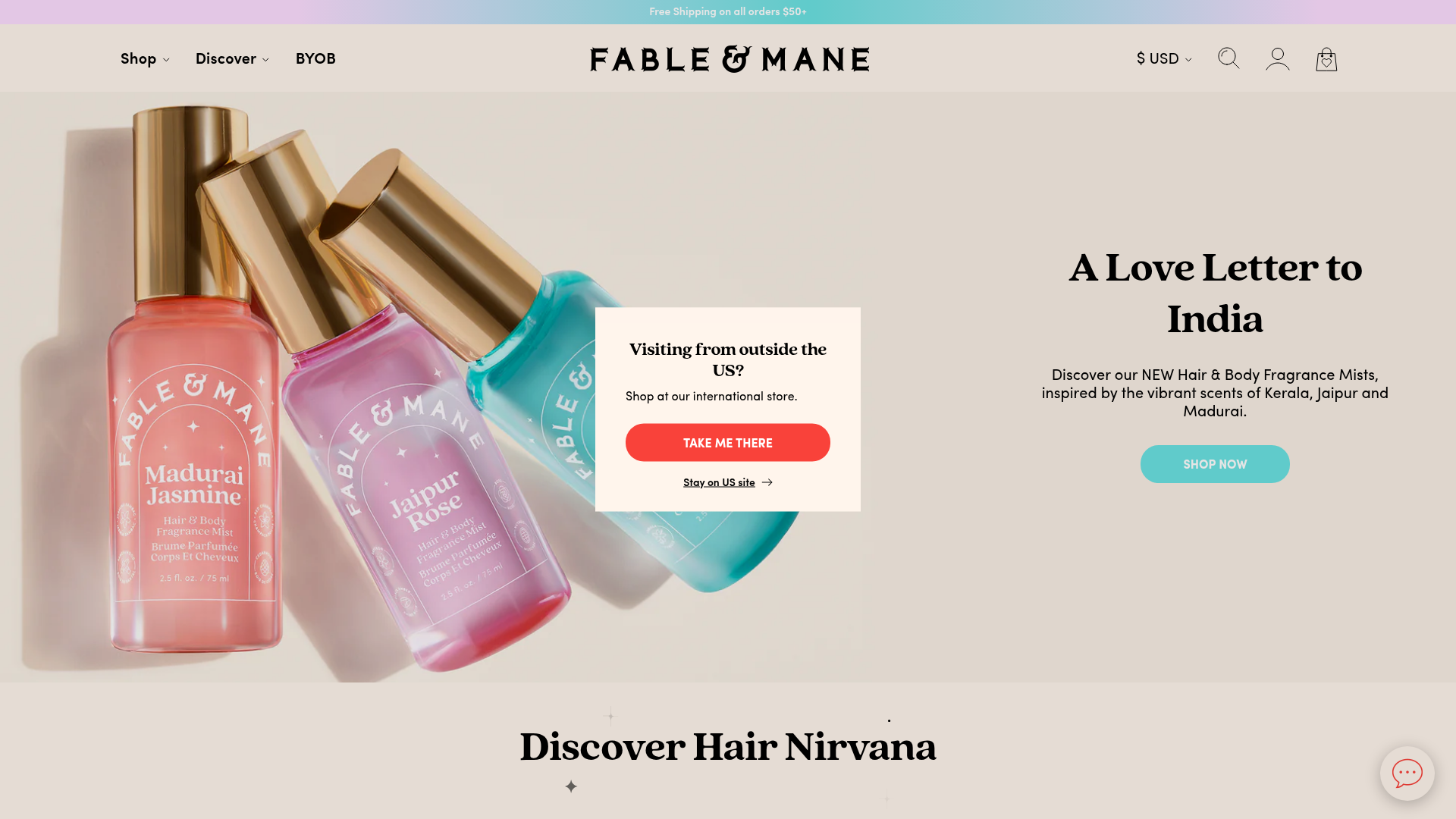
Fable & Mane Beauty Storefront
A clean e-commerce layout featuring a high-impact hero slider with localized entry popups and a product carousel with hover-triggered secondary images.

Unknown Untitled Design Portfolio Screensaver
A minimalist, experimental design agency website featuring an automated image-layout screensaver and oversized typography overlays.
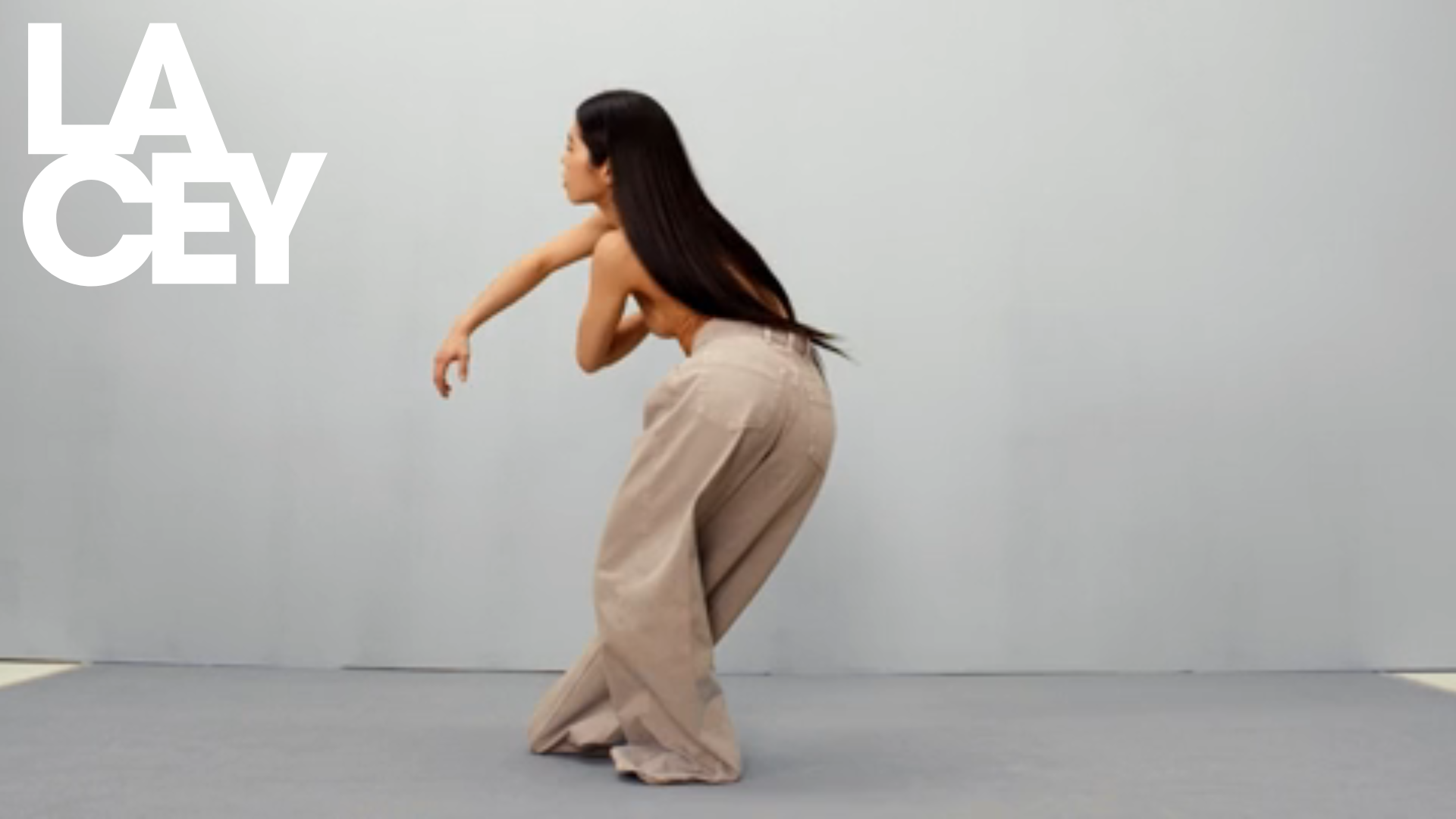
Lacey Studio Creative Portfolio Portfolio
A minimalist director's portfolio featuring a full-screen video hero, masonry-style grid with auto-playing video previews, and a sophisticated overlay navigation system.
